Join our Discord Community
Shadcn Svelte template preview

Shadcn Svelte

H

Created by Huntabyte

Last updated October 8, 2025

About This Template

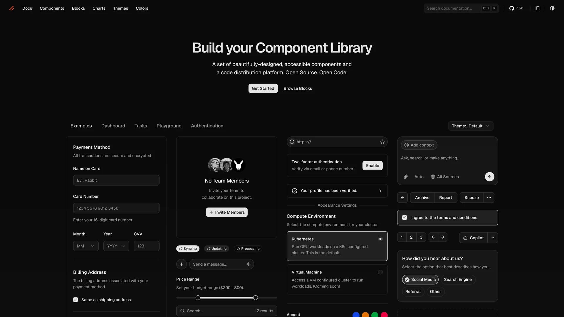
Shadcn Svelte is an unofficial, community-led Svelte port of the popular shadcn/ui component library, bringing accessible and customizable copy-paste components to the Svelte ecosystem. Developed with the blessing of shadcn's original creator, this open-source project has garnered over 7,500 GitHub stars and provides Svelte developers with a comprehensive collection of beautifully designed UI components built with Tailwind CSS and Svelte's reactive primitives. The library follows the same philosophy as shadcn/ui, allowing developers to copy components directly into their Svelte or SvelteKit applications rather than installing them as dependencies, giving teams complete control to customize, modify, and own their component code. Each component is crafted with accessibility as a priority, supports Svelte's reactivity system, and integrates seamlessly with Tailwind CSS for easy styling and theming. Perfect for Svelte and SvelteKit projects, this library provides everything from basic UI elements like buttons and inputs to complex components like data tables, command palettes, and dialog systems, enabling developers to build their own component library with consistent, production-ready building blocks designed specifically for the Svelte framework.

Related Templates

Motion Primitives template preview
Motion Primitives
Motion Primitives is an open-source UI component library designed to help engineers and designers create beautiful, animated interfaces faster using Framer Motion and Tailwind CSS. This comprehensive animation toolkit provides ready-to-use motion components that simplify the process of adding sophisticated animations to web applications without requiring deep animation expertise. The library offers a growing collection of customizable components including animated buttons, cards, modals, page transitions, scroll-triggered animations, and interactive micro-interactions, all built with performance and accessibility in mind. Each component is crafted to be developer-friendly with clear documentation, live previews, and copy-paste installation, following the same philosophy as shadcn/ui. Currently in active development with regular component releases and updates, Motion Primitives eliminates the complexity of configuring Framer Motion from scratch by providing pre-built, production-ready animation patterns that work seamlessly with Next.js and React applications. Perfect for developers building landing pages, marketing sites, SaaS applications, or any project requiring engaging user experiences, the library helps teams add professional-grade animations and transitions that enhance usability and delight users, while maintaining clean code and excellent performance through optimized animation techniques and GPU-accelerated transforms.
Note Gen template preview
Note Gen
Note Gen is an AI-powered Markdown note-taking application that combines traditional writing with advanced features like automatic note generation, semantic search, and retrieval-augmented generation (RAG) to enhance knowledge management. Built with Next.js 14, TypeScript, and shadcn/ui, it enables users to write in Markdown, organize with tags and folders, and leverage OpenAI's GPT models for intelligent content creation. The application uses vector embeddings for semantic search that finds notes by meaning rather than keywords, RAG technology that references existing notes when generating new content, and auto-completion for writing assistance. With a clean interface featuring real-time Markdown preview, syntax highlighting, and keyboard shortcuts, Note Gen transforms note-taking into an active knowledge management system. Perfect for students, writers, developers, and professionals, it helps brainstorm ideas, discover connections between notes, and synthesize information across your knowledge base.
Tremor template preview
Tremor
Tremor is a React component library featuring 35+ customizable, accessible components designed for building data-rich dashboards and analytics interfaces. Built with React, TypeScript, Tailwind CSS, and Radix UI, it provides pre-built chart components (line, bar, area, donut charts, sparklines), KPI cards, data tables, and layout components that follow accessibility best practices. Like shadcn/ui, Tremor uses a copy-paste approach, letting developers integrate component source code directly into projects for complete customization control. The library handles common dashboard requirements including loading states, error boundaries, empty states, and responsive breakpoints, with each component fully typed and integrating seamlessly with Tailwind CSS utilities. Actively maintained by Tremor Labs with comprehensive documentation at tremor.so and community support via Slack and Twitter, it's perfect for building internal tools, SaaS analytics dashboards, and business intelligence applications by providing battle-tested components for data visualization.