shadcn.io is an independent project built on shadcn/ui
The  shadcn library your AI agent builds with.
 shadcn
6,231 blocks, 14 templates and 175 components for React, Vue, Svelte and Solid. Ask your agent, and it installs them in your theme.
The world's largest shadcn block library
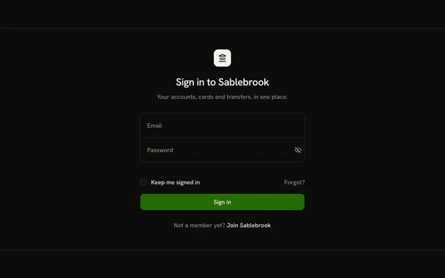
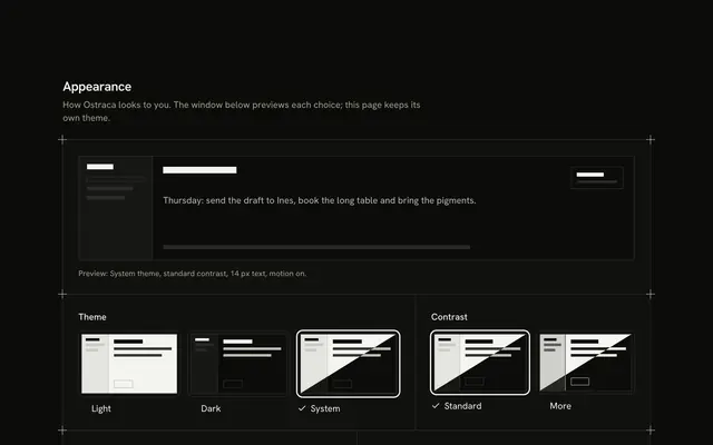
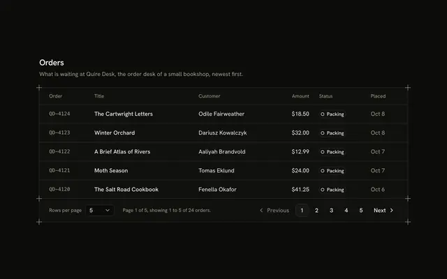
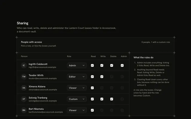
6,231 blocks, from the hero to the settings page, designed as one system: responsive, accessible, light and dark, and in your theme, for React, Vue, Svelte and Solid.











Used by 100k devs and across top universities.
- Harvard UniversityCambridge, MA
- University of California, BerkeleyBerkeley, CA
- Carnegie Mellon UniversityPittsburgh, PA
- Cornell UniversityIthaca, NY
- University of California, Los AngelesLos Angeles, CA
- University of WashingtonSeattle, WA
- University of Illinois Urbana-ChampaignChampaign, IL
- Dartmouth CollegeHanover, NH


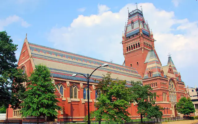





















Campus photos from Wikimedia Commons: credits
- Harvard: Wgreaves (CC BY-SA 4.0), Daderot (CC BY-SA 3.0), chensiyuan (CC BY-SA 4.0)
- Berkeley: Falcorian (CC BY-SA 4.0), Bob Collowan (CC BY-SA 3.0), Carol M. Highsmith, Library of Congress (Public domain)
- CMU: Dllu (CC BY-SA 4.0), Jared Luxenberg (CC BY-SA 3.0), Dllu (CC BY-SA 4.0)
- Cornell: Russian Elmo (CC BY-SA 4.0), Eustress (CC BY-SA 4.0), sach1tb (CC BY-SA 2.0)
- UCLA: Coolcaesar (CC BY-SA 3.0), Logan Ward (CC BY 2.0), Alton (CC BY-SA 3.0)
- UW: Ken Lund (CC BY-SA 2.0), Keng Susumpow (CC BY 2.0), Punctured Bicycle (Public domain)
- UIUC: Dori (CC BY-SA 3.0 us), HalloweenHJB (CC BY 3.0), Kevin Dooley (CC BY 2.0)
- Dartmouth: Kane5187 (Public domain), Kane5187 (Public domain), Daderot (Public domain)
Premium shadcn templates, ready to launch
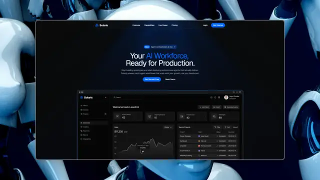
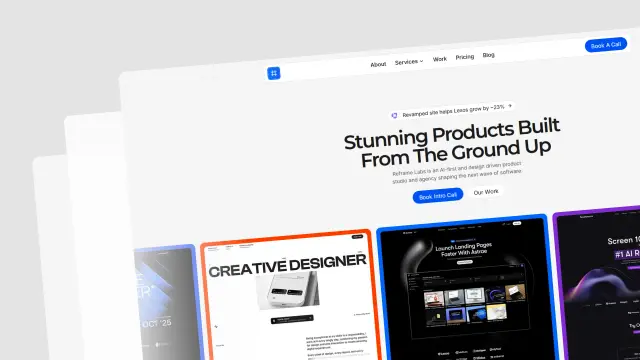
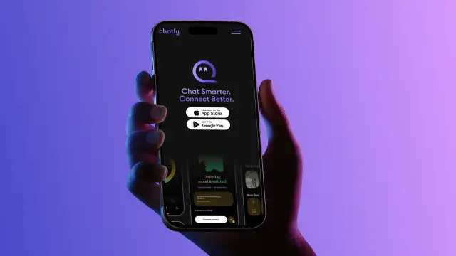
Hand-built sites for startups, SaaS, agencies and portfolios, every page designed and built with Next.js, Tailwind CSS and shadcn/ui. Yours to edit and ship, included with Pro.
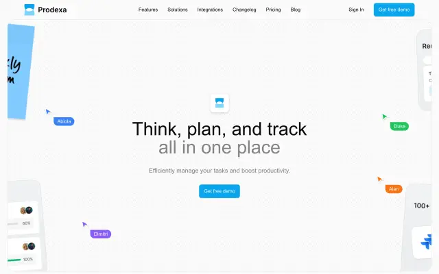
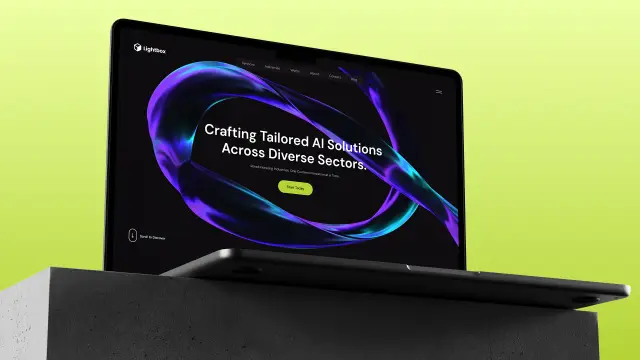
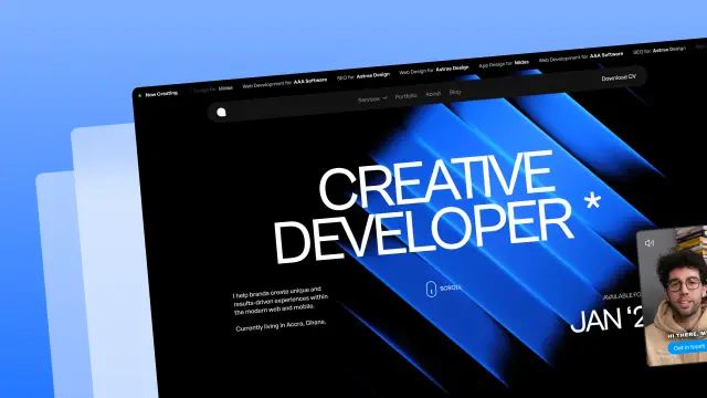


Built with shadcn.io
100k+ devs are building with shadcn.io components.
- Fetchtalent AIfetchtalent.ai
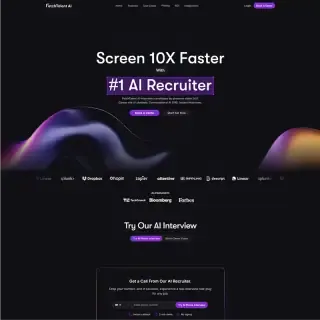

- InfoSignal Inc.infosignal.com


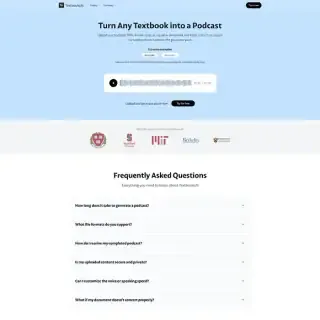
- TextbookLMtextbooklm.co

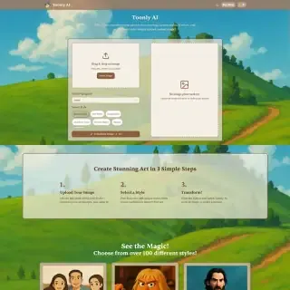
- Toonly AItoonly.ai

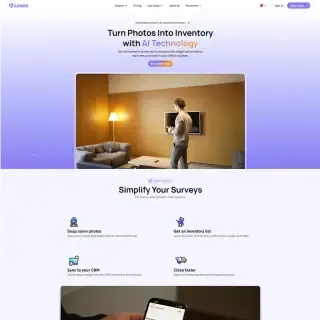
- Lexosgolexos.com

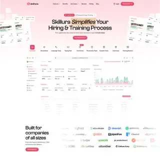
- Skilluraskillura.com

- InfoBoardifs-infoboard.com

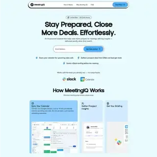
- Meeting IQmeetingiq.com

Build yours next. Pro has every block and template, ready to ship.
Get ProThe shadcn MCP server for every AI agent
Claude Code, Cursor, VS Code and 35 more. Connect once, then ask your agent for any component: it arrives in your framework, typed, accessible and in your theme. Included with Pro.
shadcn/ui for React, Vue, Svelte and Solid
The same components, one design and one theme on every framework. React runs on Base UI, Radix, React Aria or Ark UI; the others on Ark UI.
DESIGN.md files for 500 brands
Stripe, Linear, Apple and 497 more: each brand's colors, typography and components in one file your AI agent builds from. Free to download.
175 free shadcn/ui components
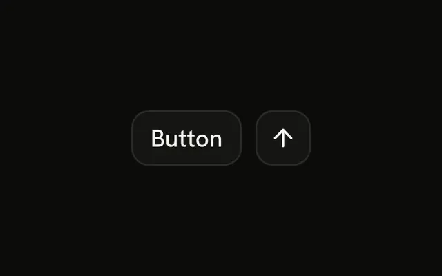
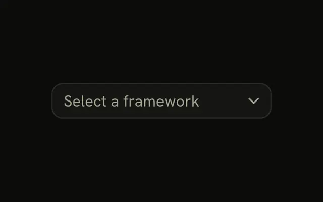
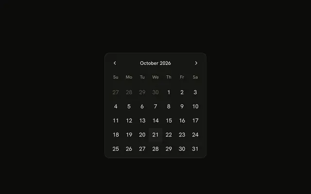
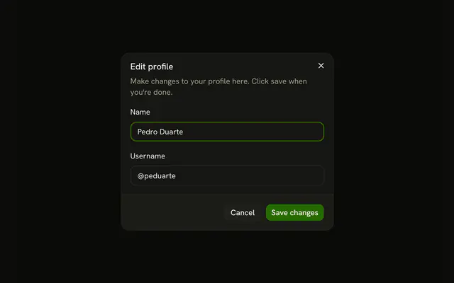
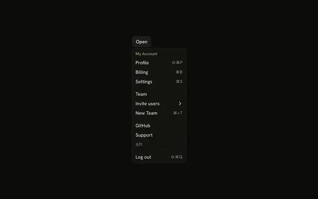
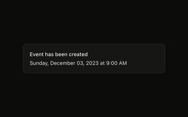
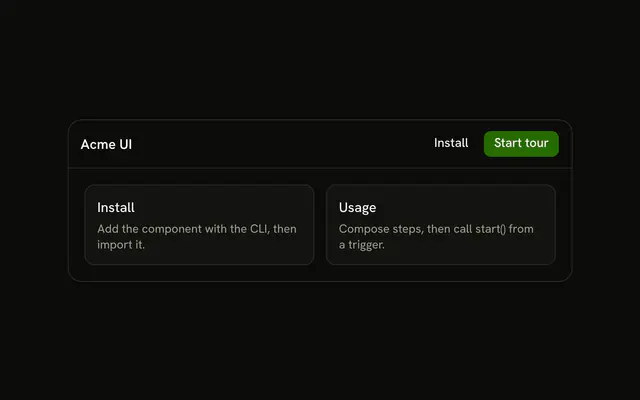
From Button to Date Picker to a guided Tour, accessible, typed in TypeScript and styled with Tailwind CSS v4, each with live demos and the code. Free with an account.

1,103 shadcn/ui examples, ready to copy
Charts, forms, menus and more, in 53 galleries: real-world patterns built from the components, each live with its code. Free with an account.


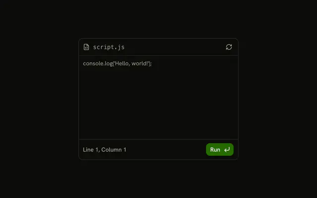


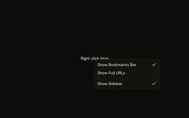


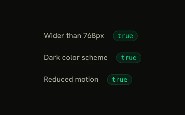
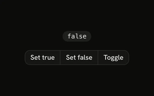
35 typed React hooks for every interface
Debounce, local storage, media queries and more: each hook one TypeScript file you copy in and own. Free with an account.





Every premium block and template, one Pro plan
Every block, all 14 premium templates, the MCP server and the Pro animated components, for you or your whole team. Monthly, yearly or lifetime.
4.9/5 out of 5 · 150+ reviewsfrom 150+ founders and developers.
- Secure checkout via Stripe
- Code lives in your repo
- Keep what you've shipped if you cancel
- License terms
Devs love shadcn.io
Rated 4.9 out of 5 from 150+ reviews. 100k+ developers build with shadcn.io; here's what they say.
- Danny G.Founder of DevStack
“shadcn.io templates have completely transformed how we approach new client projects. The code quality is exceptional and the designs are truly world-class.”
- Ibrahim S.Frontend Lead @ ScaleUp
“shadcn.io templates strike the perfect balance between aesthetics and functionality. A real game-changer for our projects.”
- Alan Obeng-PeprahSenior Designer @ NativeXAI
“Beautiful landing page design with perfect balance and flow. The color palette combined with the animations creates an exceptional user experience.”
- Garrett P.Frontend Lead at TechFusion
“I appreciate how modular and well-documented these components are. We've been able to mix and match pieces from different templates seamlessly.”
- Ian D.CTO at Wavelength
“I've used many template libraries before, but shadcn.io stands out for its attention to performance optimization and clean code architecture.”
- Abiola BraimahDeveloper @ Studio IX
“The templates are not just visually stunning but also incredibly well-structured. Saved us weeks of development time.”
- Hallic M.Developer @ AtlasLabs
“These templates have become our go-to resource. The code is clean, well-documented, and easily customizable.”
- Acromond X.Co-founder @ VectorlabsVentures
“Outstanding quality and attention to detail. The responsive design works flawlessly across all devices.”


Frequently asked questions
What shadcn.io is and which stacks it runs on, how accessible it is, and what Pro adds.
A registry of shadcn/ui-style components, hooks, examples, blocks and templates. React gets them on Base UI, Radix, React Aria or Ark UI; Vue, Svelte and Solid on Ark UI. The code is copied into your project, and it's yours to edit.
No. shadcn/ui is the open-source library by @shadcn, at ui.shadcn.com. shadcn.io is an independent project built on the same ideas: the same CLI and the same theme tokens, so its components work in a shadcn/ui project.
In React, with the shadcn CLI: every component's page has the command, carrying your account's token. In Vue, Svelte and Solid, copy the files from the component's page, or let your AI agent add them with the MCP.
Browsing and trying every demo needs nothing. Seeing, copying or installing the code takes a free account, one tap with Google or GitHub.
React, Vue, Svelte and Solid. React has 175 components on each of its four UI libraries; Vue, Svelte and Solid have 169, on Ark UI.
They're the headless libraries underneath, each handling behavior and accessibility its own way. Our components look the same and take the same theme on all four: pick the one your project already uses, or Base UI by default.
Yes, every component and demo is TypeScript, on every stack, styled with Tailwind CSS v4.
Each one is built on a headless library (Base UI, Radix, React Aria or Ark UI) that follows the WAI-ARIA patterns for focus, keyboard and screen readers. 85 components list every key they answer on their page.
Yes. Layouts use logical properties (ms-, pe-, start-), motion follows the reading direction, and 57 components have a right-to-left demo. The RTL guide in the docs shows the setup.
The animated buttons, text effects and backgrounds do: under prefers-reduced-motion their loops stop, and moves become a fade or nothing.
Every component, hook and example, plus 294k icons and the DESIGN.md files, with a free account. Some of the animated buttons, text effects, backgrounds and shaders are free too.
Every block, the 14 premium templates, the MCP server (22 tools for your AI agent) and the rest of the animated pieces. Monthly, yearly or lifetime, for you or your team.
With a Team or Organization license, yes: client work, SaaS products and anything your users pay for. The Individual license is for personal, non-commercial projects.
4.9 out of 5 from 150+ developers


Ship a polished product, faster
Components are free. Pro adds 6,231 blocks, 14 premium templates and the MCP server your agent installs them with.
Get Pro