Free React & shadcn/ui Templates
Discover the best open source templates built by the community. Production-ready Next.js starters you can copy and customize.
Free React Templates
Discover the best open source templates built by the community. Production-ready Next.js starters you can copy and customize.
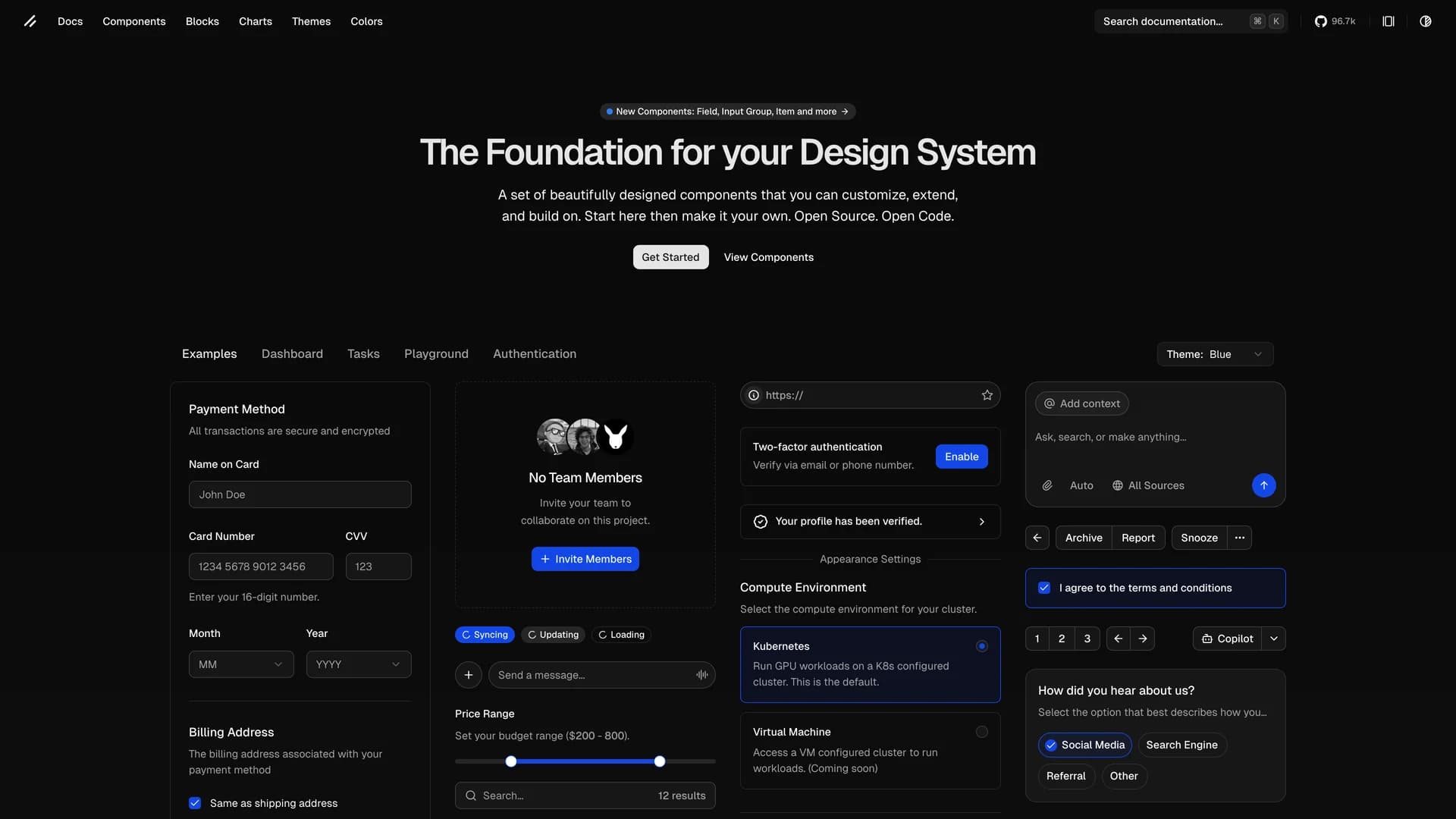
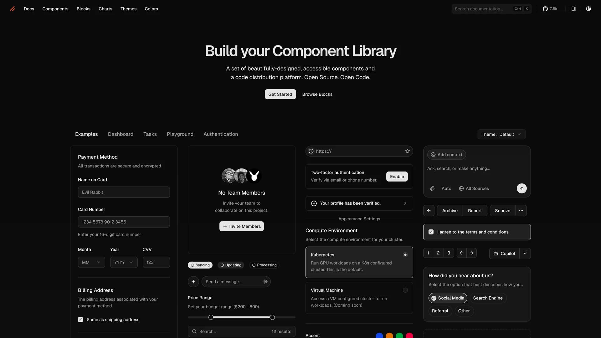
- Shadcn UIshadcn/ui is an open-source component library that provides beautifully designed, accessible, and customizable UI components built with React, Radix UI, and Tailwind CSS. Unlike traditional component libraries, shadcn/ui uses a unique copy-paste approach where developers directly copy components into their projects, giving them full ownership and control over the code. The library includes a comprehensive collection of reusable components ranging from basic elements like buttons and inputs to complex components like data tables, calendars, and command palettes. Built with TypeScript for type safety, it supports dark mode, offers a powerful CLI for easy installation, and integrates seamlessly with modern tools like Next.js, React Hook Form, and Zod. This developer-friendly approach makes shadcn/ui the perfect foundation for building custom design systems and production-ready applications across SaaS dashboards, e-commerce platforms, and admin panels.
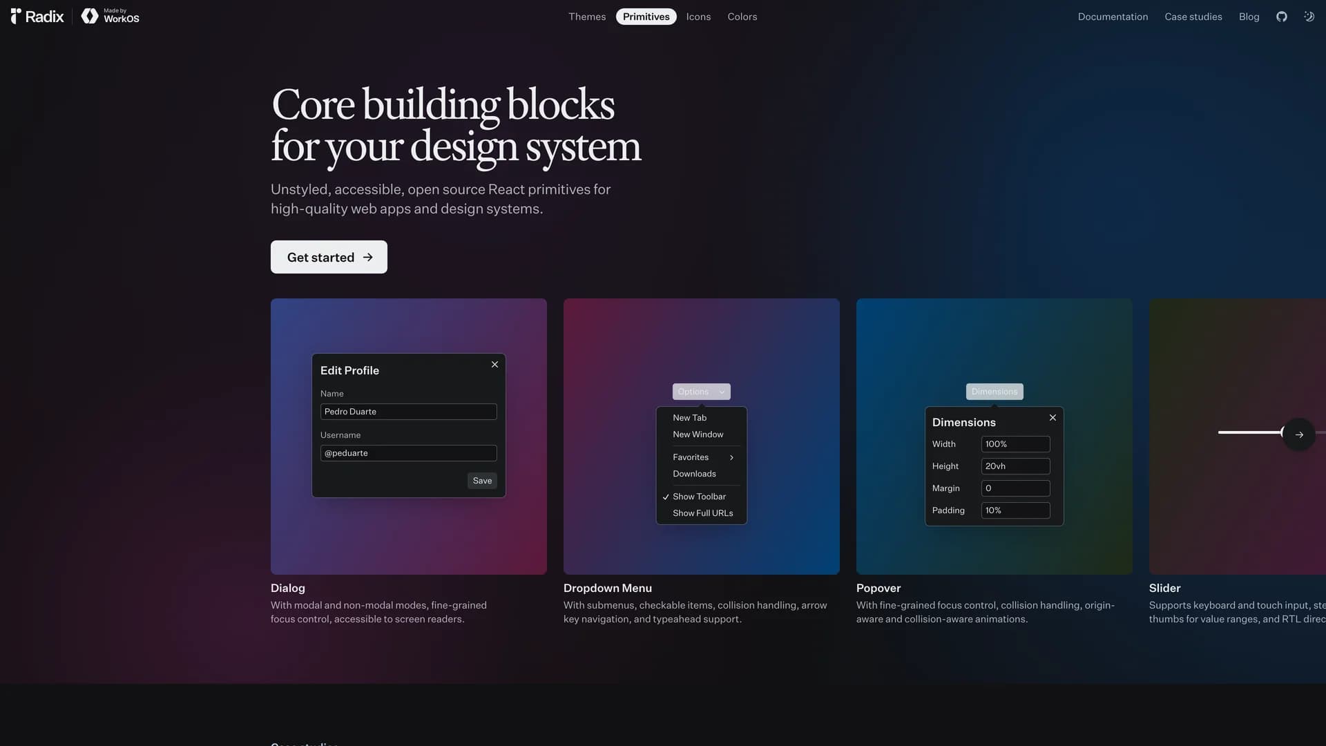
- Radix UI PrimitivesRadix Primitives is an open-source UI component library designed for building high-quality, accessible web applications and design systems with React. It provides low-level, unstyled, and highly customizable components with a strong focus on accessibility, customization, and developer experience. Maintained by WorkOS, Radix UI serves as the foundational layer that powers shadcn/ui and many other popular component libraries. The library offers primitives for common UI patterns like dialogs, dropdowns, popovers, and tooltips, all built with WAI-ARIA compliance to ensure screen reader support and keyboard navigation. Developers can use Radix Primitives as a complete foundation for their design system or incrementally adopt individual components, making it a flexible solution for teams building robust, inclusive user interfaces that meet modern accessibility standards while maintaining full styling control.
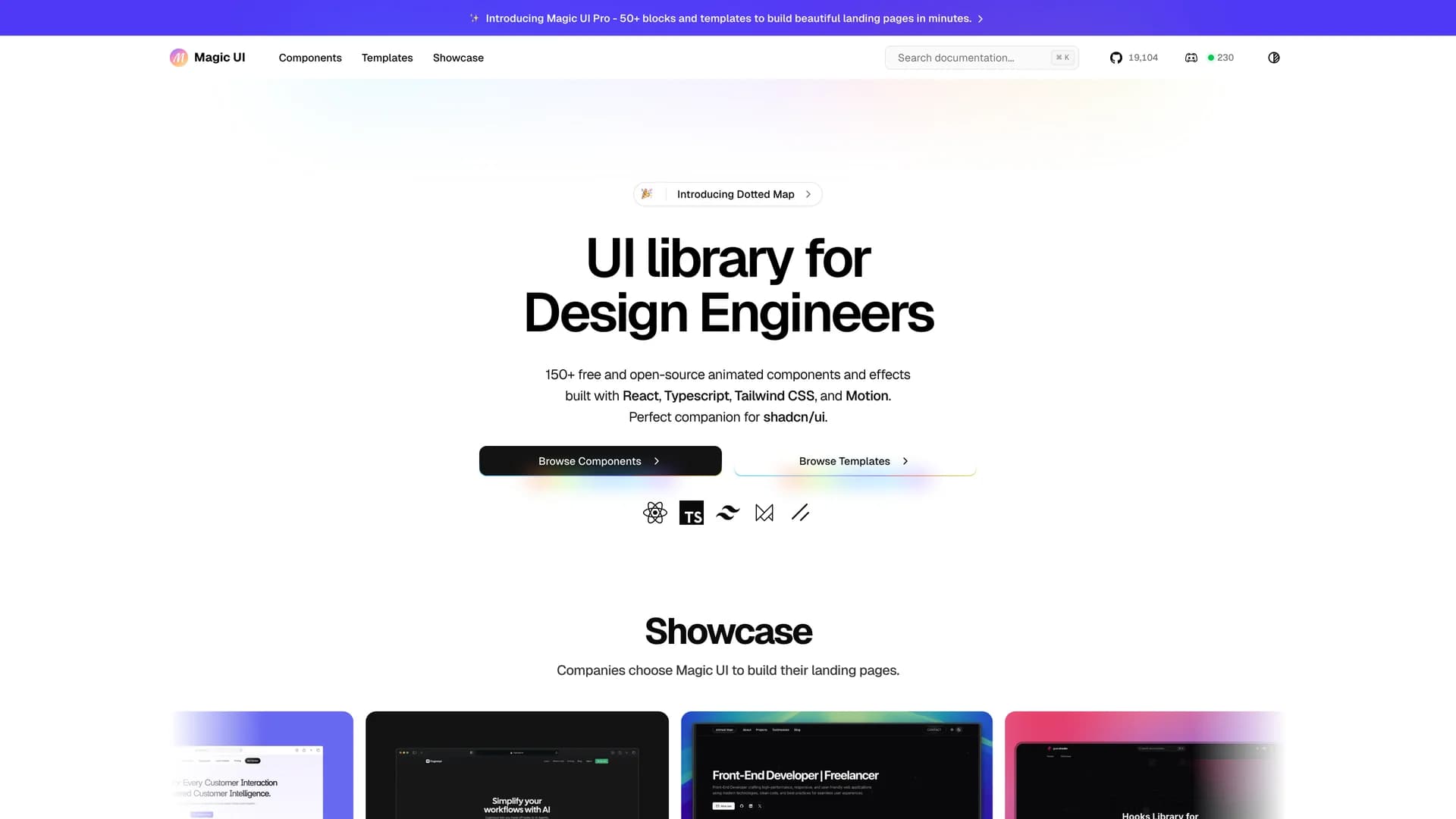
- Magic UIMagic UI is an open-source component library designed specifically for design engineers, offering a collection of over 50 animated components and visual effects that can be easily copied and pasted into React applications. Built with TypeScript, Next.js, Tailwind CSS, and Framer Motion, this library focuses on providing high-quality, visually engaging UI elements that bring motion and interactivity to modern web projects. With over 19,000 GitHub stars and an MIT license, Magic UI streamlines the process of creating dynamic user interfaces by offering ready-to-use components like animated backgrounds, text effects, interactive cards, and smooth transitions. The library follows the same copy-paste philosophy as shadcn/ui, giving developers full ownership of the code while eliminating external dependencies. Perfect for landing pages, marketing sites, and applications that need eye-catching animations, Magic UI helps developers quickly enhance their projects with professional, customizable design elements.
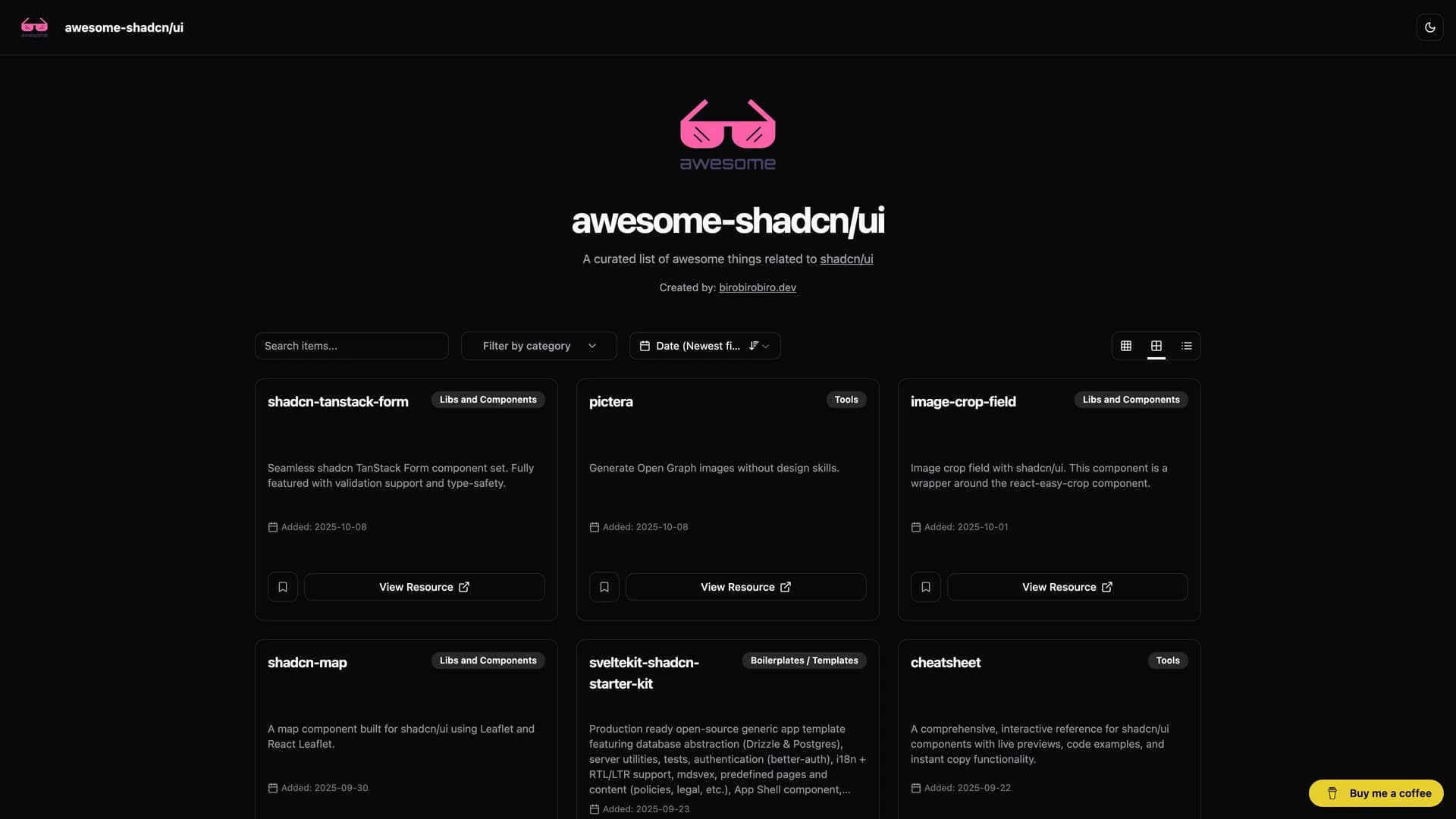
- Awesome Shadcn UIAwesome Shadcn UI is a comprehensive, community-curated collection of components, libraries, tools, and resources related to shadcn/ui ecosystem. This repository serves as a one-stop directory for developers looking to extend shadcn/ui with additional functionality, featuring hundreds of carefully selected entries including UI components (calendars, forms, charts, tables), design systems, starter templates, plugins, and integrations across multiple frameworks like React, Vue, and Svelte. The collection includes everything from advanced data tables and authentication components to complete admin dashboards and specialized tools like theme generators and icon libraries. Actively maintained by the community, this awesome list helps developers discover battle-tested components and extensions that complement shadcn/ui's core offering, making it an invaluable resource for anyone building modern web applications with shadcn/ui and looking to accelerate development with pre-built, production-ready solutions.
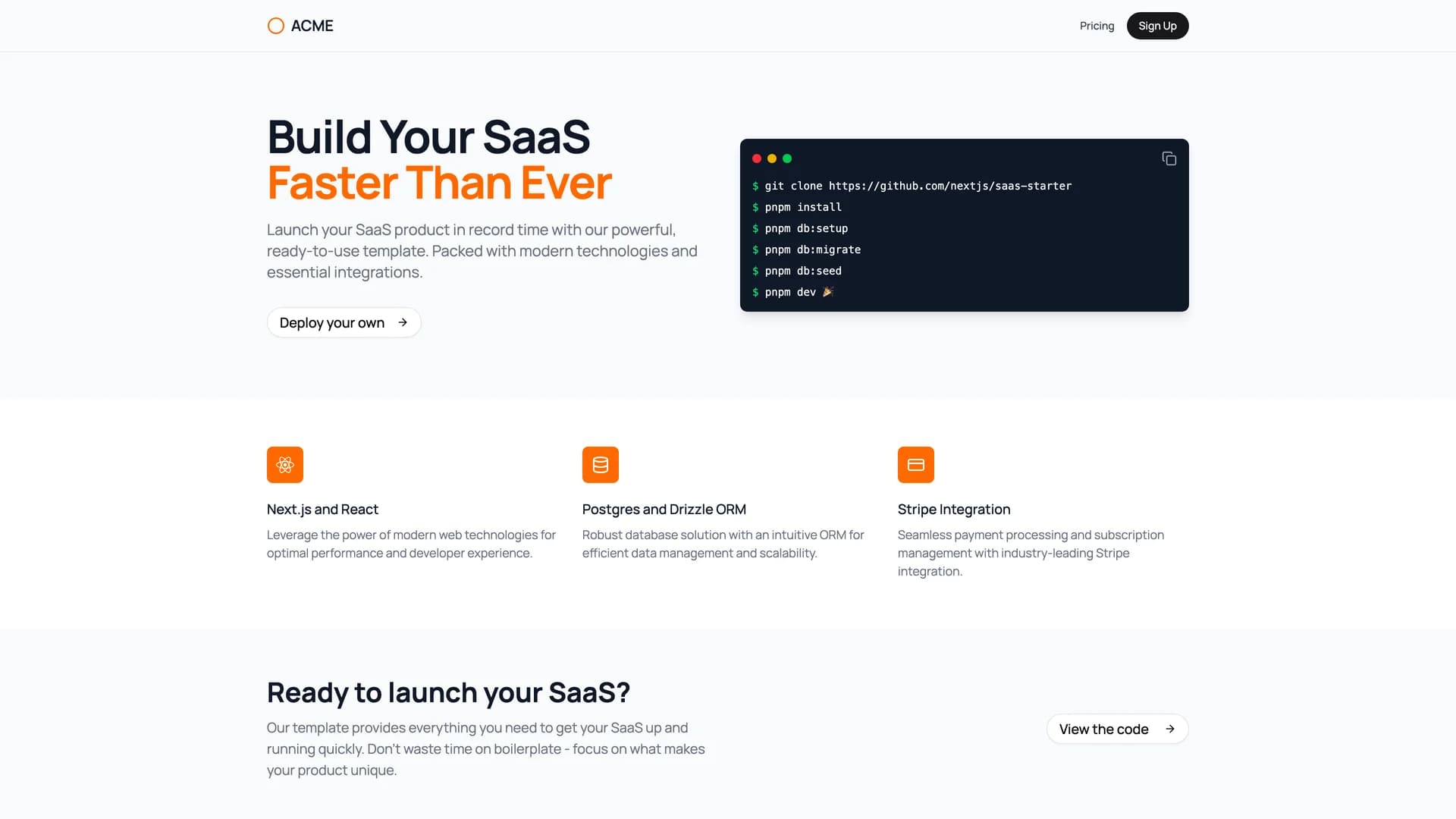
- Next.js Saas StarterNext.js SaaS Starter is an official, production-ready template from the Next.js team designed to accelerate the development of software-as-a-service applications. This comprehensive boilerplate comes fully equipped with essential SaaS features including user authentication, Stripe payment integration, subscription management, and role-based access control (RBAC) with Owner and Member roles. Built on a modern tech stack featuring Next.js 16+, PostgreSQL database, Drizzle ORM for type-safe database queries, Tailwind CSS, and shadcn/ui components, the template includes pre-built pages for marketing landing pages with animated terminal elements, dashboard interfaces with full CRUD operations, and billing management. Perfect for entrepreneurs and development teams looking to launch SaaS products quickly, this starter eliminates weeks of initial setup by providing a scalable, well-architected foundation that handles authentication flows, payment processing, and database management out of the box, allowing developers to focus on building unique product features rather than reinventing common SaaS infrastructure.
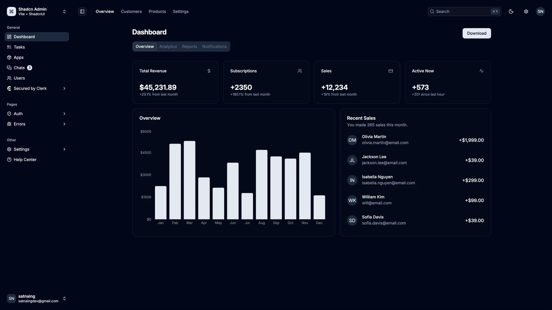
- Shadcn AdminShadcn Admin is a free, open-source admin dashboard template built with shadcn/ui, Vite, React, and TypeScript, offering a modern and fully responsive interface for building administrative panels and internal tools. This comprehensive dashboard includes over 10 pre-built pages covering common admin use cases, featuring carefully customized shadcn/ui components optimized for dashboard layouts. Key features include automatic light and dark mode theming, a powerful global search command palette for quick navigation, RTL (right-to-left) language support for internationalization, and fully accessible components following WAI-ARIA guidelines. The template leverages Vite's lightning-fast build times and hot module replacement for an exceptional developer experience, while TypeScript ensures type safety throughout the codebase. Perfect for developers building SaaS admin panels, internal business tools, or content management systems, Shadcn Admin provides a solid foundation with thoughtfully designed pages for analytics, user management, settings, and data visualization, all styled with Tailwind CSS for easy customization and consistent design.
- Inbox ZeroInbox Zero is an open-source AI-powered email management application designed to help users achieve inbox zero efficiently and spend less time managing emails. Built with Next.js, Tailwind CSS, Prisma, and shadcn/ui, this intelligent email assistant leverages artificial intelligence to automate and streamline email workflows with features like AI-assisted email drafting, automatic categorization and labeling, smart reply suggestions, and bulk unsubscribe capabilities for newsletter management. The application can pre-draft responses based on your writing style, track follow-ups and pending replies, automatically archive or categorize emails based on custom rules, and provide analytics on email patterns and time spent in inbox. Perfect for busy professionals, executives, and anyone overwhelmed by email volume, Inbox Zero integrates directly with Gmail and other email providers to offer a comprehensive email management solution. The platform focuses on privacy and data security while helping users reclaim hours of productivity by intelligently handling routine email tasks, enabling better focus on high-priority communications and reducing email-related stress through smart automation and AI-powered assistance.
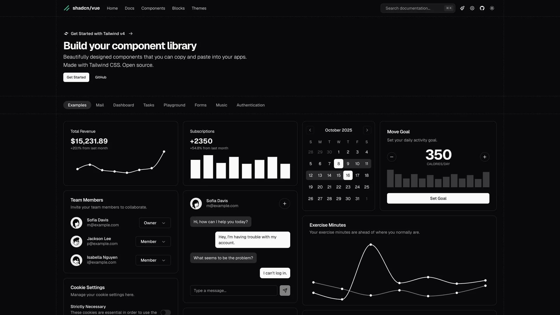
- Shadcn VueShadcn Vue is an unofficial, community-driven Vue.js port of the popular shadcn/ui component library, bringing the same accessible, customizable, and copy-paste component philosophy to the Vue ecosystem. Developed with the blessing of shadcn/ui's original creator, this open-source project provides Vue developers with beautifully designed components built on Radix Vue primitives and styled with Tailwind CSS, offering the same flexibility and ownership model that made shadcn/ui successful in the React community. The library includes a comprehensive collection of Vue components like buttons, dialogs, dropdowns, forms, and data tables, all designed with accessibility as a priority following WAI-ARIA standards. Unlike traditional Vue component libraries that require npm installations and updates, Shadcn Vue allows developers to copy components directly into their projects, giving them full control to customize, modify, and adapt components to their specific needs without dealing with dependency management. Perfect for Vue 3 applications, Nuxt projects, and any Vue-based web application, this library provides a solid foundation for building modern, consistent design systems while maintaining the composability and reactivity that Vue developers love, making it an ideal choice for teams seeking accessible, production-ready components with complete customization freedom.
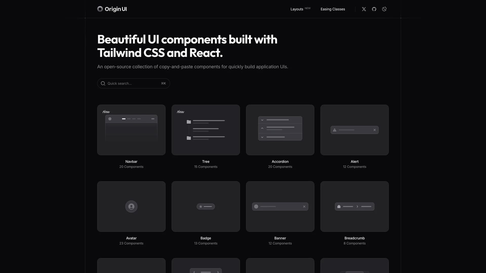
- Origin UIOrigin UI is an open-source React component library offering an extensive collection of hundreds of copy-and-paste components designed for rapidly building modern application interfaces. Powered by Tailwind CSS v4 and built for seamless integration with Next.js and React projects, Origin UI follows the same shadcn conventions and copy-paste philosophy that developers love, giving you full ownership and control over your components. The library provides beautifully designed, production-ready UI elements spanning forms, navigation, data display, feedback components, and complex interactive widgets, all styled with Tailwind's utility-first approach for easy customization. Each component is built with accessibility in mind, leveraging Radix UI primitives and React Aria for keyboard navigation and screen reader support. Perfect for developers who want a comprehensive component library without the overhead of npm dependencies, Origin UI enables you to quickly scaffold application UIs by simply copying the components you need directly into your codebase, customizing them to match your brand, and shipping faster without sacrificing quality or flexibility.
- Shadcn SvelteShadcn Svelte is an unofficial, community-led Svelte port of the popular shadcn/ui component library, bringing accessible and customizable copy-paste components to the Svelte ecosystem. Developed with the blessing of shadcn's original creator, this open-source project has garnered over 7,500 GitHub stars and provides Svelte developers with a comprehensive collection of beautifully designed UI components built with Tailwind CSS and Svelte's reactive primitives. The library follows the same philosophy as shadcn/ui, allowing developers to copy components directly into their Svelte or SvelteKit applications rather than installing them as dependencies, giving teams complete control to customize, modify, and own their component code. Each component is crafted with accessibility as a priority, supports Svelte's reactivity system, and integrates seamlessly with Tailwind CSS for easy styling and theming. Perfect for Svelte and SvelteKit projects, this library provides everything from basic UI elements like buttons and inputs to complex components like data tables, command palettes, and dialog systems, enabling developers to build their own component library with consistent, production-ready building blocks designed specifically for the Svelte framework.
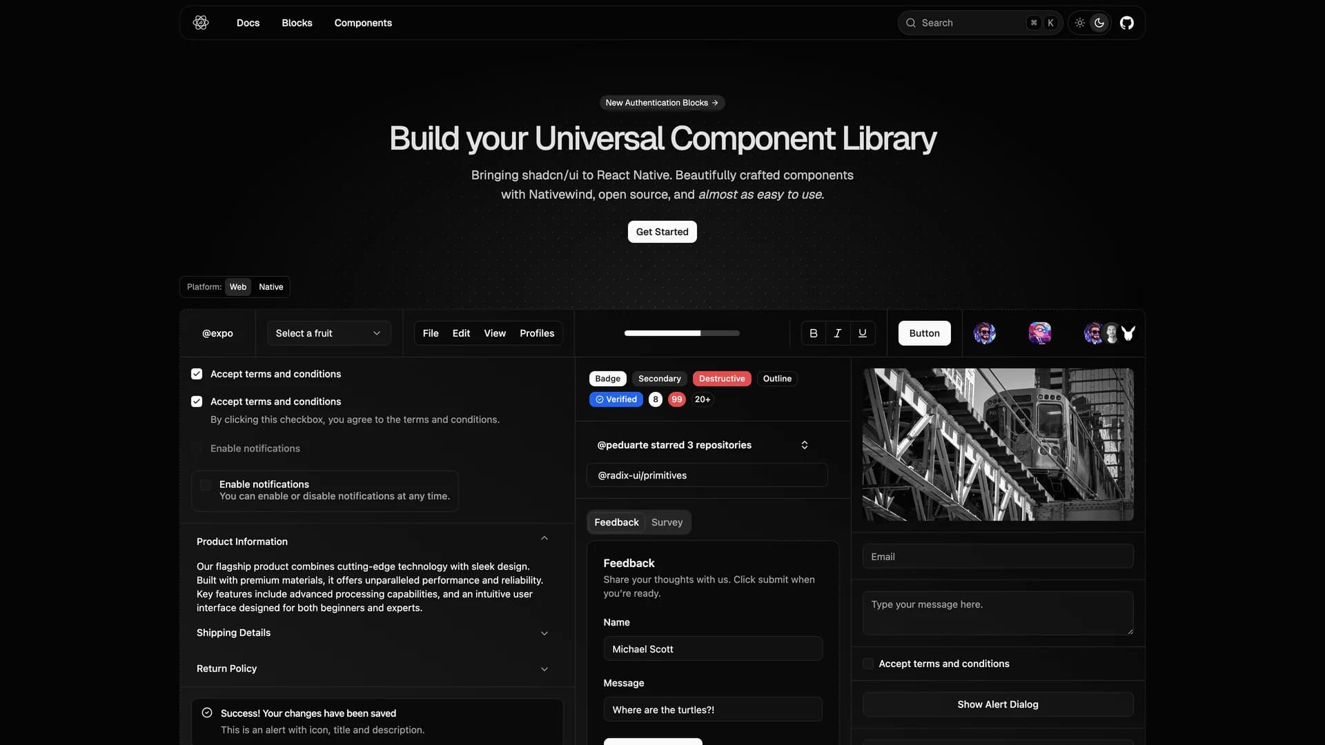
- React Native ReusablesReact Native Reusables is an open-source UI component library that brings the design philosophy and component quality of shadcn/ui to React Native mobile applications. Built with NativeWind (React Native's Tailwind CSS implementation), this library provides beautifully crafted, highly customizable components that are almost as easy to use as their web counterparts, making cross-platform mobile development more accessible. The project offers a comprehensive set of reusable UI elements specifically designed for iOS and Android applications, including buttons, forms, cards, sheets, dialogs, and navigation components, all optimized for mobile touch interactions and native performance. Each component leverages React Native's primitive components while maintaining the same copy-paste philosophy as shadcn/ui, allowing developers to directly integrate components into their Expo or React Native CLI projects with complete ownership and customization freedom. With extensive documentation at reactnativereusables.com, the library supports both light and dark themes, follows mobile accessibility best practices, and provides consistent design patterns across iOS and Android platforms. Perfect for mobile developers building consumer apps, enterprise mobile solutions, or cross-platform applications with Expo, React Native Reusables bridges the gap between web and mobile UI development, enabling teams to maintain design consistency across all platforms.
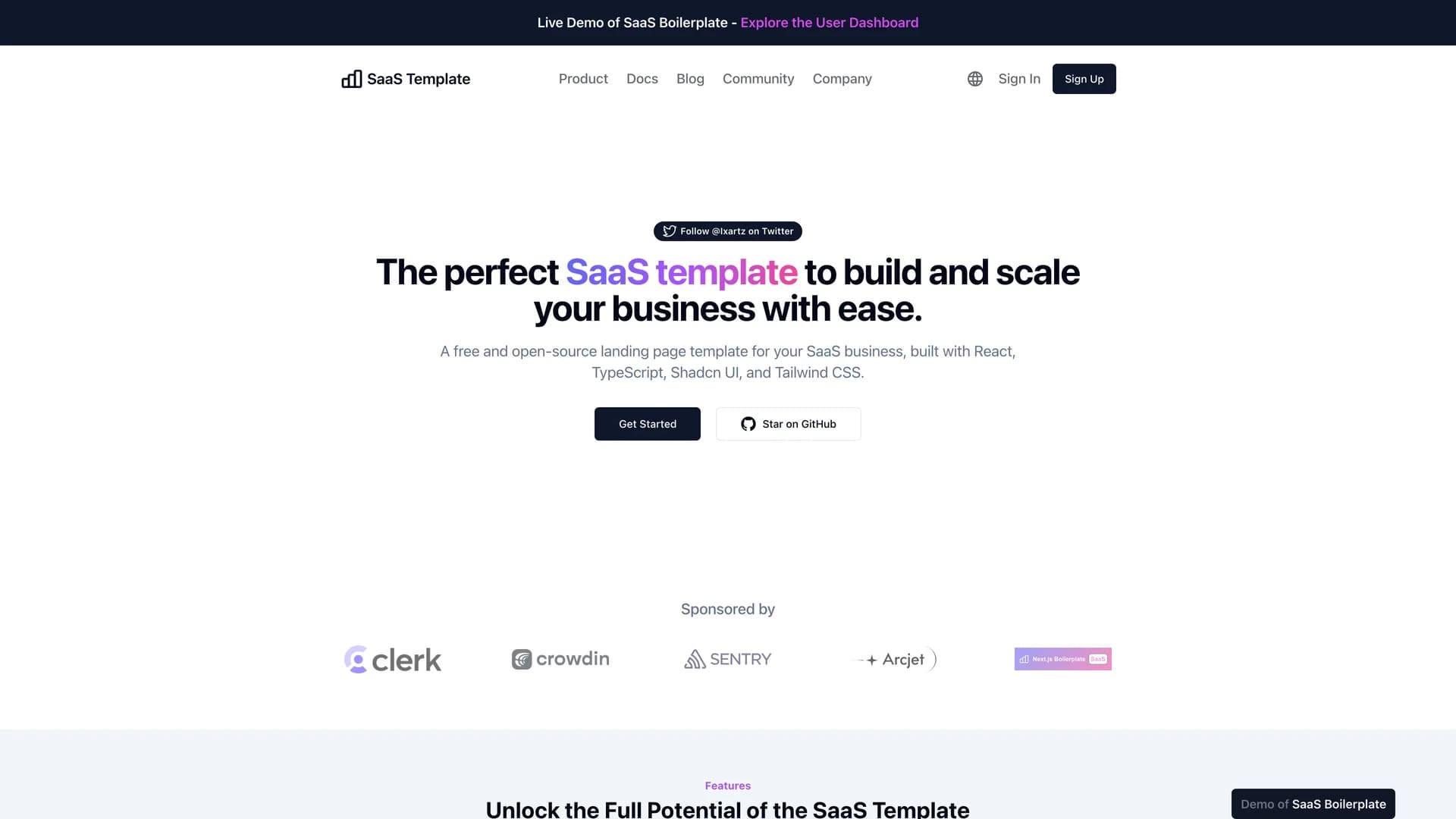
- SaaS BoilerplateSaaS Boilerplate is a comprehensive, production-ready starter kit built with Next.js, TypeScript, Tailwind CSS, and shadcn/ui, designed to accelerate the development of full-stack SaaS applications. This enterprise-grade boilerplate comes packed with essential features including Clerk authentication for secure user management, multi-tenancy support for serving multiple organizations, role-based access control (RBAC) for granular permissions, internationalization (i18n) for global markets, and a stunning landing page template to convert visitors. The technical stack includes Drizzle ORM for type-safe database operations, Vitest and Playwright for comprehensive unit and end-to-end testing, Sentry for error tracking and monitoring, and a flexible architecture that supports rapid customization and scaling. Pre-configured with development best practices like ESLint, Prettier, TypeScript strict mode, and automated CI/CD workflows, this boilerplate eliminates months of initial setup work. Perfect for startup founders, development agencies, and enterprise teams building B2B SaaS platforms, the template includes database migrations, email templates, billing integration hooks, analytics setup, and logging infrastructure, providing everything needed to launch a scalable SaaS product while maintaining code quality and developer experience throughout the development lifecycle.
Template Categories
Find templates organized by technology stack, use case, and purpose. From Next.js dashboards to React landing pages.
Tailwind
194 templates·158 authorsReact
179 templates·146 authorsNextjs
158 templates·128 authorsFullstack
46 templates·43 authorsRadix ui
31 templates·29 authorsVite
23 templates·20 authorsDrizzle orm
23 templates·22 authorsUi kits & component libraries
22 templates·20 authors
Template Creators
Meet the talented developers building open source templates with shadcn/ui, React, and Next.js.
- M
Mickasmt
5 templates - S
Sadmann7
4 templates - R
Redpangilinan
4 templates - I
Ibelick
3 templates - N
Niazmorshed2007
3 templates - S
Sujjeee
3 templates - S
Shreyas 29
3 templates - L
Ln dev7
3 templates - S
Stack auth
2 templates - C
Codehagen
2 templates - N
Nolly studio
2 templates - O
Openstatushq
2 templates
Frequently Asked Questions
Everything you need to know about this community-curated collection of open source shadcn/ui templates.
