Make your AI a shadcn expert
shadcn.io
Templates
Blocks
MCP
Browse
Pricing
Search
⌘
K
Sign in
Home
Templates
react aria
React Templates - React Aria
5 templates • 5 contributors • Open source & free
Available Templates (5)
originui.com
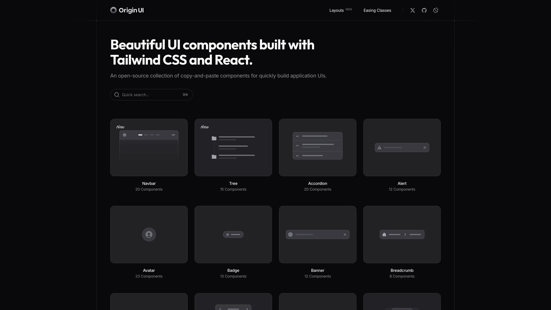
Origin UI
intentui.com
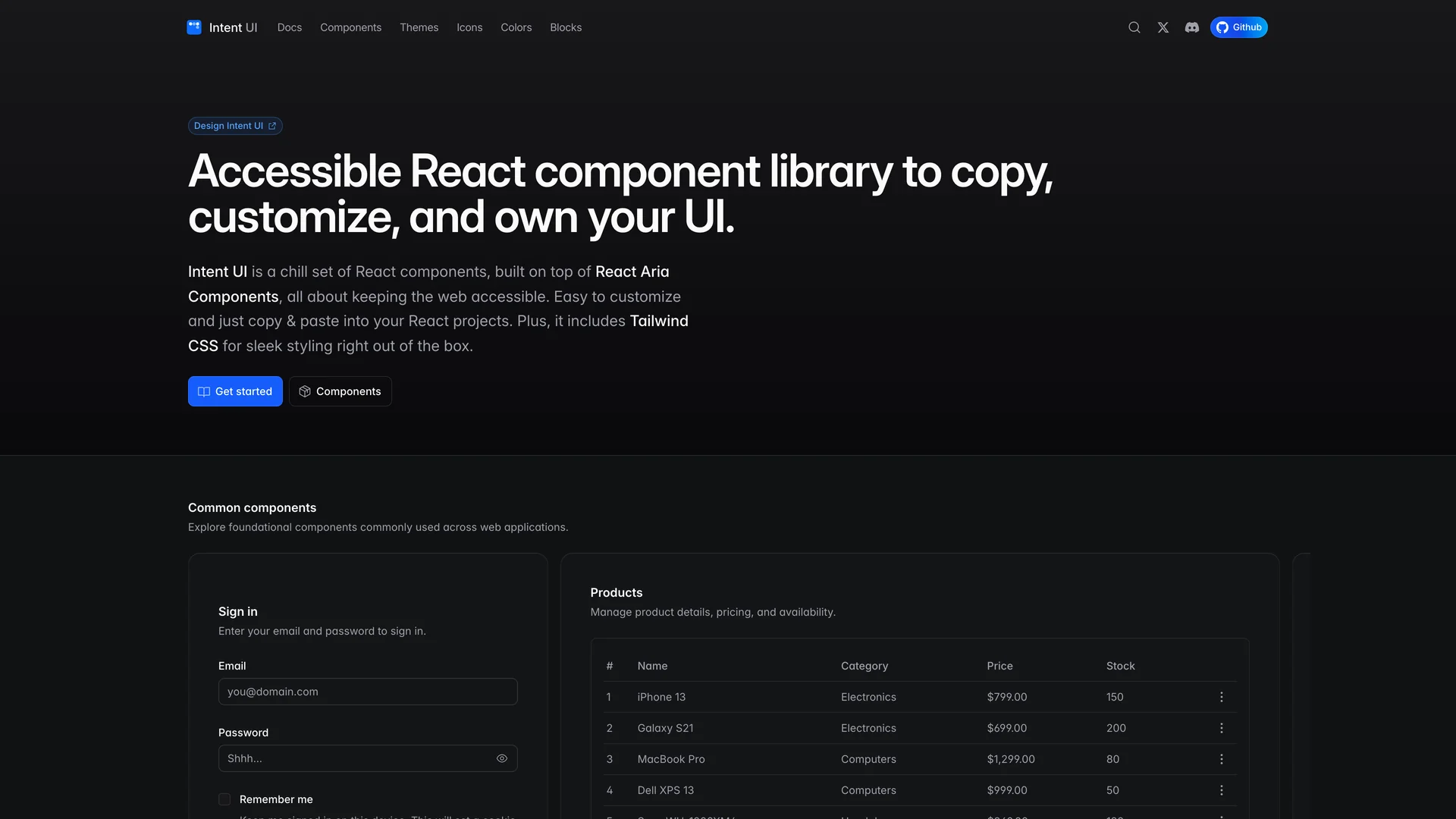
Intent UI
jollyui.dev
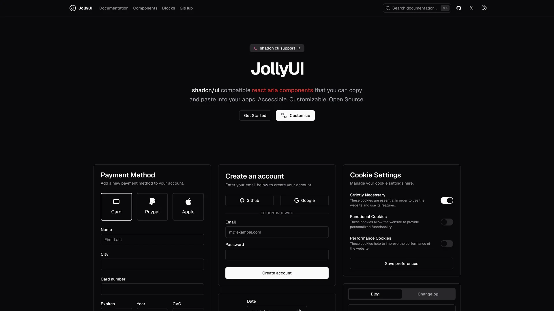
Jolly UI
fullcalendar-shadcn-example.vercel.app
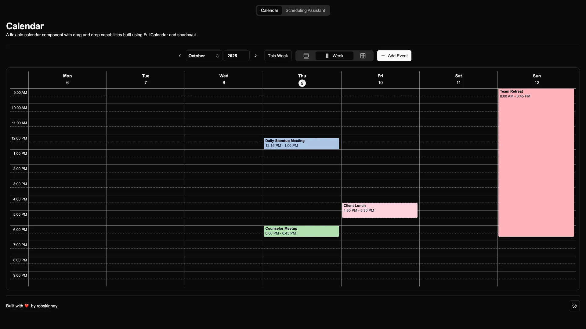
Shadcn UI FullCalendar Example
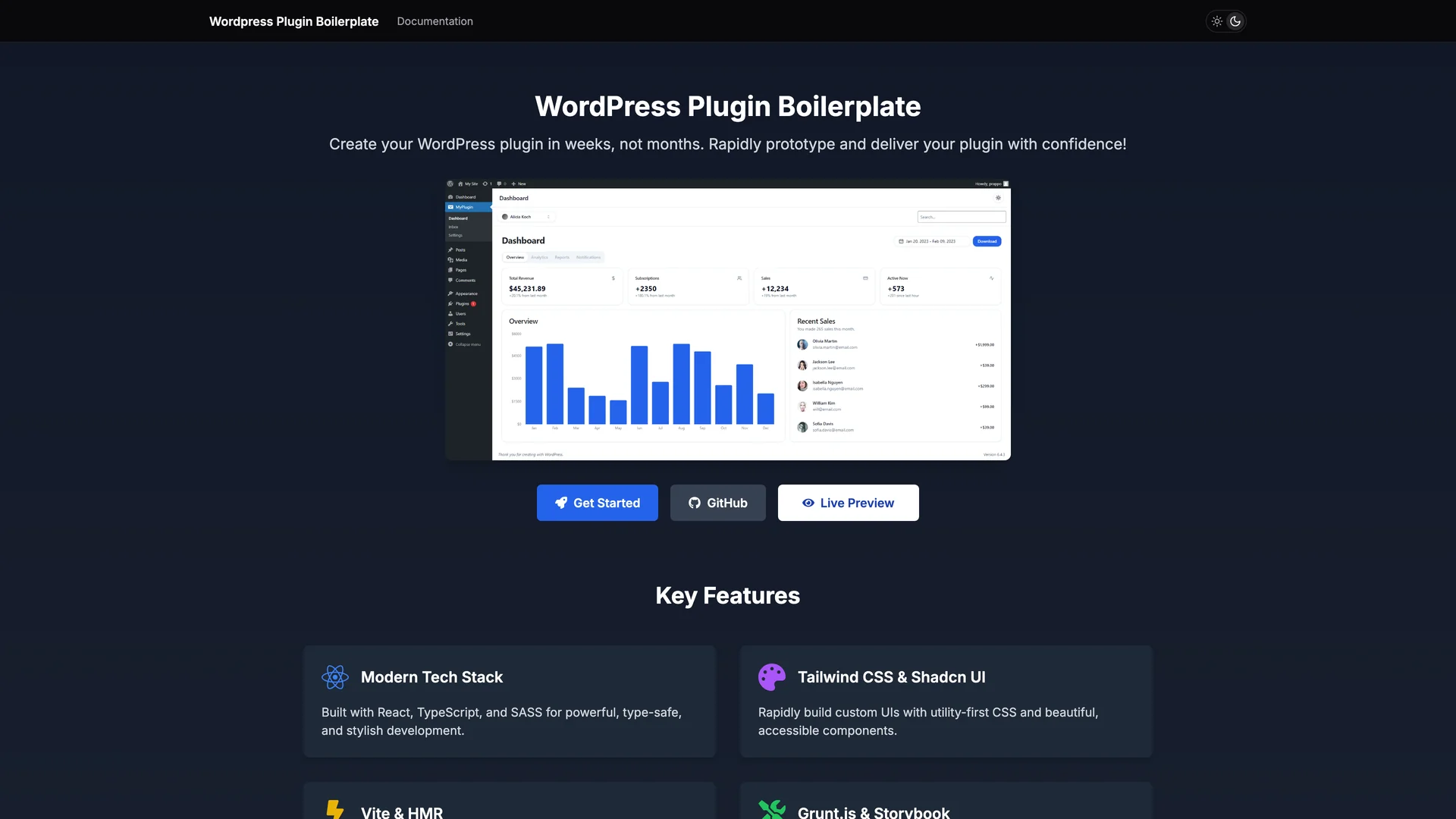
prappo.github.io/wordpress-plugin-boilerplate
WordPress Plugin Boilerplate
Authors in react aria
O
Origin space
1 templates
I
Irsyadadl
1 templates
J
Jolbol1
1 templates
R
Robskinney
1 templates
P
Prappo
1 templates
Related Categories
React
5 templates
·
5 authors
Tailwind
5 templates
·
5 authors
Nextjs
4 templates
·
4 authors
Radix ui
1 templates
·
1 authors
Ui kits & component libraries
1 templates
·
1 authors
Vite
1 templates
·
1 authors
Scss
1 templates
·
1 authors
Headless ui
1 templates
·
1 authors
Scroll to top
Get Pro — Save 33%
·
Ends in
--:--:--
→