React Templates - Radix UI
31 templates • 29 contributors • Open source & free
Available Templates (31)
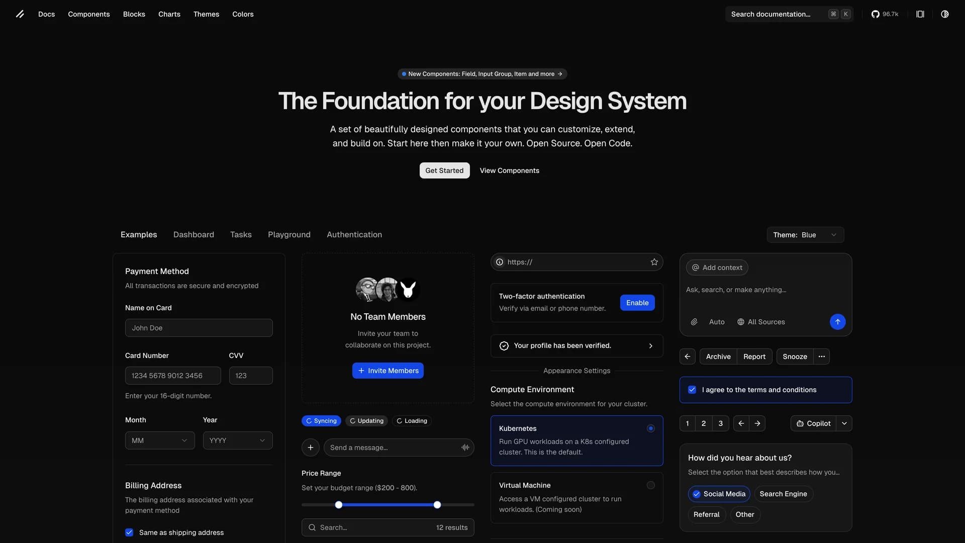
- Shadcn UIshadcn/ui is an open-source component library that provides beautifully designed, accessible, and customizable UI components built with React, Radix UI, and Tailwind CSS. Unlike traditional component libraries, shadcn/ui uses a unique copy-paste approach where developers directly copy components into their projects, giving them full ownership and control over the code. The library includes a comprehensive collection of reusable components ranging from basic elements like buttons and inputs to complex components like data tables, calendars, and command palettes. Built with TypeScript for type safety, it supports dark mode, offers a powerful CLI for easy installation, and integrates seamlessly with modern tools like Next.js, React Hook Form, and Zod. This developer-friendly approach makes shadcn/ui the perfect foundation for building custom design systems and production-ready applications across SaaS dashboards, e-commerce platforms, and admin panels.
- Radix UI PrimitivesRadix Primitives is an open-source UI component library designed for building high-quality, accessible web applications and design systems with React. It provides low-level, unstyled, and highly customizable components with a strong focus on accessibility, customization, and developer experience. Maintained by WorkOS, Radix UI serves as the foundational layer that powers shadcn/ui and many other popular component libraries. The library offers primitives for common UI patterns like dialogs, dropdowns, popovers, and tooltips, all built with WAI-ARIA compliance to ensure screen reader support and keyboard navigation. Developers can use Radix Primitives as a complete foundation for their design system or incrementally adopt individual components, making it a flexible solution for teams building robust, inclusive user interfaces that meet modern accessibility standards while maintaining full styling control.
- Radix UI PrimitivesRadix Primitives is an open-source UI component library designed for building high-quality, accessible web applications and design systems with React. It provides low-level, unstyled, and highly customizable components with a strong focus on accessibility, customization, and developer experience. Maintained by WorkOS, Radix UI serves as the foundational layer that powers shadcn/ui and many other popular component libraries. The library offers primitives for common UI patterns like dialogs, dropdowns, popovers, and tooltips, all built with WAI-ARIA compliance to ensure screen reader support and keyboard navigation. Developers can use Radix Primitives as a complete foundation for their design system or incrementally adopt individual components, making it a flexible solution for teams building robust, inclusive user interfaces that meet modern accessibility standards while maintaining full styling control.
- Origin UIOrigin UI is an open-source React component library offering an extensive collection of hundreds of copy-and-paste components designed for rapidly building modern application interfaces. Powered by Tailwind CSS v4 and built for seamless integration with Next.js and React projects, Origin UI follows the same shadcn conventions and copy-paste philosophy that developers love, giving you full ownership and control over your components. The library provides beautifully designed, production-ready UI elements spanning forms, navigation, data display, feedback components, and complex interactive widgets, all styled with Tailwind's utility-first approach for easy customization. Each component is built with accessibility in mind, leveraging Radix UI primitives and React Aria for keyboard navigation and screen reader support. Perfect for developers who want a comprehensive component library without the overhead of npm dependencies, Origin UI enables you to quickly scaffold application UIs by simply copying the components you need directly into your codebase, customizing them to match your brand, and shipping faster without sacrificing quality or flexibility.
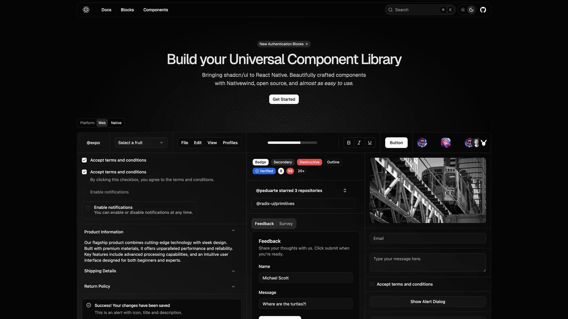
- React Native ReusablesReact Native Reusables is an open-source UI component library that brings the design philosophy and component quality of shadcn/ui to React Native mobile applications. Built with NativeWind (React Native's Tailwind CSS implementation), this library provides beautifully crafted, highly customizable components that are almost as easy to use as their web counterparts, making cross-platform mobile development more accessible. The project offers a comprehensive set of reusable UI elements specifically designed for iOS and Android applications, including buttons, forms, cards, sheets, dialogs, and navigation components, all optimized for mobile touch interactions and native performance. Each component leverages React Native's primitive components while maintaining the same copy-paste philosophy as shadcn/ui, allowing developers to directly integrate components into their Expo or React Native CLI projects with complete ownership and customization freedom. With extensive documentation at reactnativereusables.com, the library supports both light and dark themes, follows mobile accessibility best practices, and provides consistent design patterns across iOS and Android platforms. Perfect for mobile developers building consumer apps, enterprise mobile solutions, or cross-platform applications with Expo, React Native Reusables bridges the gap between web and mobile UI development, enabling teams to maintain design consistency across all platforms.
- Assistant UIAssistant UI is an open-source TypeScript/React library designed for rapidly building production-grade AI chat interfaces with ChatGPT-like experiences. This comprehensive UI toolkit provides fully composable primitives built on Radix UI with built-in features like message streaming, automatic scrolling, typing indicators, and complete accessibility support through WAI-ARIA compliance. The library supports integration with major AI providers including OpenAI, Anthropic Claude, Google Gemini, and any backend compatible with Vercel AI SDK, offering maximum flexibility for AI application development. With enterprise-ready components, developers get features like markdown rendering, code syntax highlighting, file attachments, voice input support, conversation threading, and customizable themes that work seamlessly with shadcn/ui styling. The composable architecture allows fine-grained control over every aspect of the chat interface, from message bubbles and input areas to suggestion chips and action buttons, while maintaining excellent performance and developer experience. Perfect for building AI assistants, customer support chatbots, documentation helpers, or any conversational AI application, Assistant UI eliminates weeks of UI development by providing battle-tested components that handle the complexity of real-time streaming, state management, and user interactions, allowing teams to focus on AI logic rather than interface implementation.
- Graphile StarterGraphile Starter is an opinionated, batteries-included full-stack SaaS template featuring pre-built user accounts, organization management, and a deeply integrated GraphQL-first architecture for rapid application development. Built with React, Next.js, Node.js, TypeScript, PostgreSQL, and PostGraphile, it provides a production-ready foundation with Apollo Client for GraphQL queries, Graphile Worker for background jobs, Graphile Migrate for database migrations, GraphQL Code Generator for type safety, and comprehensive testing with Jest and Cypress. The starter includes complete authentication flows, server-side rendering, automated code generation, and a job queue system, following best practices for type safety, performance, and scalability. Designed for developers familiar with the technology stack (not for beginners), it accelerates development by providing a cohesive, pre-configured environment that handles common SaaS requirements like user management, organizations, and GraphQL APIs. Perfect for building production web applications quickly, Graphile Starter is crowd-funded open-source software that eliminates setup overhead and provides a robust foundation for both small projects and large-scale applications.
- Tauri UITauri UI is a project scaffolding tool for creating modern, lightweight cross-platform desktop applications using Tauri and shadcn/ui with support for multiple frontend frameworks including React, Next.js, and SvelteKit. The CLI tool (create-tauri-ui) enables developers to quickly set up new desktop app projects with a single command, providing templates that include native-looking window controls, dark and light mode support, Radix UI primitives, Lucide/Radix icons, and optimized bundle sizes around 2-2.5 MB per platform. Built with TypeScript and Tailwind CSS, Tauri UI bridges web development and native desktop apps, allowing developers to build performant, system-native applications using familiar web technologies. The templates follow best practices for Tauri development while maintaining the flexibility and design consistency of shadcn/ui components. Perfect for developers looking to create desktop applications for Windows, macOS, and Linux without learning platform-specific languages, Tauri UI simplifies the setup process and provides a modern development experience with hot reload, TypeScript support, and production-ready configurations.
- RelivatorRelivator is a comprehensive Next.js 16 and React 19 ecommerce template designed for developers seeking a modern, scalable foundation for building full-stack web applications with robust commerce functionality. Built with TypeScript, Tailwind CSS, shadcn/ui, Drizzle ORM with Postgres/Neon database, better-auth for authentication, and Polar for payment processing and subscription management, it provides a feature-complete starting point for ecommerce projects. The template includes subscription checkout flows, dark mode support, AI-friendly development environment optimized for AI-powered IDEs, and a flexible, extensible architecture that scales from MVPs to production applications. Released under MIT license, Relivator emphasizes developer experience by integrating modern technologies without requiring extensive setup, allowing teams to focus on business logic rather than infrastructure. The comprehensive tech stack handles authentication, database operations, UI components, payments, and deployment, making it suitable for building SaaS products, online stores, marketplaces, or any application requiring ecommerce capabilities. Perfect for developers who want the productivity of a batteries-included template while maintaining the flexibility to customize every aspect of their application.
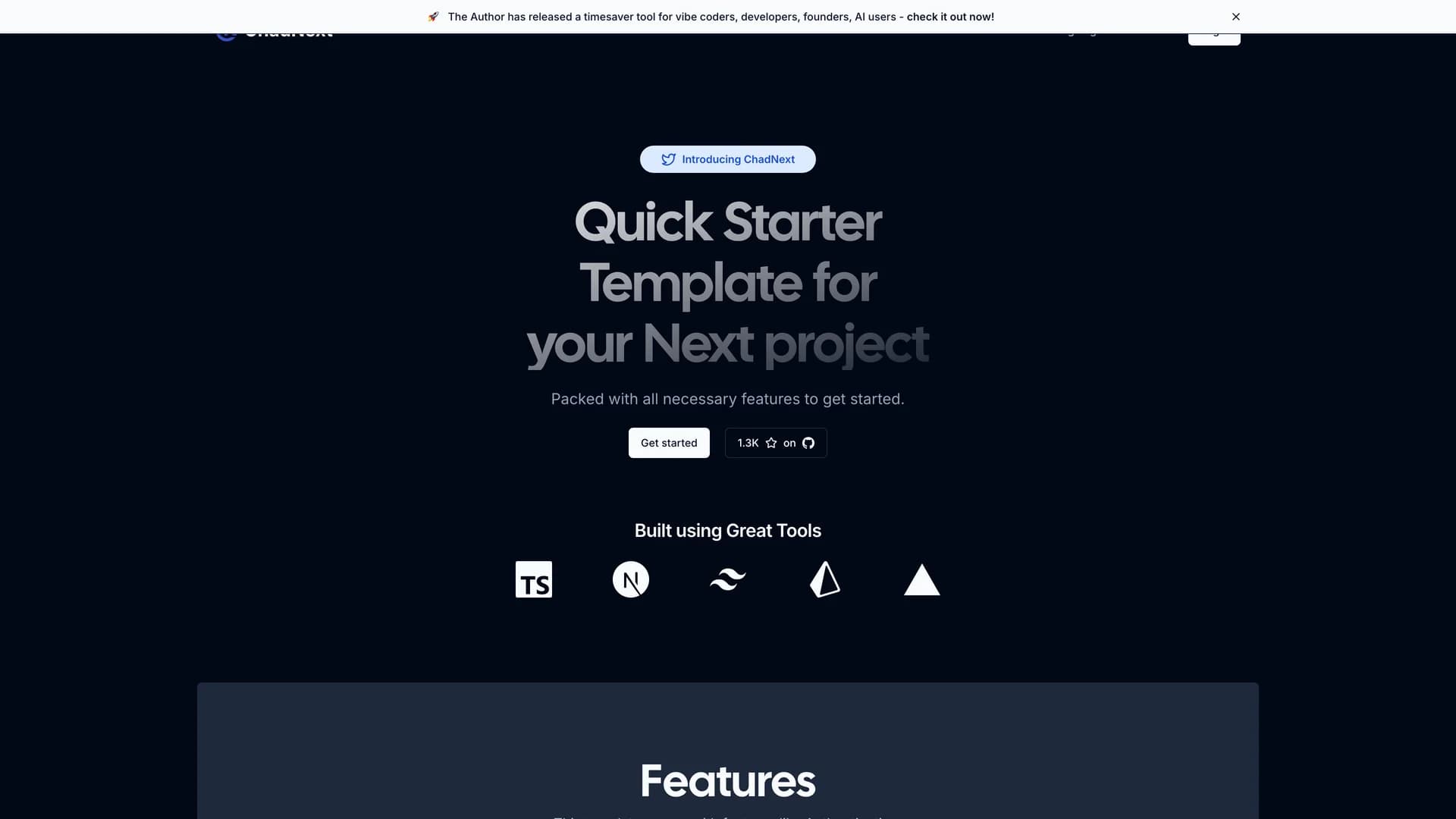
- ChadNextChadNext is a comprehensive Next.js 16 starter template designed to accelerate web development with a feature-rich stack including App Router, shadcn/ui, Lucia Authentication, Prisma ORM, Server Actions, Stripe integration, and internationalization support. Built with TypeScript, Tailwind CSS, and Radix UI primitives, this MIT-licensed template provides developers with a quick-start solution for building performant, full-stack applications with excellent developer experience. The template saves time and effort by providing pre-configured authentication flows, database interactions through Prisma, payment processing with Stripe, and beautiful UI components from shadcn/ui, all working together seamlessly. With support for rapid prototyping and streamlined deployment to platforms like Vercel, ChadNext eliminates hours of initial setup by providing a cohesive, production-ready foundation. The project includes server actions for type-safe mutations, internationalization for multi-language support, and a well-organized project structure that scales from MVPs to production applications. Perfect for developers building SaaS products, web applications, or any project requiring authentication, database management, and payment processing, ChadNext demonstrates best practices for modern Next.js development while maintaining flexibility for customization.
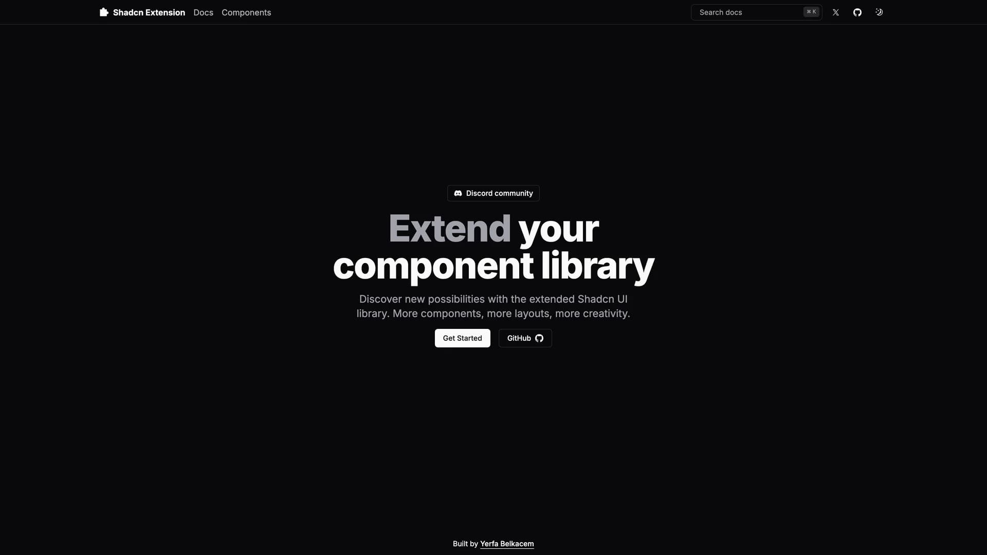
- Shadcn ExtensionShadcn Extension is an open-source component collection that extends UI libraries with additional shadcn/ui components, built using a Turborepo monorepo architecture with TypeScript, Next.js, Tailwind CSS, and Radix UI. The project provides a structured framework for developing and sharing reusable React components with a CLI that automates repetitive tasks like creating new components and managing dependencies. Organized into apps and packages directories, the extension offers a component registry mechanism that makes it easy to add custom components to projects while maintaining consistency with shadcn/ui's design principles. Built with pnpm for efficient package management, the monorepo structure allows developers to work on multiple related packages simultaneously while sharing common configuration and tooling. Perfect for teams building design systems or developers creating component libraries, Shadcn Extension provides the infrastructure to develop, test, and distribute high-quality UI components. The project demonstrates best practices for component library development including TypeScript for type safety, modular architecture for maintainability, and automated tooling for developer productivity.
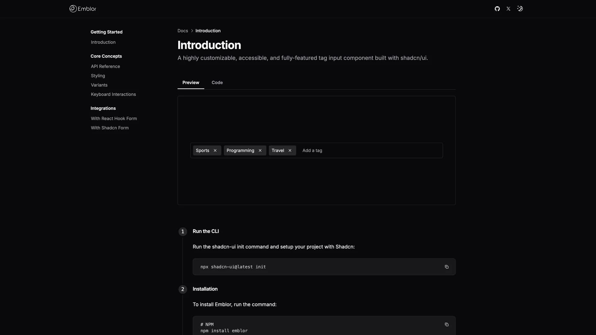
- EmblorEmblor is a highly customizable, fully-featured tag input component built with shadcn/ui, React, TypeScript, and Tailwind CSS that provides advanced functionality for managing tags in web applications. The component offers autocomplete suggestions, tag validation, configurable tag limits, duplicate tag control, character length restrictions, sorting and truncation options, keyboard navigation, drag-and-drop functionality, and comprehensive accessibility support. Built on shadcn/ui's input, popover, command, and dialog components, Emblor integrates seamlessly with existing shadcn/ui projects while providing extensive customization through props that control behavior and appearance. Features include intelligent autocomplete for suggesting tags as users type, validation to ensure only acceptable tags are added, limits to prevent too many tags, and keyboard shortcuts for efficient tag management. The drag-and-drop interface allows users to reorder tags visually, while accessibility features ensure screen reader compatibility and keyboard navigation. Perfect for applications requiring tag-based categorization, keyword input, multi-select fields, or any interface where users need to add, remove, and organize multiple items, Emblor provides a polished, production-ready solution with minimal setup.
 Nextjs
 React
React Tailwind
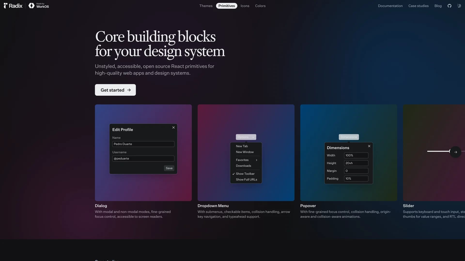
 Vite
Vite Radix ui
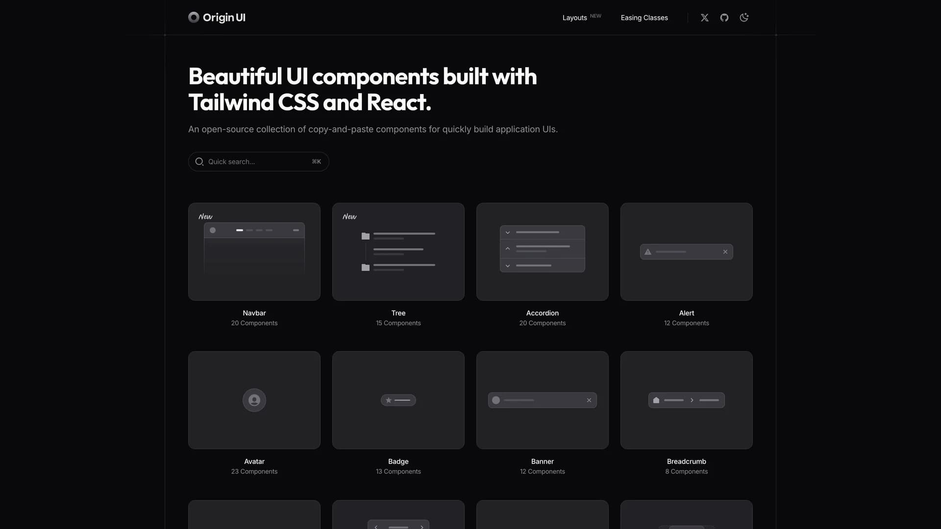
 React native
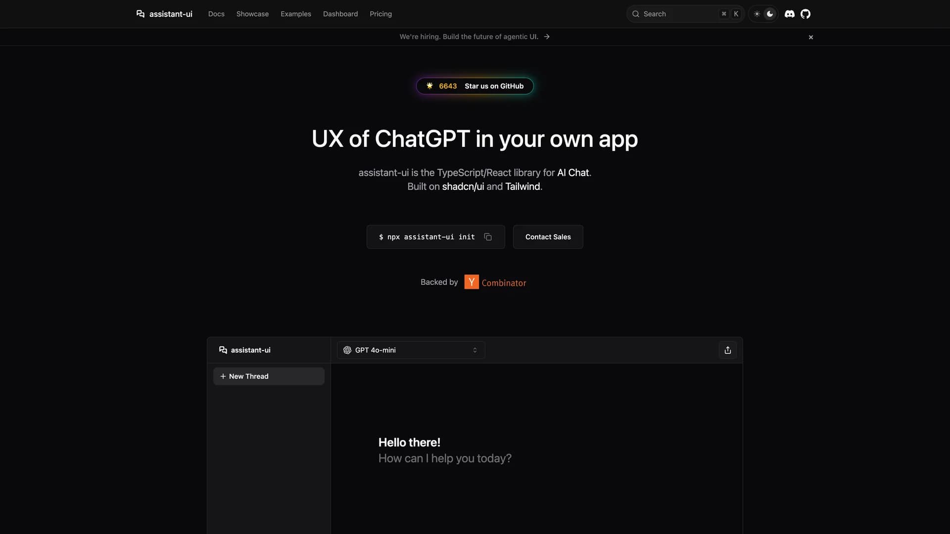
 Ui kits & component libraries
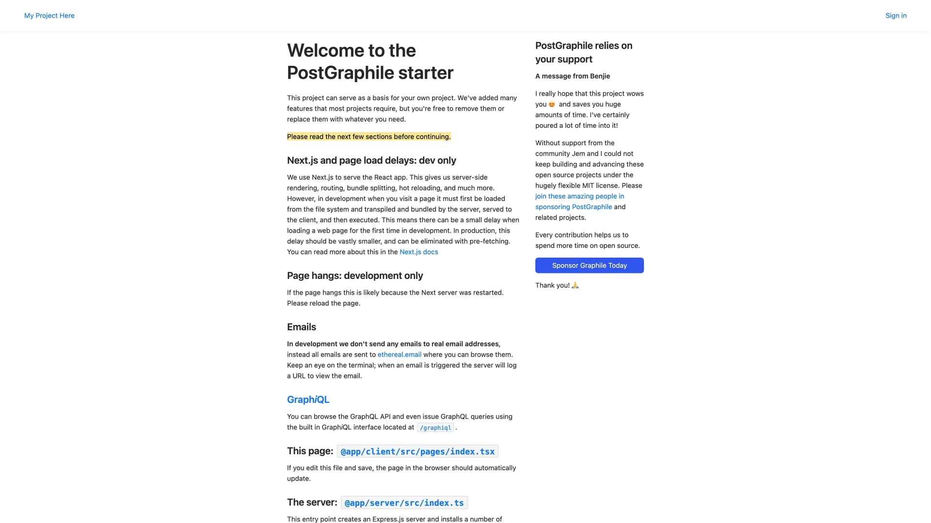
 Drizzle orm
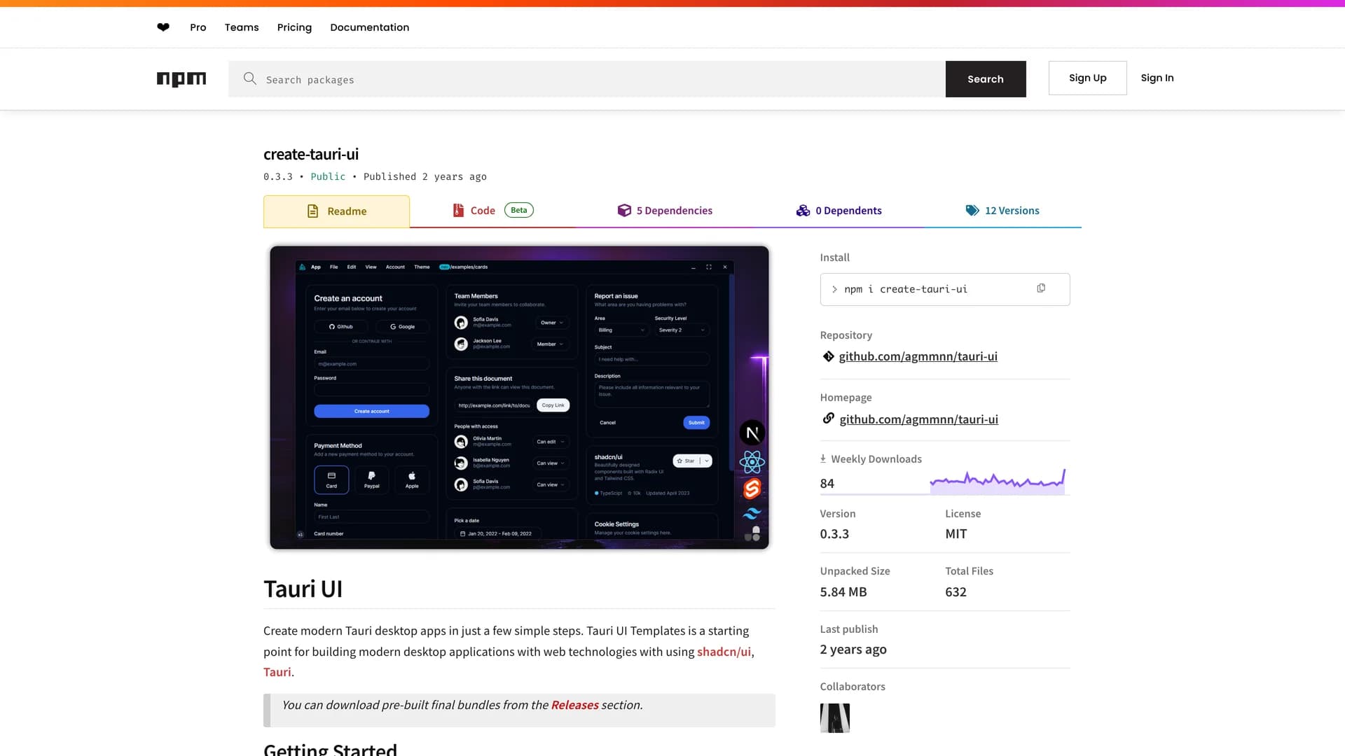
 Svelte
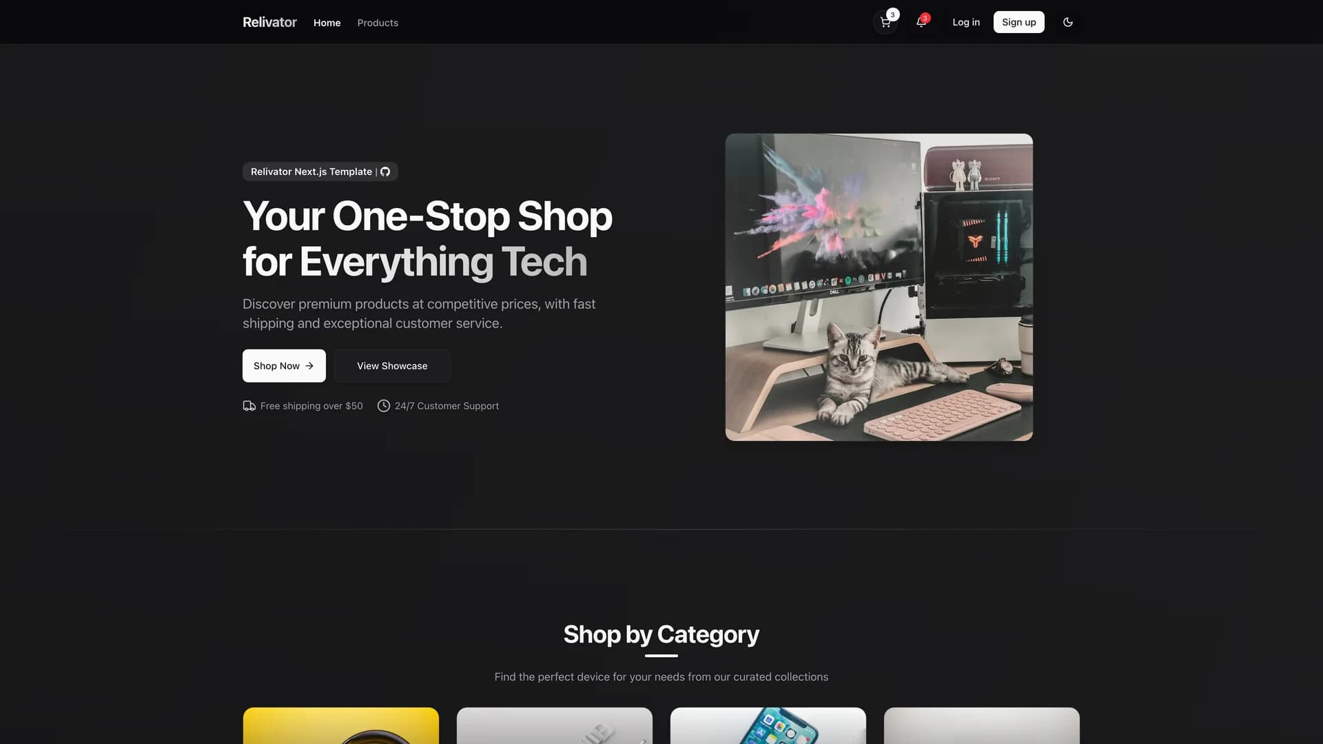