Join our Discord Community
Shadow Panda template preview

Shadow Panda

K

Created by Kumaaa inc

Last updated October 8, 2025

About This Template

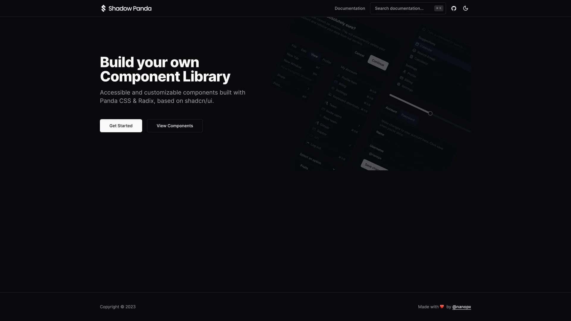
Shadow Panda is an open-source UI component library built with TypeScript, Panda CSS, and Radix UI, providing accessible and customizable components based on shadcn/ui's design philosophy for developers seeking an alternative to Tailwind CSS. This innovative library maintains the same component structure and design patterns as shadcn/ui while leveraging Panda CSS's build-time CSS generation, type safety, and zero-runtime overhead, offering developers the familiar shadcn experience with different styling technology. The project includes a comprehensive preset for Panda CSS, supports React applications, and emphasizes both developer experience and accessibility compliance through proper semantic HTML and ARIA attributes. Perfect for teams standardizing on Panda CSS across projects, developers seeking type-safe styling with better IDE support, projects requiring fine-grained CSS control beyond utility classes, or applications where build-time CSS generation and smaller bundle sizes matter for performance optimization. Maintained primarily by Atsushi Yoshitake and welcoming community contributions under the MIT license, Shadow Panda demonstrates how the component-driven philosophy can transcend specific CSS frameworks, enabling developers to choose their preferred styling solution while benefiting from proven component designs and accessibility patterns established by the shadcn/ui ecosystem.

Related Templates

Radix UI Primitives template preview
Radix UI Primitives
Radix Primitives is an open-source UI component library designed for building high-quality, accessible web applications and design systems with React. It provides low-level, unstyled, and highly customizable components with a strong focus on accessibility, customization, and developer experience. Maintained by WorkOS, Radix UI serves as the foundational layer that powers shadcn/ui and many other popular component libraries. The library offers primitives for common UI patterns like dialogs, dropdowns, popovers, and tooltips, all built with WAI-ARIA compliance to ensure screen reader support and keyboard navigation. Developers can use Radix Primitives as a complete foundation for their design system or incrementally adopt individual components, making it a flexible solution for teams building robust, inclusive user interfaces that meet modern accessibility standards while maintaining full styling control.
Shadcn UI template preview
Shadcn UI
shadcn/ui is an open-source component library that provides beautifully designed, accessible, and customizable UI components built with React, Radix UI, and Tailwind CSS. Unlike traditional component libraries, shadcn/ui uses a unique copy-paste approach where developers directly copy components into their projects, giving them full ownership and control over the code. The library includes a comprehensive collection of reusable components ranging from basic elements like buttons and inputs to complex components like data tables, calendars, and command palettes. Built with TypeScript for type safety, it supports dark mode, offers a powerful CLI for easy installation, and integrates seamlessly with modern tools like Next.js, React Hook Form, and Zod. This developer-friendly approach makes shadcn/ui the perfect foundation for building custom design systems and production-ready applications across SaaS dashboards, e-commerce platforms, and admin panels.
Origin UI template preview
Origin UI
Origin UI is an open-source React component library offering an extensive collection of hundreds of copy-and-paste components designed for rapidly building modern application interfaces. Powered by Tailwind CSS v4 and built for seamless integration with Next.js and React projects, Origin UI follows the same shadcn conventions and copy-paste philosophy that developers love, giving you full ownership and control over your components. The library provides beautifully designed, production-ready UI elements spanning forms, navigation, data display, feedback components, and complex interactive widgets, all styled with Tailwind's utility-first approach for easy customization. Each component is built with accessibility in mind, leveraging Radix UI primitives and React Aria for keyboard navigation and screen reader support. Perfect for developers who want a comprehensive component library without the overhead of npm dependencies, Origin UI enables you to quickly scaffold application UIs by simply copying the components you need directly into your codebase, customizing them to match your brand, and shipping faster without sacrificing quality or flexibility.