Join our Discord Community

About This Template

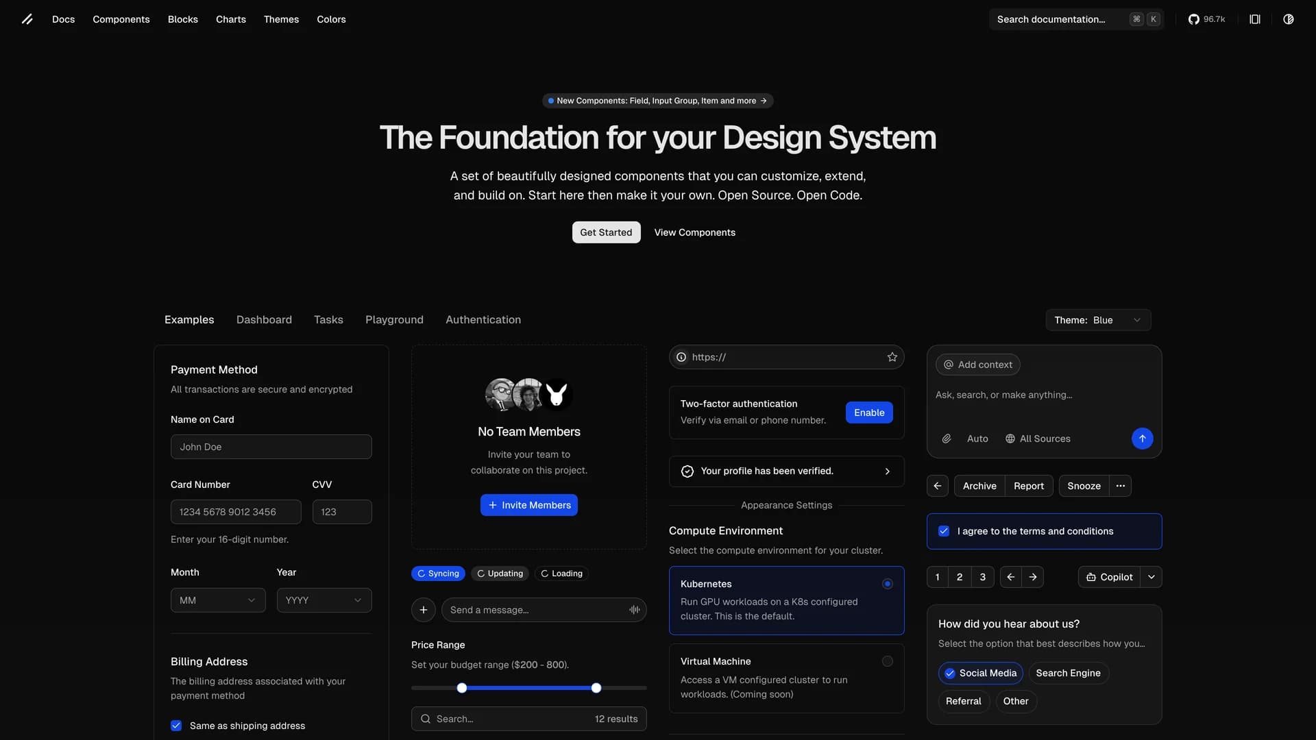
shadcn/ui is an open-source component library that provides beautifully designed, accessible, and customizable UI components built with React, Radix UI, and Tailwind CSS. Unlike traditional component libraries, shadcn/ui uses a unique copy-paste approach where developers directly copy components into their projects, giving them full ownership and control over the code. The library includes a comprehensive collection of reusable components ranging from basic elements like buttons and inputs to complex components like data tables, calendars, and command palettes. Built with TypeScript for type safety, it supports dark mode, offers a powerful CLI for easy installation, and integrates seamlessly with modern tools like Next.js, React Hook Form, and Zod. This developer-friendly approach makes shadcn/ui the perfect foundation for building custom design systems and production-ready applications across SaaS dashboards, e-commerce platforms, and admin panels.

Related Templates

Prompt Kit template preview
Prompt Kit
Core building blocks for AI apps. High-quality, accessible, and customizable components for AI interfaces.
Kokonut UI template preview
Kokonut UI
Kokonut UI is a collection of animated, accessible UI components built with React, Tailwind CSS, and Framer Motion, providing production-ready components with smooth animations and modern design patterns. The open-source library offers copy-and-paste components following shadcn/ui's philosophy, including animated cards, interactive buttons, smooth transitions, and engaging micro-interactions that enhance user experience. Built with TypeScript for type safety, the components integrate Framer Motion's animation capabilities with Tailwind CSS utility classes, creating visually polished interfaces without complex animation code. Each component is designed for accessibility with proper ARIA attributes, keyboard navigation support, and responsive behavior across devices. Perfect for marketing websites, landing pages, SaaS applications, or any project requiring eye-catching animations and professional polish beyond basic UI primitives, Kokonut UI demonstrates how to combine animation libraries with utility-first CSS for components that are both beautiful and maintainable.
Motion Primitives template preview
Motion Primitives
Motion Primitives is an open-source UI component library designed to help engineers and designers create beautiful, animated interfaces faster using Framer Motion and Tailwind CSS. This comprehensive animation toolkit provides ready-to-use motion components that simplify the process of adding sophisticated animations to web applications without requiring deep animation expertise. The library offers a growing collection of customizable components including animated buttons, cards, modals, page transitions, scroll-triggered animations, and interactive micro-interactions, all built with performance and accessibility in mind. Each component is crafted to be developer-friendly with clear documentation, live previews, and copy-paste installation, following the same philosophy as shadcn/ui. Currently in active development with regular component releases and updates, Motion Primitives eliminates the complexity of configuring Framer Motion from scratch by providing pre-built, production-ready animation patterns that work seamlessly with Next.js and React applications. Perfect for developers building landing pages, marketing sites, SaaS applications, or any project requiring engaging user experiences, the library helps teams add professional-grade animations and transitions that enhance usability and delight users, while maintaining clean code and excellent performance through optimized animation techniques and GPU-accelerated transforms.