Join our Discord Community
Shadcn Theme Editor template preview

Shadcn Theme Editor

P

Created by Programming with ia

Last updated October 8, 2025

About This Template

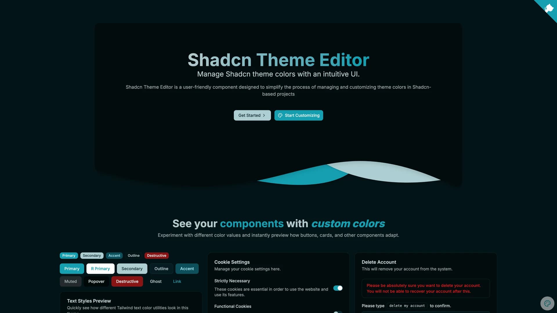
The shadcn Theme Editor is a must-have developer tool that provides an intuitive visual interface for customizing shadcn/ui color themes without manually editing CSS variables or converting between color formats. Built with Next.js, React, TypeScript, and Tailwind CSS, this component allows developers and designers to interactively adjust all theme tokens, preview changes in real-time across light and dark modes, and export ready-to-use CSS configurations. The editor features interactive color pickers for all shadcn/ui theme tokens including background, foreground, primary, secondary, accent, destructive, and border colors, live preview showing how components look with the selected theme applied, automatic HSL to CSS variable conversion eliminating manual color format calculations, one-click copying of generated CSS for immediate integration into projects, preset theme templates to jumpstart customization from popular color schemes, and accessibility contrast checking to ensure color combinations meet WCAG standards. The interface organizes theme tokens by their semantic purpose, making it clear which colors affect buttons versus backgrounds versus text, helping developers understand the shadcn/ui theming system while customizing it. This tool is invaluable for designers creating custom brand themes without CSS expertise, developers building white-label applications requiring multiple tenant-specific themes, teams experimenting with color palettes before committing to final designs, projects needing to match precise brand guidelines with exact color control, and anyone frustrated with manually converting hex colors to the HSL format required by shadcn/ui. The Theme Editor can be installed as a dev dependency via npm or integrated using the Scaflo CLI, bridging the gap between visual design and technical implementation to make theme customization accessible and efficient.

Related Templates

Tremor template preview
Tremor
Tremor is a React component library featuring 35+ customizable, accessible components designed for building data-rich dashboards and analytics interfaces. Built with React, TypeScript, Tailwind CSS, and Radix UI, it provides pre-built chart components (line, bar, area, donut charts, sparklines), KPI cards, data tables, and layout components that follow accessibility best practices. Like shadcn/ui, Tremor uses a copy-paste approach, letting developers integrate component source code directly into projects for complete customization control. The library handles common dashboard requirements including loading states, error boundaries, empty states, and responsive breakpoints, with each component fully typed and integrating seamlessly with Tailwind CSS utilities. Actively maintained by Tremor Labs with comprehensive documentation at tremor.so and community support via Slack and Twitter, it's perfect for building internal tools, SaaS analytics dashboards, and business intelligence applications by providing battle-tested components for data visualization.
Kokonut UI template preview
Kokonut UI
Kokonut UI is a collection of animated, accessible UI components built with React, Tailwind CSS, and Framer Motion, providing production-ready components with smooth animations and modern design patterns. The open-source library offers copy-and-paste components following shadcn/ui's philosophy, including animated cards, interactive buttons, smooth transitions, and engaging micro-interactions that enhance user experience. Built with TypeScript for type safety, the components integrate Framer Motion's animation capabilities with Tailwind CSS utility classes, creating visually polished interfaces without complex animation code. Each component is designed for accessibility with proper ARIA attributes, keyboard navigation support, and responsive behavior across devices. Perfect for marketing websites, landing pages, SaaS applications, or any project requiring eye-catching animations and professional polish beyond basic UI primitives, Kokonut UI demonstrates how to combine animation libraries with utility-first CSS for components that are both beautiful and maintainable.
Prompt Kit template preview
Prompt Kit
Core building blocks for AI apps. High-quality, accessible, and customizable components for AI interfaces.