Join our Discord Community

About This Template

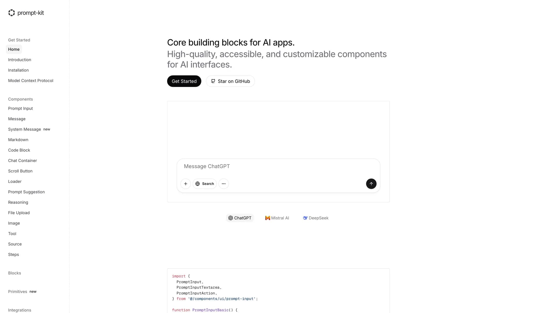
Core building blocks for AI apps. High-quality, accessible, and customizable components for AI interfaces.

Related Templates

Motion Primitives template preview
Motion Primitives
Motion Primitives is an open-source UI component library designed to help engineers and designers create beautiful, animated interfaces faster using Framer Motion and Tailwind CSS. This comprehensive animation toolkit provides ready-to-use motion components that simplify the process of adding sophisticated animations to web applications without requiring deep animation expertise. The library offers a growing collection of customizable components including animated buttons, cards, modals, page transitions, scroll-triggered animations, and interactive micro-interactions, all built with performance and accessibility in mind. Each component is crafted to be developer-friendly with clear documentation, live previews, and copy-paste installation, following the same philosophy as shadcn/ui. Currently in active development with regular component releases and updates, Motion Primitives eliminates the complexity of configuring Framer Motion from scratch by providing pre-built, production-ready animation patterns that work seamlessly with Next.js and React applications. Perfect for developers building landing pages, marketing sites, SaaS applications, or any project requiring engaging user experiences, the library helps teams add professional-grade animations and transitions that enhance usability and delight users, while maintaining clean code and excellent performance through optimized animation techniques and GPU-accelerated transforms.
Tremor template preview
Tremor
Tremor is a React component library featuring 35+ customizable, accessible components designed for building data-rich dashboards and analytics interfaces. Built with React, TypeScript, Tailwind CSS, and Radix UI, it provides pre-built chart components (line, bar, area, donut charts, sparklines), KPI cards, data tables, and layout components that follow accessibility best practices. Like shadcn/ui, Tremor uses a copy-paste approach, letting developers integrate component source code directly into projects for complete customization control. The library handles common dashboard requirements including loading states, error boundaries, empty states, and responsive breakpoints, with each component fully typed and integrating seamlessly with Tailwind CSS utilities. Actively maintained by Tremor Labs with comprehensive documentation at tremor.so and community support via Slack and Twitter, it's perfect for building internal tools, SaaS analytics dashboards, and business intelligence applications by providing battle-tested components for data visualization.
Kokonut UI template preview
Kokonut UI
Kokonut UI is a collection of animated, accessible UI components built with React, Tailwind CSS, and Framer Motion, providing production-ready components with smooth animations and modern design patterns. The open-source library offers copy-and-paste components following shadcn/ui's philosophy, including animated cards, interactive buttons, smooth transitions, and engaging micro-interactions that enhance user experience. Built with TypeScript for type safety, the components integrate Framer Motion's animation capabilities with Tailwind CSS utility classes, creating visually polished interfaces without complex animation code. Each component is designed for accessibility with proper ARIA attributes, keyboard navigation support, and responsive behavior across devices. Perfect for marketing websites, landing pages, SaaS applications, or any project requiring eye-catching animations and professional polish beyond basic UI primitives, Kokonut UI demonstrates how to combine animation libraries with utility-first CSS for components that are both beautiful and maintainable.