Join our Discord Community
Poketto Stack template preview

Poketto Stack

T

Created by Tinsfox

Last updated October 8, 2025

About This Template

Poketto Stack is a comprehensive boilerplate built with shadcn/ui for rapidly developing modern web applications with pre-configured tools, consistent design patterns, and best practices integrated from the start. 
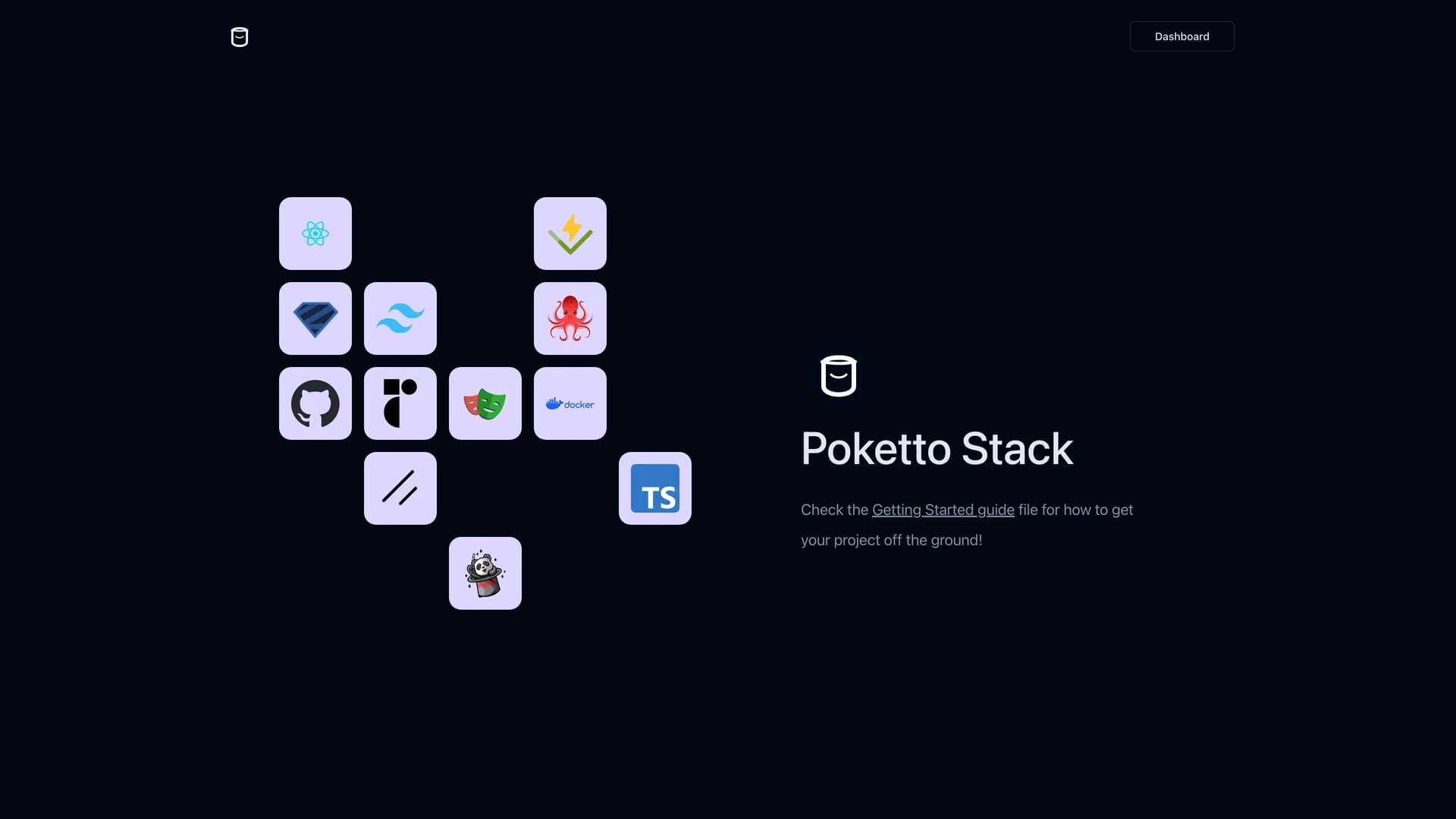
The MIT-licensed template provides customizable UI components through shadcn/ui, Tailwind CSS for styling, Radix UI for accessibility, and Framer Motion for animations, all configured and ready to use. Built with React, TypeScript, Vite for fast development, and Storybook for component documentation, the boilerplate includes Jotai for atomic state management, React Query for server state, React Hook Form for forms, Zod for schema validation, i18next for internationalization, MSW for API mocking, and Vitest for testing. The template offers a modular, scalable architecture with enhanced developer experience through rapid setup and consistent patterns. Perfect for teams starting new React projects, developers building dashboard applications, projects requiring comprehensive tooling, or any application needing a robust starting point with state management, form handling, testing, and internationalization configured and integrated seamlessly.

Related Templates

Tremor template preview
Tremor
Tremor is a React component library featuring 35+ customizable, accessible components designed for building data-rich dashboards and analytics interfaces. Built with React, TypeScript, Tailwind CSS, and Radix UI, it provides pre-built chart components (line, bar, area, donut charts, sparklines), KPI cards, data tables, and layout components that follow accessibility best practices. Like shadcn/ui, Tremor uses a copy-paste approach, letting developers integrate component source code directly into projects for complete customization control. The library handles common dashboard requirements including loading states, error boundaries, empty states, and responsive breakpoints, with each component fully typed and integrating seamlessly with Tailwind CSS utilities. Actively maintained by Tremor Labs with comprehensive documentation at tremor.so and community support via Slack and Twitter, it's perfect for building internal tools, SaaS analytics dashboards, and business intelligence applications by providing battle-tested components for data visualization.
Shadcn Admin template preview
Shadcn Admin
Shadcn Admin is a free, open-source admin dashboard template built with shadcn/ui, Vite, React, and TypeScript, offering a modern and fully responsive interface for building administrative panels and internal tools. This comprehensive dashboard includes over 10 pre-built pages covering common admin use cases, featuring carefully customized shadcn/ui components optimized for dashboard layouts. Key features include automatic light and dark mode theming, a powerful global search command palette for quick navigation, RTL (right-to-left) language support for internationalization, and fully accessible components following WAI-ARIA guidelines. The template leverages Vite's lightning-fast build times and hot module replacement for an exceptional developer experience, while TypeScript ensures type safety throughout the codebase. Perfect for developers building SaaS admin panels, internal business tools, or content management systems, Shadcn Admin provides a solid foundation with thoughtfully designed pages for analytics, user management, settings, and data visualization, all styled with Tailwind CSS for easy customization and consistent design.
Kokonut UI template preview
Kokonut UI
Kokonut UI is a collection of animated, accessible UI components built with React, Tailwind CSS, and Framer Motion, providing production-ready components with smooth animations and modern design patterns. The open-source library offers copy-and-paste components following shadcn/ui's philosophy, including animated cards, interactive buttons, smooth transitions, and engaging micro-interactions that enhance user experience. Built with TypeScript for type safety, the components integrate Framer Motion's animation capabilities with Tailwind CSS utility classes, creating visually polished interfaces without complex animation code. Each component is designed for accessibility with proper ARIA attributes, keyboard navigation support, and responsive behavior across devices. Perfect for marketing websites, landing pages, SaaS applications, or any project requiring eye-catching animations and professional polish beyond basic UI primitives, Kokonut UI demonstrates how to combine animation libraries with utility-first CSS for components that are both beautiful and maintainable.