Make your AI a shadcn expert
shadcn.io
Templates
Blocks
MCP
Browse
Pricing
Search
⌘
K
Sign in
Home
Templates
dashboard
React Templates - Dashboard
7 templates • 7 contributors • Open source & free
Available Templates (7)
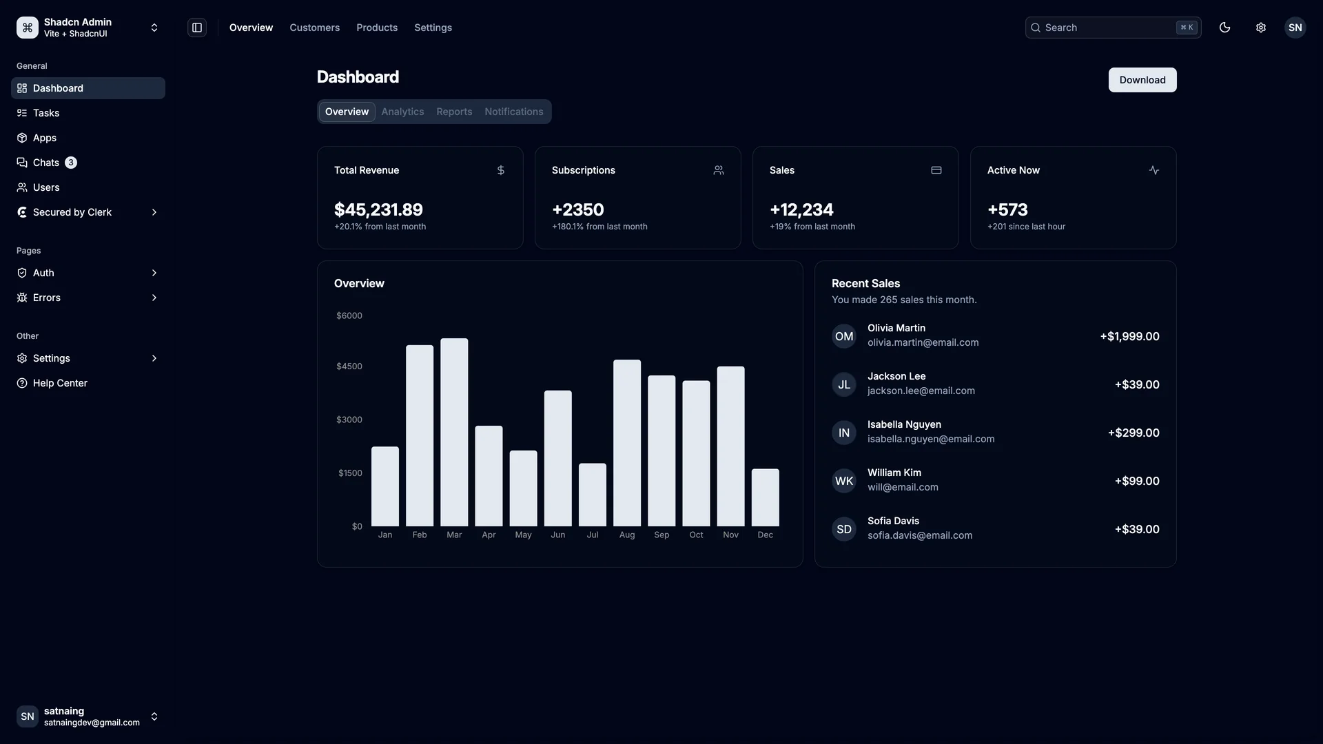
shadcn-admin.netlify.app
Shadcn Admin
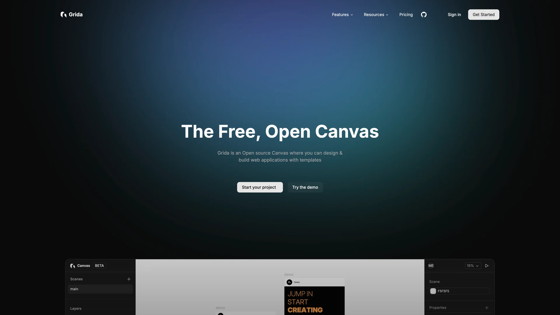
grida.co
Grida
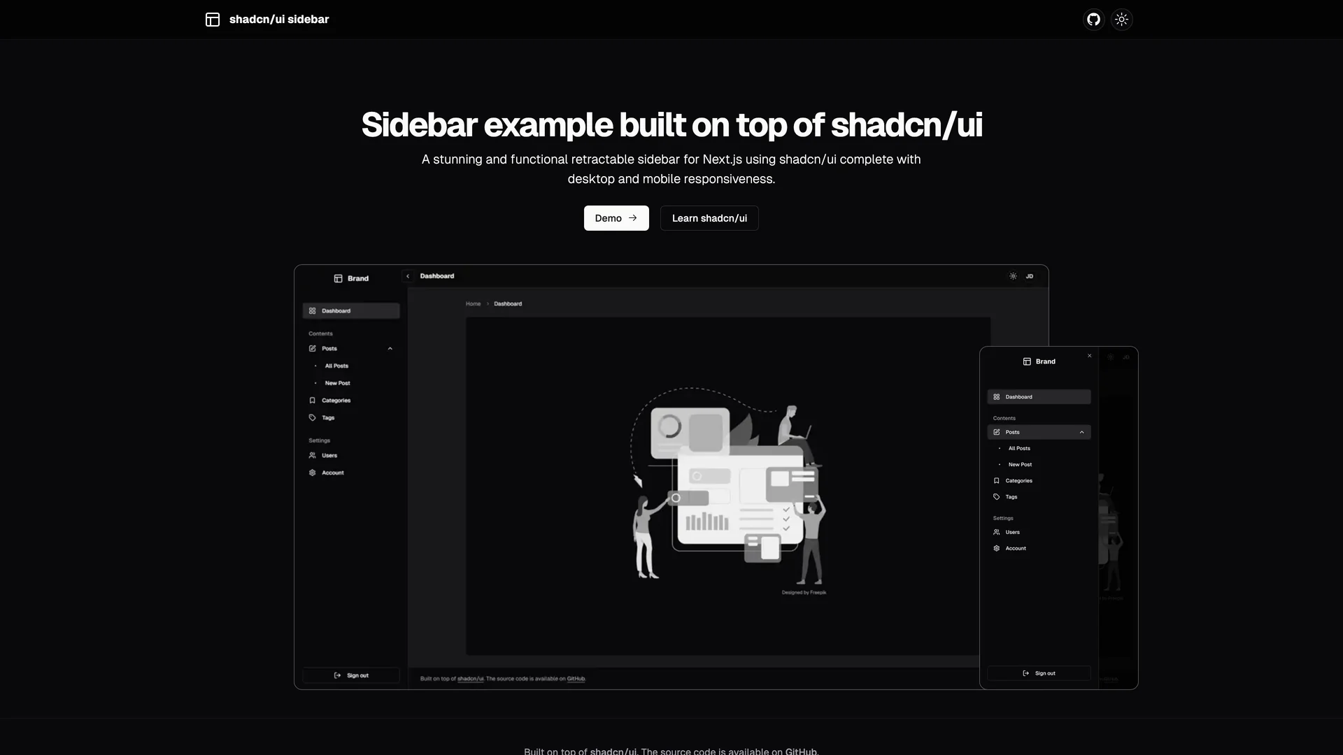
shadcn-ui-sidebar.salimi.my
Shadcn UI Sidebar
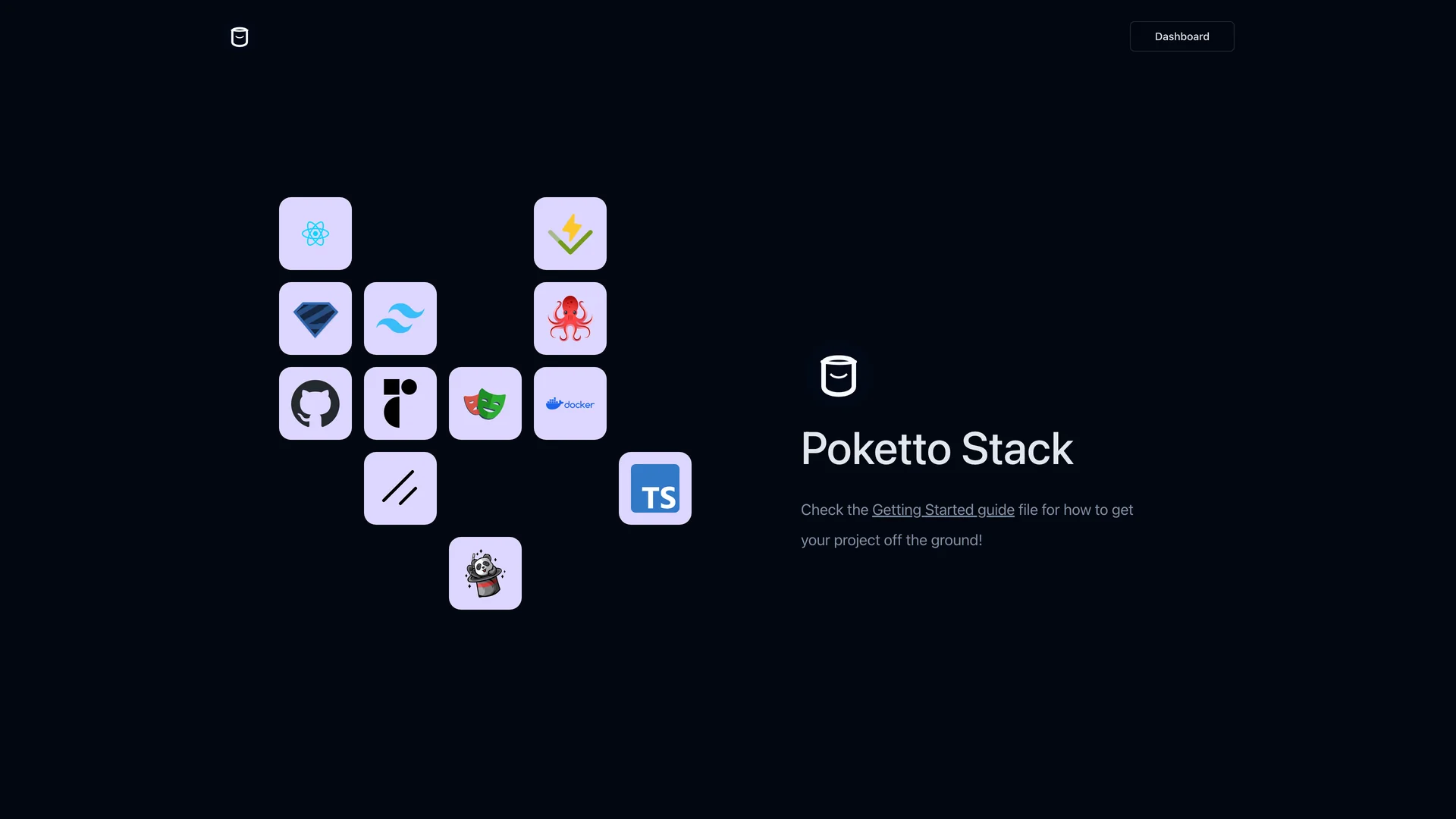
poketto-stack.afjs.dev
Poketto Stack
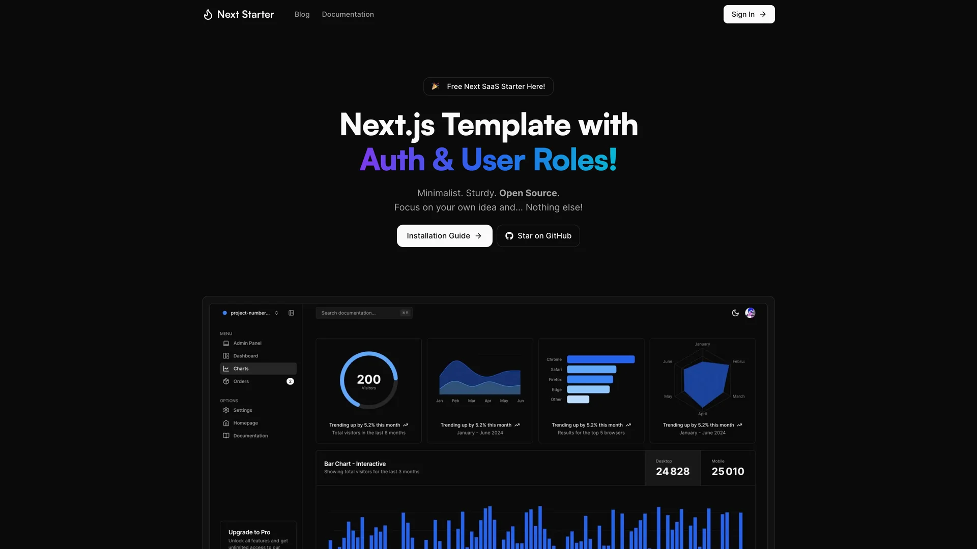
next-auth-roles-template.vercel.app
Next Auth Roles Template
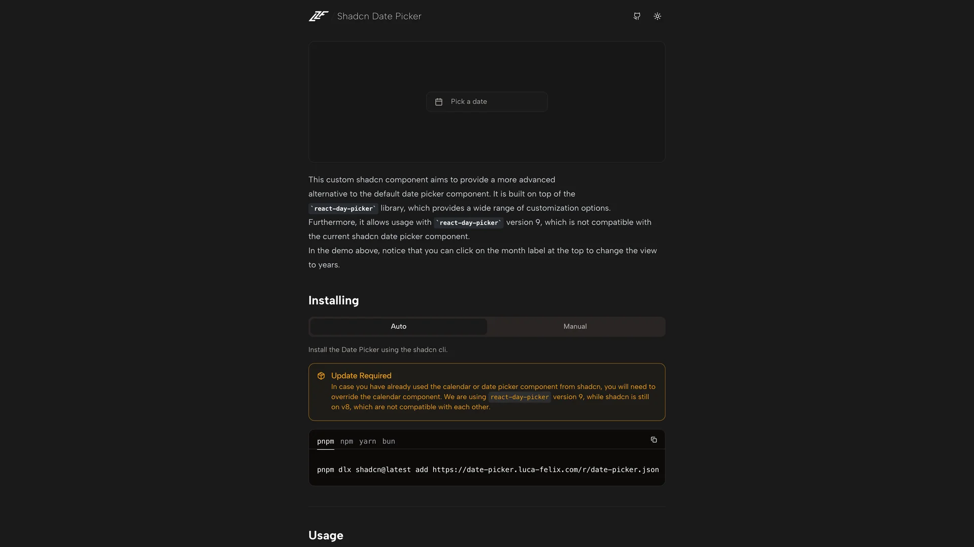
date-picker.luca-felix.com
Shadcn Date Picker
shadcnuikit.com
Shadcn Dashboard Free
Authors in dashboard
S
Satnaing
1 templates
G
Gridaco
1 templates
S
Salimi my
1 templates
T
Tinsfox
1 templates
M
Mickasmt
1 templates
F
Flixlix
1 templates
B
Bundui
1 templates
Related Categories
React
6 templates
·
6 authors
Tailwind
6 templates
·
6 authors
Nextjs
4 templates
·
4 authors
Vite
2 templates
·
2 authors
Fullstack
2 templates
·
2 authors
Supabase
1 templates
·
1 authors
Vitepress
1 templates
·
1 authors
Prisma
1 templates
·
1 authors
Scroll to top
Get Pro — Save 33%
·
Ends in
--:--:--
→