React Templates - Radix UI
31 templates • 29 contributors • Open source & free
Available Templates (31)
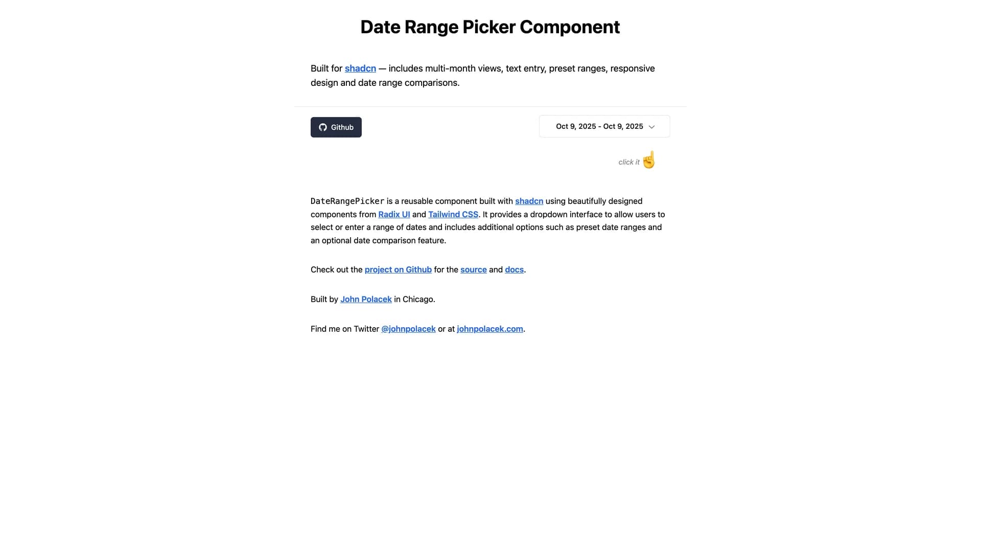
- Date Range PickerDate Range Picker for shadcn is a comprehensive date range selection component built on shadcn/ui's design system with support for presets, comparison ranges, and advanced filtering. The MIT-licensed component integrates seamlessly with shadcn/ui projects, providing a polished interface for selecting date ranges with pre-defined options like "Last 7 days," "Last 30 days," and "This month" alongside custom range selection. Built with React, TypeScript, and date-fns for reliable date handling, the picker includes comparison mode for analyzing period-over-period metrics, single date selection mode, and customizable preset configurations. The component follows shadcn/ui's philosophy of being copy-and-paste ready rather than installed as a dependency, allowing developers to customize styling, behavior, and presets directly in their codebase. Perfect for analytics dashboards, reporting interfaces, booking systems, or any application requiring sophisticated date range selection with user-friendly presets and comparison capabilities common in platforms like Google Analytics or business intelligence tools.
- BasejumpBasejump is a Supabase extension providing production-ready authentication, team accounts, billing, and permission management through database-level schemas and helper functions. The MIT-licensed project extends Supabase with multi-tenant architecture supporting team creation, member invitations, role-based permissions, and subscription billing all managed through PostgreSQL schemas and Row Level Security policies. Built specifically for Supabase projects, Basejump eliminates the need to build common SaaS infrastructure by providing database migrations for account management, team hierarchies, billing integrations, and access control that work seamlessly with Supabase Auth. The extension includes TypeScript client libraries, React hooks for easy frontend integration, and comprehensive documentation for implementing team-based applications where users belong to multiple organizations with different permission levels. Perfect for B2B SaaS platforms, collaborative tools, agency portals, or any application requiring sophisticated multi-tenant architecture with team accounts, role-based permissions, and subscription management built directly into the Supabase database layer.
- Shadcn Phone InputShadcn Phone Input is a customizable international phone number input component built specifically for shadcn/ui with comprehensive validation for any country worldwide. The MIT-licensed component provides seamless country selection with flag icons, automatic formatting based on selected country, and robust validation using the react-phone-number-input library integrated with Zod for form validation. Built with React, TypeScript, Tailwind CSS, and shadcn/ui components, the phone input fills a gap in the shadcn ecosystem by providing a production-ready solution for international phone number collection with proper validation and formatting. The component supports optional phone number fields, clear error messaging for invalid numbers, and flexible form integration with React Hook Form. Perfect for user registration forms, contact information collection, e-commerce checkout flows, or any application requiring international phone number input with proper validation, country detection, and a clean modern UI design that matches shadcn/ui's aesthetic.
- Astro NomyAstro Nomy is an open-source experimental project demonstrating modern web development with Astro v4.5, shadcn/ui, and React, showcasing how to build feature-rich applications with view transitions, routing, layouts, and 100/100 Lighthouse performance. The MIT-licensed project includes React components and hooks, MDX and Content Collections support, Tailwind CSS styling, Zod validations, TypeScript, RSS feed and sitemap generation, and API endpoints. Built as an experiment to test how modern app features like authentication, subscriptions, API routes, markdown, and content collections work in Astro v4 with shadcn/ui, the project plans to include blog pages with Astro DB, changelog pages, waitlist and newsletter functionality, anime pages, e-commerce pages, and authentication/dashboard pages. The project achieves perfect Lighthouse scores while demonstrating Astro's content-focused architecture combined with React's interactivity through shadcn/ui components. Perfect for learning Astro with shadcn/ui, building content-heavy sites with interactive components, marketing websites requiring performance, or any project exploring Astro's capabilities with modern UI libraries and best practices.
- Animate UIAnimate UI is a fully animated, open-source component library built with React, TypeScript, Tailwind CSS, and Framer Motion, providing customizable components with smooth animations and motion as core design principles. The MIT-licensed library offers installable and modifiable components through shadcn CLI, making it easy to browse, add, and customize animated components for web projects. Built with TypeScript (89.9% of codebase), React, Tailwind CSS, Radix UI primitives, and Framer Motion for animations, Animate UI emphasizes motion and animation throughout its component collection. The project welcomes contributions with a published Code of Conduct and has garnered significant community support with 2.6k stars and 16 contributors. Perfect for projects requiring animated interfaces, landing pages with engaging interactions, marketing websites, applications needing polished micro-interactions, or any project benefiting from professional animations without building custom animation logic, Animate UI provides production-ready animated components installable through familiar tooling and customizable to match any design system.
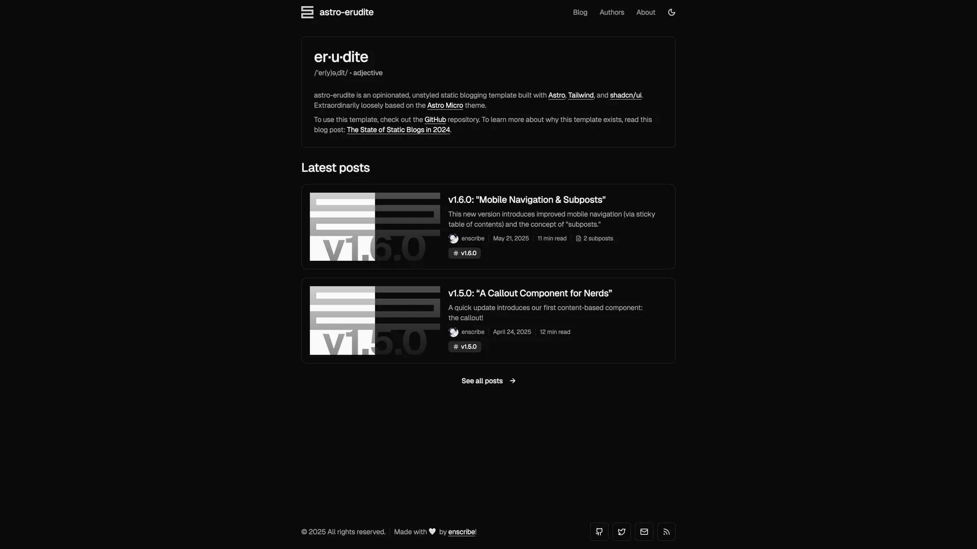
- Astro EruditeAstro Erudite is an opinionated, unstyled static blogging template built with Astro, Tailwind CSS, and shadcn/ui, designed for developers who value performance and flexibility in their web publishing workflow. This modern template leverages Astro Islands architecture for selective hydration, ensuring optimal loading performance by only hydrating interactive components when needed. Features include automatic light/dark theme styling, MDX content support with LaTeX math rendering for technical writing, SEO optimization, RSS feed generation, author and project profiles, and smooth view transitions for an enhanced user experience. The unstyled approach provides maximum design flexibility, allowing developers to customize appearance without fighting against opinionated defaults. Perfect for technical bloggers, academics, developers maintaining project documentation, or anyone building a content-focused site with modern web standards, Astro Erudite combines the performance benefits of static site generation with the developer experience of component-based development, making it ideal for creating fast, accessible, and highly customizable blogs and portfolios.
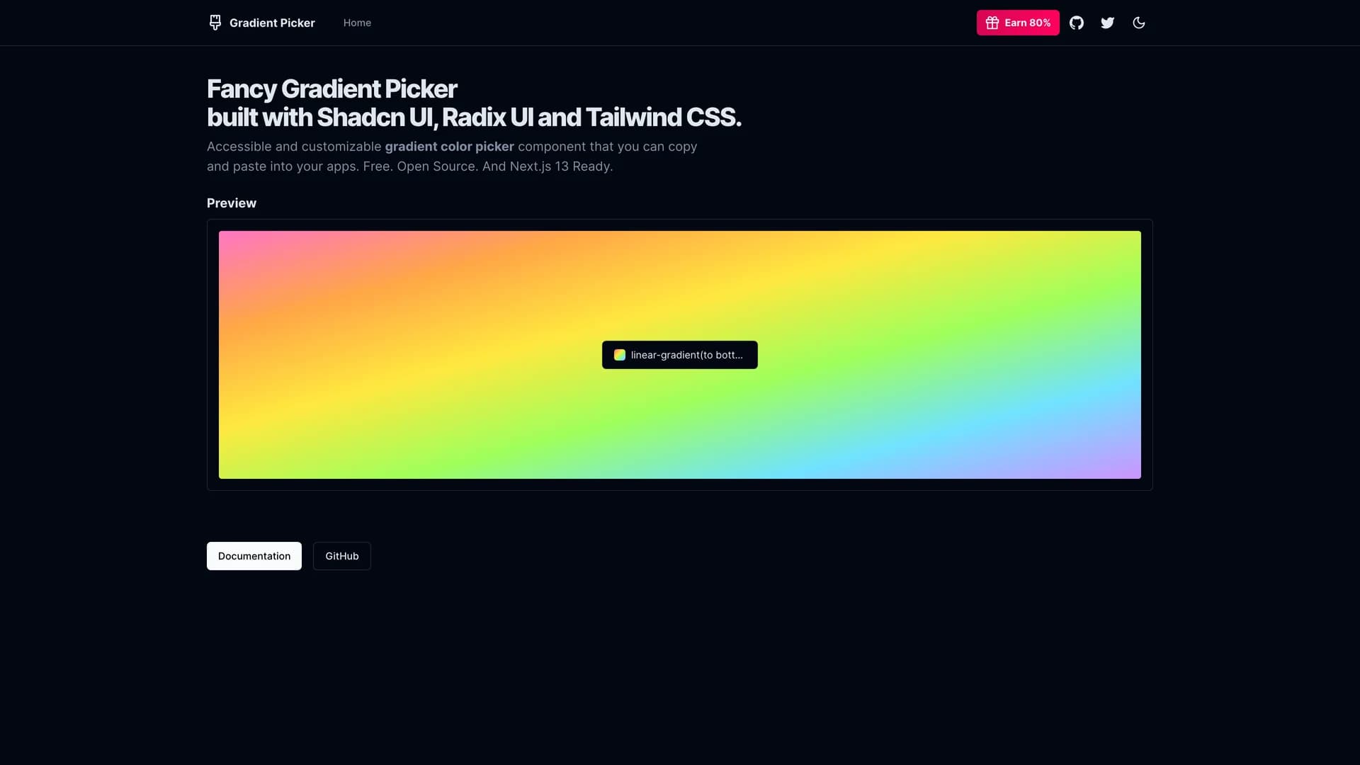
- Gradient PickerGradient Picker is a fancy, visually appealing web application built with Next.js, React, TypeScript, Tailwind CSS, shadcn/ui, and Radix UI, designed to help developers and designers select and customize color gradients with an intuitive interface. This comprehensive color tool enables users to select solid colors, create and customize complex gradients, browse background images, and generate complete color themes for UI components, all within a unified, accessible interface. The application provides free samples for exploration and includes an affiliate program offering significant commissions, demonstrating a sustainable open-source business model. Perfect for design systems teams establishing brand colors and gradient patterns, developers building themed applications requiring dynamic color generation, marketing teams creating branded assets and landing pages, or designers working on visual identities where gradient exploration and theme generation accelerate creative workflows. With easy integration into existing design systems and released under the MIT license, Gradient Picker showcases how specialized tools can bridge the gap between design inspiration and implementation, providing developers with a practical utility that generates production-ready CSS while offering designers the creative freedom to explore color combinations without technical barriers.
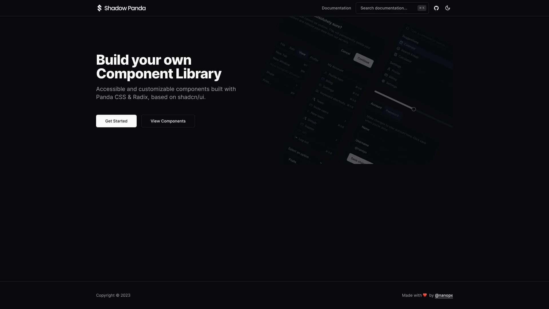
- Shadow PandaShadow Panda is an open-source UI component library built with TypeScript, Panda CSS, and Radix UI, providing accessible and customizable components based on shadcn/ui's design philosophy for developers seeking an alternative to Tailwind CSS. This innovative library maintains the same component structure and design patterns as shadcn/ui while leveraging Panda CSS's build-time CSS generation, type safety, and zero-runtime overhead, offering developers the familiar shadcn experience with different styling technology. The project includes a comprehensive preset for Panda CSS, supports React applications, and emphasizes both developer experience and accessibility compliance through proper semantic HTML and ARIA attributes. Perfect for teams standardizing on Panda CSS across projects, developers seeking type-safe styling with better IDE support, projects requiring fine-grained CSS control beyond utility classes, or applications where build-time CSS generation and smaller bundle sizes matter for performance optimization. Maintained primarily by Atsushi Yoshitake and welcoming community contributions under the MIT license, Shadow Panda demonstrates how the component-driven philosophy can transcend specific CSS frameworks, enabling developers to choose their preferred styling solution while benefiting from proven component designs and accessibility patterns established by the shadcn/ui ecosystem.
- Shadcn Calendar ComponentShadcn Calendar Component is a flexible, feature-rich date picker built with Next.js, React, TypeScript, shadcn/ui, date-fns, date-fns-tz, and Tailwind CSS, designed to provide advanced date selection capabilities with single and multi-month views, predefined date range options, and timezone-aware date handling. This sophisticated component supports selecting predefined ranges like "Today", "This Week", "This Year" for quick date selection, interactive date picking with both mouse and keyboard controls for accessibility, customizable year and month range selection for historical or future dates, and timezone-aware date handling ensuring accurate date representation across global deployments. The clean, modern UI design integrates seamlessly with shadcn/ui design systems while the date-fns library provides robust date manipulation without the overhead of larger date libraries. Perfect for analytics dashboards requiring date range filters, booking systems handling reservations across timezones, reporting tools with flexible date selection requirements, or any application where sophisticated date picking directly impacts user workflows and data accuracy. The component's support for predefined ranges accelerates common user interactions like viewing "Last 7 Days" or "This Month" data without manual date selection, while timezone awareness prevents the common pitfalls of date handling in globally distributed applications where server and client timezones differ.
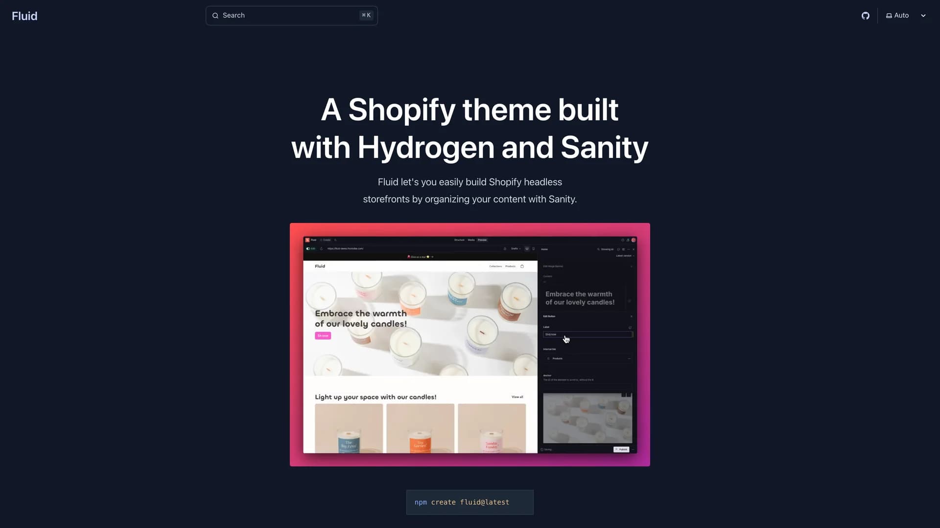
- Frontvibe FluidFluid is a Hydrogen theme built with React Router V7, Shopify Hydrogen, React, Tailwind CSS, Sanity CMS, Radix UI, shadcn/ui, Motion, and Embla Carousel, enabling developers to easily build modern headless Shopify storefronts by organizing content with modular sections similar to Shopify Liquid themes. This comprehensive e-commerce solution provides real-time visual editing for content editors, page building through modular, reusable sections, seamless Shopify integration for product data and checkout, and flexible content management with Sanity CMS offering advanced content modeling and preview capabilities. Drawing inspiration from Shopify's Dawn theme, Sanity's Akva demo, the Hydrogen demo store, and Build UI recipes, Fluid combines the best patterns from established e-commerce solutions into a unified, headless architecture. Perfect for brands seeking full design control over their storefronts, agencies building custom e-commerce experiences for clients, growing businesses outgrowing Shopify theme limitations, or any project where content-driven commerce and unique customer experiences differentiate products in competitive markets. The separation of content management (Sanity) from commerce functionality (Shopify) enables marketing teams to iterate on content without developer involvement while developers maintain control over the storefront implementation, performance optimization, and custom features that standard Shopify themes cannot support, creating a scalable foundation for modern e-commerce that adapts to business growth and changing market demands.
- Launch UILaunch UI is a comprehensive Next.js 15 website components template built with TypeScript, Tailwind CSS, shadcn/ui, and Lucide icons, providing pre-built, production-ready UI components specifically designed for products that need great-looking, conversion-optimized landing pages speaking to professional, quality-oriented audiences. This modern design system features fully mobile-compatible components with responsive layouts, dark mode support for user preference, performance and SEO optimization for discoverability, accessibility-focused implementation with ARIA attributes, and multiple pre-built sections including Navbar, Hero, FAQ, Stats, CTA, and Footer components. Created specifically for developer tools, AI-powered applications, SaaS products, mobile apps, and technical product landing pages where first impressions directly impact conversion rates and customer acquisition costs, Launch UI eliminates weeks of design and development work. Perfect for startups launching MVPs with limited design resources, developers building side projects requiring professional presentation, product teams iterating quickly on landing page variations for A/B testing, or technical founders who recognize that poorly designed landing pages undermine product credibility regardless of underlying technology quality. The copy-and-paste approach maintains the flexibility and customization that developers expect from shadcn/ui while providing the cohesive design system and conversion optimization patterns that professional landing pages require, enabling rapid deployment without sacrificing quality or brand consistency.
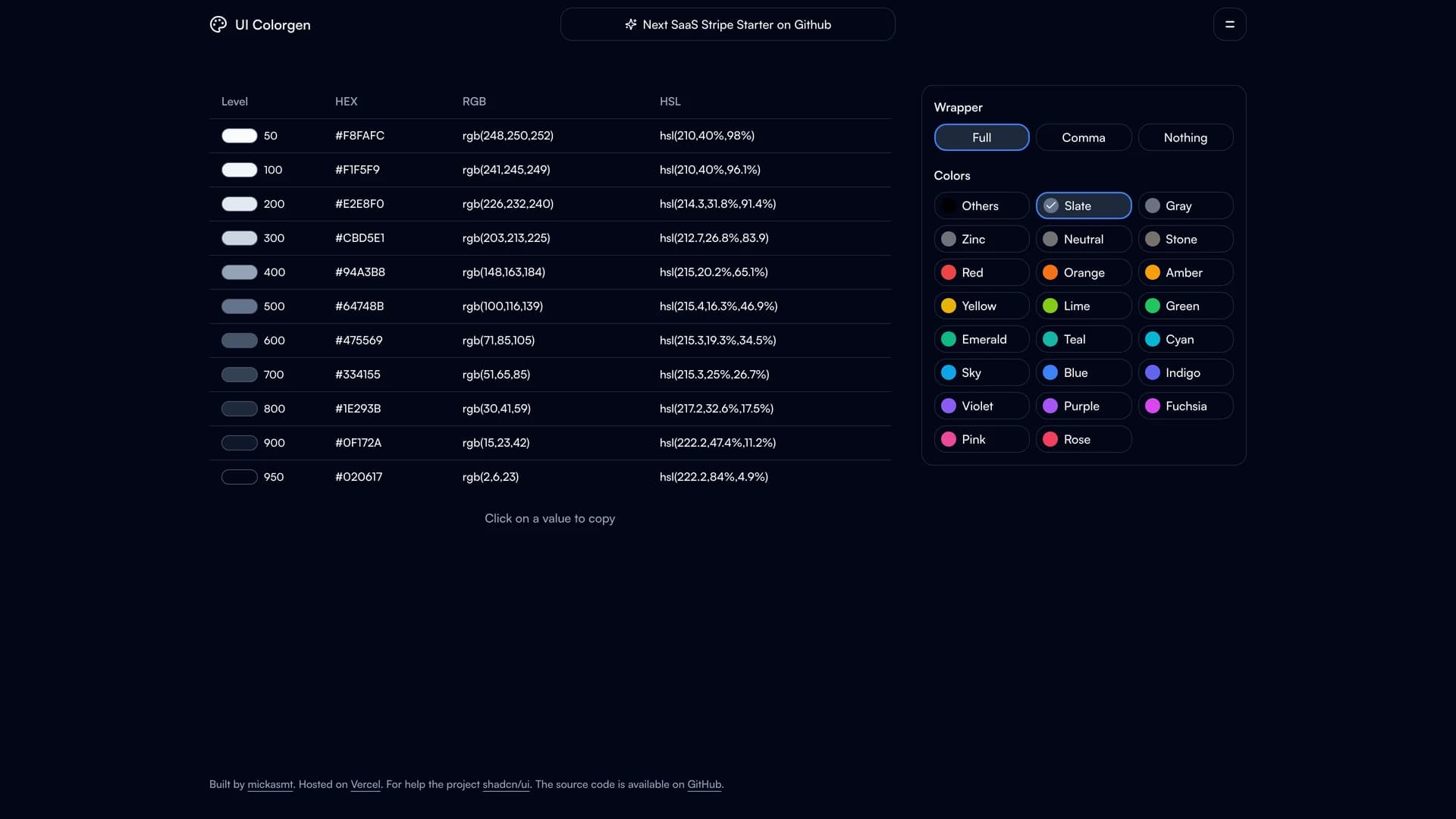
- UI ColorgenUI Colorgen is a web application built with Next.js 14, TypeScript, Tailwind CSS, and Radix UI, designed to simplify shadcn/ui color configuration by providing an interactive interface for listing TailwindCSS colors in multiple formats (hex, rgb, hsl), using a color picker to update CSS variables in real-time, adding custom color variables beyond defaults, selecting initial colors and preferred color formats, generating CSS root variables for theme files, and creating Tailwind color configuration for projects. This specialized tool addresses the complexity of color system setup in shadcn/ui projects where manual CSS variable management becomes error-prone and time-consuming as color schemes evolve. Perfect for design systems teams establishing brand colors across shadcn/ui components, developers implementing client-specific themes in white-label applications, agencies customizing shadcn/ui for multiple clients with different brand guidelines, or any project where efficient color configuration directly impacts development velocity and design consistency. The TypeScript-heavy codebase (94.8%) provides excellent type safety for color manipulation operations, while the multi-format color display helps developers work with colors in their preferred format whether designing in Figma (hex), working with CSS (hsl), or integrating with existing systems (rgb). By generating ready-to-use CSS variables and Tailwind configurations, UI Colorgen eliminates the manual translation between design decisions and code implementation, reducing errors and enabling rapid theme iterations that respond to design feedback or A/B testing results.
 React
React Tailwind
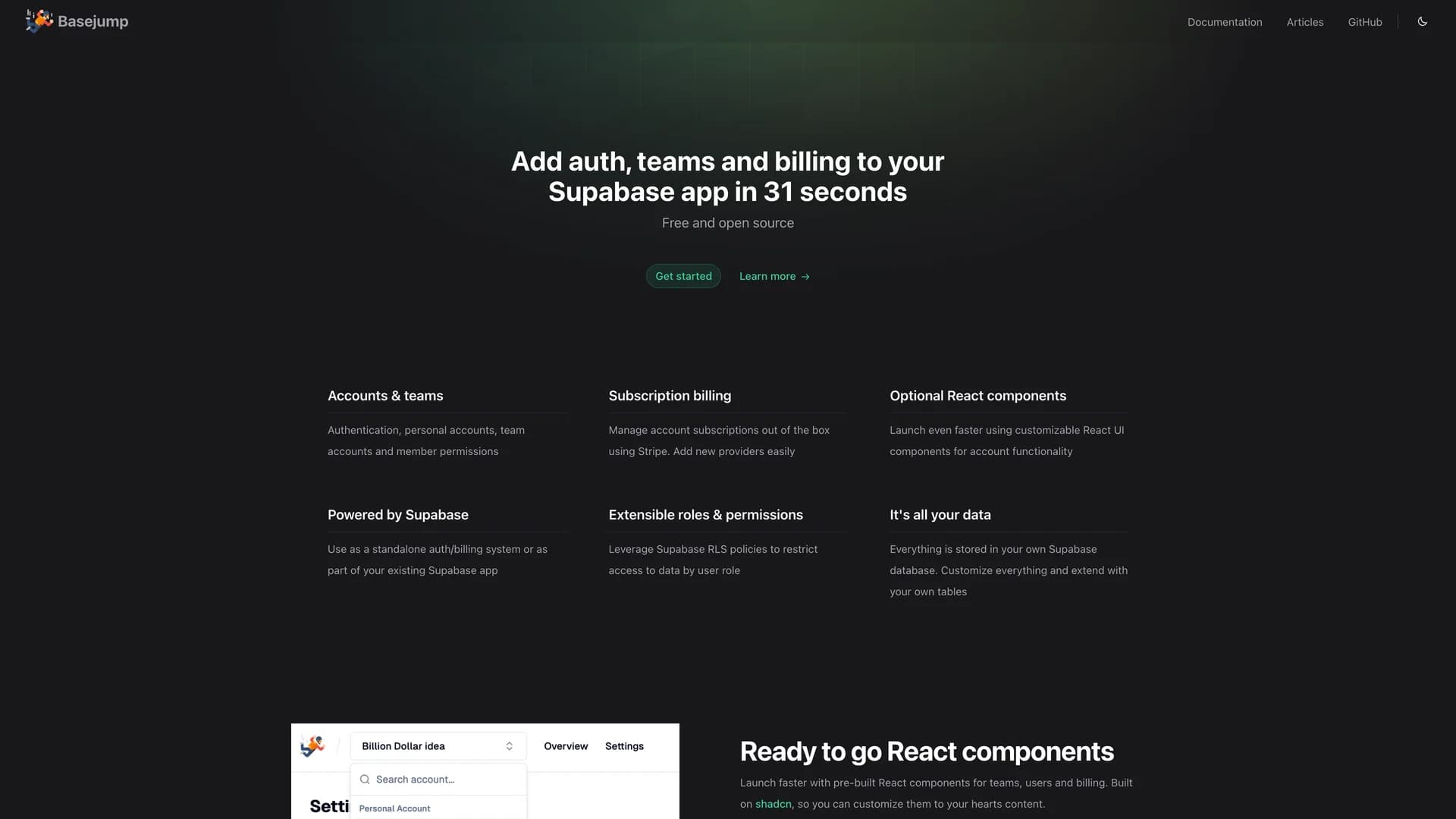
 Supabase
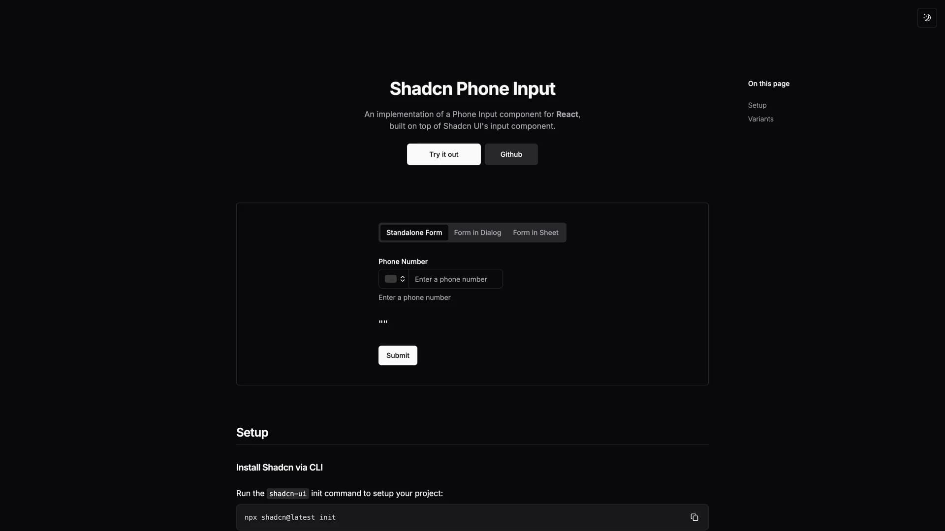
 Nextjs
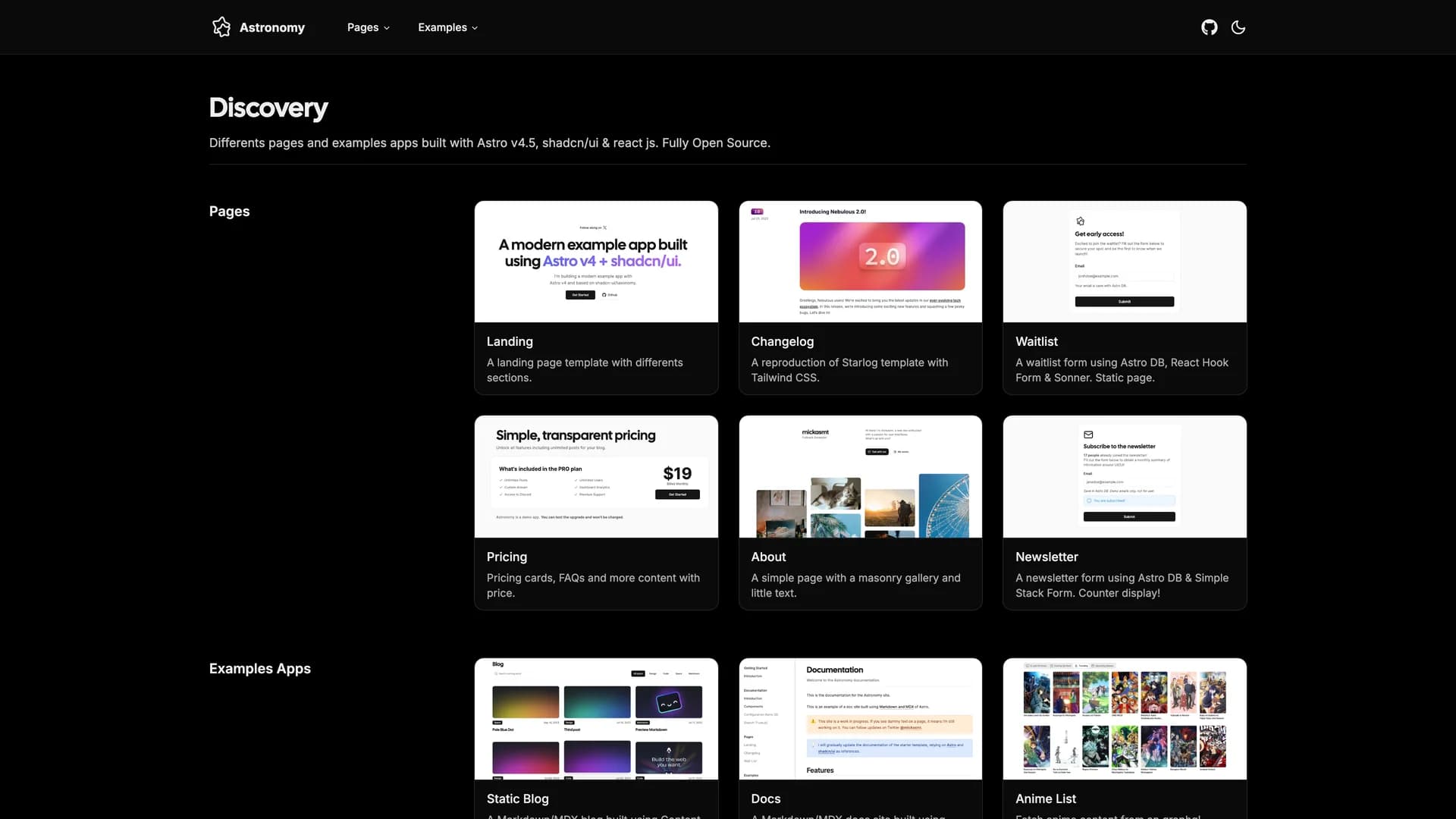
 Astro
Astro
 Radix ui
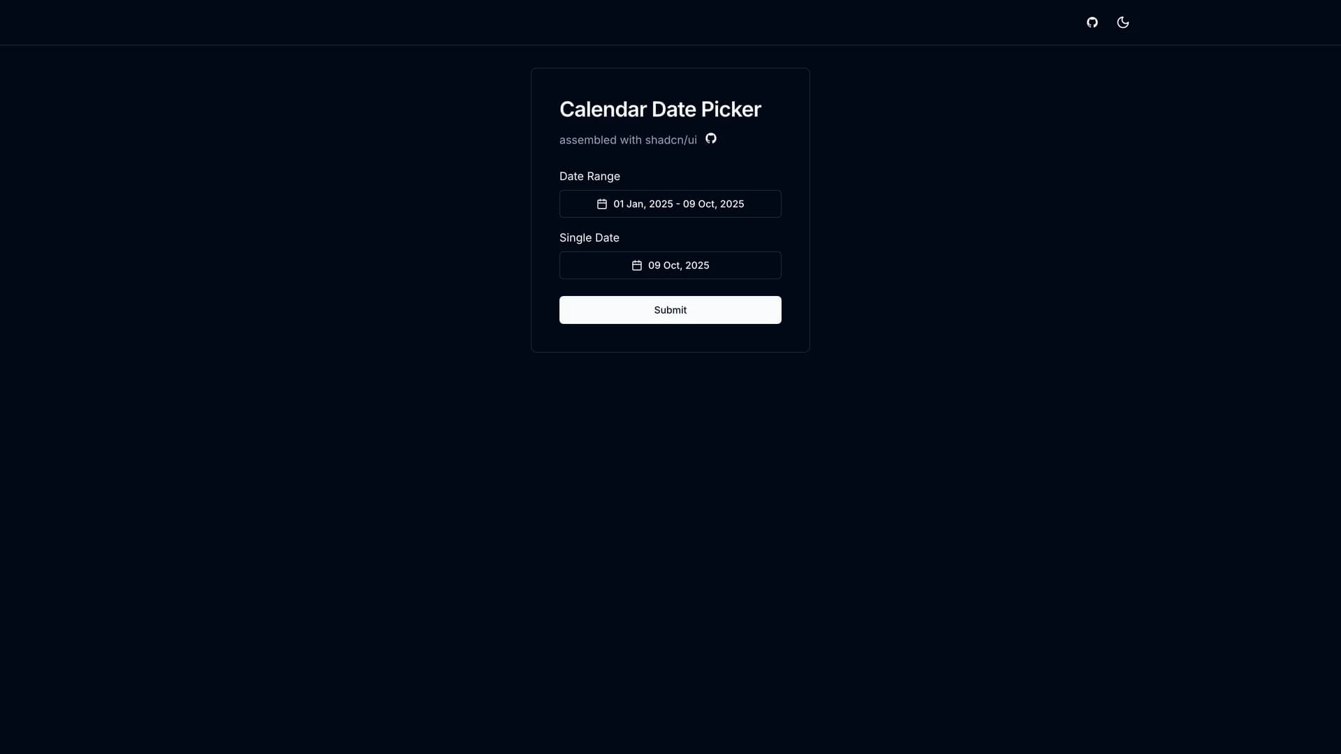
 Remix
Remix Vite
Vite