Make your AI a shadcn expert
shadcn.io
Templates
Blocks
MCP
Browse
Pricing
Search
⌘
K
Sign in
Home
Templates
react native
React Templates - React Native
6 templates • 5 contributors • Open source & free
Available Templates (6)
rnr-docs.vercel.app
React Native Reusables
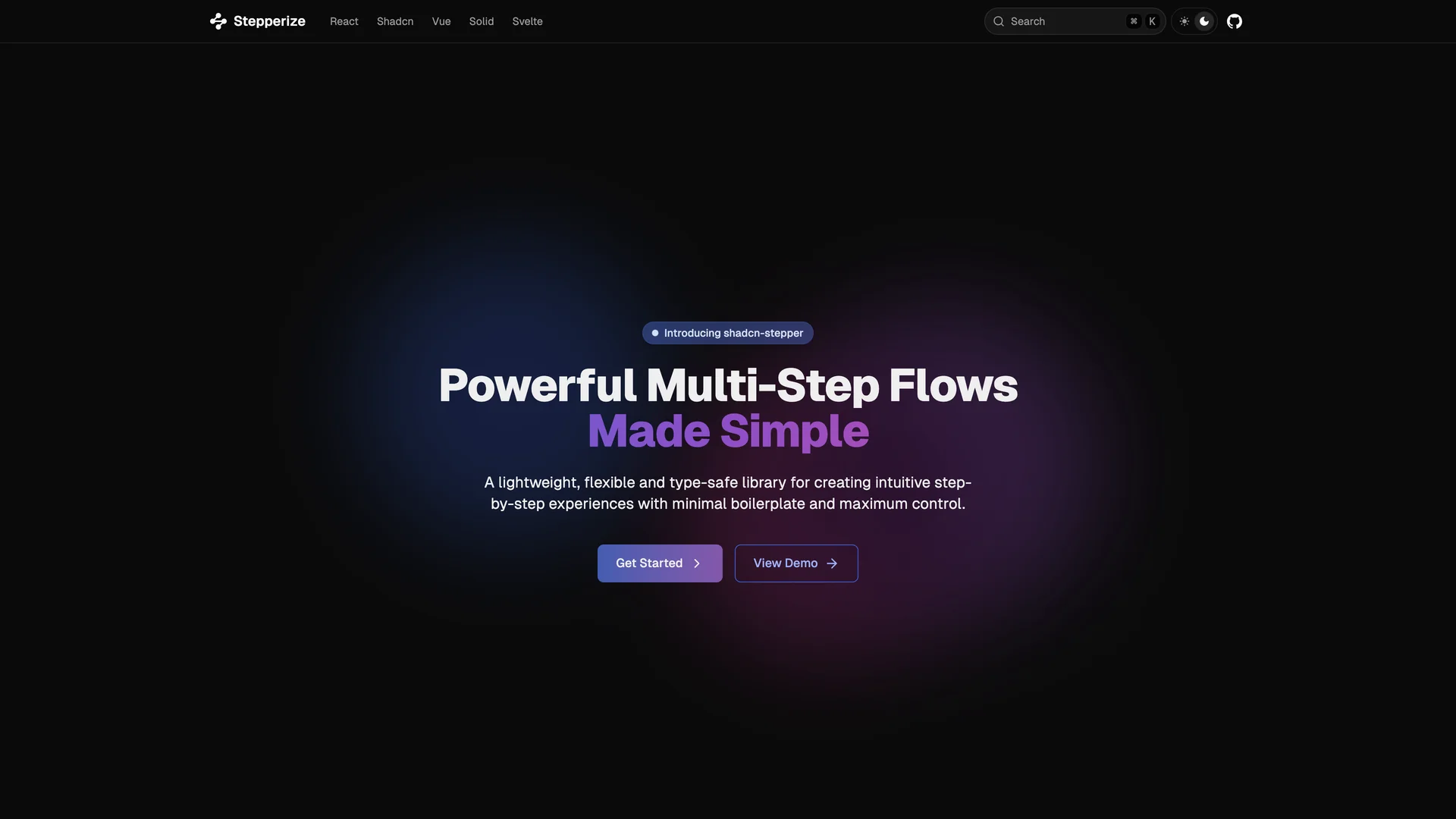
stepperize.vercel.app
Stepperize
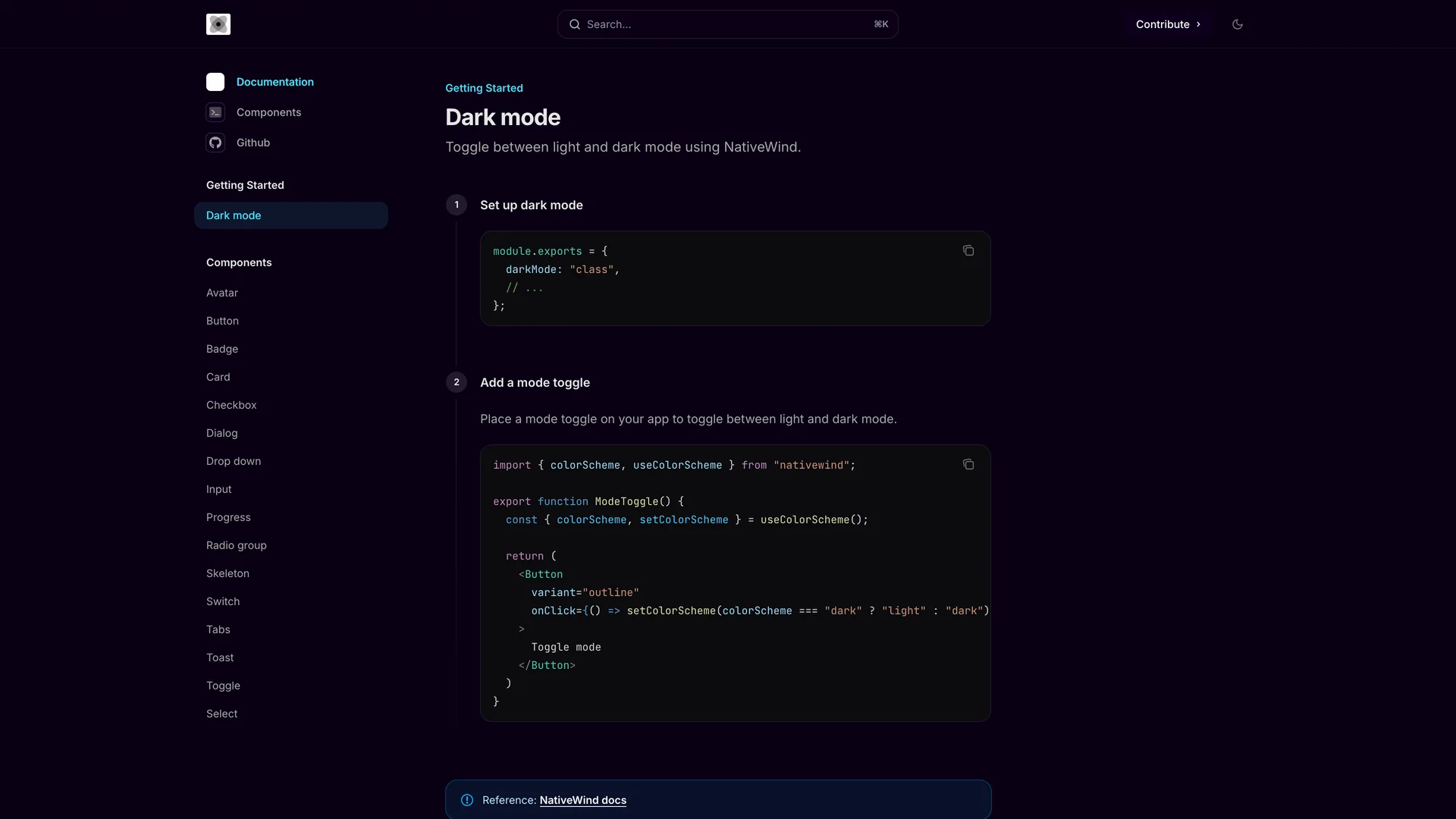
nativecn.mintlify.app
Nativecn UI
stepperize.vercel.app
Shadcn Stepper
usedom.expo.app
Expo DOM Components Example
nativecn.xyz
NativeCN
Authors in react native
D
Damianricobelli
2 templates
M
Mrzachnugent
1 templates
M
Mobilecn ui
1 templates
E
Evanbacon
1 templates
T
Tailwiinder
1 templates
Related Categories
React
4 templates
·
3 authors
Tailwind
3 templates
·
3 authors
Radix ui
1 templates
·
1 authors
Scss
1 templates
·
1 authors
Ui kits & component libraries
1 templates
·
1 authors
Scroll to top
Get Pro — Save 33%
·
Ends in
--:--:--
→


