React Templates - React
179 templates • 146 contributors • Open source & free
Available Templates (179)
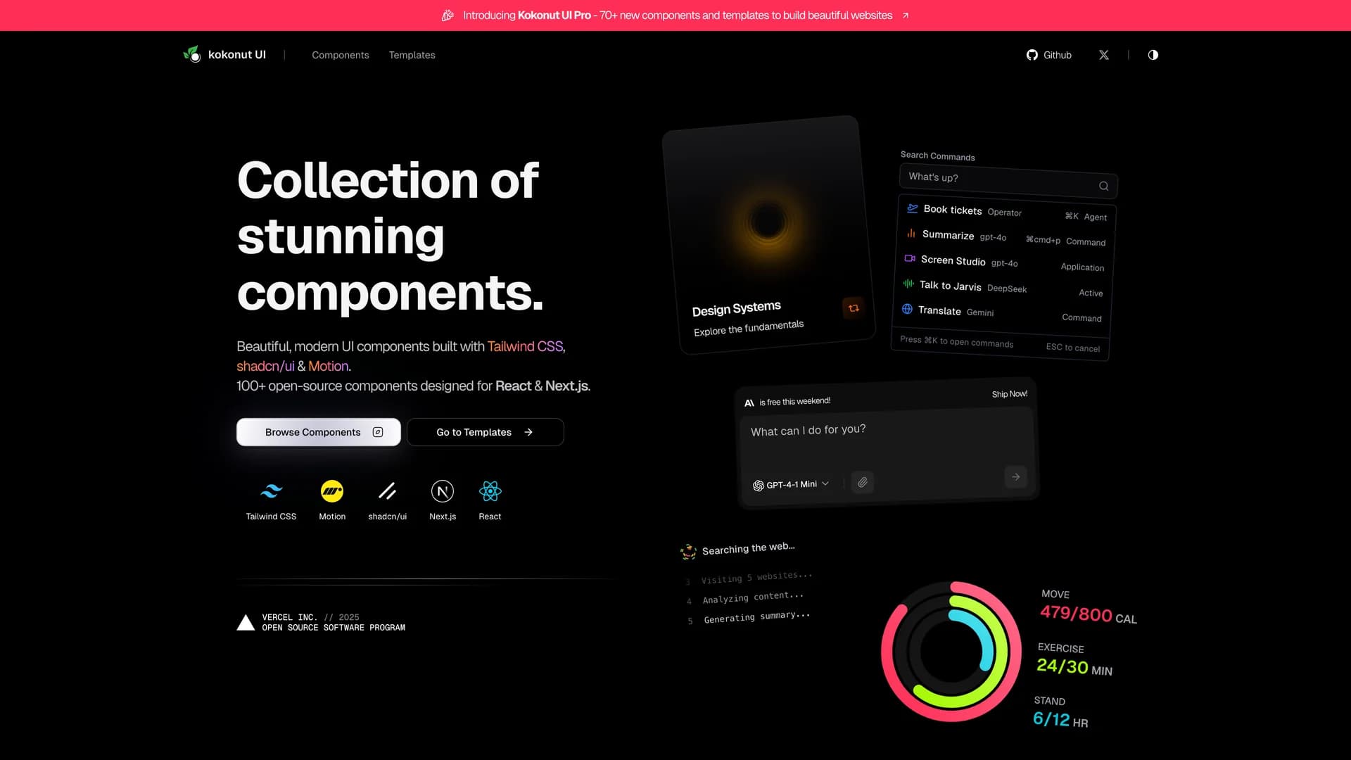
- Kokonut UIKokonut UI is a collection of animated, accessible UI components built with React, Tailwind CSS, and Framer Motion, providing production-ready components with smooth animations and modern design patterns. The open-source library offers copy-and-paste components following shadcn/ui's philosophy, including animated cards, interactive buttons, smooth transitions, and engaging micro-interactions that enhance user experience. Built with TypeScript for type safety, the components integrate Framer Motion's animation capabilities with Tailwind CSS utility classes, creating visually polished interfaces without complex animation code. Each component is designed for accessibility with proper ARIA attributes, keyboard navigation support, and responsive behavior across devices. Perfect for marketing websites, landing pages, SaaS applications, or any project requiring eye-catching animations and professional polish beyond basic UI primitives, Kokonut UI demonstrates how to combine animation libraries with utility-first CSS for components that are both beautiful and maintainable.
- Kokonut UIKokonut UI is a collection of animated, accessible UI components built with React, Tailwind CSS, and Framer Motion, providing production-ready components with smooth animations and modern design patterns. The open-source library offers copy-and-paste components following shadcn/ui's philosophy, including animated cards, interactive buttons, smooth transitions, and engaging micro-interactions that enhance user experience. Built with TypeScript for type safety, the components integrate Framer Motion's animation capabilities with Tailwind CSS utility classes, creating visually polished interfaces without complex animation code. Each component is designed for accessibility with proper ARIA attributes, keyboard navigation support, and responsive behavior across devices. Perfect for marketing websites, landing pages, SaaS applications, or any project requiring eye-catching animations and professional polish beyond basic UI primitives, Kokonut UI demonstrates how to combine animation libraries with utility-first CSS for components that are both beautiful and maintainable.
- Next StarterNext Starter is a comprehensive Next.js 16 template combining modern development tools including TypeScript, Tailwind CSS, shadcn/ui components, Drizzle ORM, and comprehensive testing setup for rapid application development. The MIT-licensed starter provides a complete development environment with ESLint and Prettier configurations, Husky pre-commit hooks, React Hook Form for form management, and Zod schema validation for type-safe data handling. Built on Next.js App Router with React Server Components, the template includes database integration through Drizzle ORM with PostgreSQL, authentication scaffolding, and deployment optimization for Vercel. The project structure follows Next.js best practices with organized component architecture, utility functions, custom hooks, and environment variable management. Perfect for developers starting new Next.js projects who want production-ready tooling, testing infrastructure with Jest and React Testing Library, and a curated set of libraries that work well together without the complexity of larger boilerplates.
- CredenzaCredenza is a responsive modal component for shadcn/ui that automatically adapts between dialog and drawer layouts based on screen size, providing optimal user experience across all devices. The MIT-licensed component seamlessly switches from full-screen dialogs on desktop to bottom-drawer sheets on mobile, eliminating the need to manually manage different modal implementations for different viewport sizes. Built with React, TypeScript, shadcn/ui components, Vaul for drawer functionality, and Tailwind CSS, Credenza provides a unified API through composable sub-components including Trigger, Content, Header, Footer, and Body elements. The component supports both declarative and state-based modal management, integrating perfectly with existing shadcn/ui projects while leveraging Vaul's smooth drawer animations. Perfect for applications requiring modals, forms, confirmations, or content overlays that need to work beautifully on both mobile and desktop without writing responsive logic manually.
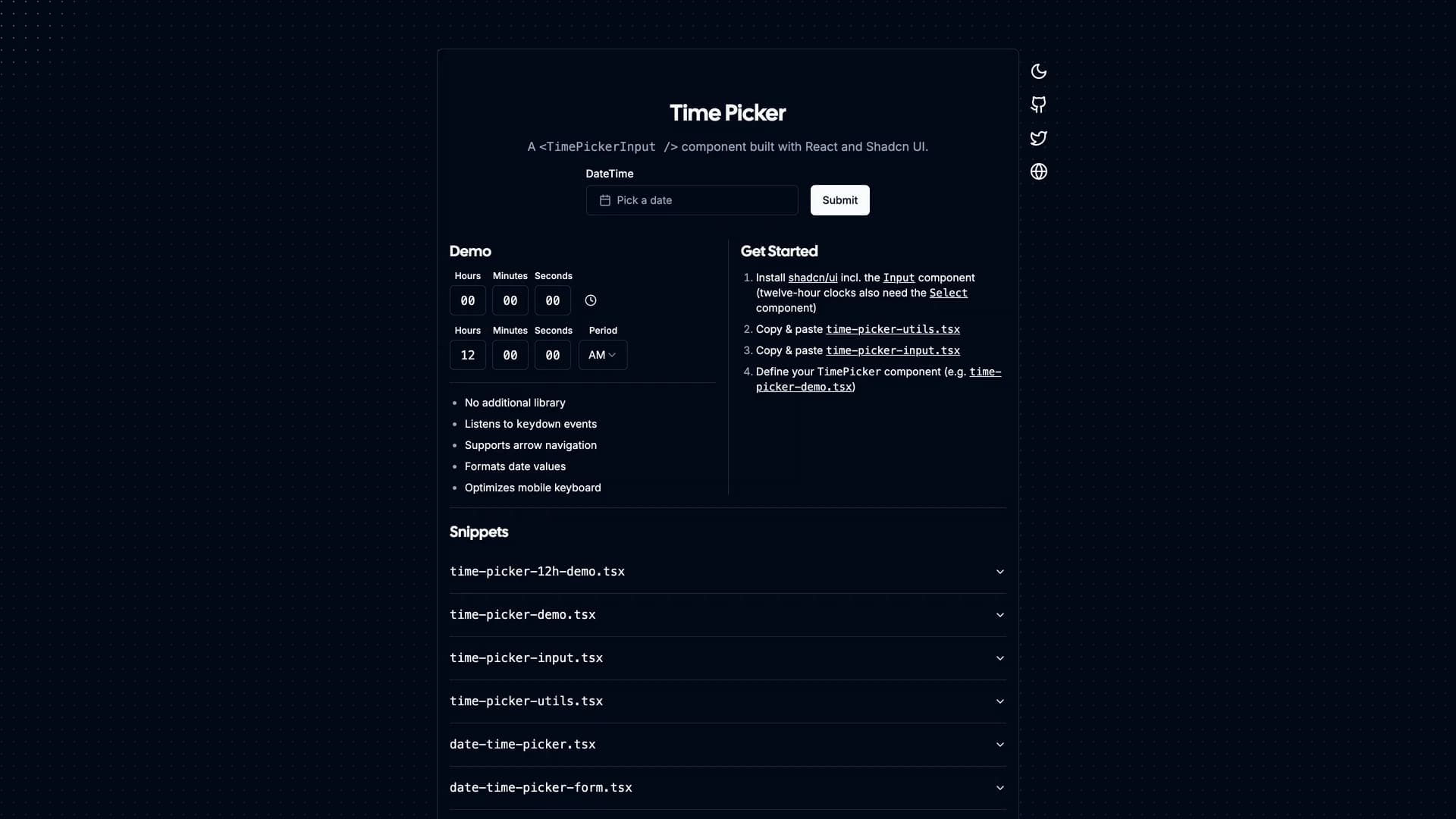
- Time PickerTime Picker is a simple, lightweight time selection component designed specifically for shadcn/ui projects with a clean, customizable interface for precise time input. The MIT-licensed component provides an intuitive time selection experience with keyboard support, proper validation, and seamless integration with shadcn/ui's design system and form components. Built with TypeScript, React, Next.js, and Tailwind CSS, the picker offers a minimalist approach to time selection without unnecessary complexity or dependencies. The component follows shadcn/ui's copy-and-paste philosophy, allowing developers to customize styling, time formats, and validation rules directly in their codebase. Perfect for booking systems, scheduling interfaces, appointment forms, or any application requiring time input with a polished, accessible user experience that matches shadcn/ui's design language and component patterns.
- FramelyFramely is an open-source, lightweight drag-and-drop website editor built with Next.js that provides multi-tenant architecture with full subdomain support for creating modern web applications. The MIT-licensed platform offers a fully customizable, user-friendly interface for building websites through an intuitive drag-and-drop system without requiring extensive coding knowledge. Built with Next.js, Tailwind CSS, Prisma ORM with MySQL, Clerk authentication, and Umami Analytics, Framely provides a complete full-stack solution for website creation with custom domain configurations and tenant isolation. The platform is designed as a flexible boilerplate that developers can customize and extend, welcoming community contributions to shape its evolution. Perfect for SaaS platforms offering website building capabilities, multi-tenant applications requiring subdomain support, agency tools for client website management, or any project needing a developer-friendly website editor that balances ease-of-use with technical flexibility and scalability.
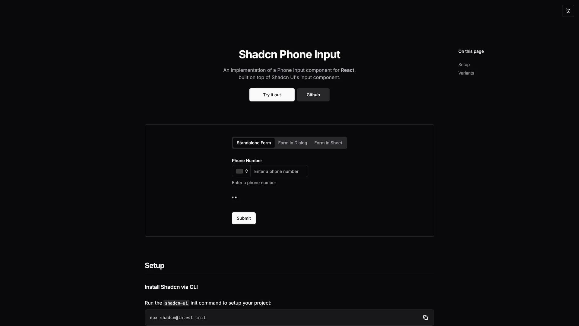
- Shadcn Phone InputShadcn Phone Input is a customizable international phone number input component built specifically for shadcn/ui with comprehensive validation for any country worldwide. The MIT-licensed component provides seamless country selection with flag icons, automatic formatting based on selected country, and robust validation using the react-phone-number-input library integrated with Zod for form validation. Built with React, TypeScript, Tailwind CSS, and shadcn/ui components, the phone input fills a gap in the shadcn ecosystem by providing a production-ready solution for international phone number collection with proper validation and formatting. The component supports optional phone number fields, clear error messaging for invalid numbers, and flexible form integration with React Hook Form. Perfect for user registration forms, contact information collection, e-commerce checkout flows, or any application requiring international phone number input with proper validation, country detection, and a clean modern UI design that matches shadcn/ui's aesthetic.
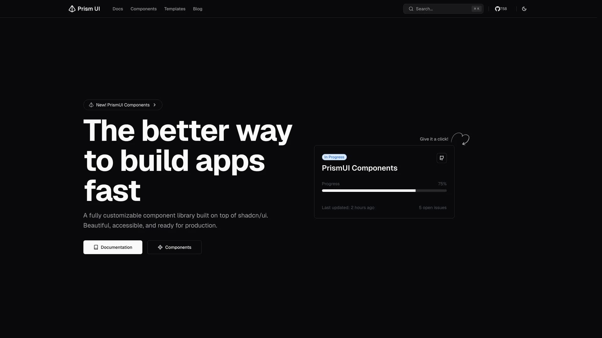
- Prism UIPrism UI is a fully customizable component library extending shadcn/ui with pre-built page sections, complex layouts, and production-ready templates for rapid application development. The open-source library provides ready-to-use components including hero sections, feature grids, responsive navigation systems, footer variations, and MDX components for blogs and documentation, all built with accessibility and customization in mind. Built with Next.js 16 and React Server Components, Radix UI primitives, Tailwind CSS, and TypeScript, Prism UI offers developers a comprehensive ecosystem for creating stunning web applications faster than building from scratch. The library extends shadcn/ui's primitive components with higher-level patterns and page sections, supporting dark mode, responsive design across all devices, and full TypeScript type safety. Perfect for marketing websites, landing pages, documentation sites, or any project requiring beautiful, accessible UI patterns beyond basic components, Prism UI helps developers ship polished interfaces quickly while maintaining the flexibility to customize every aspect of the design.
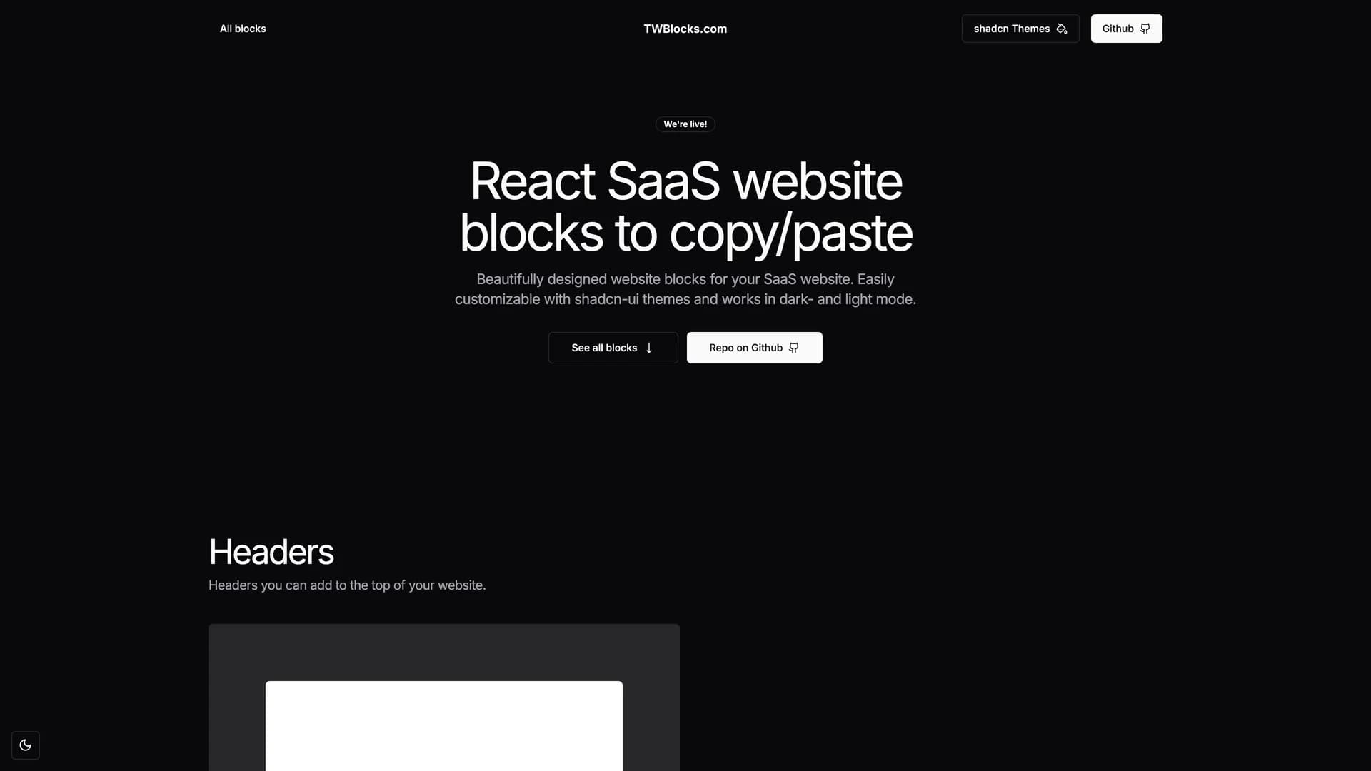
- TWBlocksTWBlocks is a free, open-source collection of ready-to-use website blocks built with shadcn/ui, Radix UI, Tailwind CSS, and Next.js that developers can easily copy and paste into React projects. The MIT-licensed library provides visually consistent, production-ready components including headers, hero sections, feature displays, CTAs, pricing tables, FAQs, blog layouts, contact forms, and footers, all designed to work seamlessly together. Built with TypeScript and supporting both dark and light modes through shadcn themes, TWBlocks eliminates the need to build common website sections from scratch while maintaining full customization capabilities. Each block requires shadcn UI installation and can be customized through shadcn's theming system, providing a balance between ready-to-use components and design flexibility. Perfect for landing pages, marketing websites, portfolio sites, or any React project requiring polished website sections without the time investment of building components from scratch, TWBlocks accelerates development while maintaining code quality and visual consistency across all blocks.
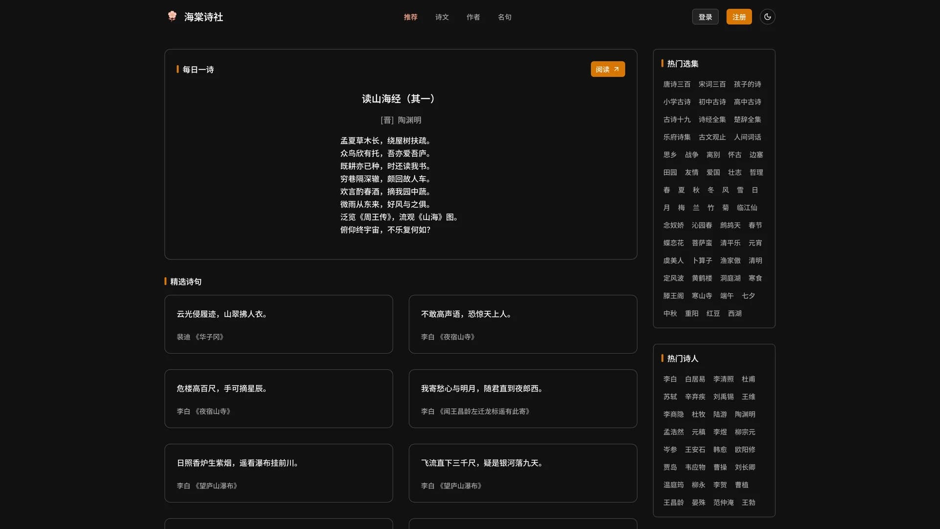
- HaitangHaitang Poetry Society (海棠诗社) is a digital platform dedicated to classical Chinese poetry, creating an immersive cultural sanctuary for exploring thousands of traditional poems through an elegant, modern interface. The MIT-licensed application provides comprehensive search capabilities by collections, dynasties, poets, and individual poems, along with curated categories based on themes like festivals, seasons, and geographical regions. Built with Astro for optimal performance, Tailwind CSS and shadcn/ui for beautiful design, SQLite with Drizzle ORM for efficient data management, and integrated analytics through Umami and Google Analytics, Haitang makes classical Chinese literature accessible to modern audiences. The platform features responsive design with mobile compatibility, dark mode support, and Giscus-powered comments for community engagement around poetry appreciation. Perfect for students of Chinese literature, poetry enthusiasts, cultural preservation projects, or educational platforms, Haitang demonstrates how to build culturally significant applications with modern web technologies while maintaining the elegance and depth of traditional Chinese poetic heritage.
- SortableSortable is a headless drag-and-drop component built with shadcn/ui, Radix UI, and dnd-kit, providing flexible and accessible sortable UI primitives for React applications. The MIT-licensed component offers smooth, customizable drag-and-drop functionality with integration support for react-hook-form and TanStack Table, enabling developers to build sortable lists, tables, and grids without wrestling with complex drag-and-drop logic. Built with Next.js, TypeScript, Tailwind CSS, and Zod validation, Sortable provides a headless approach where developers control the visual presentation while the component handles interaction states, accessibility, and keyboard navigation. The component supports various deployment options including Vercel, Netlify, and Docker, making it versatile for different hosting environments. Perfect for admin interfaces with reorderable lists, kanban boards, data tables with row reordering, file managers, or any application requiring intuitive drag-and-drop sorting with proper accessibility support and smooth animations powered by dnd-kit's optimized drag-and-drop engine.
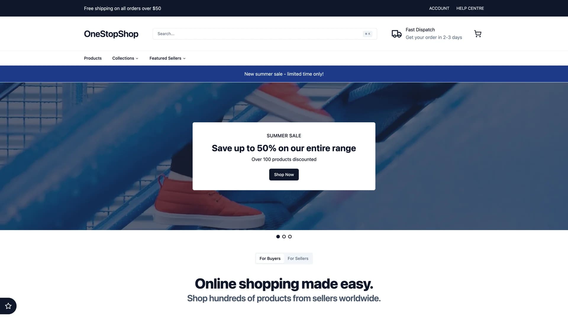
- OneStopShopOneStopShop is an online marketplace built with Next.js 13 App Router demonstrating cutting-edge features including React Server Components, Server Actions for mutations, and parallel and intercepting routes for seamless user experiences. The MIT-licensed platform enables users to buy and sell products through a comprehensive e-commerce system with seller profiles, product management, and integrated payment processing via Stripe Connect with platform fees and seller payouts. Built with Next.js 13, Drizzle ORM, PlanetScale MySQL, Clerk authentication, UploadThing for file uploads, and Tailwind CSS with shadcn/ui components, the marketplace showcases advanced routing techniques like intercepted routes for product quick view modals and new product creation workflows. The seller-focused architecture allows users to create profiles, manage product listings, and collect payments through Stripe's marketplace features. Perfect for learning Next.js 13's latest capabilities, building multi-vendor marketplaces, e-commerce platforms with seller management, or any project requiring modern server-side rendering patterns with experimental features demonstrating the future of React and Next.js development.
 Nextjs
 React
React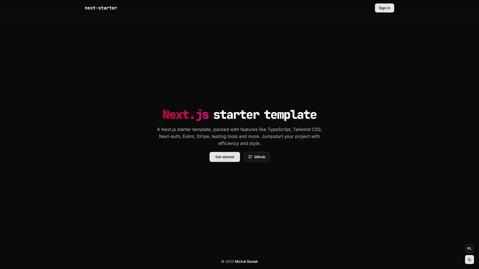
 Tailwind
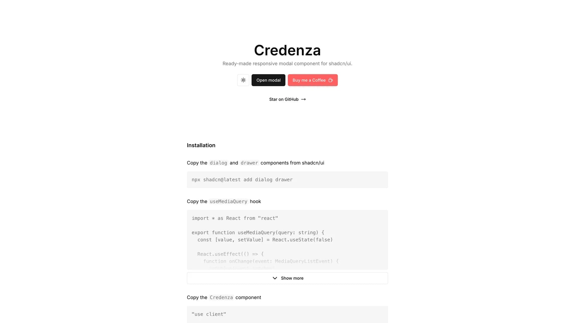
 Astro
Astro Scss
Scss