React Templates - React
179 templates • 146 contributors • Open source & free
Available Templates (179)
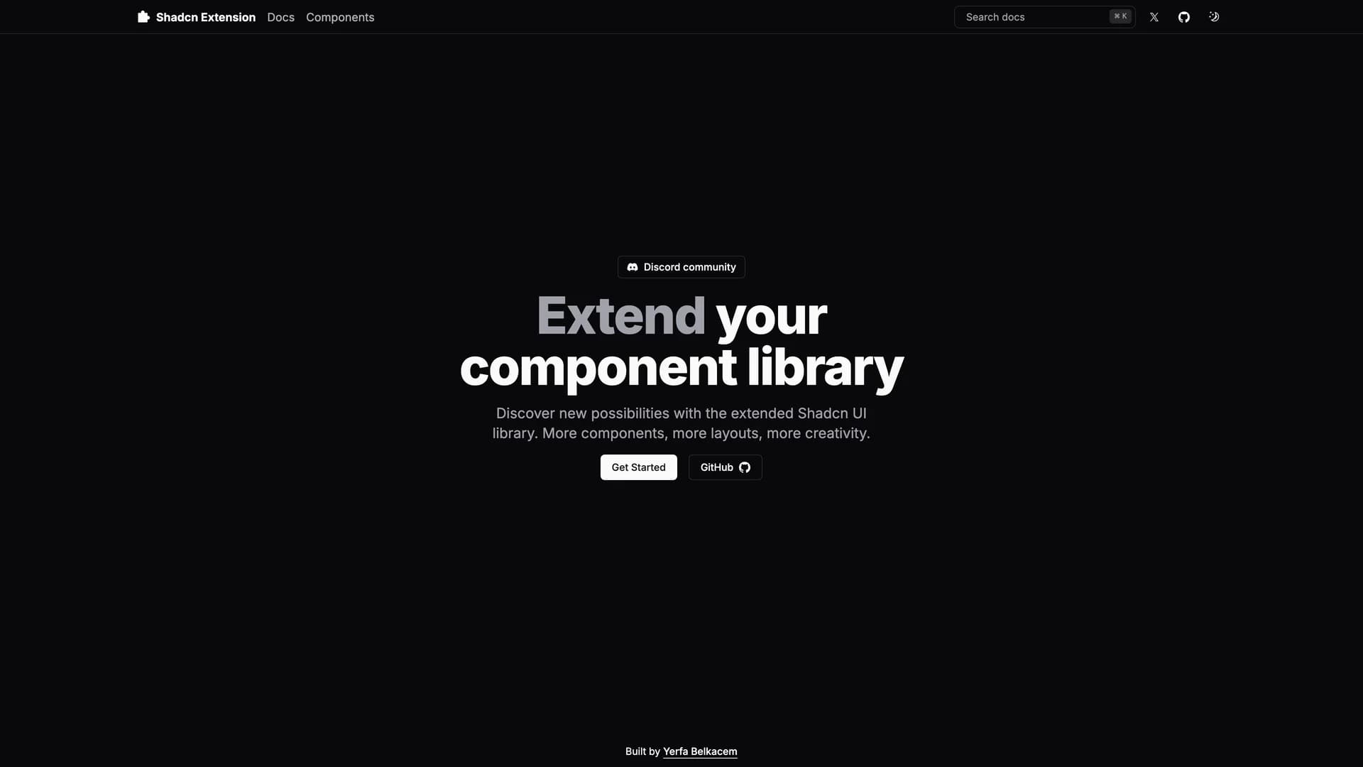
- Shadcn ExtensionShadcn Extension is an open-source component collection that extends UI libraries with additional shadcn/ui components, built using a Turborepo monorepo architecture with TypeScript, Next.js, Tailwind CSS, and Radix UI. The project provides a structured framework for developing and sharing reusable React components with a CLI that automates repetitive tasks like creating new components and managing dependencies. Organized into apps and packages directories, the extension offers a component registry mechanism that makes it easy to add custom components to projects while maintaining consistency with shadcn/ui's design principles. Built with pnpm for efficient package management, the monorepo structure allows developers to work on multiple related packages simultaneously while sharing common configuration and tooling. Perfect for teams building design systems or developers creating component libraries, Shadcn Extension provides the infrastructure to develop, test, and distribute high-quality UI components. The project demonstrates best practices for component library development including TypeScript for type safety, modular architecture for maintainability, and automated tooling for developer productivity.
- Shadcn StepperShadcn Stepper is a component registry template for creating custom component libraries using Next.js, TypeScript, and shadcn/ui, enabling developers to distribute custom React components, hooks, and pages to any project. Written primarily in TypeScript (85.8%), the template uses a registry.json file to define components and supports the shadcn build command to compile the registry into static JSON files served to consuming applications. Compatible with Shadcn CLI and v0 integration, it provides infrastructure for running your own component registry similar to shadcn/ui's official registry but for custom components. The template demonstrates how to package and distribute UI components in a way that developers can install via CLI commands, maintaining the copy-paste philosophy while adding discovery and versioning capabilities. Perfect for teams building internal design systems, component library maintainers, or developers wanting to share custom shadcn/ui-compatible components, the registry template handles the build process, serving, and CLI integration needed for a professional component distribution system.
- OnbordaOnborda is a lightweight onboarding wizard and product tour library for Next.js applications that uses Framer Motion for smooth animations and Tailwind CSS for styling, with full shadcn/ui compatibility. The library enables developers to create customizable, interactive product tours that guide users through application features with configurable tooltips, pointers, and step-by-step flows. Supporting multiple tours in a single implementation, Onborda provides flexible step configuration including custom icons, positioning options (top, bottom, left, right), route navigation between steps, and custom card/tooltip designs. Features include customizable shadow and overlay effects, interactive overlay controls, smooth transitions between steps, and declarative tour definitions using simple selector-based targeting. The library handles complex scenarios like multi-page tours that navigate between routes, conditional step display, and custom styling for each tour step. Perfect for SaaS applications needing user onboarding, feature announcements, or guided walkthroughs, Onborda provides a polished user experience with minimal setup. With comprehensive documentation at onborda.dev, the library demonstrates how to create engaging product tours that improve user adoption and feature discovery.
- OnbordaOnborda is a lightweight onboarding wizard and product tour library for Next.js applications that uses Framer Motion for smooth animations and Tailwind CSS for styling, with full shadcn/ui compatibility. The library enables developers to create customizable, interactive product tours that guide users through application features with configurable tooltips, pointers, and step-by-step flows. Supporting multiple tours in a single implementation, Onborda provides flexible step configuration including custom icons, positioning options (top, bottom, left, right), route navigation between steps, and custom card/tooltip designs. Features include customizable shadow and overlay effects, interactive overlay controls, smooth transitions between steps, and declarative tour definitions using simple selector-based targeting. The library handles complex scenarios like multi-page tours that navigate between routes, conditional step display, and custom styling for each tour step. Perfect for SaaS applications needing user onboarding, feature announcements, or guided walkthroughs, Onborda provides a polished user experience with minimal setup. With comprehensive documentation at onborda.dev, the library demonstrates how to create engaging product tours that improve user adoption and feature discovery.
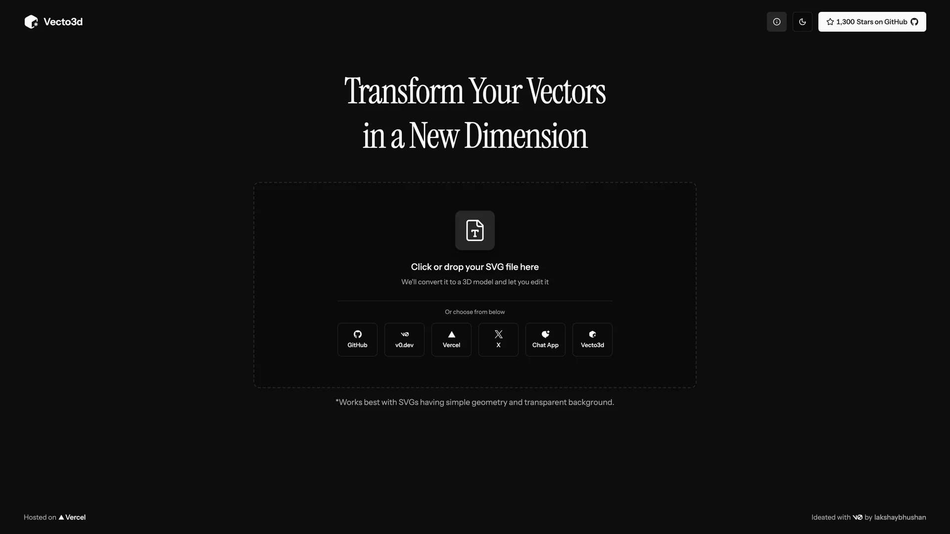
- Vecto3DVecto3d is a web-based tool that converts SVG files, particularly logos, into customizable 3D models with adjustable geometry, materials, and export options. Built with Next.js, Three.js, Tailwind CSS, and shadcn/ui, the MIT-licensed application provides an intuitive interface for transforming 2D vector graphics into 3D models without complex 3D software like Blender. Users can customize thickness and bevels, experiment with different materials including glass, metal, and plastic, preview models in various environments, and export in STL, GLB, and GLTF formats for use in 3D printing or rendering software. The application includes a unique vibe mode that adds dreamy effects with bloom and soft shadows to the preview panel, creating artistic visualizations of 3D models. With the ability to export high-resolution PNG images alongside 3D files, Vecto3d serves designers, marketers, and developers who need to quickly create 3D versions of logos or simple graphics for presentations, websites, or 3D printing. Perfect for creating 3D logos, product mockups, or promotional materials, the tool makes 3D model creation faster and easier than traditional 3D modeling workflows while maintaining quality output suitable for professional use.
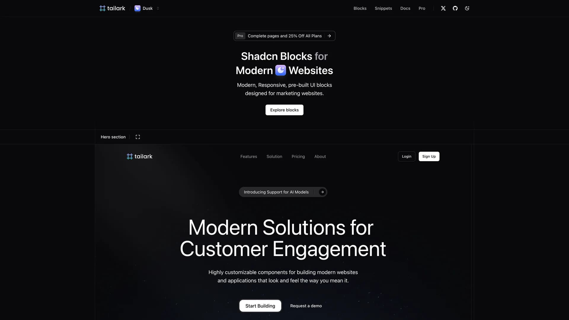
- Tailark BlocksTailark Blocks is a collection of responsive, pre-built UI components specifically designed for marketing websites, built with shadcn/ui, Tailwind CSS, Next.js, and TypeScript to accelerate website development. With over 1,800 GitHub stars, this MIT-licensed project provides ready-to-use marketing blocks including hero sections, feature showcases, pricing tables, testimonials, call-to-action sections, and footer designs that can be copied directly into projects. Written almost entirely in TypeScript (99%), Tailark Blocks eliminates the time-consuming process of designing and coding common marketing page sections by providing professionally designed, conversion-optimized components. The responsive design ensures all blocks work seamlessly across desktop, tablet, and mobile devices, while the integration with shadcn/ui and Tailwind CSS allows for easy customization to match brand requirements. Developers can quickly assemble landing pages, product pages, or marketing sites by combining pre-built blocks, then customize colors, spacing, typography, and content to fit specific needs. Perfect for startups needing quick landing pages, agencies building client websites, or developers creating marketing sites for SaaS products, Tailark Blocks demonstrates how component libraries can accelerate web development while maintaining design quality and responsiveness.
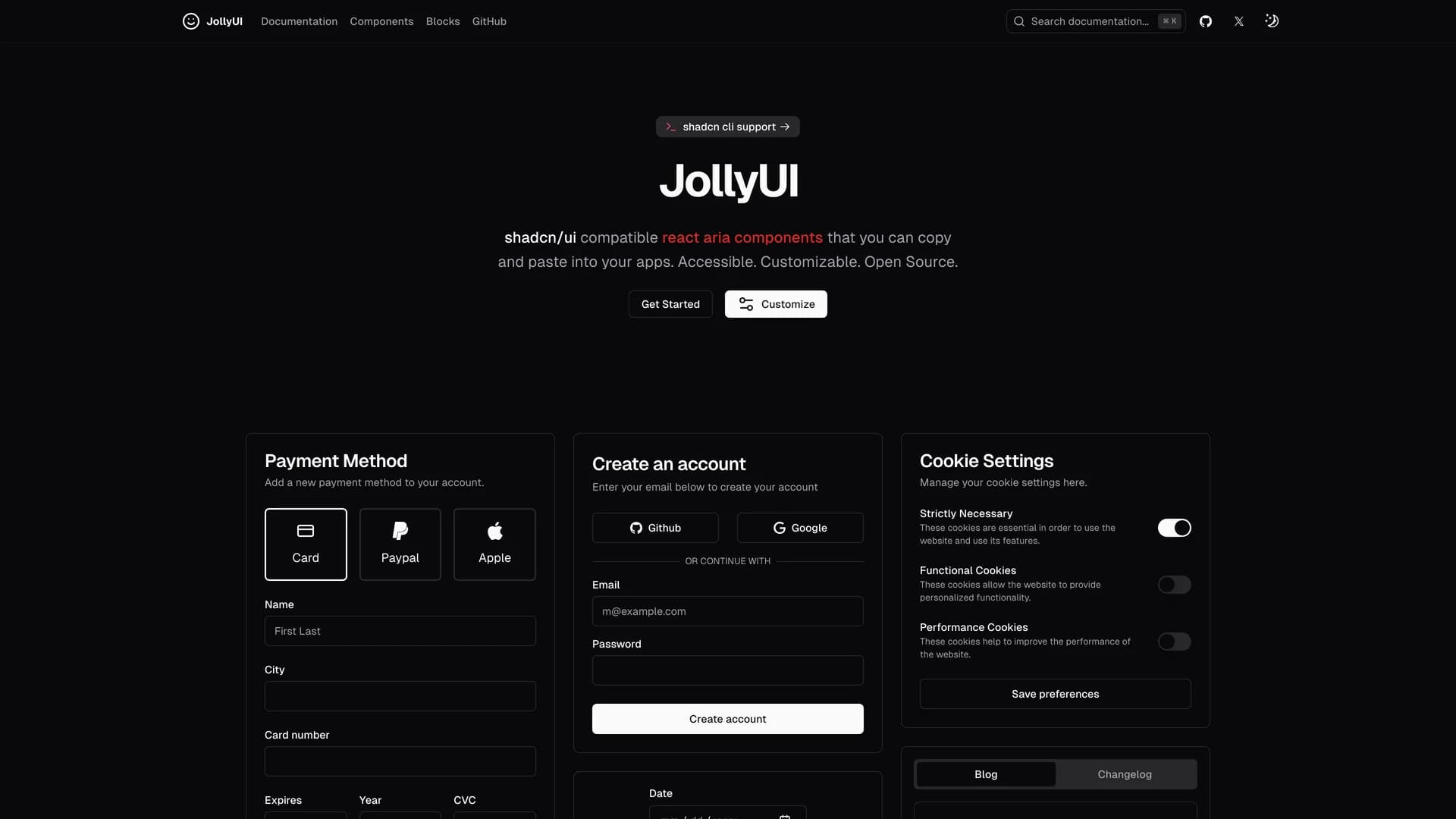
- Jolly UIJolly UI is an open-source React component library that provides accessible, customizable components built with React Aria and compatible with shadcn/ui, allowing developers to copy and paste production-ready accessible components into their applications. Written primarily in TypeScript (86.9%), the library combines React Aria's robust accessibility primitives with Tailwind CSS styling and shadcn/ui's design language to deliver components that are both beautiful and fully accessible. Maintained by James Shopland with community contributions, Jolly UI offers comprehensive documentation at jollyui.dev covering component APIs, usage examples, and integration guides. The library focuses on providing high-quality, accessible alternatives to standard UI components, ensuring keyboard navigation, screen reader support, and ARIA compliance work correctly out of the box. Built with Next.js and leveraging React Aria's proven accessibility foundations, Jolly UI components handle complex interactions like focus management, keyboard shortcuts, and touch interactions while maintaining visual consistency with shadcn/ui projects. Perfect for developers who need shadcn/ui-compatible components with React Aria's superior accessibility features, Jolly UI demonstrates how to build inclusive user interfaces that meet WCAG standards without sacrificing design quality or developer experience.
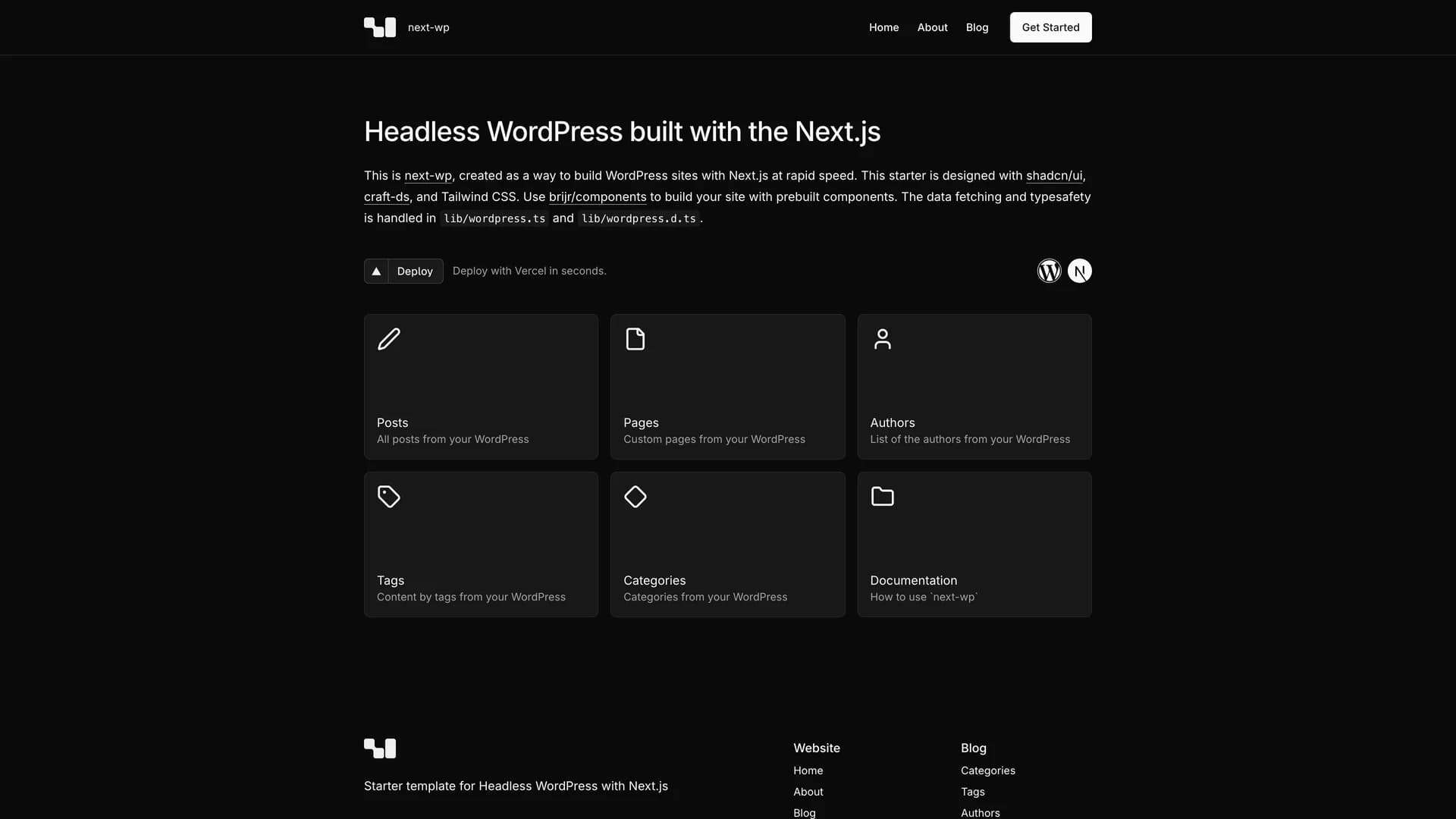
- Next WordPressNext WordPress is a headless WordPress starter template built with Next.js 16 and the WordPress REST API, offering a modern approach to content management with React Server Components and cutting-edge web technologies. The MIT-licensed project provides efficient pagination using query parameters, full TypeScript type safety with Zod schema validation, shadcn/ui components for beautiful design, and Tailwind CSS styling for rapid development. Built on Next.js App Router architecture with React Server Components, the template delivers fast page loads through server-side rendering while maintaining SEO-friendly URLs and proper metadata handling. The WordPress integration uses the REST API to fetch posts, pages, and custom content types with built-in support for featured images, post metadata, and taxonomy terms. Perfect for content-heavy websites, blogs, marketing sites, or any project requiring WordPress's powerful content management capabilities combined with Next.js's modern development experience and performance optimizations.
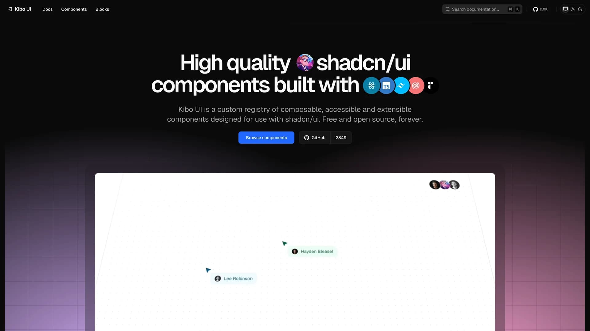
- Kibo UIKibo UI is a custom component registry template that extends shadcn/ui's philosophy to more complex, opinionated components requiring business logic and state management. The MIT-licensed project provides a curated collection of advanced UI components including enhanced data tables, multi-step forms, command palettes, and feature-rich input controls that go beyond shadcn/ui's primitive building blocks. Built with Next.js 16, TypeScript, Tailwind CSS, and Radix UI primitives, Kibo demonstrates how to create a custom registry following shadcn/ui's architecture while adding components with integrated functionality like drag-and-drop file uploads, advanced search interfaces, and complex form validation. The template includes a complete documentation site powered by Fumadocs, showing developers how to build, document, and distribute their own component libraries using the same CLI-based installation approach that makes shadcn/ui popular. Perfect for teams building design systems, developers creating reusable component libraries, or projects requiring sophisticated UI patterns with built-in business logic beyond basic primitives.
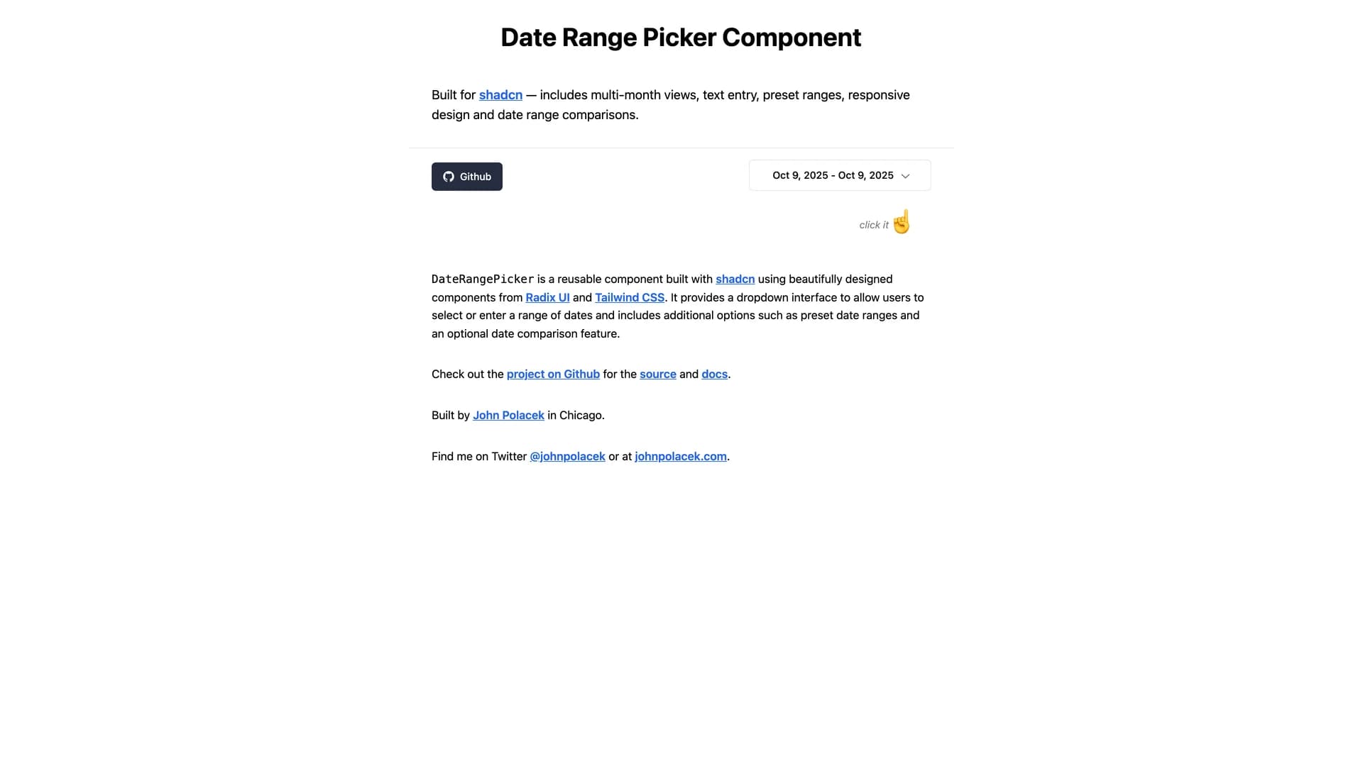
- Date Range PickerDate Range Picker for shadcn is a comprehensive date range selection component built on shadcn/ui's design system with support for presets, comparison ranges, and advanced filtering. The MIT-licensed component integrates seamlessly with shadcn/ui projects, providing a polished interface for selecting date ranges with pre-defined options like "Last 7 days," "Last 30 days," and "This month" alongside custom range selection. Built with React, TypeScript, and date-fns for reliable date handling, the picker includes comparison mode for analyzing period-over-period metrics, single date selection mode, and customizable preset configurations. The component follows shadcn/ui's philosophy of being copy-and-paste ready rather than installed as a dependency, allowing developers to customize styling, behavior, and presets directly in their codebase. Perfect for analytics dashboards, reporting interfaces, booking systems, or any application requiring sophisticated date range selection with user-friendly presets and comparison capabilities common in platforms like Google Analytics or business intelligence tools.
- Enhanced ButtonEnhanced Button is a feature-rich button component extending shadcn/ui's Button with built-in loading states, success animations, error handling, and progress indicators for improved user feedback during async operations. The MIT-licensed component provides automatic state management for promises, displaying loading spinners during execution, success checkmarks on completion, and error states with retry capabilities. Built with React, TypeScript, Framer Motion for smooth animations, and Tailwind CSS for styling, the enhanced button eliminates boilerplate code for common patterns like form submissions, API calls, and async workflows. The component integrates seamlessly with shadcn/ui projects while adding sophisticated interaction patterns including disabled states during loading, customizable success/error messages, progress bars for long-running operations, and automatic state resets. Perfect for form submissions, data mutations, file uploads, or any user action requiring clear feedback about async operation status with professional loading indicators and success confirmations that enhance user experience.
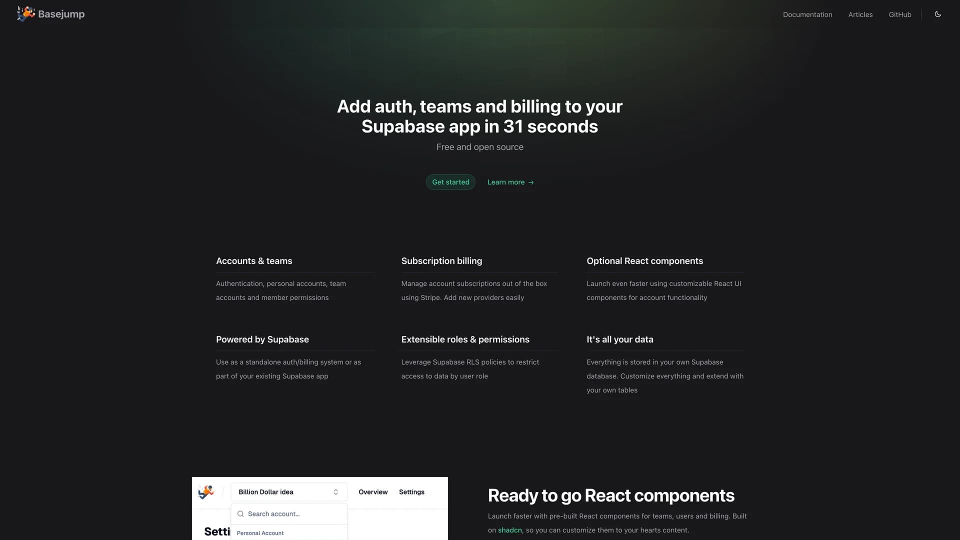
- BasejumpBasejump is a Supabase extension providing production-ready authentication, team accounts, billing, and permission management through database-level schemas and helper functions. The MIT-licensed project extends Supabase with multi-tenant architecture supporting team creation, member invitations, role-based permissions, and subscription billing all managed through PostgreSQL schemas and Row Level Security policies. Built specifically for Supabase projects, Basejump eliminates the need to build common SaaS infrastructure by providing database migrations for account management, team hierarchies, billing integrations, and access control that work seamlessly with Supabase Auth. The extension includes TypeScript client libraries, React hooks for easy frontend integration, and comprehensive documentation for implementing team-based applications where users belong to multiple organizations with different permission levels. Perfect for B2B SaaS platforms, collaborative tools, agency portals, or any application requiring sophisticated multi-tenant architecture with team accounts, role-based permissions, and subscription management built directly into the Supabase database layer.
 Nextjs
 React
React Tailwind
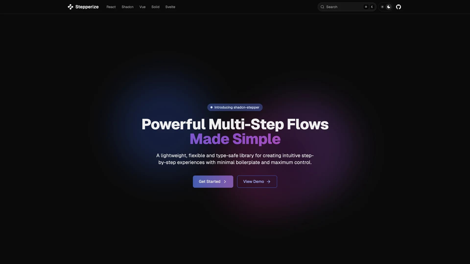
 React native
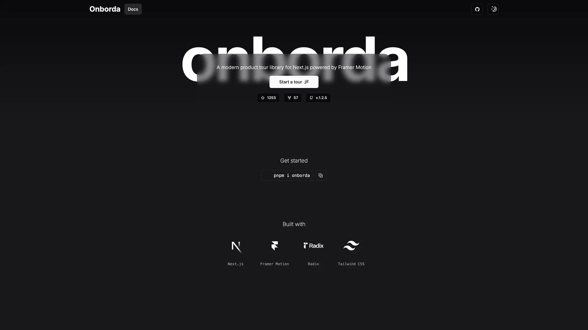

 Supabase