Open source and free shadcn templates using Templates & Themes
16 templates • 14 contributors • Open source & free
16
Templates
14
Authors
Available Templates (16)

Astro Shadcn UI Template
The Astro shadcn/ui Template combines Astro's content-focused static site generation with shadcn/ui's beautiful component library, creating an ideal starter for building fast, content-driven websites with modern interactive components. Built with Astro 4, React, TypeScript, Tailwind CSS, and Radix UI primitives, this template demonstrates how to integrate shadcn/ui components into Astro's island architecture for optimal performance. Astro's unique approach loads JavaScript only for interactive components (islands), making it perfect for content-heavy sites like blogs, documentation, marketing pages, and portfolios that need occasional interactivity without the overhead of a full SPA. The template includes shadcn/ui components configured to work within Astro islands, optimized Tailwind CSS configuration for Astro's build process, TypeScript support for type-safe component development, example pages showing how to use shadcn/ui components in Astro, proper integration of Radix UI for accessibility, and optimal build configurations for production deployment. The setup allows developers to use shadcn/ui's Button, Dialog, Dropdown, and other components within Astro's partial hydration model, shipping minimal JavaScript while maintaining rich interactivity where needed. This template is perfect for building documentation sites with interactive examples and search functionality, marketing websites with contact forms and modals, content-heavy blogs with interactive elements, portfolio sites with project galleries and filtering, and landing pages that need high performance scores with selective interactivity. The combination of Astro's speed with shadcn/ui's polish creates websites that load instantly while still providing excellent user experiences.
 Astro
Astro React
React Tailwind
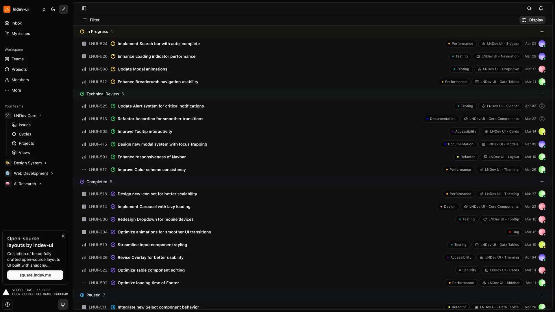
Circle
Circle is a sleek, modern project management interface directly inspired by Linear's renowned design and user experience, built with Next.js, TypeScript, shadcn/ui, and Tailwind CSS to demonstrate how to create production-quality project management tools with contemporary web technologies. With over 2,200 stars on GitHub, this open-source project showcases best practices for building responsive, performant interfaces that handle issue tracking, project organization, and team collaboration. The application features a clean, distraction-free interface optimized for keyboard navigation and rapid task management, comprehensive issue tracking with status labels, priorities, and assignments, project views with Kanban boards and list layouts, team management with member roles and permissions, responsive design that works seamlessly across desktop and mobile devices, real-time updates for collaborative team environments, and keyboard shortcuts for power users who want to move fast. Circle's design philosophy emphasizes speed and clarity, removing unnecessary visual clutter while ensuring all essential information is accessible within one or two clicks. The codebase demonstrates advanced Next.js patterns including server components, optimistic UI updates, proper TypeScript typing throughout the application, and Tailwind CSS organization for maintainable styles. This project is invaluable for developers building internal project management tools for engineering teams, learning how to replicate Linear's elegant UX patterns, creating issue tracking systems for open-source projects, studying modern Next.js architecture with shadcn/ui, and understanding how to build keyboard-first interfaces. Circle serves as both a functional project management tool and an educational resource for developers who admire Linear's approach to software design.
 Nextjs
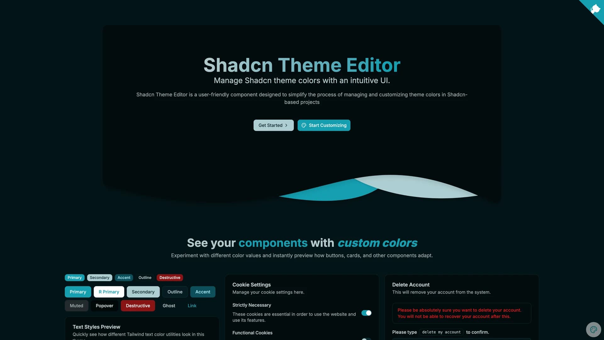
Shadcn Theme Editor
The shadcn Theme Editor is a must-have developer tool that provides an intuitive visual interface for customizing shadcn/ui color themes without manually editing CSS variables or converting between color formats. Built with Next.js, React, TypeScript, and Tailwind CSS, this component allows developers and designers to interactively adjust all theme tokens, preview changes in real-time across light and dark modes, and export ready-to-use CSS configurations. The editor features interactive color pickers for all shadcn/ui theme tokens including background, foreground, primary, secondary, accent, destructive, and border colors, live preview showing how components look with the selected theme applied, automatic HSL to CSS variable conversion eliminating manual color format calculations, one-click copying of generated CSS for immediate integration into projects, preset theme templates to jumpstart customization from popular color schemes, and accessibility contrast checking to ensure color combinations meet WCAG standards. The interface organizes theme tokens by their semantic purpose, making it clear which colors affect buttons versus backgrounds versus text, helping developers understand the shadcn/ui theming system while customizing it. This tool is invaluable for designers creating custom brand themes without CSS expertise, developers building white-label applications requiring multiple tenant-specific themes, teams experimenting with color palettes before committing to final designs, projects needing to match precise brand guidelines with exact color control, and anyone frustrated with manually converting hex colors to the HSL format required by shadcn/ui. The Theme Editor can be installed as a dev dependency via npm or integrated using the Scaflo CLI, bridging the gap between visual design and technical implementation to make theme customization accessible and efficient.
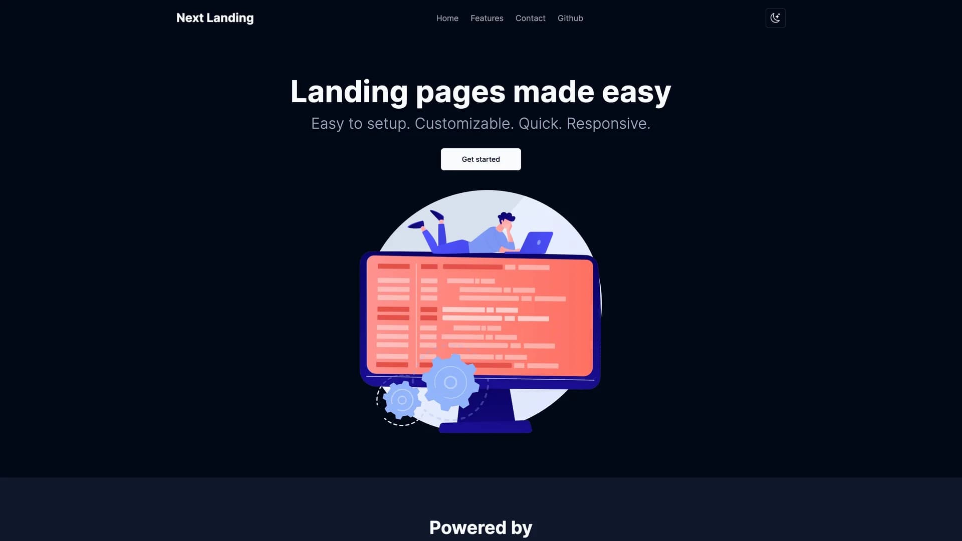
Next Shadcn Landing
Next Shadcn Landing is a streamlined, production-ready landing page template built with Next.js, shadcn/ui, TypeScript, and Tailwind CSS that's designed to be easy to set up, highly customizable, quick to deploy, and fully responsive across all devices. Unlike complex landing page builders or bloated templates, this starter focuses on simplicity and developer experience, allowing you to launch professional landing pages in minutes rather than hours. The template features a clean, modern design following shadcn/ui's aesthetic principles, fully responsive layout adapting seamlessly to mobile, tablet, and desktop screens, TypeScript support ensuring type safety throughout the codebase, Tailwind CSS for rapid styling customization, organized project structure with clear separation of concerns, and simple configuration through centralized config files. Customization is straightforward: modify content in the /config folder for site-wide settings, adjust layouts and routing in the /app directory, change navigation links in lib/links.ts, and deploy to Vercel with a single click. The setup process takes minutes: clone the repository using degit, update package.json with your project name, install dependencies with your preferred package manager, and run the development server to see your landing page. This template is perfect for indie developers launching SaaS products who need professional landing pages quickly, startups building MVPs who want to focus on product rather than marketing site development, agencies creating client landing pages with consistent, maintainable architecture, developers building portfolios or personal sites with modern web technologies, and anyone who values simplicity and speed over feature bloat. The minimalist approach means less code to maintain, faster page loads, and easier customization compared to heavyweight landing page frameworks. Released under the MIT License, Next Shadcn Landing provides the essential foundation for landing pages without unnecessary complexity, letting you customize what matters while handling the boilerplate.