Amie Design System
Amie's marketing system is gray Inter chrome with a single sky-blue pill CTA — the product's pastel calendar blocks carry every chromatic moment.
About Amie DESIGN.md
Curated by Dov AzencotUpdated Source amie.so
- Productivity & SaaS
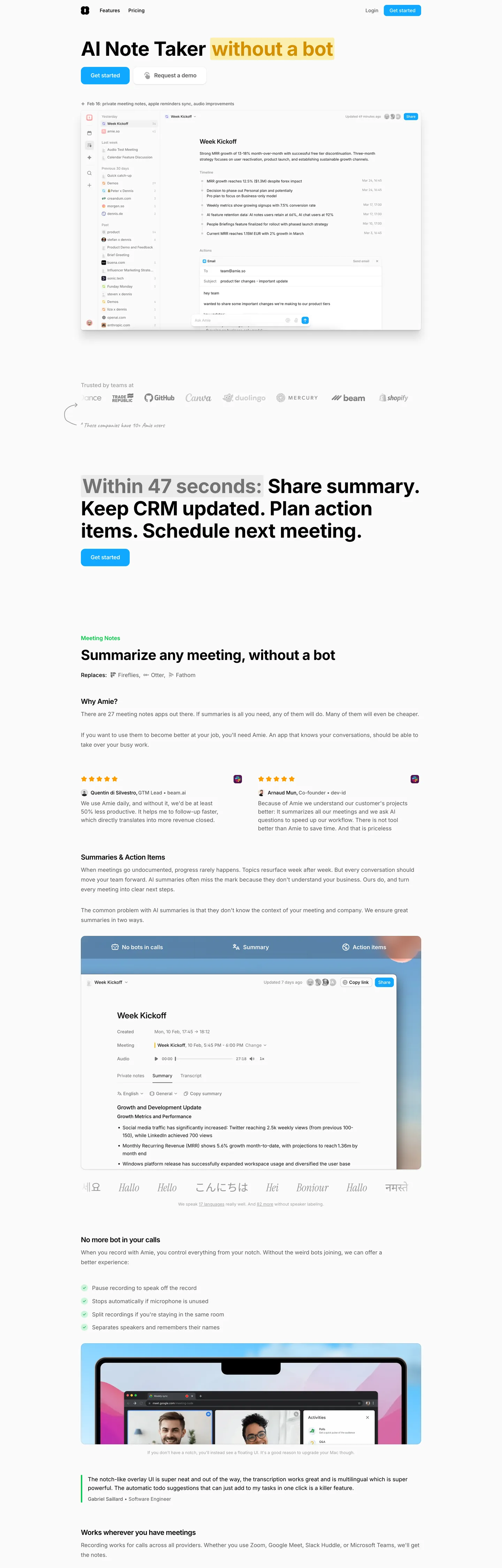
Amie's marketing site does something most calendar brands wouldn't dare: it renders the entire above-fold chrome in grayscale. The hero headline reads "AI Note Taker without a bot" with the second half wrapped in a soft yellow highlight; below it sit two buttons, only one of which is colored — a sky-blue pill carrying "Get started," paired with a transparent "Request a demo" sibling. Where Notion paints its hero with friendly multi-color object photography and Calendly leans on a saturated marine-blue chrome, Amie keeps the marketing surface almost entirely neutral and lets the product screenshots underneath do every chromatic job. The hand-drawn salmon-pink scribble arrow looping under the wordmark is the brand's only decorative moment in the page header itself.
The DESIGN.md file packages the system into a machine-readable spec for React tooling. Inside: 14 color tokens — one sky-blue brand voltage, one salmon hand-drawn accent, four pastel event-block hues borrowed from the product, plus the grayscale chrome ladder; 11 typography tokens running Inter from a 56px / 700 display down to a 12px / 400 caption; 6 corner-radius tokens centered on 8px with a full-pill option for CTAs; 8 spacing values on a 4px base; and 14 component definitions covering the sky-blue pill primary button, the transparent secondary, the hairline-bordered cards, the calendar event blocks, and the inbox-style task rows.
Feed this file to an AI coding tool and it reproduces Amie's specific moves: grayscale Inter chrome on near-white, sky-blue voltage held to a single CTA above the fold, hand-drawn scribble decorations in salmon pink, and the pastel event-block palette reserved for the product canvas. The one move worth borrowing only if your product has a colorful canvas of its own: refuse to put any of those product colors into the marketing chrome. Amie gets away with the restraint because the screenshots beneath the fold are bright enough to carry it — most landing pages need to paint the chrome itself.
What makes it distinct
- Product-as-palettethe marketing chrome is monochrome Inter on near-white, while pastel event blocks (mint, pink, lavender, sky, sun) saturate the calendar screenshots
- Single sky-blue voltagethe brand hex appears just twice in the captured page, both as the pill CTA fill, the only saturated marketing element above the fold
- Hand-drawn salmon underlinethe loop-scribbled arrow under the headline is the brand's playfulness signal, rendered in the same salmon pink as the wordmark dot
- Inter across every tierdisplay at 40-56px in weight 700, body at 16px in weight 400, button labels at 14px in weight 500, no second family
- 8px default rounding plus full pillcards at 12px, buttons at full pill, the calendar event blocks at 8px; no sharp 0-2px corners anywhere
Live at amie.so
A snapshot of the brand in production. Hover the frame to scroll the page; click to visit.
 amie.so
Explore Amie
Pick what you want to see — mockups, colors, typography, layout, or the full component list.
Brand & Accent
Sparing, CTA-only voltage.
Surface
Page and card backgrounds.
Text
Headlines, body, captions, muted.
Borders & Hairlines
Dividers, outlines, structural rules.
Semantic
Status, errors, success, inline links.
Other
Specialty colors.
Amie design system FAQ
Common questions about Amie's tokens, components, and how to use this DESIGN.md in your project.
Related reading
Specs, directories, and component libraries that pair with this design system.
Browse all design systems
The full directory of DESIGN.md files on shadcn.io, with live mockups for each.
Amie — official site
Amie's public marketing site — the source of truth for the live tokens captured in this file.
The DESIGN.md specification
Google Labs' open spec for machine-readable design system files — the format this page is built on.