Amplitude Design System
Amplitude's marketing-system tokens as a DESIGN.md file.
About Amplitude DESIGN.md
Curated by Dov AzencotUpdated Source amplitude.com
- Analytics & Data
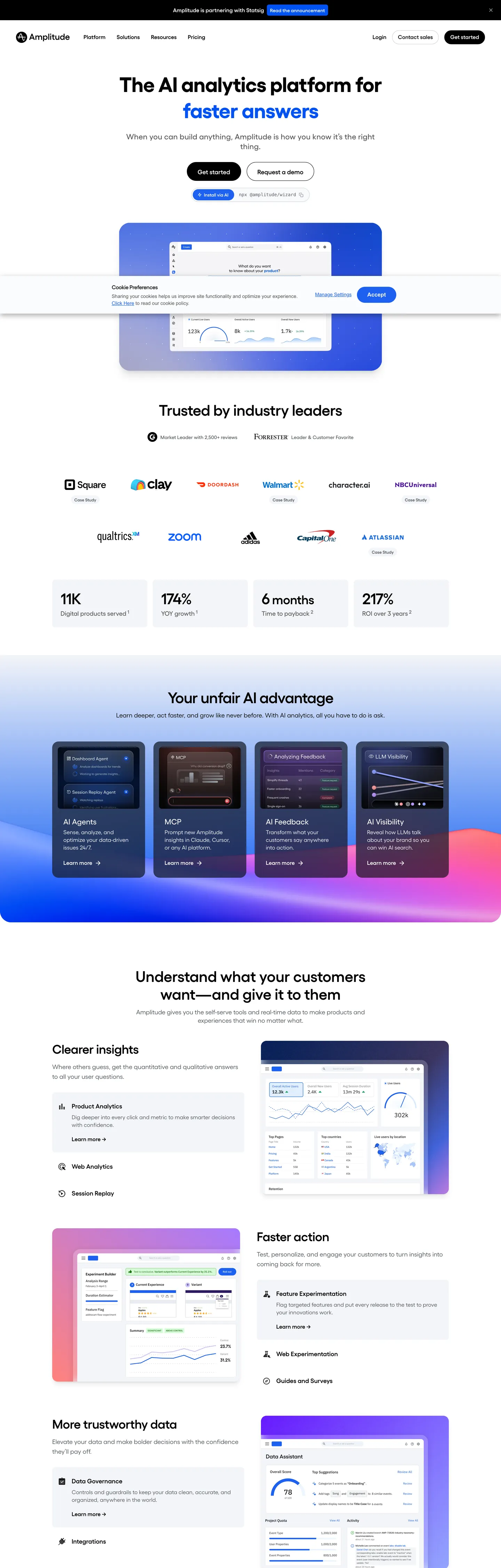
Amplitude's marketing site does the opposite of what its category usually does. Where Mixpanel paints the hero violet and Segment fills its CDP page with deep navy, Amplitude sits on a near-monochrome canvas — a 60px IBM Plex Sans headline in pure black on white, with one cobalt-blue word that animates through "faster answers," "testing everything," "non-stop optimizations." The brand voltage is reserved entirely for that rotating verb. The primary CTA beneath the headline does not even use the cobalt — it is a 56px-tall near-black pill in ink #1a1f23 with white text, sitting next to a transparent secondary that opens a request-demo flow.
The DESIGN.md file packages the system into a machine-readable spec. Inside: 18 color tokens drawn from a structural palette of near-blacks, cool grays, and a hairline cream, plus a brand tier of cobalt #1e61f0, deep cobalt #0052f2, navy #001a4f, and a single accent violet #a273ff that appears only in the "unfair advantage" band below the fold. 14 typography tokens span the Gellix display stack with IBM Plex Sans as the loaded body family — sizes go from 60px hero down to 12px metadata, with weight 600 doing the heading work and weight 400 the body. 16 components cover the black-pill primary, the dashboard-mock embed, the six-up advantage tile band, hairline cards, and the top-nav.
Feed this file to Claude or Cursor and it reproduces Amplitude's specific moves: near-monochrome canvas instead of brand-tinted gradient, cobalt voltage reserved for a single animated word, near-black pill CTA over the brand cobalt, and the embedded dashboard mock that does the chromatic job the hero itself refuses to do. The one move worth borrowing only if your product has a genuine analytics surface: the dashboard-as-hero embed. Most teams reach for an abstract brand gradient because they have nothing real to show.
What makes it distinct
- Black CTA, blue voltagethe primary button fills with near-black #1a1f23 while cobalt #1e61f0 is reserved for the rotating tagline word
- Animated word-swap headlinethe hero h1 cycles through four taglines, each rendered as a cobalt span inside a black sentence
- Embedded dashboard herothe above-fold area shows a real-looking purple-tinted analytics mock rather than abstract brand chrome
- Six-up advantage tile bandsaturated-fill cards in cobalt, indigo, violet, and ink build a horizontal advantage strip below the fold
- IBM Plex Sans across every tierGellix is the visible display family but the loaded font variables walk IBM Plex Sans and IBM Plex Serif
Live at amplitude.com
A snapshot of the brand in production. Hover the frame to scroll the page; click to visit.
 amplitude.com
Explore Amplitude
Pick what you want to see — mockups, colors, typography, layout, or the full component list.
Brand & Accent
Sparing, CTA-only voltage.
Surface
Page and card backgrounds.
Text
Headlines, body, captions, muted.
Borders & Hairlines
Dividers, outlines, structural rules.
Amplitude design system FAQ
Common questions about Amplitude's tokens, components, and how to use this DESIGN.md in your project.
Related reading
Specs, directories, and component libraries that pair with this design system.
Browse all design systems
The full directory of DESIGN.md files on shadcn.io, with live mockups for each.
Amplitude — official site
Amplitude's public marketing site — the source of truth for the live tokens captured in this file.
The DESIGN.md specification
Google Labs' open spec for machine-readable design system files — the format this page is built on.