Analogue Design System
Analogue's marketing site pairs circularXx at tight negative tracking with a pure-black canvas and white-only text — hardware photography carries all color.
About Analogue DESIGN.md
Curated by Dov AzencotUpdated Source analogue.co
- Consumer Electronics
- Gaming & Entertainment
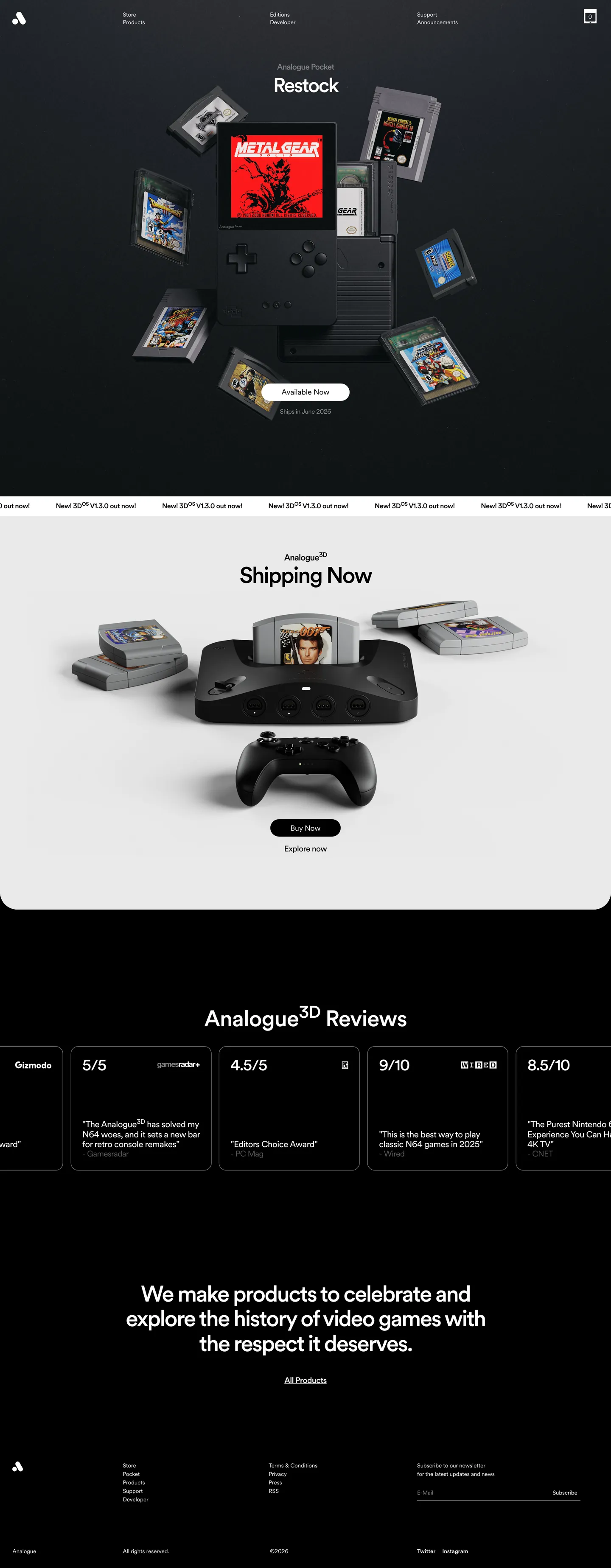
Analogue's marketing site is essentially a product brochure from a company that doesn't believe brochures need color. The hero is a dark stage — pure black — with a three-dimensional render of the Analogue Pocket handheld hovering at center, surrounded by floating game cartridges whose original artwork (Metal Gear's box art, classic platform-game covers) supplies every chromatic moment on the page. Below the fold, a matte-black Analogue 3D console sits on a warm grey surface next to cartridges and a controller. The page never introduces a brand color. The interface is white type on black, or black type on warm grey, and nothing else.
The DESIGN.md file captures this system: 8 color tokens covering a pure-black canvas, a warm off-white card surface, white as the sole text color, and four grey steps for secondary hierarchy. Thirteen typography tokens run circularXx — a single-family system with an unusually precise weight ladder (400, 450, 500) and letter-spacing values that go negative at display sizes, reaching -2.64px at the 53px h1. The radius system shows 18px as the dominant card rounding (captured from the hardware cards), with a pill token for the newsletter input. Spacing derives from viewport-width units. Fifteen component definitions cover the nav, hero, cards, the newsletter form, and review-score tiles.
Feed this file to an AI coding tool and it reproduces Analogue's particular moves: pure-black canvas with no supplemental dark-grey intermediate, negative-tracking circularXx headlines at weight 500 only, white as the single text color on dark surfaces, and zero brand chrome competing with the hardware photography. The one thing worth studying here independently of implementation: the brand is so confident in its objects that it has nothing to say about itself — the website's job is to hold a clean space around the products, not to perform.
What makes it distinct
- Negative tracking as brand signaturedisplay headings run at -2.64px letter-spacing, tightening circularXx until characters nearly touch, an editorial compression absent from the competition
- Chromatic monochromethe entire marketing interface palette is black and white; no accent color appears in any button, border, or heading
- circularXx book weight (450)the body tier uses a 450-weight between regular and medium, a precision not available in most typeface systems
- Fluid vw spacingevery padding, margin, and radius derives from viewport-width units rather than fixed px breakpoints
- Hardware photography as decorationthe hero is a 3D render of the Analogue Pocket surrounded by floating game cartridges; the interface chrome adds nothing chromatic
Live at analogue.co
A snapshot of the brand in production. Hover the frame to scroll the page; click to visit.
 analogue.co
Explore Analogue
Pick what you want to see — mockups, colors, typography, layout, or the full component list.
Brand & Accent
Sparing, CTA-only voltage.
Surface
Page and card backgrounds.
Text
Headlines, body, captions, muted.
Borders & Hairlines
Dividers, outlines, structural rules.
Analogue design system FAQ
Common questions about Analogue's tokens, components, and how to use this DESIGN.md in your project.
Related reading
Specs, directories, and component libraries that pair with this design system.
Browse all design systems
The full directory of DESIGN.md files on shadcn.io, with live mockups for each.
Analogue — official site
Analogue's public marketing and store site — the source of truth for the live tokens captured in this file.
The DESIGN.md specification
Google Labs' open spec for machine-readable design system files — the format this page is built on.