Apple Design System
Apple's design system as a DESIGN.md file.
About Apple DESIGN.md
Curated by Dov AzencotUpdated Source apple.com
- Consumer Electronics
- Mobile Platforms
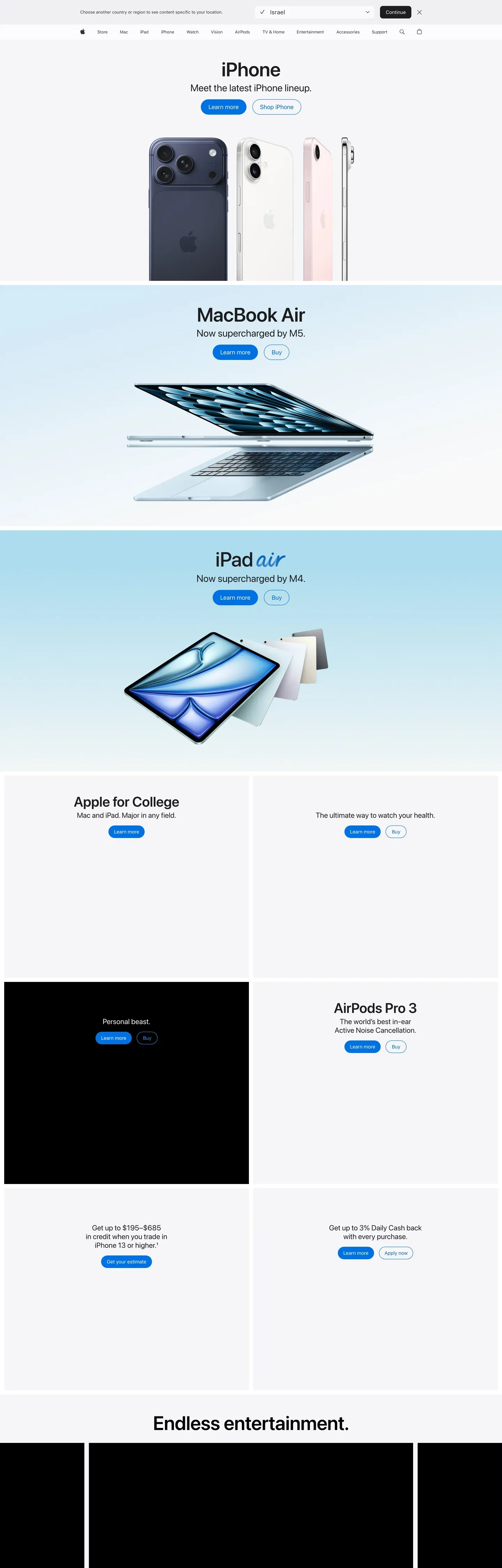
Apple's web presence is a masterclass in reverent product photography framed by near-invisible UI. Every page is a stack of edge-to-edge product tiles — alternating light and dark canvases, each centered on a hero headline, a one-line tagline, two tiny blue pill CTAs, and an impossibly crisp product render. Nothing competes with the product. Typography is confident but quiet; color is either pure white, an off-white parchment, or a near-black tile; interactive elements are a single, quiet Action Blue at #0066cc. Density is unusually low even by contemporary SaaS standards.
This page captures Apple's marketing system as a DESIGN.md file — Google Labs' open spec for machine-readable design tokens. Inside: 21 color tokens covering the one signature blue, three near-black tile variants, white and parchment canvases, and a muted text ladder; 16 typography tokens running entirely on SF Pro Display (for display sizes) and SF Pro Text (for body and UI), with weight 500 deliberately absent from the ladder; seven radius tokens that hierarchically split between zero (full-bleed tiles) and pill (every interactive element); and 24 component definitions covering buttons, product tiles, the two-row navigation, store utility cards, the iPhone configurator, and a floating sticky purchase bar.
Drop the file into Claude, Cursor, GitHub Copilot, or any AI assistant that reads structured design tokens. The agent will produce React components and Tailwind classes that match Apple's actual voice — museum-grade reverence for product, not a generic SaaS template. Use it as a reference for design audits, a starting point for your own product-led marketing surface, or a teaching artifact for talking about restraint, single-accent systems, and the discipline of letting photography do the framing.
What makes it distinct
- Single interactive colorAction Blue #0066cc is every link, every pill CTA, every focus signal; no secondary brand accent exists
- Photography-first chromeUI recedes so the product can speak; exactly one drop-shadow in the system, reserved for product imagery
- Alternating tile rhythmfull-bleed light and dark canvases stack edge-to-edge; the color change itself is the section divider
- Body at 17px, not 16pxdisplay headlines carry negative letter-spacing for the signature Apple-tight cadence
- Weight 500 is absentthe type ladder runs 300/400/600/700, with the rare weight 300 reserved for airy moments
Live at apple.com
A snapshot of the brand in production. Hover the frame to scroll the page; click to visit.
 apple.com
Explore Apple
Pick what you want to see — mockups, colors, typography, layout, or the full component list.
Brand & Accent
Sparing, CTA-only voltage.
Surface
Page and card backgrounds.
Text
Headlines, body, captions, muted.
Borders & Hairlines
Dividers, outlines, structural rules.
Apple design system FAQ
Common questions about Apple's tokens, components, and how to use this DESIGN.md in your project.
Related reading
Specs, directories, and component libraries that pair with this design system.
The DESIGN.md specification
Google Labs' open spec for machine-readable design system files — the format this page is built on.
Browse all design systems
The full directory of DESIGN.md files on shadcn.io, with live mockups for each.
React blocks for shadcn/ui
Production-ready hero, pricing, CTA, and dashboard sections built with the same Tailwind + shadcn primitives.