Audemars Piguet Design System
Audemars Piguet's design system as a DESIGN.md file.
About Audemars Piguet DESIGN.md
Curated by Dov AzencotUpdated Source audemarspiguet.com
- E-commerce & Retail
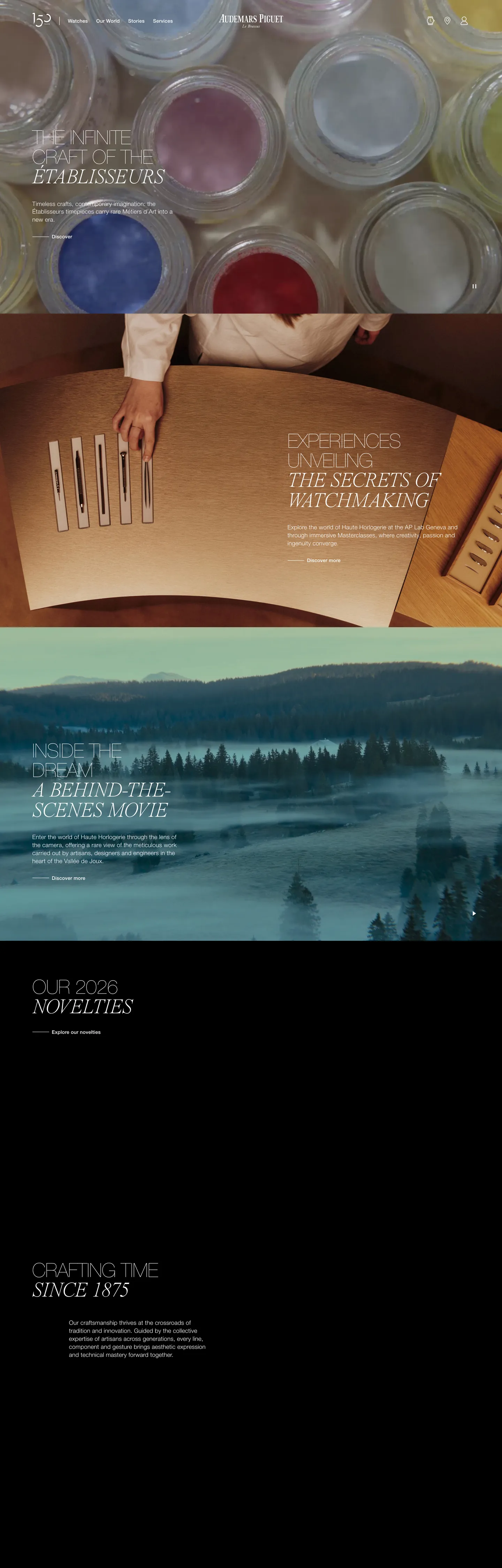
Audemars Piguet's marketing site runs a dual-typeface system that is nearly unique in the luxury-goods sector: Helvetica Neue Web in ultra-thin weight 100 handles every headline and interface label, while Times Now italic in weight 250 holds every editorial subheading and pull-quote. The two voices do not compete — the sans is uppercase, tracked, mechanical; the serif is lowercase, italic, unhurried. The hero h1 reads "The Infinite Craft of the Établisseurs" in white Helvetica Neue Web at 56px / 100 / uppercase; on the next editorial beat the same text might appear in Times Now at 60px / 250 / italic over a photograph of a workshop scene. The tension between those two surfaces is the brand's typographic signature. Where Cartier commits to all-caps sans throughout and Ferrari commits to a single FerrariSans, AP splits the page between machine and manuscript.
This DESIGN.md file packages the system into 17 color tokens — primarily white, off-white, pure black, and mid-grays, plus a declared-but-invisible brand green wired as --color-brand-color; 14 typography tokens covering Helvetica Neue Web at weights 100 through 500 and Times Now italic at 250; 5 corner-radius values from the extracted CSS variables (none to 56px pill); 8 spacing tokens on an approximate 8px base; and 14 component definitions covering the hero heading, section headings, navigation, body copy, CTA buttons, and card surfaces. The absence of a rendered brand accent color is documented and intentional.
Feed this file to Claude or Cursor and it will reproduce AP's counterpoint system: ultra-thin sans uppercase display, lightweight italic serif editorial, off-white warm canvas, zero decorative chrome. The most consequential discipline to preserve is the typeface split — when in doubt, use the sans for anything interface-level and the serif for anything editorial. Breaking that rule collapses the tension the system depends on.
What makes it distinct
- Dual-typeface counterpointHelvetica Neue Web in ultra-thin weight 100 for sans display, Times Now in weight 250 italic for serif editorial; no other weights above 500
- Near-white warm canvasthe page floor merges pure white and light beige into a single off-white floor; the system never uses a blue-white or neutral gray canvas
- Declared brand green absent from marketing render--color-brand-color (deep forest) and --color-brand-green are in CSS but produce zero rendered occurrences; photography carries all color
- Uppercase all-caps sans at 56px weight 100the system's loudest typographic moment uses negative letter-spacing (-0.56px) at ultra-thin weight, not heavyweight
- Full-bleed photography between typographic bandsevery editorial section transitions through a cinematic photograph before the next text zone
Live at audemarspiguet.com
A snapshot of the brand in production. Hover the frame to scroll the page; click to visit.
 audemarspiguet.com
Explore Audemars Piguet
Pick what you want to see — mockups, colors, typography, layout, or the full component list.
Brand & Accent
Sparing, CTA-only voltage.
Surface
Page and card backgrounds.
Text
Headlines, body, captions, muted.
Borders & Hairlines
Dividers, outlines, structural rules.
Semantic
Status, errors, success, inline links.
Other
Specialty colors.
Audemars Piguet design system FAQ
Common questions about Audemars Piguet's tokens, components, and how to use this DESIGN.md in your project.
Related reading
Specs, directories, and component libraries that pair with this design system.
Browse all design systems
The full directory of DESIGN.md files on shadcn.io, with live mockups for each.
Audemars Piguet — official site
Audemars Piguet's public marketing site — the source of truth for the live tokens captured in this file.
The DESIGN.md specification
Google Labs' open spec for machine-readable design system files — the format this page is built on.