Bear Design System
Bear's marketing system pairs two custom typefaces (Bear Sans and Bear Sans Headline) with a single coral-red accent on a pure white canvas.
About Bear DESIGN.md
Curated by Dov AzencotUpdated Source bear.app
- Productivity & SaaS
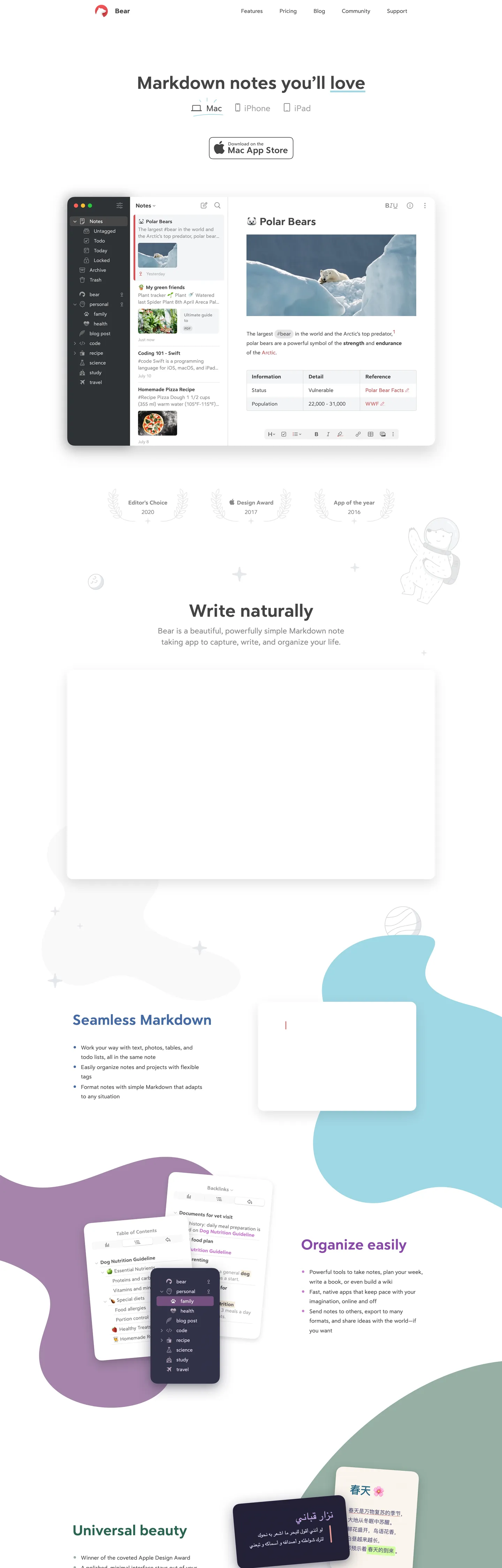
Bear's marketing page at bear.app announces itself with a single large headline — "Markdown notes you'll love" — in Bear Sans Headline, a custom typeface that sits somewhere between a geometric sans and a humanist text face. The letterforms have a slightly calligraphic warmth that San Francisco and Inter lack; the underline under "love" (the brand-accent coral red) is the only chromatic moment above the fold besides the bear mascot logo in the top-left corner. The hero is a Mac window mockup showing a note about polar bears, with a uncluttered white canvas, a sidebar with tag-based navigation, and a formatting toolbar. It reads less like a SaaS marketing page and more like a product screenshot in an Apple press kit.
Where Notion signals editor-grade power through an ink-black canvas and Apple Notes signals simplicity through white and blue, Bear occupies a third position: warm type on white, with the brand color so restrained it functions more like a watermark than an accent. The colorful blob shapes that float behind the mid-page screenshots — teal curves, purple amorphous patches, lilac arcs — are the only chromatic release in the system, and they reference the app's own theme library rather than any single brand color. Bear ships with over a dozen editor themes, and the marketing page suggests this plurality rather than asserting one.
Feed this file to an AI coding tool and it will reproduce Bear's specific signature: Bear Sans Headline for h1-h2 display at 51-42px in weight 400 (not bold — the custom family is drawn to read strongly at 400), Bear Sans for body at 16-22px, a single coral-red accent wired to exactly one interactive moment per section, and a pure-white canvas where the only warmth comes from the typeface itself. The design works because the custom typefaces carry the brand identity; without them, the system reads as generic white-page product marketing.
What makes it distinct
- Two custom typefacesBear Sans Headline at 51px for h1 and Bear Sans for body; both are proprietary, warm, and calligraphic compared to system-sans peers
- Single coral-red accentthe brand color at --accent-color appears on section heading links, the bear mascot icon, and navigation; never as a background fill in the hero
- Organic blob decorationteal, lavender, and lilac freeform shapes float behind app screenshots, signaling the app's multi-theme library without committing to a single background color
- White canvas, near-black inkthe page runs pure white with a charcoal ink at #444444 wired as --text-color; the warmth lives in the typeface, not the surface
- App Store badge as the only CTAno primary-button-style download CTA; Bear ships a single Apple-spec Mac App Store badge as the hero action
Live at bear.app
A snapshot of the brand in production. Hover the frame to scroll the page; click to visit.
 bear.app
Explore Bear
Pick what you want to see — mockups, colors, typography, layout, or the full component list.
Brand & Accent
Sparing, CTA-only voltage.
Surface
Page and card backgrounds.
Text
Headlines, body, captions, muted.
Borders & Hairlines
Dividers, outlines, structural rules.
Other
Specialty colors.
Bear design system FAQ
Common questions about Bear's tokens, components, and how to use this DESIGN.md in your project.
Related reading
Specs, directories, and component libraries that pair with this design system.
Browse all design systems
The full directory of DESIGN.md files on shadcn.io, with live mockups for each.
Bear — official site
Bear's public marketing site — the source of truth for the live tokens captured in this file.
The DESIGN.md specification
Google Labs' open spec for machine-readable design system files — the format this page is built on.