Best Buy Design System
Best Buy's marketing chrome packaged as a DESIGN.md file.
About Best Buy DESIGN.md
Curated by Dov AzencotUpdated Source bestbuy.com
- E-commerce & Retail
- Consumer Electronics
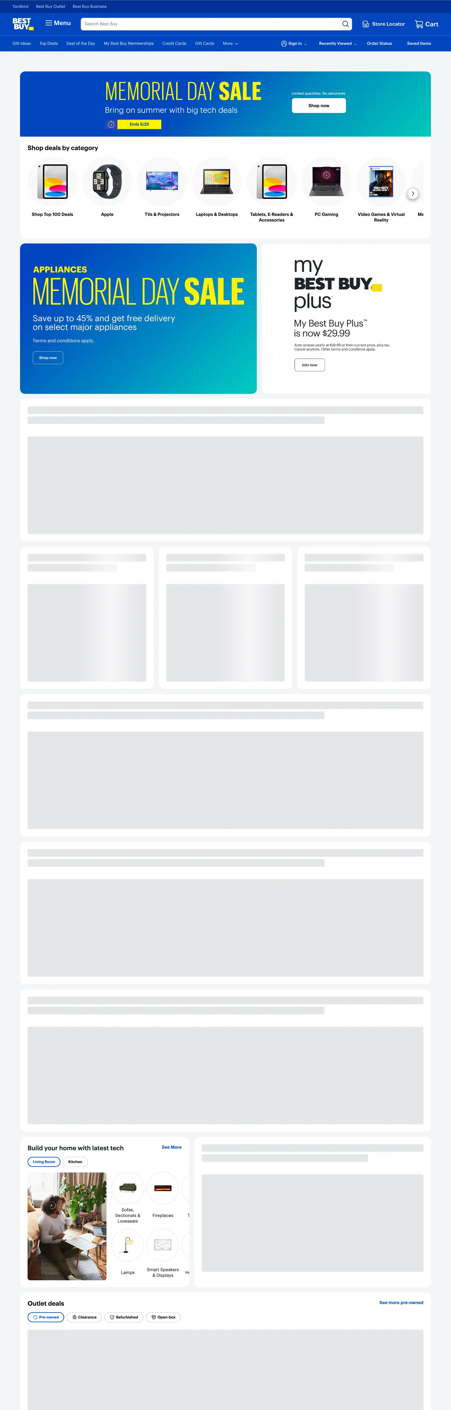
Best Buy's homepage is what happens when a 50-year-old big-box retailer commits to a single physical-world primitive and runs the entire chrome on it. The brand mark is a yellow rectangular price tag with "BEST BUY" stamped across it; the top-nav is a flat cobalt band the same hue as the logo's background; the above-fold promotional billboard is a blue-to-teal gradient block carrying an 80px condensed yellow display headline that reads "MEMORIAL DAY SALE" with a tag-shaped "Ends 5/25" date chip beneath. The yellow tag is everywhere or nowhere — never a generic accent, always price-coded. Where Amazon trusts a smile-arrow icon to do almost no decorative work and Walmart leans on a spark and pure white, Best Buy paints the chrome in retail-banner saturation and lets the typography shout.
The DESIGN.md file packages the marketing surface into a machine-readable spec. Inside: 16 color tokens drawn from a structural near-black ink, a cobalt link voltage, three tiers of grey, a scarcity yellow, and the promotional gradient end-stops; 12 typography tokens running Human BBY Digital (the proprietary brand sans) at 11-20px for chrome and Human BBY Digital Condensed at 80px / weight 300 for the promotional headline; 5 corner-radius tokens centered on 4px with full pills for action buttons; 9 spacing values on an 8px base; and 18 component definitions covering the cobalt nav band, the gradient promo card, the tag-shaped date chip, the circular category-puck rail, skeleton placeholders, and the standard ecommerce inventory.
Feed this file to an AI coding tool and it reproduces Best Buy's specific moves: cobalt-blue nav rather than charcoal, a blue-to-teal gradient promotional band instead of flat brand-color blocks, condensed display at weight 300 for in-page billboards, and the scarcity yellow scoped to in-banner price tags only. The one move worth borrowing only if your retail mark has a physical-world referent: the tag-as-logomark coherence. Most marks are abstract symbols; the Best Buy tag works because every yellow rectangle on the page reads as "this is a price."
What makes it distinct
- Price-tag as logomarkthe yellow tag in the wordmark, the tag-shaped sale chip, and the promotional yellow on blue all derive from the same physical retail prop
- Cobalt nav, gradient billboardsthe top-nav is flat #0457c8 cobalt, the in-page promo cards run a blue-to-teal gradient that no peer big-box retailer uses
- Condensed display, weight 30080px Human BBY Digital Condensed at weight 300 is the promotional shout; the rest of the page sits at 11-20px / weight 400-600
- Highlighter yellow as price-tag voltage#fff200 appears only inside Memorial Day Sale chips and the date-pill, scoped tightly and never as body text
- Skeleton-first lazy loadthe captured page shows greyed-out placeholder blocks below the fold where product modules hydrate; the structure narrates the lazy-load pattern
Live at bestbuy.com
A snapshot of the brand in production. Hover the frame to scroll the page; click to visit.
 bestbuy.com
Explore Best Buy
Pick what you want to see — mockups, colors, typography, layout, or the full component list.
Brand & Accent
Sparing, CTA-only voltage.
Surface
Page and card backgrounds.
Text
Headlines, body, captions, muted.
Borders & Hairlines
Dividers, outlines, structural rules.
Other
Specialty colors.
Best Buy design system FAQ
Common questions about Best Buy's tokens, components, and how to use this DESIGN.md in your project.
Related reading
Specs, directories, and component libraries that pair with this design system.
Browse all design systems
The full directory of DESIGN.md files on shadcn.io, with live mockups for each.
Best Buy — official site
Best Buy's public marketing site — the source of truth for the live tokens captured in this file.
The DESIGN.md specification
Google Labs' open spec for machine-readable design system files — the format this page is built on.