Betterment Design System
Betterment's fintech marketing system: midnight navy #000b50 hero, Season Mix display type, GT America body, gold #ffc729 sparingly.
About Betterment DESIGN.md
Curated by Dov AzencotUpdated Source betterment.com
- Fintech & Crypto
- Banking & Payments
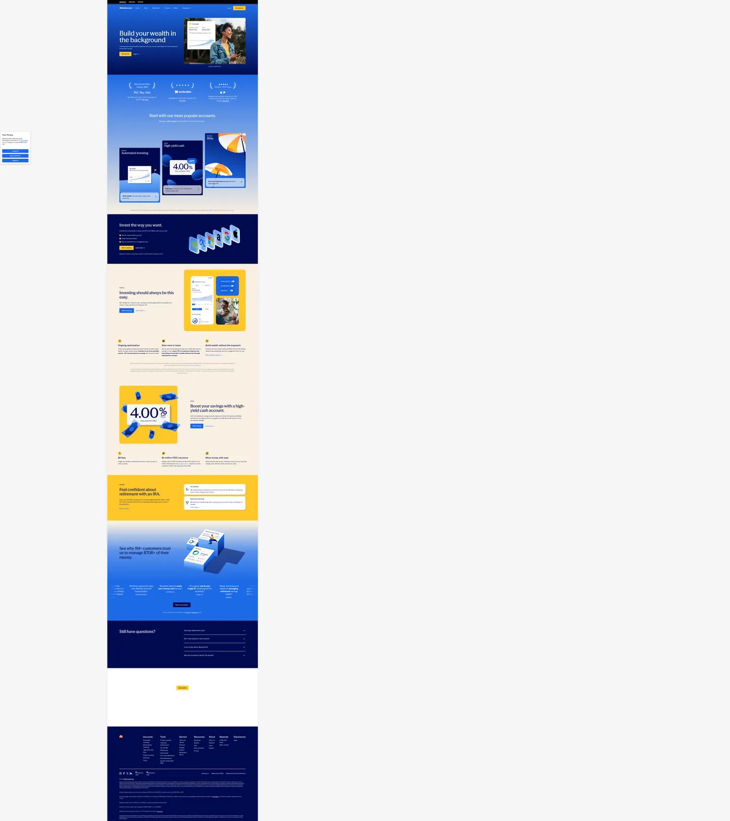
Betterment's marketing site opens on midnight navy — a very dark blue with just enough chroma to read as sky rather than charcoal — and sets its hero headline ("Build your wealth in the background") in Season Mix, a proprietary serif-influenced display face that brings editorial gravity to what is otherwise a technology product. This pairing is unusual in the robo-advisor category. Wealthfront and Fidelity run mid-weight blue canvases and standard sans-serif headlines; Robinhood goes dark-mode with green accents. Betterment makes the opposite bet: deep navy that almost reads as night sky, editorial display type that reads closer to a financial magazine than a fintech dashboard.
The DESIGN.md file packages 14 color tokens drawn from the extraction, organized into a midnight navy floor, a bright cobalt blue (#1d6ae5) for interactive elements and gradient nodes, a single gold (#ffc729) warm accent used 5 times as illustration and highlight fills, and a cream canvas (#f9f0e2) below the fold. Typography runs 14 tokens across two families: Season Mix at 44–72px for display, and GT America (a proprietary grotesque licensed from GrilliType) for every body, label, nav, and UI surface. Components number 18, covering the navy hero, the physical-shadow product cards, the gold-highlight yield panels, the warm-cream section floor, and the dark-navy footer.
Feed this file to Claude or Cursor and it reproduces the fintech tension: the night-sky canvas signals safety and seriousness, the editorial display type signals authority without aggression, and the single gold accent delivers just enough warmth to feel aspirational. The physical-card shadow is the most distinctive implementation move — a CSS compound shadow with a deep-navy offset (matching `--btm-card-shadow` in the CSS) that no other fintech brand in the directory uses.
What makes it distinct
- Midnight navy voltage#000b50 fills the above-fold hero canvas; not corporate blue but a near-black with chroma that distinguishes it from the gray-dark canvases at Linear or Vercel
- Two-typeface hierarchySeason Mix (a proprietary serif-influenced sans) runs h1/h2 display at 44–72px; GT America handles all body, nav, and UI labels
- Gold as the solitary warm accent#ffc729 appears exactly 5 times as background fills; in a cold-navy system, one gold element carries all the warmth in the page
- Physical card illusionproduct cards use a compound shadow (drop + inset) that casts a deep navy offset shadow, making the cards read as tangible objects
- Warm cream floor below the fold#f9f0e2 carries the below-fold sections, inverting the hero's dark gravity and making the system feel like day and night
Live at betterment.com
A snapshot of the brand in production. Hover the frame to scroll the page; click to visit.
 betterment.com
Explore Betterment
Pick what you want to see — mockups, colors, typography, layout, or the full component list.
Brand & Accent
Sparing, CTA-only voltage.
Surface
Page and card backgrounds.
Text
Headlines, body, captions, muted.
Borders & Hairlines
Dividers, outlines, structural rules.
Other
Specialty colors.
Betterment design system FAQ
Common questions about Betterment's tokens, components, and how to use this DESIGN.md in your project.
Related reading
Specs, directories, and component libraries that pair with this design system.
Browse all design systems
The full directory of DESIGN.md files on shadcn.io, with live mockups for each.
Betterment — official site
Betterment's public marketing site — the source of truth for the live tokens captured in this file.
The DESIGN.md specification
Google Labs' open spec for machine-readable design system files — the format this page is built on.