Bank of America Design System
Bank of America's marketing system: CNX humanist sans for display, Roboto for UI, azure #0053c2 for interactive elements, flag-red #e31837 for accents.
About Bank of America DESIGN.md
Curated by Dov AzencotUpdated Source bankofamerica.com
- Banking & Payments
- Fintech & Crypto
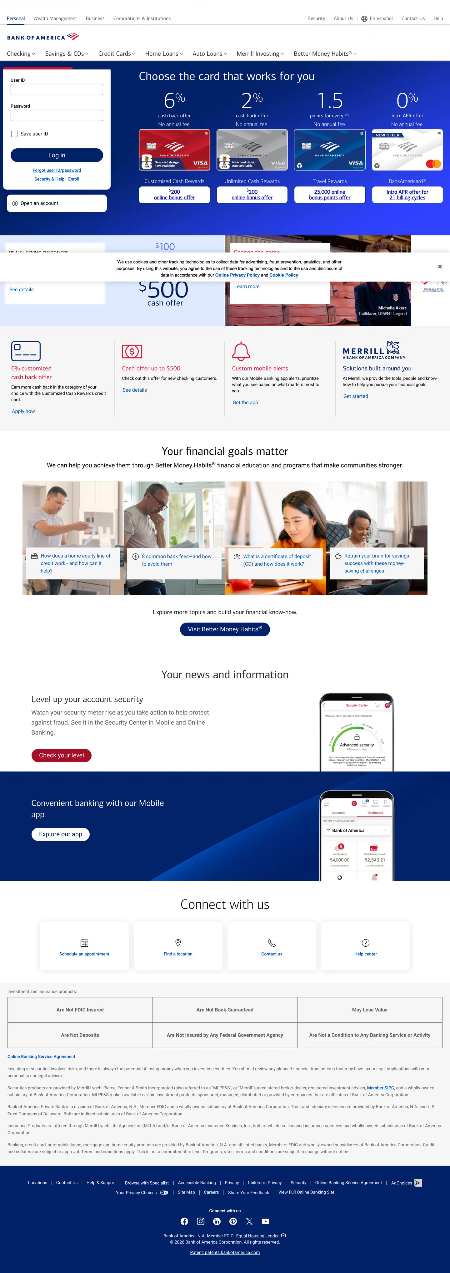
Bank of America's marketing site is a document, not a campaign. The page opens with a dense product-card grid showing credit card offers side by side — APR rates, sign-up bonuses, card names — before a headline appears. This sequence inverts every contemporary landing-page convention: where fintech brands lead with a mission statement and defer product details, BofA leads with the product and assumes the visitor already knows what a bank does. The result is a page that reads like a well-organized financial portal rather than a brand statement, a deliberate choice for an institution where 40+ million households already carry some relationship.
The DESIGN.md file packages 15 color tokens grounded in the extraction — five neutrals covering the near-black ink ladder (#222222, #333333, #646464), two blues (azure #0053c2 and navy #012169) as the structural interactive and the deep brand tone, flag-red (#e31837) as a confined accent, and three whites (pure #ffffff plus two light grays). Typography runs 13 tokens across two families: CNX (a proprietary BofA humanist sans) for marketing display and headers, and Roboto for all functional UI — form labels, body paragraphs, navigational elements. Components total 17 definitions, including the 22px pill-shaped login button, the credit card feature grid, and the site-wide login panel.
Feed this file to Claude or Cursor and it reproduces the institutional specificity: near-black ink instead of true black, azure reserved exclusively for text and borders (never as a background fill in the marketing surface), flag-red confined to the logo zone, and CNX at 38–44px / weight 300–400 for all display headings. The one design move worth studying is the absence of decorative density reduction — BofA does not add whitespace to appear contemporary, and the grid's information density is a feature, not a limitation.
What makes it distinct
- Dual proprietary typefacesCNX (a custom humanist sans for headlines) and Roboto (for UI labels and body copy) create a hard boundary between marketing and functional surfaces
- 2px dominant radiusthe most frequent border-radius in the extraction (18 occurrences) signals a traditional banking aesthetic that has not adopted consumer-app rounding conventions
- Azure as interactive anchor#0053c2 appears 62 times in text (31) and border (31), carrying every link, nav item, and focus indicator without ever appearing as a background fill in the marketing surface
- Flag-red contained to logo and alerts#e31837 appears 10 times but exclusively in the logomark and contextual alert callouts; it never decorates marketing copy
- Information density over whitespacethe page alternates between dense card grids and wide editorial bands, with minimal blank breathing room between sections
Live at bankofamerica.com
A snapshot of the brand in production. Hover the frame to scroll the page; click to visit.
 bankofamerica.com
Explore Bank of America
Pick what you want to see — mockups, colors, typography, layout, or the full component list.
Surface
Page and card backgrounds.
Text
Headlines, body, captions, muted.
Other
Specialty colors.
Bank of America design system FAQ
Common questions about Bank of America's tokens, components, and how to use this DESIGN.md in your project.
Related reading
Specs, directories, and component libraries that pair with this design system.
Browse all design systems
The full directory of DESIGN.md files on shadcn.io, with live mockups for each.
Bank of America — official site
Bank of America's public marketing site — the source of truth for the live tokens captured in this file.
The DESIGN.md specification
Google Labs' open spec for machine-readable design system files — the format this page is built on.