Bun Design System
The Bun design system uses a charcoal #282a36 canvas, a punchy #f472b6 pink accent, system‑ui for interface typography and JetBrains Mono for code, delivering a focused UI built f…
About Bun DESIGN.md
Curated by Dov AzencotUpdated Source bun.sh
- Design & Creative Tools
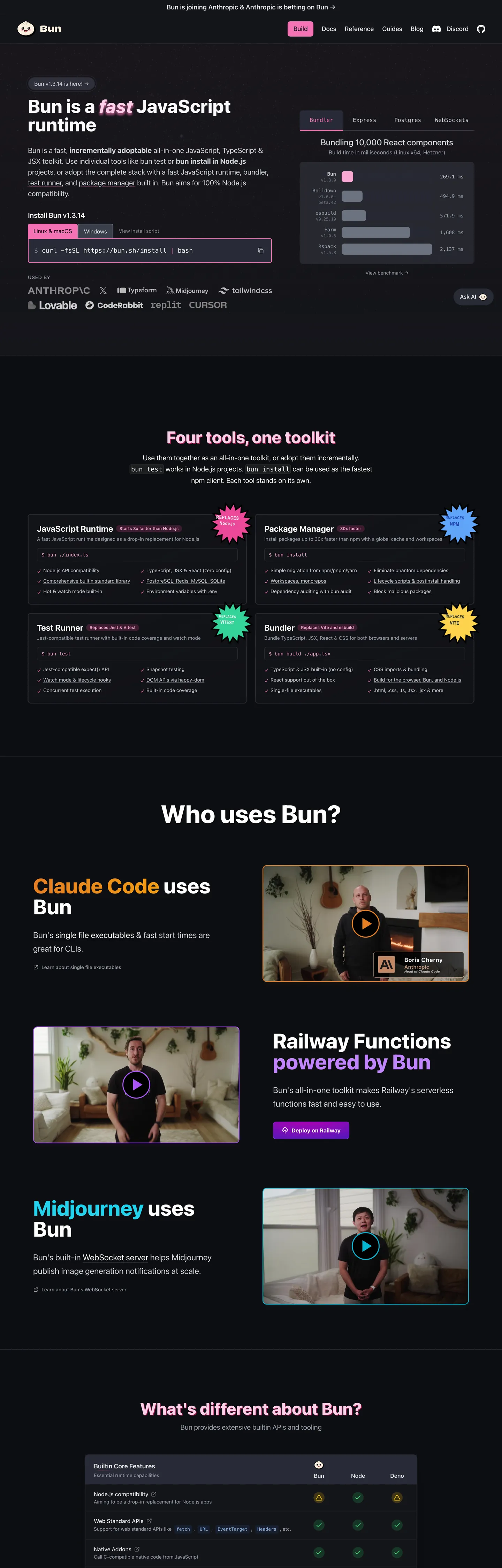
Bun’s site refuses the usual runtime aesthetic of a dark terminal lit by neon green. The fold opens on a charcoal #282a36 canvas, a flat, almost matte surface that feels more like a night‑sky than a console. A single 44‑pixel tall pill‑shaped button in hot pink #f472b6 dominates the hero, its 8px rounding and white border turning the call‑to‑action into a visual anchor that instantly tells you where to click. No gradient meshes, no illustrative hero graphics – just type, color, and a bold accent that says "this is the tool you run code with."
The palette is deliberately limited: a single saturated pink for emphasis, a deep charcoal for the main background, and a muted gray scale for supporting text. Where Stripe leans on an indigo gradient and Vercel opts for a matte black with subtle teal highlights, Bun chooses a binary contrast – dark canvas versus bright pink – to signal performance and speed. The brand’s own language talks about “fast all‑in‑one” and the visual restraint mirrors that promise, keeping the user’s eye on the code rather than decorative fluff.
For a designer or developer feeding this spec into a component library generator, the payoff is immediate. The system tells you exactly which token to use for every UI element – pink only lives on primary actions, white borders never change, and the code font is locked to JetBrains Mono. The one thing worth stealing is the disciplined use of a single accent color as a hierarchy marker; it lets you build a UI that feels fast, focused, and unmistakably Bun without drowning the page in unnecessary hues.
What makes it distinct
- Primary pink #f472b6appears only on the main call‑to‑action button, the hero wordmark, and the navigation pill, never elsewhere.
- Ink #9ca3afserves as the default text color across headings, paragraphs and UI labels, providing high contrast on the dark canvas.
- Hairline #ffffffdefines every border, from input outlines to card dividers, keeping the visual language crisp without adding visual weight.
- Muted #e5e7ebused for secondary copy, code comments and subtle UI hints, ensuring a gentle hierarchy beneath the primary ink.
- Surface‑1 #14151athe deepest background layer for modals and footers, creating a sense of depth without breaking the dark theme.
Live at bun.sh
A snapshot of the brand in production. Hover the frame to scroll the page; click to visit.
 bun.sh
Explore Bun
Pick what you want to see — mockups, colors, typography, layout, or the full component list.
Brand & Accent
Sparing, CTA-only voltage.
Surface
Page and card backgrounds.
Text
Headlines, body, captions, muted.
Borders & Hairlines
Dividers, outlines, structural rules.
Other
Specialty colors.
Bun design system FAQ
Common questions about Bun's tokens, components, and how to use this DESIGN.md in your project.
Related reading
Specs, directories, and component libraries that pair with this design system.
Browse all design systems
The full directory of DESIGN.md files on shadcn.io, with live mockups for each.
Bun — official site
Bun's public marketing site — the source of truth for the live tokens captured in this file.
The DESIGN.md specification
Google Labs' open spec for machine-readable design system files — the format this page is built on.