BuzzFeed Design System
BuzzFeed's homepage as a DESIGN.md file.
About BuzzFeed DESIGN.md
Curated by Dov AzencotUpdated Source buzzfeed.com
- News & Publishing
- Social & Community
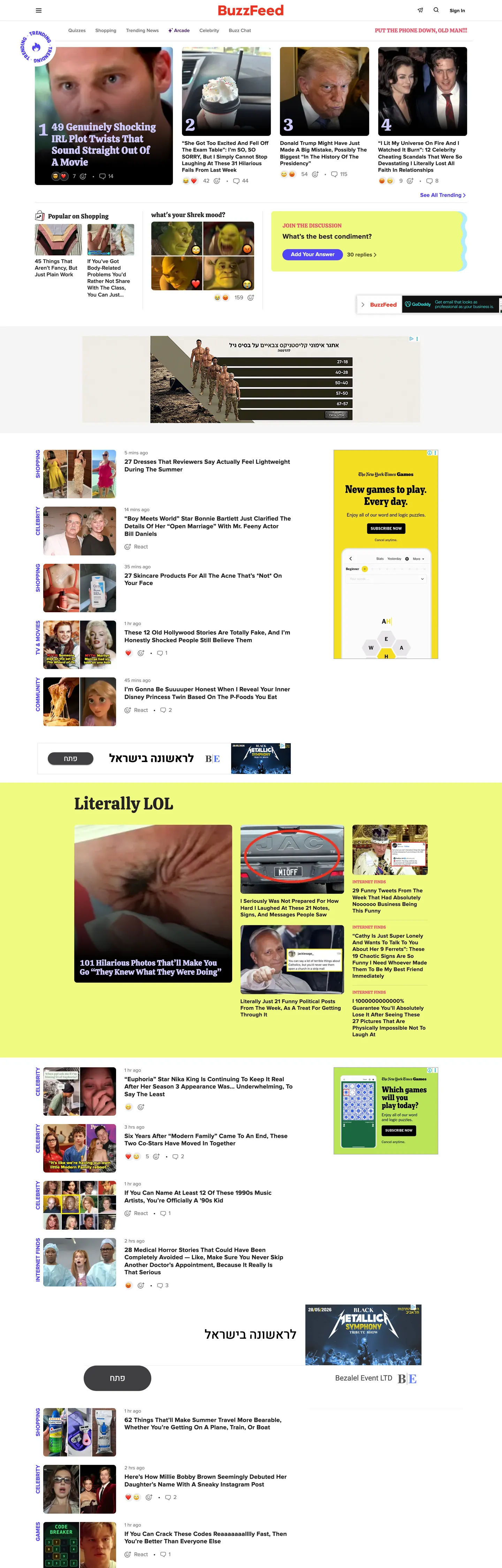
BuzzFeed's homepage looks like a tabloid front page crossed with a social-media feed, organized around an inky charcoal grid with a saturated electric-purple primary CTA. The wordmark sits in the historical BuzzFeed red as a decorative header at the top of the page, but the brand voltage that actually carries every primary action below the masthead is electric purple — every Add Your Answer pill, every Subscribe button, every quiz-call-to-action uses #5246f5 at 29px pill radius. This is the inverse of what most readers expect: the "red BuzzFeed pill" people remember from the 2014-era brand has been retired from the action layer, and red survives only on the wordmark itself and a handful of inline accents.
The DESIGN.md file packages the system into a structured spec. Inside: 13 color tokens organized around an inky charcoal body grid (#222222 carries 2395 occurrences — the dominant token by an enormous margin), a saturated electric purple primary, a graphite gray for secondary text, a cool gray for surface fills, and a single lemon-highlighter yellow used as a feature-band background on the "Literally LOL" quiz section; 11 typography tokens running Proxima Nova at weight 600/700 for every news-and-action tier and Calistoga (a bouncy display serif) at 18/22/28/48px for quiz-and-list section titles; an 8/29/50% radius scale with no middle tier; a 12/24/48px spacing rhythm; and 14 component definitions covering the photo card, the electric-purple pill CTA, the yellow-band quiz section, the avatar chip, and the dense top-nav.
Feed this file to Claude, Cursor, or any AI coding agent that reads structured tokens and it reproduces BuzzFeed's specific moves: charcoal ink on white canvas, electric-purple pill CTAs at 29px radius, Proxima Nova / Calistoga two-voice display, the lemon highlighter band as the only chromatic feature fill, and the dense 3-up / 4-up news-grid rhythm. The token references resolve cleanly. The one disciplined move worth borrowing only if your content mix includes quizzes: the two-voice display pairing where Proxima Nova carries news and Calistoga signals "this is a quiz." On a pure-news brand the Calistoga tier would feel unmotivated; here it carries the editorial scope-flip that BuzzFeed's mixed-feed identity depends on.
What makes it distinct
- Electric purple primary CTA#5246f5 at 29px pill radius carries every Add Your Answer and primary action, the inverse of the red-pill brand most readers remember
- Calistoga display serifa bouncy display serif at 48px weight 400 signals quiz-and-list editorial scope; never used on news headlines
- Inky charcoal body#222222 carries 1209 text and 1184 border occurrences, the dominant token by a 5x margin over any other
- Lemon highlighter banda saturated #f0fa81 yellow appears just 3 times as a full-bleed feature-band background, the page's only quiz-emphasis fill
- 8px / 29px / 50% radius ladderstory cards at 8px, primary pill CTAs at 29px, avatar chips at full circle; no middle tier between the card and the pill
Live at buzzfeed.com
A snapshot of the brand in production. Hover the frame to scroll the page; click to visit.
 buzzfeed.com
Explore BuzzFeed
Pick what you want to see — mockups, colors, typography, layout, or the full component list.
Brand & Accent
Sparing, CTA-only voltage.
Surface
Page and card backgrounds.
Text
Headlines, body, captions, muted.
Borders & Hairlines
Dividers, outlines, structural rules.
Other
Specialty colors.
BuzzFeed design system FAQ
Common questions about BuzzFeed's tokens, components, and how to use this DESIGN.md in your project.
Related reading
Specs, directories, and component libraries that pair with this design system.
Browse all design systems
The full directory of DESIGN.md files on shadcn.io, with live mockups for each.
BuzzFeed — official site
BuzzFeed's public marketing site — the source of truth for the live tokens captured in this file.
The DESIGN.md specification
Google Labs' open spec for machine-readable design system files — the format this page is built on.