Cadillac Design System
Cadillac's marketing design system as a DESIGN.md file.
About Cadillac DESIGN.md
Curated by Dov AzencotUpdated Source cadillac.com
- Automotive
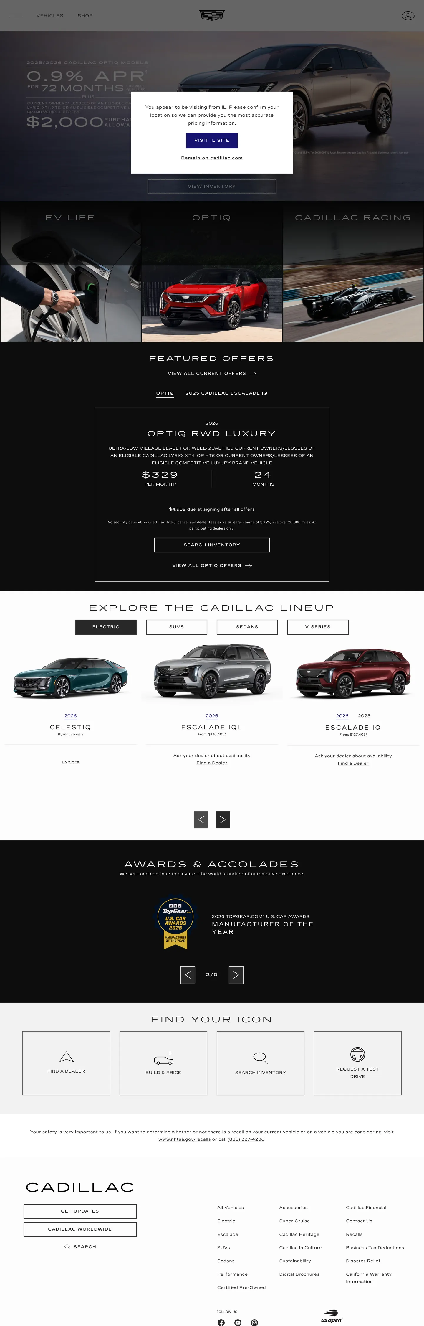
Cadillac's marketing site makes a move almost no other luxury-automotive brand attempts in its typography: it dials weight down to 100 and letter-spacing up to 5px on section headings. The surface reads "EXPLORE THE CADILLAC LINEUP" in CadillacGothic at 28px / weight 400, and "FEATURED OFFERS" at 24px / weight 400 — but the sub-labels and most running headers run at weight 100, spread wide. Where BMW holds display at weight 700 and Mercedes counts on serif gravitas, Cadillac treats thinness and air as the authority signal. The near-black canvas (#282828) underneath never goes to pure black; the slight warmth in the dark floor softens the technical tension without releasing it.
The DESIGN.md file packages the system into a machine-readable spec. Inside: 14 color tokens from the extracted palette (near-black, electric citron, white, deep navy, mid-gray surfaces), 12 typography tokens spanning CadillacGothic and CadillacGothicNarrow at weights 100–500 across display and body tiers, a universal 0px border-radius, and 15 components covering the primary button, hero heading, featured-offer card, vehicle model tile, top nav, and navigation links. The primary CTA uses deep navy (#171473) fill — a color appearing only 20 times on the page — while the electric citron (#e7e000) functions exclusively as a border and divider accent across 235 border occurrences.
Feed this spec to Claude or Cursor to reproduce Cadillac's discipline: CadillacGothic at weight 100 for labels, wide letter-spacing on every heading, 0px sharp corners, full-bleed photography underneath, and the citron accent reserved for structural dividers rather than fills. The move worth borrowing for any dark-canvas luxury brand is the ultra-light + extreme-tracking combination — it reads expensive precisely because it refuses to shout.
What makes it distinct
- Ultra-light type as authorityCadillacGothic at weight 100 with 3.6–5px letter-spacing on section headings, the inverse of the bold-header convention in luxury automotive
- Electric citron accent#e7e000 appears 477 times as border and text accent, never as a button fill; the primary button uses deep navy #171473
- Sharp 0px everywhereno corner rounding on buttons, cards, or inputs; the geometry reads as precision engineering rather than approachability
- Photography-first layoutfull-bleed hero and model-lineup shots carry all visual weight; typography is intentionally thin so it does not compete
- Near-black canvas#282828 (not pure black) carries the page with white and citron type on top, 907 combined occurrences
Live at cadillac.com
A snapshot of the brand in production. Hover the frame to scroll the page; click to visit.
 cadillac.com
Explore Cadillac
Pick what you want to see — mockups, colors, typography, layout, or the full component list.
Brand & Accent
Sparing, CTA-only voltage.
Surface
Page and card backgrounds.
Text
Headlines, body, captions, muted.
Borders & Hairlines
Dividers, outlines, structural rules.
Other
Specialty colors.
Cadillac design system FAQ
Common questions about Cadillac's tokens, components, and how to use this DESIGN.md in your project.
Related reading
Specs, directories, and component libraries that pair with this design system.
Browse all design systems
The full directory of DESIGN.md files on shadcn.io, with live mockups for each.
Cadillac — official site
Cadillac's public marketing site — the source of truth for the live tokens captured in this file.
The DESIGN.md specification
Google Labs' open spec for machine-readable design system files — the format this page is built on.