Calm Design System
Calm's design system as a DESIGN.md file.
About Calm DESIGN.md
Curated by Dov AzencotUpdated Source calm.com
- Healthcare & Wellness
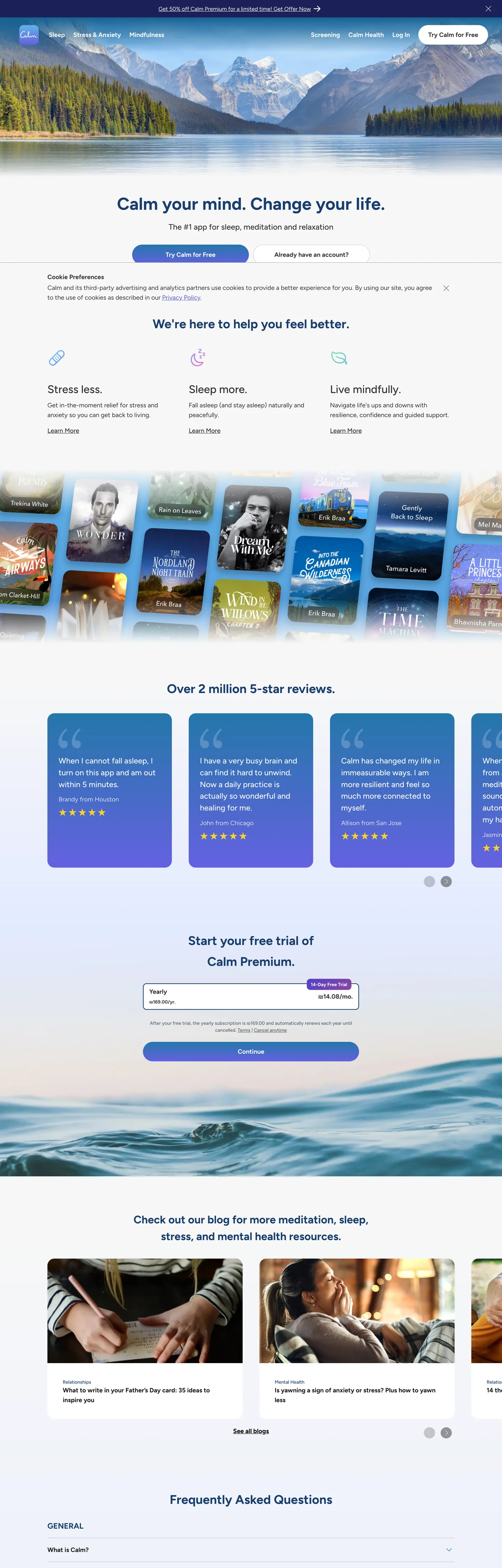
Calm's marketing system is what happens when a wellness brand refuses to be cute. There is no eucalyptus green, no terracotta, no soft-serif headline, no rounded illustration of a smiling lotus. Instead: a near-white canvas, a deep navy-blue ink (#1a3e6f) running every headline, a single blue-to-purple gradient (#2477aa → #6461e0) reserved for the primary CTA pill, and Figtree — a humanist sans — doing the entire typographic job at three weights. The hero photograph (snow-tipped mountains over an alpine lake) carries the brand's atmosphere; the chrome around it is almost mute. Where most wellness apps shout serenity through soft pastels and hand-drawn motifs, Calm whispers it through restraint — a quiet, almost editorial composure that reads less like an app store screenshot and more like a print quarterly.
This file packages that restraint as a Google Labs DESIGN.md spec: 19 color tokens (12 extracted hexes plus their semantic role assignments), 13 typography levels (all Figtree, weights 400 / 500 / 700, sizes 13.5px to 49.5px), 3 corner radii (20px / 100px / 10px — the 100px pill being the system's one departure from soft-rectangle geometry), 9 spacing values built around an 8 / 12 / 20 / 40px scale, and 19 components covering top-nav, hero headline, CTA gradient pill, testimonial review card, trial-card form, FAQ row, and the lavender content blocks that anchor the page below the fold. Every value is grounded in the live extraction — no invented hexes, no aspirational radii.
Feed this DESIGN.md to Claude, Cursor, or GitHub Copilot and the AI will build React components that look like Calm rather than a generic shadcn theme — deep-blue headings on near-white, gradient CTAs on 100px pills, 20px-rounded cards floating over lavender bands, Figtree everywhere. Or use the file as a reference: every hex, every font weight, every spacing value is documented inline. The result is a marketing surface that earns its serenity by refusing the visual shortcuts — no soft-serif gestures, no nature-toned palette, no rounded-illustration mascots. Just deep blue, pale lavender, and one gradient moment per page.
What makes it distinct
- Deep-blue ink monopoly#1a3e6f carries every h1, h2, h3, and brand link; pure black is reserved for body paragraphs only
- One gradient, one job#2477aa → #6461e0 lives exclusively on the primary CTA pill and the hero mountain wash
- 20px is the house radius49 of 62 corner instances; the 100px CTA pill is the only departure
- No serif, no italic, no display dramaFigtree alone covers all 19 type signatures from 13.5px caption to 49.5px h1
- Lavender (#e2eaff) is the warmthappears on testimonial cards and trial card surfaces where most wellness apps would reach for cream
Live at calm.com
A snapshot of the brand in production. Hover the frame to scroll the page; click to visit.
 calm.com
Explore Calm
Pick what you want to see — mockups, colors, typography, layout, or the full component list.
Brand & Accent
Sparing, CTA-only voltage.
Surface
Page and card backgrounds.
Text
Headlines, body, captions, muted.
Borders & Hairlines
Dividers, outlines, structural rules.
Other
Specialty colors.
Calm design system FAQ
Common questions about Calm's tokens, components, and how to use this DESIGN.md in your project.
Related reading
Specs, directories, and component libraries that pair with this design system.
Browse all design systems
The full directory of DESIGN.md files on shadcn.io, with live mockups for each.
Calm — official site
The #1 app for meditation, sleep, and relaxation — the live marketing surface this design system was extracted from.
The DESIGN.md specification
Google Labs' open spec for machine-readable design system files.
Use Calm in your project
One machine-readable file. Drop it into Claude, Cursor, or any AI tool that reads DESIGN.md.