CHANEL Design System
CHANEL's marketing design system as a DESIGN.md file.
About CHANEL DESIGN.md
Curated by Dov AzencotUpdated Source chanel.com
- E-commerce & Retail
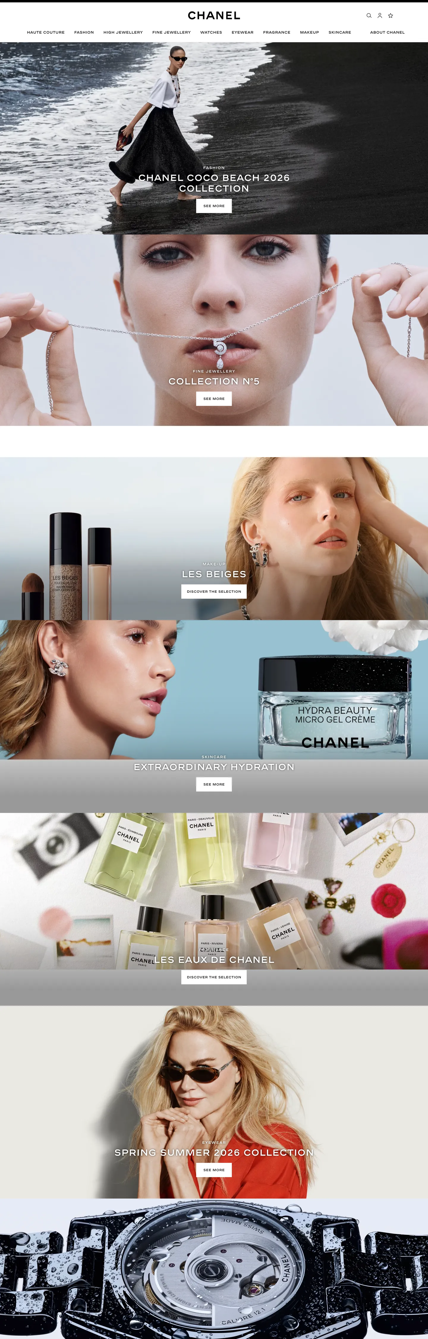
CHANEL's digital system runs a five-step greyscale and stops there. The palette is pure white for the canvas, near-black for the hardest structural elements, and three intermediate greys separating information tiers — middle grey at 767676 for body text and borders (the most frequently used tone in the system, at 367 total occurrences), light grey at 9b9b9b for secondary labels, and warm charcoal at 333333 for heading-weight text. There is no chromatic accent, no brand rouge, no gold-adjacent warm. The identity is carried entirely by abchanel-corpo — a proprietary compressed uppercase typeface that appears on every navigation label, every product category, every section identifier, and the two interlocked C marks of the logo. Where other luxury houses use a brand color as their primary identity signal, CHANEL uses a letterform.
The DESIGN.md file captures 13 color tokens from the five-step greyscale, 11 typography tokens spanning abchanel-corpo at 11–30px (weight 600, uppercase or lowercase depending on context) and Helvetica at 12–14px (weight 100–300 for body and supporting text), a minimal radius scale (only 40px captured, used for a single pill element), 7 spacing tokens, and 17 component definitions. The extraction confirms one notable detail: CHANEL's body text runs Helvetica at weight 100 — ultra-light, unusual for running prose — which creates a deliberate contrast with the weight-600 uppercase abchanel-corpo labels.
Feed this file to Claude or Cursor and it reproduces CHANEL's specific moves: white canvas, abchanel-corpo uppercase at 12px / 600 for every label and navigation element, Helvetica at ultra-light for body paragraphs, and the absence of any chromatic accent. The discipline worth studying: the system functions because abchanel-corpo is doing the job that brand color normally does — it's the single signal that identifies this as CHANEL rather than any other luxury white-canvas site. Without it, the greyscale and Helvetica could belong to anyone.
What makes it distinct
- Proprietary uppercase type as logoabchanel-corpo at 12px bold uppercase, with weight 600, is the brand mark at every scale from the interlocking CC to the navigation label
- Five-step greyscale with no chromatic elementthe entire system runs from pure white through three grey tones to near-black, with zero hue involvement anywhere
- Weight 600 as the only boldabchanel-corpo uses a single weight (600), which reads as simultaneously authoritative and controlled; there is no 700 or 800 tier
- Helvetica as the deliberate supporting voicewhere other brands would use a second proprietary family, CHANEL uses a universal system font, making abchanel-corpo the sole carrier of identity
- Full-bleed photography over token decorationthe site's visual richness comes entirely from campaign imagery; the UI chrome is stripped to the minimum that keeps photography centered
Live at chanel.com
A snapshot of the brand in production. Hover the frame to scroll the page; click to visit.
 chanel.com
Explore CHANEL
Pick what you want to see — mockups, colors, typography, layout, or the full component list.
Surface
Page and card backgrounds.
Text
Headlines, body, captions, muted.
Borders & Hairlines
Dividers, outlines, structural rules.
CHANEL design system FAQ
Common questions about CHANEL's tokens, components, and how to use this DESIGN.md in your project.
Related reading
Specs, directories, and component libraries that pair with this design system.
Browse all design systems
The full directory of DESIGN.md files on shadcn.io, with live mockups for each.
CHANEL — official site
CHANEL's public marketing site — the source of truth for the live tokens captured in this file.
The DESIGN.md specification
Google Labs' open spec for machine-readable design system files — the format this page is built on.