Chick-fil-A Design System
Chick-fil-A's design system approximation as a DESIGN.md file.
About Chick-fil-A DESIGN.md
Curated by Dov AzencotUpdated Source chick-fil-a.com
- Food & Delivery
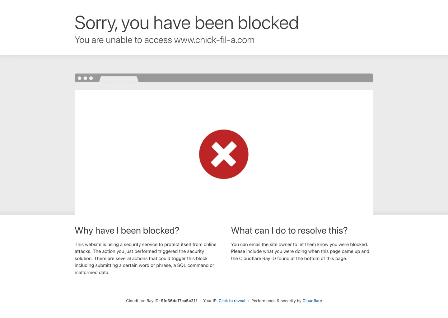
Chick-fil-A's marketing site returned a Cloudflare security block at the time of extraction. The screenshot and extraction data document Cloudflare's default block page — not the brand's actual homepage — which means the color tokens, typography measurements, and component data in this file reflect the block page's generic system-UI chrome rather than Chick-fil-A's own design decisions. The dominant surface is a light gray gradient (#ebebeb transitioning to #dedede), the text is charcoal #404040, and the only chromatic element is Cloudflare's steel-blue link #0051c3. None of these belong to Chick-fil-A's identity.
What is known from the brand record: Chick-fil-A operates with a bold crimson red as its primary voltage — the C-as-chicken-head logo renders in red on white packaging, signage, and digital touchpoints. The chain positions aggressively on hospitality (training every operator to say "My Pleasure" in response to customer thanks) and this hospitality voice carries into digital copy in a way that no other major US QSR brand has replicated. The real marketing site was known to run a photography-led hero format with food-forward images, a top-navigation structured around menu, rewards, and delivery ordering, and a red fill on primary CTA buttons.
This file is an honest gap document. The structural tokens from the block-page capture are included because they are real measured values; the brand-knowledge framing describes what the live site is known to implement. A practitioner building a Chick-fil-A-flavored interface should treat the red voltage and typography as directional guidance pending a live extraction, and should use the system-UI stack as a development fallback only.
What makes it distinct
- Cloudflare-blocked extractionthe live site returned a security block at extraction time; color and typography tokens reflect the block-page capture only
- Charcoal-not-black inkthe dominant text tone is #404040, a warm near-black that appears on 25 text and 24 border instances in the captured surface
- System-UI typographythe block page runs Apple system font stack at weights 300–600; the brand's actual custom family (Apertura) was not captured
- Hospitality positioningChick-fil-A is the only major US QSR brand whose operators are trained to respond 'My Pleasure' to thank-yous, a service-design signal that appears in its digital copy voice
- Steel-blue link accentCloudflare's default #0051c3 provides the only chromatic signal in the block page; not a Chick-fil-A brand color
Live at chick-fil-a.com
A snapshot of the brand in production. Hover the frame to scroll the page; click to visit.
 chick-fil-a.com
Explore Chick-fil-A
Pick what you want to see — mockups, colors, typography, layout, or the full component list.
Surface
Page and card backgrounds.
Text
Headlines, body, captions, muted.
Borders & Hairlines
Dividers, outlines, structural rules.
Chick-fil-A design system FAQ
Common questions about Chick-fil-A's tokens, components, and how to use this DESIGN.md in your project.
Related reading
Specs, directories, and component libraries that pair with this design system.
Browse all design systems
The full directory of DESIGN.md files on shadcn.io, with live mockups for each.
Chick-fil-A — official site
Chick-fil-A's public marketing site — the intended source of truth for live tokens; blocked at time of capture.
The DESIGN.md specification
Google Labs' open spec for machine-readable design system files — the format this page is built on.