Chipotle Design System
Chipotle's design system as a DESIGN.md file.
About Chipotle DESIGN.md
Curated by Dov AzencotUpdated Source chipotle.com
- Food & Delivery
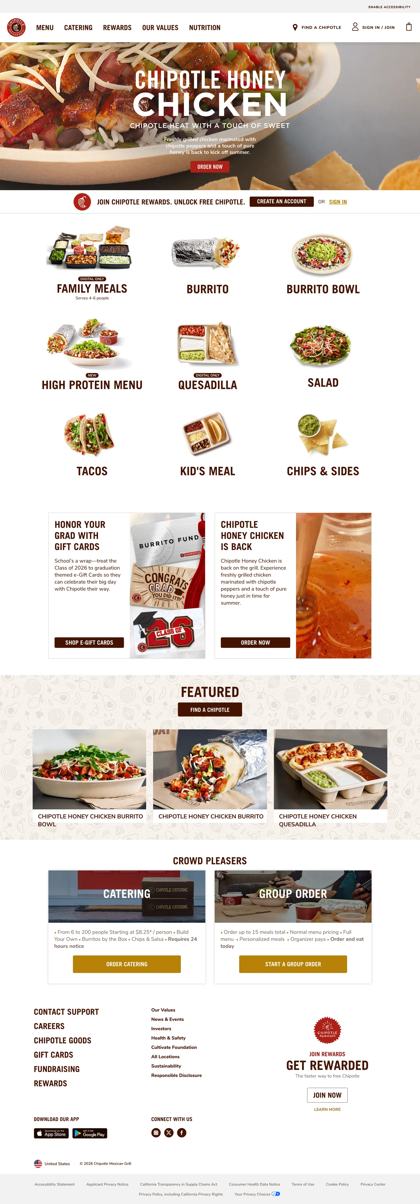
Chipotle's ordering surface reads like a deli counter laid out on butcher paper. The dominant chrome color is not black and not gray — it is a deep burnt-umber ink (`#451400`) that carries roughly 677 occurrences across the captured page, split almost evenly between text (335) and hairline border (331). That single token does the work that most retail systems split between a heading color, a body color, and a divider gray. Mustard gold (`#b68207`) shows up only 8 times — the Honey Chicken hero CTA strip and a Rewards bag-grab promo are essentially the entire chromatic budget of the page. Where most fast-casual brands ship a flat tomato red or a leaf green as their voltage, Chipotle reserves color for the moments the photograph cannot carry on its own.
This page packages Chipotle's marketing-and-order surface into one DESIGN.md file built on the Google Labs spec. Inside: 18 color tokens grouped into burnt-umber chrome (ink, hairline, shadow), photographic-safe neutrals (cream, white, ash), the single mustard-gold brand voltage, a crimson Rewards red, and four warm chili-tone gradients. 11 typography tokens run on a Trade Gothic LT Bold uppercase / Nunito body split — display sits at 48px in weight 500 uppercase rather than the 700+ weight that fintech brands lean on. The spec also captures 4px and 12px corner radii, an 8-step spacing scale from 5px to 40px anchored at 16px and 20px, and 17 components — the menu category tile, the burnt-umber filled CTA, the Rewards bag-grab card, the Catering hero panel, the bottom-of-page footer column.
Feed the file to Claude, Cursor, or GitHub Copilot and the agent will reproduce Chipotle's restraint — die-cut food photography on cream-white tiles, 4px-cornered burnt-umber buttons with 16/700 Nunito Extra Bold uppercase labels, mustard-gold reserved for the hero strip — rather than a generic fast-casual theme. Or read the file as a discipline study: the system's strength is that almost every container reuses the same burnt-umber outline plus white fill plus photographic tile vocabulary, which is why Chipotle never needs a secondary accent to ship a new featured menu category.
What makes it distinct
- Burnt-umber monochrome chrome#451400 carries 677 occurrences as both text (335) and hairline border (331), the structural workhorse of the whole site
- Mustard-gold scarcity voltage#b68207 appears 8 times total, reserved for the Honey Chicken hero CTA and a single rewards strip
- Photographic menu tiles, not typographic categoriesevery menu entry is a die-cut food photograph above 24px uppercase Trade Gothic LT Bold
- Hard-corner geometryevery CTA carries a 4px radius and 9 of 12 radii on the page are 4px, with 12px reserved only for the catering hero panels
- Two-typeface split disciplineTrade Gothic LT Bold uppercase for category and headline moments, Nunito 18/400 for descriptions and body, never blended
Live at chipotle.com
A snapshot of the brand in production. Hover the frame to scroll the page; click to visit.
 chipotle.com
Explore Chipotle
Pick what you want to see — mockups, colors, typography, layout, or the full component list.
Brand & Accent
Sparing, CTA-only voltage.
Text
Headlines, body, captions, muted.
Borders & Hairlines
Dividers, outlines, structural rules.
Other
Specialty colors.
Chipotle design system FAQ
Common questions about Chipotle's tokens, components, and how to use this DESIGN.md in your project.
Related reading
Specs, directories, and component libraries that pair with this design system.
Browse all design systems
The full directory of DESIGN.md files on shadcn.io, with live mockups for each.
Chipotle — official site
Chipotle Mexican Grill's ordering and rewards surface — the source this design.md describes.
The DESIGN.md specification
Google Labs' open spec for machine-readable design system files.
Use Chipotle in your project
One machine-readable file. Drop it into Claude, Cursor, or any AI tool that reads DESIGN.md.