Circle Design System
Circle's marketing-site design system as DESIGN.md.
About Circle DESIGN.md
Curated by Dov AzencotUpdated Source circle.com
- Fintech & Crypto
- Banking & Payments
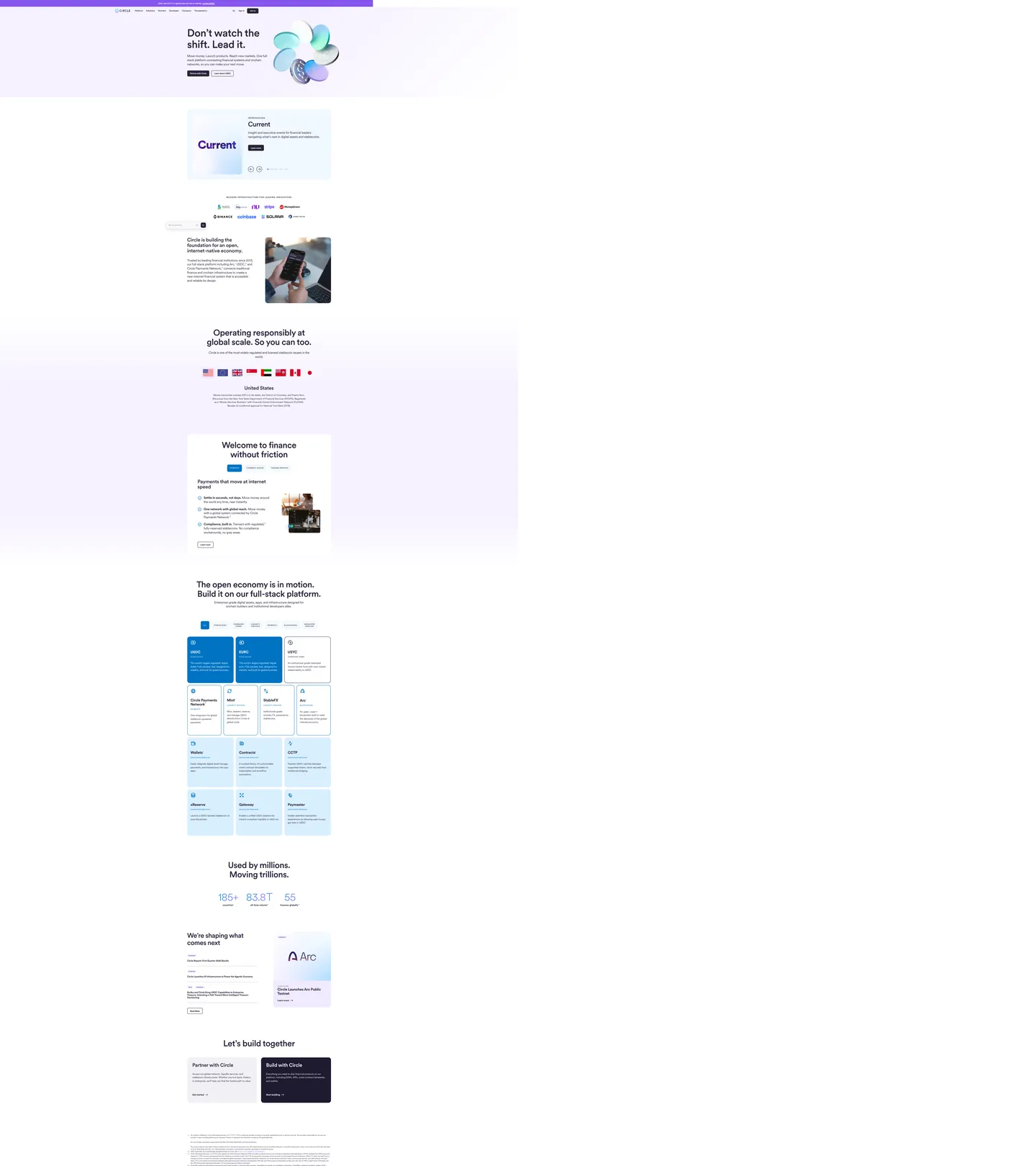
Circle's marketing site has an identity signal that takes a moment to name: the dark color that does everything is not black, not navy, but aubergine. The primary ink, the button fill, the button border, the text-selection highlight, and the CSS variable `--colors-all--primary` all resolve to the same deep purple-near-black (#29233b), wired as "Licorice 700" in the system's semantic palette. The effect, against a pale periwinkle canvas, is that Circle reads simultaneously as a financial institution (dark, authoritative) and a product with a distinctive chromatic identity (the canvas is never neutral white, always blue-lavender). Where Stripe leans indigo, and where most crypto-infrastructure brands reach for electric blue on dark surfaces, Circle plants its authority in an aubergine that doesn't announce itself as purple but reads differently from any neutral.
The DESIGN.md file packages the system into a machine-readable spec for React and AI coding tools. Inside: 17 color tokens drawn from Circle's palette-bestiary — Licorice (aubergine-dark tier), Jelly (violet accent for gradients), Gumdrop (sky-blue link and accent tier), plus structural whites and hairlines. Thirteen typography tokens run Circularxx across every surface: the hero h1 at 80px/500 with -1.5px tracking, h2 section displays at 51-66px, a 12px/500/uppercase eyebrow style that appears 28 times, and body copy at 14-18px/400. Radius tokens center on 20px for card surfaces and 50px for pill elements. Eighteen components cover the product-grid with tabbed navigation, the stats counter strip, the news-card set, and the CTAs.
Feed this file to Claude or Cursor and it will reproduce Circle's specific moves: periwinkle canvas instead of white, aubergine primary used as both ink and button fill with no separate accent reserved for CTAs, Circularxx at the same geometric weight across every tier, uppercase eyebrows at 12px for category labeling, and the violet-to-cyan gradient orb that floats beside the hero headline. The system's design lesson: when a single color carries every semantic role (text, border, button, selection), the palette achieves coherence through simplicity rather than through careful accent isolation.
What makes it distinct
- Licorice-as-everythingthe aubergine near-black (#29233b) serves simultaneously as primary ink, button fill, button border, and even the browser text-selection background
- Circularxx across every tierthe same rounded geometric sans from 12px uppercase eyebrows to 80px hero h1, with no weight heavier than 700 anywhere above body copy
- Periwinkle canvasthe page background is a pale blue-lavender (#edf1fc from themeColor) rather than pure white, carrying a faint blockchain-native color signal
- Jelly violet gradientthe hero decoration is a 3D-rendered orb in violet-to-cyan gradients using the Jelly (#9f72ff) and Gumdrop (#1894e8) palette families
- UPPERCASE eyebrows at 12pxsmall-caps category labels run Circularxx 12px/500 uppercase with 1.2px letter-spacing, appearing 28 times across the page
Live at circle.com
A snapshot of the brand in production. Hover the frame to scroll the page; click to visit.
 circle.com
Explore Circle
Pick what you want to see — mockups, colors, typography, layout, or the full component list.
Brand & Accent
Sparing, CTA-only voltage.
Surface
Page and card backgrounds.
Text
Headlines, body, captions, muted.
Borders & Hairlines
Dividers, outlines, structural rules.
Other
Specialty colors.
Circle design system FAQ
Common questions about Circle's tokens, components, and how to use this DESIGN.md in your project.
Related reading
Specs, directories, and component libraries that pair with this design system.
Browse all design systems
The full directory of DESIGN.md files on shadcn.io, with live mockups for each.
Circle — official site
Circle's public marketing site — the source of truth for the live tokens captured in this file.
The DESIGN.md specification
Google Labs' open spec for machine-readable design system files — the format this page is built on.