Citi Design System
Citi's marketing-site design system as a DESIGN.md file.
About Citi DESIGN.md
Curated by Dov AzencotUpdated Source citi.com
- Banking & Payments
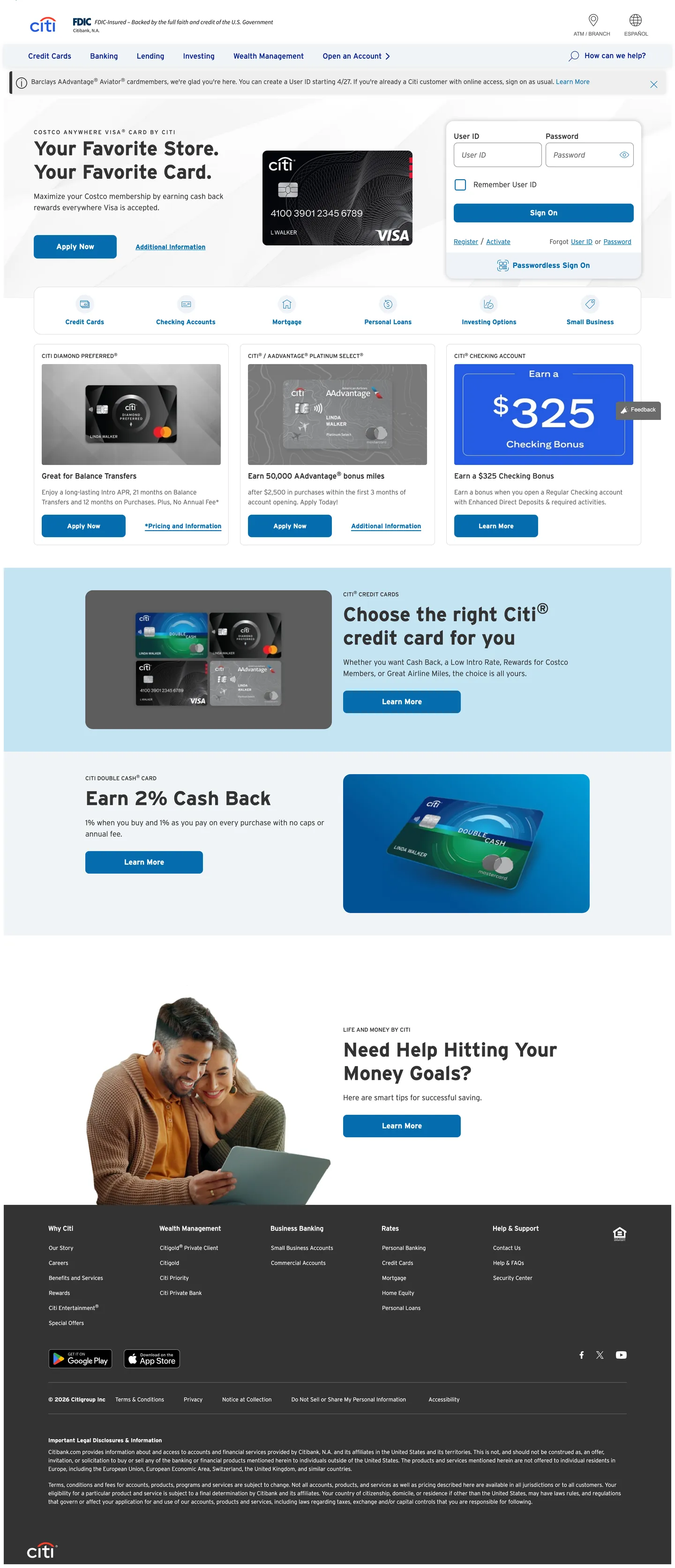
Citi's homepage is a banking page in the most literal sense: white canvas, navy top navigation, cerulean link text everywhere, card product photography, and dense utility navigation above the fold. The Citi arc logo — the two blue arcs framing the wordmark — is the only expressive brand mark on the page. Below it, the system is entirely workhorse. Where Chase leans on dark navy fills and JPMorgan applies institutional photography at scale, Citi holds everything on white and lets the cerulean link color do all the wayfinding. The hero area is a light blue-tinted band that sits just below the nav, not a full-bleed canvas; the brand color never escapes to fill a section.
The DESIGN.md file packages the system into machine-readable tokens for React and AI tools. Inside: 12 color tokens anchored by deep navy #002d72 (the CSS --cdsbs-primary, layer: brand) and cerulean #056dae (appearing 115 times as the link and interactive surface color), with a supporting cast of near-black #333333 for body text, white for the canvas, and a light grey #f4f4f4 for alternate section fills. Typography runs Interstate exclusively — Light at 300 weight for caption and body, Regular at 400 for nav and running text, Bold at 700 for display headlines (42px) and label accents. Fifteen components cover the dual-button nav, credit card product tiles, the sign-on form, and the primary CTA.
Feed this file to an AI coding tool and it reproduces Citi's specific moves: dual-blue wayfinding, Interstate weight system, 8px radius on every interactive surface, and white-canvas banking-first layout. The one discipline worth borrowing for any financial product: separating the brand blue (deep navy, used sparingly for the logo and primary variable) from the interactive blue (cerulean, used everywhere that needs to feel clickable), rather than collapsing both into a single brand accent. Citi's link color and button color are the same cerulean — a deliberate convention that trains users to trust the color as interactive rather than decorative.
What makes it distinct
- Dual-blue hierarchydeep navy #002d72 anchors the brand primary while cerulean #056dae carries all interactive link and CTA surfaces, appearing 115 times across the page
- Interstate across every tierthe proprietary highway sans runs in three weights (Light/Regular/Bold) with no secondary family, from 42px display to 12px caption
- Institutional white canvasthe page floor is pure white with light grey (#f4f4f4) section bands; no hero canvas fill, no expressive color moments outside the nav
- 8px default radiusconsistent rounded-md on every card, button, and input; the system neither commits to sharp corners nor to generous rounding
- High-density nav with utility linksthe top nav bands a thin utility strip (Find a branch, Sign on) above the primary product nav (Credit Cards, Banking, Loans, Investing)
Live at citi.com
A snapshot of the brand in production. Hover the frame to scroll the page; click to visit.
 citi.com
Explore Citi
Pick what you want to see — mockups, colors, typography, layout, or the full component list.
Brand & Accent
Sparing, CTA-only voltage.
Surface
Page and card backgrounds.
Text
Headlines, body, captions, muted.
Borders & Hairlines
Dividers, outlines, structural rules.
Semantic
Status, errors, success, inline links.
Other
Specialty colors.
Citi design system FAQ
Common questions about Citi's tokens, components, and how to use this DESIGN.md in your project.
Related reading
Specs, directories, and component libraries that pair with this design system.
Browse all design systems
The full directory of DESIGN.md files on shadcn.io, with live mockups for each.
Citi — official site
Citi's public marketing site — the source of truth for the live tokens captured in this file.
The DESIGN.md specification
Google Labs' open spec for machine-readable design system files — the format this page is built on.