Coolify Design System
Coolify's marketing system runs the dev-infra dark canvas at #101010, a 60px Inter hero headline in white, charcoal pill toggles instead of a CTA, and a three-tier sponsor wall th…
About Coolify DESIGN.md
Curated by Dov AzencotUpdated Source coolify.io
- Web Infrastructure & Hosting
- Backend, Database & DevOps
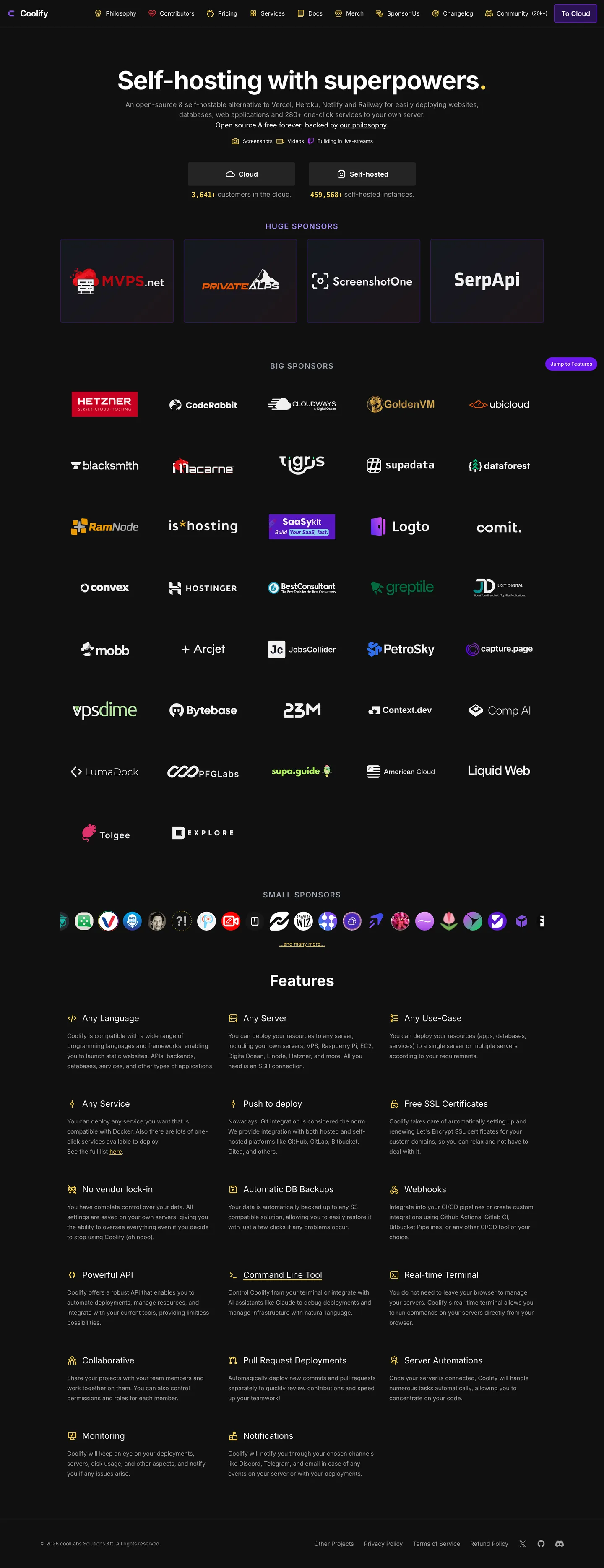
Coolify's marketing page does something most dev-infra brands would consider risky: there is no primary CTA above the fold. The hero centers a 60px Inter weight-700 headline ("Self-hosting with superpowers.") in white on a near-black floor, a 14px grey sub-paragraph, a row of micro stat badges, and then — instead of a single bright "Get Started" pill — a 2-up segmented toggle in matte charcoal lets the visitor pick between Cloud and Self-hosted. The cobalt-violet brand voltage that the CSS calls coollabs purple sits dormant. The only place the page concedes a chromatic pill above the fold is a small buttercup "View Features" jump-link tucked at the right edge of the toggle row.
The DESIGN.md file captures the system as a token spec for React tooling. Inside: 13 color tokens drawn from the 12 raw hexes the page renders, organized into a three-tier dark surface ladder (canvas #101010, base-200 #181818, base-300 #242424), an Inter-only typography stack at weights 400 and 700, a 4-step radius scale centered on 4.8px, an 8px-based spacing system, and 14 component definitions covering the charcoal segmented toggle, the cobalt-violet feature pill, the dark sponsor card, the dark feature checklist row, and the standard dev-infra top nav. Cobalt-violet #6b16ed and buttercup yellow #fcd34d are the only chromatic tokens; everything else is the dark surface ladder, the white ink, and the neutral-400 grey body text.
Feed this file to an AI coding tool and it reproduces the specific moves: near-black canvas at #101010 rather than the slightly-warmer Linear / Vercel near-black, dark charcoal segmented toggle instead of a bright CTA, Inter at 400/700 only with no medium weight, and a multi-tier sponsor wall doing the social-proof work that customer logos and testimonials would normally carry. Borrow it if your product is itself open-source and the visitor needs to choose between hosted and self-hosted before they can read further; the deferred-CTA move would feel evasive in a closed-source SaaS context.
What makes it distinct
- Sponsor-wall as proofHuge, Big, and Small sponsor tiers replace the testimonial carousel and customer-logo strip, filling 60% of the mid-page in monochrome OSS marks
- No-CTA herothe only above-fold action is a Cloud vs Self-hosted pill toggle in charcoal, not the cobalt-violet brand color held in reserve below
- Inter at 400 and 700 onlyno medium weight, no display family, the 60px headline shares the same face as 14px body
- Cobalt-violet kept off the hero#6b16ed is wired as --color-coollabs and --color-primary but appears just once above the fold, on the View Features pill
- Three-tier dark surface laddercanvas #101010, base-200 #181818, base-300 #202020, lifting cards by lightness only with no shadow tier
Live at coolify.io
A snapshot of the brand in production. Hover the frame to scroll the page; click to visit.
 coolify.io
Explore Coolify
Pick what you want to see — mockups, colors, typography, layout, or the full component list.
Brand & Accent
Sparing, CTA-only voltage.
Surface
Page and card backgrounds.
Text
Headlines, body, captions, muted.
Borders & Hairlines
Dividers, outlines, structural rules.
Semantic
Status, errors, success, inline links.
Other
Specialty colors.
Coolify design system FAQ
Common questions about Coolify's tokens, components, and how to use this DESIGN.md in your project.
Related reading
Specs, directories, and component libraries that pair with this design system.
Browse all design systems
The full directory of DESIGN.md files on shadcn.io, with live mockups for each.
Coolify — official site
Coolify's public marketing site — the source of truth for the live tokens captured in this file.
The DESIGN.md specification
Google Labs' open spec for machine-readable design system files — the format this page is built on.