Defector Design System
Defector's design system as a DESIGN.md file.
About Defector DESIGN.md
Curated by Dov AzencotUpdated Source defector.com
- News & Publishing
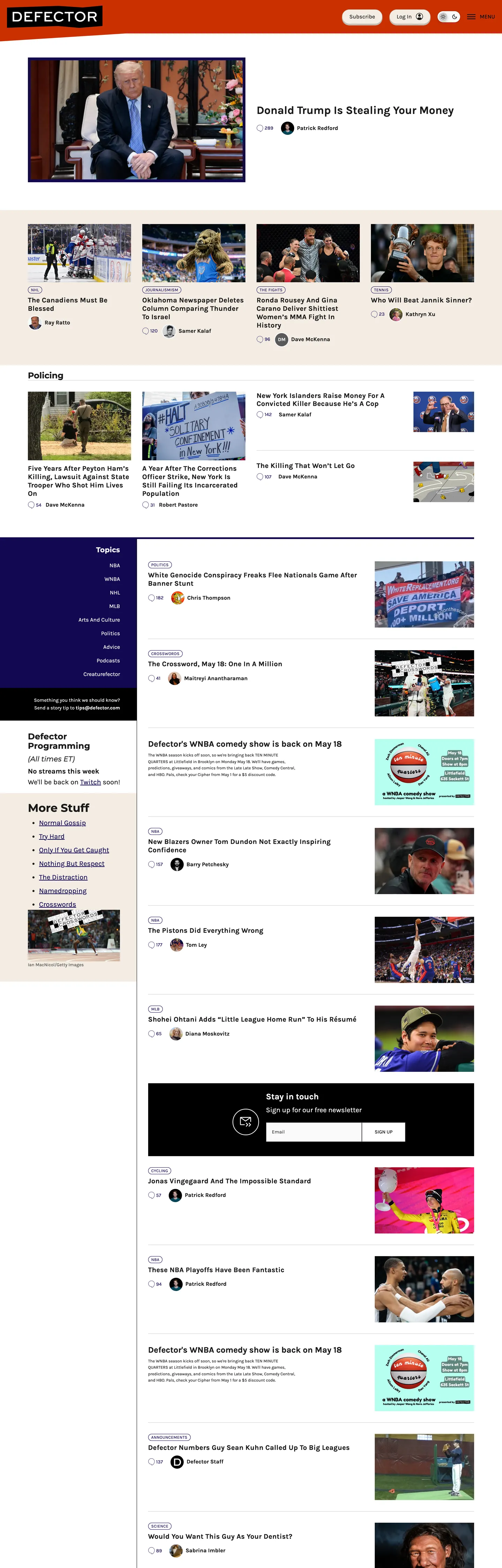
Defector's homepage packs more content into one viewport than almost any peer publication. A 32px bold article headline sits above a compressed grid of photo-plus-title cards, a sidebar column runs parallel with a timestamped feed of stories, and a dark-navy navigation bar anchors the top with sport-category links in white Karla at weight 500. This is a publication built by and for people who want sports writing in high volume. Where The Atlantic layers editorial restraint into every typographic choice and The New Yorker deploys custom display type, Defector uses a Google Font at bold weight and makes no apologies for it.
The DESIGN.md file packages the system into a machine-readable spec for React and AI tools. Inside: 8 color tokens drawn from a near-monochromatic palette — near-black ink, midnight navy for the navigation band, white canvas, light cream for secondary surface states, and a handful of greys — with no accent color appearing in any chrome element. Ten typography tokens run Karla across all display and body tiers, with Montserrat appearing in section-heading contexts; weight 700 is the display standard, weight 500 the body standard, and weight 400 reserved for form inputs. The radius scale has one step for pill CTAs at 40px and zero for all other surfaces. 15 components cover the dense article-card grid, the dark-navy nav band, the ghost-pill login button, and the square email subscription input.
Feed this file to an AI coding tool and it reproduces Defector's specific moves: navy-only chromatic moment in the nav, Karla bold across editorial display, ghost-pill CTA beside a sharp-cornered input, and the compressed multi-column layout built for reading volume rather than premium pause. The one discipline worth borrowing for editorial products: Defector proves that a single navy navigation bar — not a full brand color applied to CTAs and links — is enough chromatic identity for a site that runs on content authority rather than brand marketing.
What makes it distinct
- Midnight navy navigation bandthe only chromatic moment in the chrome is the deep navy header bar; every other surface is near-black or white, making the nav the sole brand-color statement
- Karla 700 as the editorial workhorseheadlines, section labels, and the primary button all run Karla at bold weight; there is no display-only tier using a separate high-contrast face
- Ghost pill at 40px beside a square input at 0pxthe CTA button curves to a full capsule while the email subscription field stays flat-cornered; the radius contrast is stark and intentional
- Information-dense grid20px column gutters, compressed article-card layouts, and a sidebar-plus-feed structure that packs more headlines per viewport than any peer publication
- Worker-owned publication identityno investor-aligned color restraint or enterprise-safe neutrality; the system is built for readers who want a lot of sports writing, fast
Live at defector.com
A snapshot of the brand in production. Hover the frame to scroll the page; click to visit.
 defector.com
Explore Defector
Pick what you want to see — mockups, colors, typography, layout, or the full component list.
Brand & Accent
Sparing, CTA-only voltage.
Surface
Page and card backgrounds.
Text
Headlines, body, captions, muted.
Borders & Hairlines
Dividers, outlines, structural rules.
Defector design system FAQ
Common questions about Defector's tokens, components, and how to use this DESIGN.md in your project.
Related reading
Specs, directories, and component libraries that pair with this design system.
Browse all design systems
The full directory of DESIGN.md files on shadcn.io, with live mockups for each.
Defector — official site
Defector's public site — the source of truth for the live tokens captured in this file.
The DESIGN.md specification
Google Labs' open spec for machine-readable design system files — the format this page is built on.