Docker Design System
Docker's marketing-site design system as a DESIGN.md file.
About Docker DESIGN.md
Curated by Dov AzencotUpdated Source docker.com
- Developer Tools & IDEs
- Backend, Database & DevOps
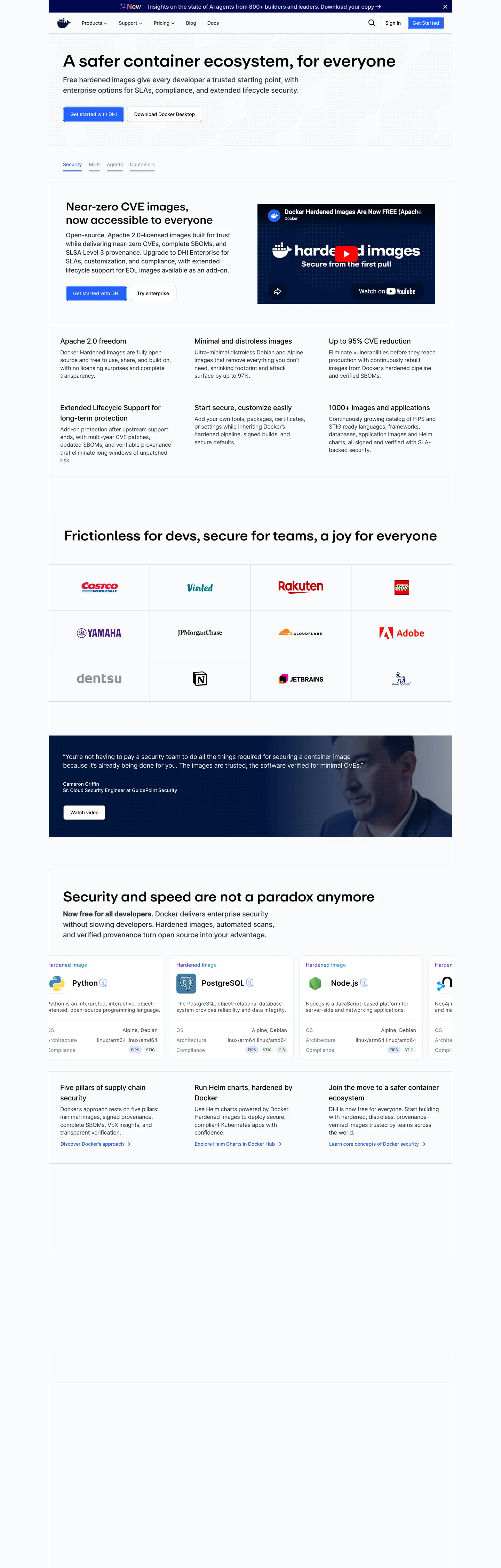
Docker's marketing homepage is not trying to win a design award. The hero is a white surface with a black 48px headline ("A safer container ecosystem, for everyone"), a two-paragraph body explanation, and a side-panel screenshot showing "Hardened Images" with a metric counter. Below the fold: a partner-logo wall (Salesforce, Rakuten, HelloFresh, Adobe, Atlassian), a two-column security feature block, and a testimonial quote. The decorative budget is zero. Where Cloudflare fills the hero canvas with saturated orange and AWS runs spectral gradient thumbnails, Docker gives you a statement and gets out of the way. The entire chromatic system rests on one electric-blue (#2560ff) voltage wired to 30+ CSS custom properties — button fills, link colors, icon fills, tab borders, input focus rings, table accents — and a deep navy-to-dark-slate prose palette.
The typographic split is the system's most distinctive move: **Repro** (a proprietary display sans) carries the 24–48px headline tier at weight 500, while **Inter** carries everything below — body paragraphs at 16–18px, nav links at 14px, labels at 12–14px in weight 400–500. The display/body split means the two faces share weight and rhythm but differ in optical warmth. Repro reads slightly cooler and more geometric at large sizes; Inter reads neutral and trustworthy at small. The combination signals "product company with engineering discipline" without the austerity of a purely monospace system (Bun, Warp) or the editorial weight of a grotesk system (Cloudflare, Docker's own enterprise competitor VMware).
The radius story is binary-conservative: 4px on buttons and interactive chips, 8px on cards. No 12px, 16px, or pill tier. Every surface rounds just enough to not be sharp. This is the opposite of Spline's generous-soft 16px default or Cloudflare's binary small-step-plus-pill — Docker's rounding says "tool, not toy."
What makes it distinct
- Single electric-blue voltage#2560ff wired to --buttonPrimaryBackground, --linkColor, --iconColor, and 30+ other CSS custom properties
- Two-family typographyRepro (proprietary) for display headings, Inter for body, labels, and nav links
- Conservative rounding4px on buttons and chips, 8px on cards; no generous pill scale, no 16px default
- Security-metric credibility layerthe hero section names CVE counts and partner logos rather than using decorative brand illustration
- High-frequency dark slate ink#2c333f (644 occurrences) handles label, subhead, and copy roles simultaneously
Live at docker.com
A snapshot of the brand in production. Hover the frame to scroll the page; click to visit.
 docker.com
Explore Docker
Pick what you want to see — mockups, colors, typography, layout, or the full component list.
Brand & Accent
Sparing, CTA-only voltage.
Surface
Page and card backgrounds.
Text
Headlines, body, captions, muted.
Borders & Hairlines
Dividers, outlines, structural rules.
Semantic
Status, errors, success, inline links.
Docker design system FAQ
Common questions about Docker's tokens, components, and how to use this DESIGN.md in your project.
Related reading
Specs, directories, and component libraries that pair with this design system.
Browse all design systems
The full directory of DESIGN.md files on shadcn.io, with live mockups for each.
Docker — official site
Docker's public marketing site — the source of truth for the live tokens captured in this file.
The DESIGN.md specification
Google Labs' open spec for machine-readable design system files — the format this page is built on.