Dropbox Design System
Dropbox's design system as a DESIGN.md file.
About Dropbox DESIGN.md
Curated by Dov AzencotUpdated Source dropbox.com
- Productivity & SaaS
- Documentation & Knowledge
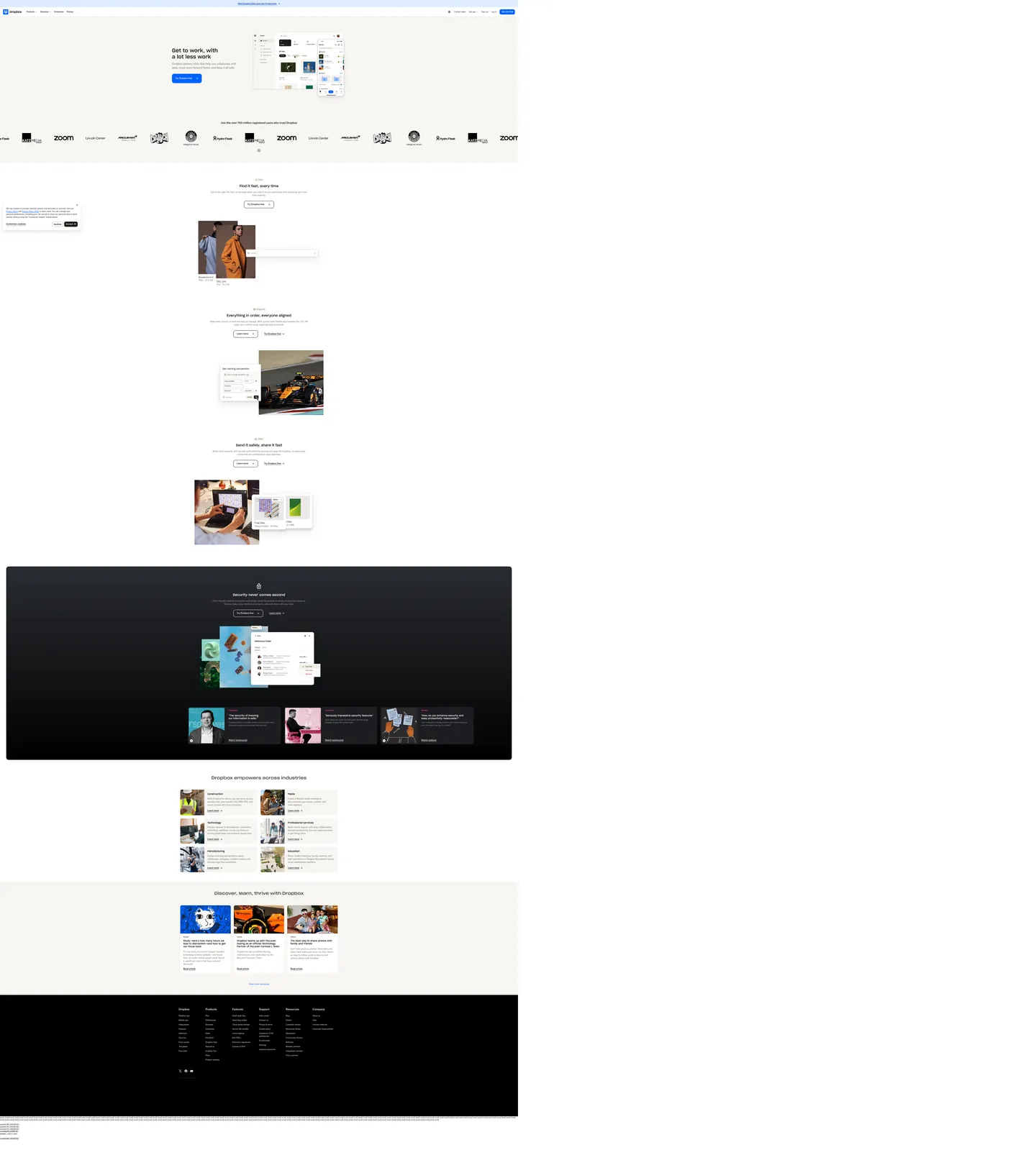
Dropbox's marketing page opens on a warm cream wash — not white — at "#f7f5f2", with the headline "Get to work, with a lot less work" set in Sharp Grotesk at 40px weight 500 against near-black ink "#1e1919". The lone filled CTA is a Dropbox Blue "#0061fe" pill carrying "Try Dropbox free", and a soft-gray product mockup hovers to the right of the type column. The page never doubles up on filled buttons in the same band, never gradients its hero, and never reaches for pure black on its primary canvas. The voice is workspace, not consumer; the chrome is warm-neutral, not fintech-blue.
This page packages the surface into a single DESIGN.md file. Inside: 20 color tokens covering the cream canvas, near-black ink, Dropbox Blue voltage, the deep sapphire press state "#0044af", and the supporting brown-warm hairline tier, plus the inverted "#000000" dark band that carries the security pitch mid-page; 12 typography tokens running Sharp Grotesk at 18 to 40px for display and Atlas Grotesk Web at 14 to 20px for body and UI; 5 corner radii from 8px chips to the 100px button pill; 8 spacing values resolving to a 4 / 8 / 12 / 16 / 24px rhythm; and 17 components covering the primary pill, outline secondary, text input, top nav, customer logo strip, feature card, dark security band, and the eyebrow-and-headline pairing that opens every section. Format follows the Google Labs DESIGN.md spec.
Feed the file to Claude, Cursor, or GitHub Copilot. The agent reproduces Dropbox's warm-neutral discipline — cream canvas, single-blue CTA hierarchy, Sharp-and-Atlas typeface pairing, 12 to 16px card radii with 100px button pills — instead of a generic SaaS theme. Reference tokens directly inside Tailwind config or CSS variables. This system is worth studying for one reason: it shows that a 700-million-user productivity brand can stay warm and bookish on the page while keeping a single electric voltage in reserve, a stance most workspace competitors abandon for either dark dashboards or pastel maximalism.
What makes it distinct
- Single voltage CTADropbox Blue #0061fe carries the lone filled pill per band, never paired with a second filled button
- Warm cream canvas #f7f5f2 instead of pure whitethe brand softens its workspace identity with a 4-percent warm tint
- Dual-typeface contrastSharp Grotesk at weight 500 for display headlines, Atlas Grotesk Web for every body and UI surface
- Two-radius geometry12 to 16px on cards and surfaces, 100px on every interactive pill button
- Inverted security bandnear-black #000000 dark surface drops into the middle of a cream marketing flow for the security pitch
Live at dropbox.com
A snapshot of the brand in production. Hover the frame to scroll the page; click to visit.
 dropbox.com
Explore Dropbox
Pick what you want to see — mockups, colors, typography, layout, or the full component list.
Brand & Accent
Sparing, CTA-only voltage.
Surface
Page and card backgrounds.
Text
Headlines, body, captions, muted.
Borders & Hairlines
Dividers, outlines, structural rules.
Dropbox design system FAQ
Common questions about Dropbox's tokens, components, and how to use this DESIGN.md in your project.
Related reading
Specs, directories, and component libraries that pair with this design system.