Figma Design System
Figma's design system as a DESIGN.md file.
About Figma DESIGN.md
Curated by Dov AzencotUpdated Source figma.com
- Design & Creative Tools
- Productivity & SaaS
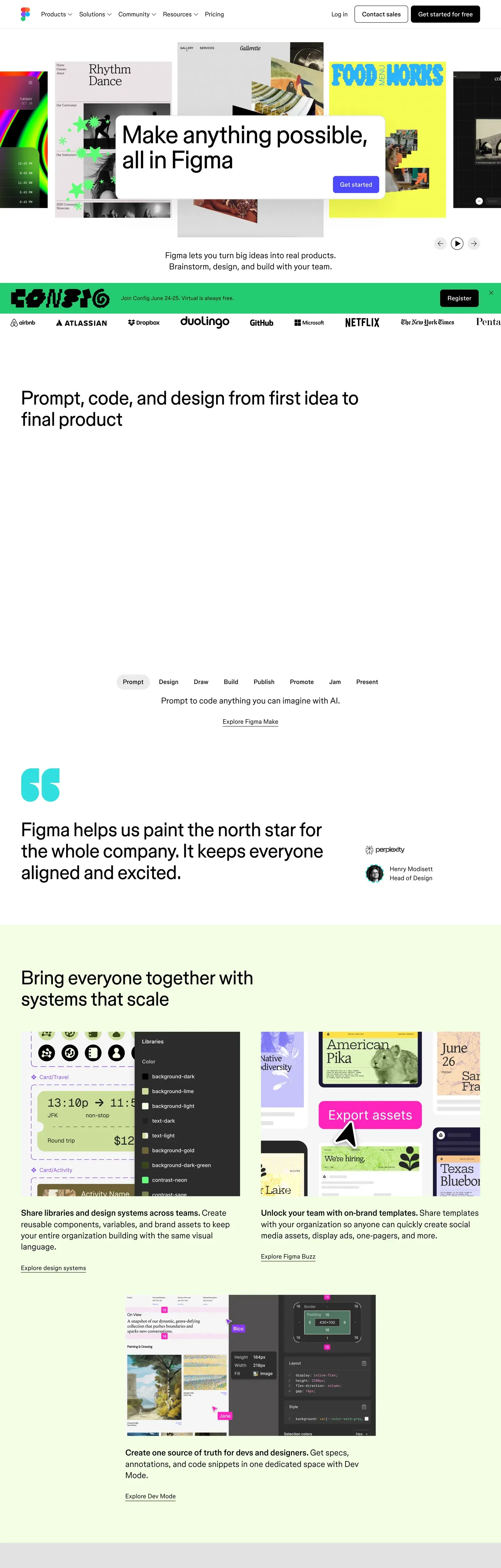
Figma's marketing site is the rare case where a design tool actually demonstrates its own design discipline. The frame is monochrome — black ink, white canvas, figmaSans variable type, pill-shaped CTAs — but every long-form page interrupts itself with oversized pastel panels that span the full content width. Lime for systems and FAQ, lilac for the /design route and FigJam highlights, cream for templates, mint and pink for FigJam pastel stories, coral for "ship products" on the home page, and a deep navy for the only inverse story block above the footer. The chrome stays editorial; the blocks do the storytelling. There is no gradient, no shadow stack, no second accent color outside a single magenta promo pill reserved for one CTA per page.
This page packages all of that into a single DESIGN.md file. Inside: 20 color tokens grouped into brand, surface, text, and semantic roles; 13 type styles across figmaSans and figmaMono; 7 corner radius steps from 2px hairline to a 50px pill; 9 spacing tokens on an 8px base; and 26 components covering buttons, pricing tabs, color-block sections, navigation, comparison glyphs, and the dense footer link grid. The file follows Google Labs' DESIGN.md spec, so every token resolves to a concrete hex, px, or weight a build tool can read.
Feed the file to Claude, Cursor, or GitHub Copilot and the agent reproduces Figma's contrast — monochrome chrome interrupted by deliberate color-block sections — rather than a generic SaaS theme. Reference the tokens directly to wire them into Tailwind config, CSS variables, or your own component library. The system is worth studying because it solves a problem most marketing sites get wrong: how to feel both technical and joyful without leaning on bling.
What makes it distinct
- Monochrome chromeevery CTA is black #000000 or white #ffffff; the system never reaches for a brand color outside the pastel blocks
- Seven oversized pastel surfaceslime, lilac, cream, mint, pink, coral, navy — span full content width with 24px corners and 48px padding
- Pill is the only button shape50px radius for text CTAs, 9999px for icon buttons, no square button anywhere
- figmaSans at unusual weight increments320, 330, 340, 480, 540, 700 — the type reads as one voice modulating, not a stepped family
- Display headlines pull -1.72px tracking at 86pxeditorial cadence without sacrificing body readability at 18px
Live at figma.com
A snapshot of the brand in production. Hover the frame to scroll the page; click to visit.
 figma.com
Explore Figma
Pick what you want to see — mockups, colors, typography, layout, or the full component list.
Brand & Accent
Sparing, CTA-only voltage.
Surface
Page and card backgrounds.
Text
Headlines, body, captions, muted.
Borders & Hairlines
Dividers, outlines, structural rules.
Semantic
Status, errors, success, inline links.
Other
Specialty colors.
Figma design system FAQ
Common questions about Figma's tokens, components, and how to use this DESIGN.md in your project.
Related reading
Specs, directories, and component libraries that pair with this design system.
Browse all design systems
The full directory of DESIGN.md files on shadcn.io, with live mockups for each.
Figma Design product page
The live /design/ route Figma uses to market the editor — the lilac hero is the canonical color-block reference.
The DESIGN.md specification
Google Labs' open spec for machine-readable design system files — the format this page is built on.