Framer Design System
Framer's design system as a DESIGN.md file.
About Framer DESIGN.md
Curated by Dov AzencotUpdated Source framer.com
- Design & Creative Tools
- Developer Tools & IDEs
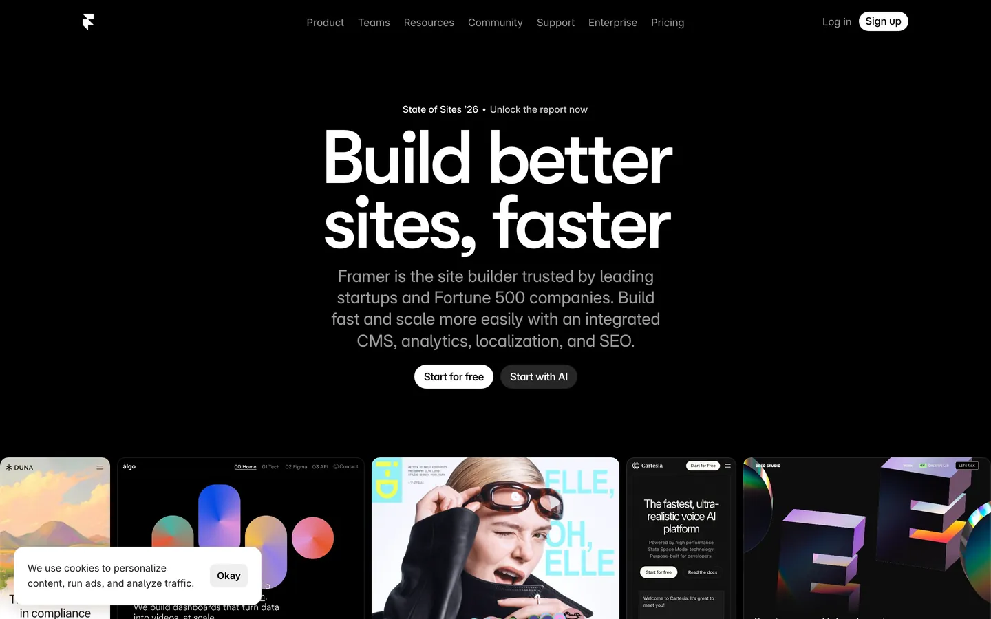
Framer's marketing canvas reads like a working artboard. The dominant surface is near-pure black with a faint warmth, and on top of it sits oversized white display type in GT Walsheim Medium with letter-spacing pulled to extreme negative values — 5.5px on the 110px hero, 4.25px on the 85px section openers. There is no light mode. Every band of the page chooses between black canvas or a charcoal lift; no white interludes break the rhythm. The single chromatic accent is a sharp signal blue (#0099ff), reserved exclusively for hyperlinks, focus rings, and selection states. What separates Framer from other dark systems is the rhythm break: oversized magenta, violet, orange and coral gradient panels drop into monochrome card grids as living atmosphere tiles, not section backgrounds.
This page packages the whole system into a single DESIGN.md file built on the Google Labs spec. Inside: 18 color tokens grouped into brand, surface, text, semantic and signature gradient sets; 13 type styles running from a 110px display down to 12px micro; 8 corner radii from a 4px utility chip up to a 100px pill; 9 spacing increments on a non-standard 5px base; and 22 components covering pill buttons, pricing tabs, text inputs, mockup tiles, gradient spotlight cards, comparison rows, FAQ, top nav and footer. Every token is a quoted string ready to paste into Tailwind config, CSS variables, or your own component library.
Feed the file to Claude, Cursor, or GitHub Copilot and the agent reproduces Framer's discipline — the white pill CTA, the charcoal surface lift, the binary ink-to-ink-muted hierarchy, the scarce gradient spotlight — rather than a generic dark SaaS theme. The system is worth studying because it shows how far typography and surface lift can carry a brand when the palette is monochrome plus one signal color. Where lesser dark themes lean on neon or rainbow gradients, Framer leans on negative tracking and a single confident blue.
What makes it distinct
- Pure black canvas#090909 carries hero, pricing, FAQ and footer; no light-mode interludes anywhere on the marketing site
- Display tracking at -5.5px110px GT Walsheim Medium pulled to 5% negative letter-spacing is the brand voice, not a stylistic accident
- Single signal blue#0099ff appears only on hyperlinks, focus rings and selected states; never a button fill
- Gradient spotlight cardsmagenta, violet, orange and coral tiles drop into monochrome grids as atmosphere, not section grounds
- Inter Variable with cv01/05/09/11 and ss03/ss07OpenType character variants are the body voice, not a stylistic afterthought
Live at framer.com
A snapshot of the brand in production. Hover the frame to scroll the page; click to visit.
 framer.com
Explore Framer
Pick what you want to see — mockups, colors, typography, layout, or the full component list.
Brand & Accent
Sparing, CTA-only voltage.
Surface
Page and card backgrounds.
Text
Headlines, body, captions, muted.
Borders & Hairlines
Dividers, outlines, structural rules.
Semantic
Status, errors, success, inline links.
Other
Specialty colors.
Framer design system FAQ
Common questions about Framer's tokens, components, and how to use this DESIGN.md in your project.
Related reading
Specs, directories, and component libraries that pair with this design system.
Browse all design systems
The full directory of DESIGN.md files on shadcn.io, with live mockups for each.
Framer.com
The live site this spec was extracted from — see the gradient spotlight cards and display tracking in motion.
The DESIGN.md specification
Google Labs' open spec for machine-readable design system files — the format this page is built on.