Last.fm Design System
Last.fm's design system as a DESIGN.md file.
About Last.fm DESIGN.md
Curated by Dov AzencotUpdated Source last.fm
- Music, Video & Streaming
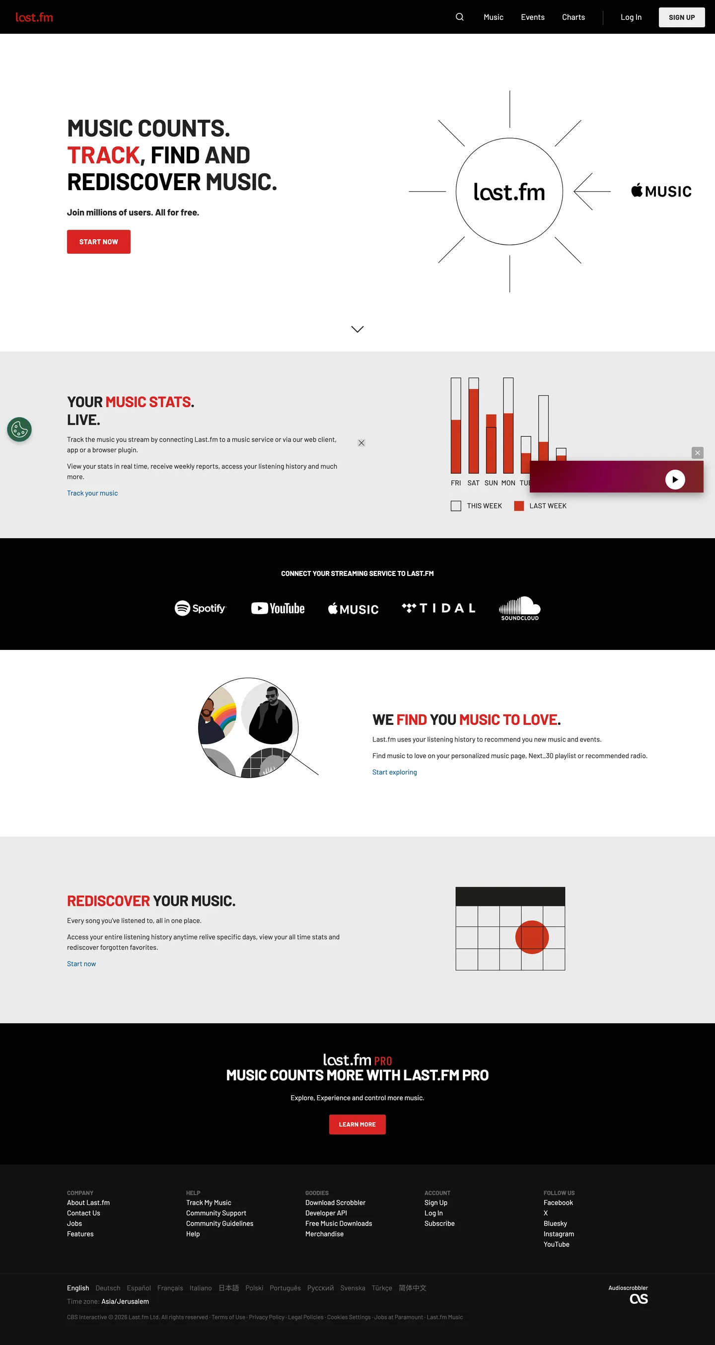
Last.fm's homepage is the rare 2026 music product that still looks like a 2008 scrobbler — a deliberate two-band layout where a white statistics surface sits above a black "Connect your streaming service to Last.fm" band, with a single Postbox Red ("#d92323") CTA labeled START NOW pinned beneath the hero. The brand voltage is applied with surgical scarcity: red appears on exactly one button, on one word inside each headline ("TRACK", "MUSIC STATS", "REDISCOVER"), and on a calendar dot illustration. Every other interactive surface is achromatic. Links run in Navy ("#005399") rather than the brand red, because red has been promoted to a structural role — almost a fifth typographic weight rather than a decorative accent.
This DESIGN.md file packages the system into a single machine-readable spec built on the Google Labs format. Inside: 18 color tokens grouped into brand, surface, ink, and link roles; 11 typography tokens spanning the Barlow uppercase display ladder (48px / 30px / 14px / 12px) and the body / nav / button registers; 3 corner radii — 3px, 50px, and 100px — that intentionally skip the 6–16px mid-corner zone most products live in; an 8-step spacing scale built on 4px micro-steps; and 19 component recipes covering the dark-bordered START NOW pill, the outlined nav SIGN UP, the search icon button, the streaming-service connector band, and the footer language picker.
Feed the file to Claude, Cursor, or GitHub Copilot and the agent reproduces Last.fm's two-band rhythm — white-then-black sections separated by full-bleed color shifts, uppercase Barlow shouting the verb of each promise while weight-400 Barlow whispers the supporting copy, red restricted to a single CTA per screen. Reference the tokens directly to paste into Tailwind config or CSS variables. The system is worth studying because almost no contemporary music product still trusts a flat two-color canvas to carry the entire identity — Spotify went dark-immersive, Apple Music went translucent-glass, and Last.fm stayed loud, square, and almost newspaper-graphic.
What makes it distinct
- Single functional accentPostbox Red ("#d92323") used only on the primary START NOW CTA and on the emphasized word inside every uppercase headline
- Two-band canvasa white statistics surface stacked above a black streaming-service band, with no graded ladder of grays between them
- Uppercase Barlow 700 display at 48px / 30px with -0.4px tracking, weight 400 at 14px for bodya strict 700/400 weight binary
- Navy link voltage ("#005399") for running text links, never redred is structural CTA paint only
- Two-radius geometry3px on every button, image, and form field; 100px pill reserved for legal language toggles. No mid-corner softness.
Live at last.fm
A snapshot of the brand in production. Hover the frame to scroll the page; click to visit.
 last.fm
Explore Last.fm
Pick what you want to see — mockups, colors, typography, layout, or the full component list.
Brand & Accent
Sparing, CTA-only voltage.
Surface
Page and card backgrounds.
Text
Headlines, body, captions, muted.
Other
Specialty colors.
Last.fm design system FAQ
Common questions about Last.fm's tokens, components, and how to use this DESIGN.md in your project.
Related reading
Specs, directories, and component libraries that pair with this design system.
Browse all design systems
The full directory of DESIGN.md files on shadcn.io, with live mockups for each.
Last.fm — official site
Track, find, and rediscover music — the world's largest scrobbling and music-statistics service.
The DESIGN.md specification
Google Labs' open spec for machine-readable design system files.