Lyft Design System
Lyft's design system as a DESIGN.md file.
About Lyft DESIGN.md
Curated by Dov AzencotUpdated Source lyft.com
- Travel & Hospitality
- Marketplaces
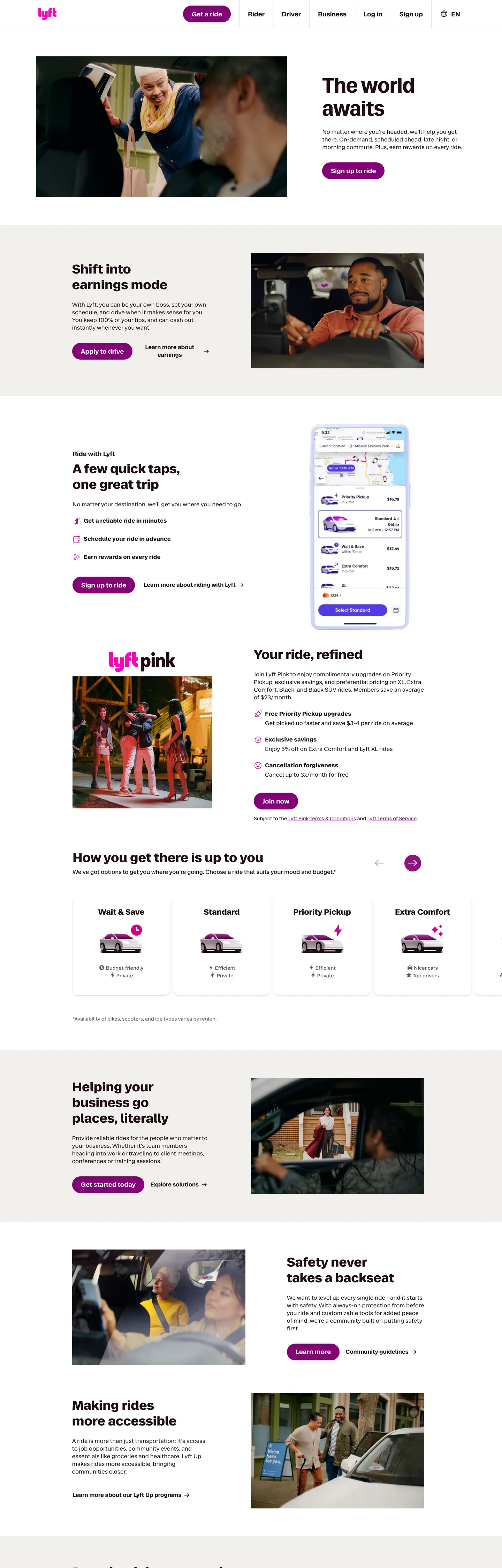
Lyft's web surface runs on a magenta-over-cordovan duet. Where most ride-hailing marketing leans on either pure black ink or a flat consumer blue, Lyft anchors every CTA in a saturated purple-magenta (#820076) and lets a deep cordovan text colour (#1d0c17) carry headings and paragraph body — a colour that reads as black at a glance but warms toward wine when you look closer. The hotter Lyft Pink (#ff00bf) is treated as eyebrow voltage rather than a primary, surfacing only on the lyft-pink subscription wordmark and inside one or two highlight icons. The rest of the page is a soft off-white (#f1f0ec) and a strict 48px capsule shape on every interactive element.
This page packages Lyft's marketing surface into a single DESIGN.md file following the Google Labs spec. Inside: 20 colour tokens grouped into brand, surface, text, and highlight roles; 8 typography tokens spanning RebelSansDisplay 60px headlines down to RebelSansText 14px captions in weights 400, 500, 600, and 700; 9 spacing values on an 8px base; 4 corner radii anchored on the 48px capsule and the 16px card; and 18 components covering buttons, cards, the nav row, FAQ accordions, and the bordered category tile grid.
Feed the file to Claude, Cursor, or GitHub Copilot and the agent renders React components that match Lyft's specific restraint — magenta capsule CTAs on warm off-white, 36px section heads in weight 600, paired-photo cards inside 16px chrome. Or use the tokens directly: every hex, every font stack, every padding value is a quoted string you can paste into Tailwind config or CSS variables. The system is worth studying because it proves a rideshare brand can hold attention with a single magenta voltage and one capsule shape — no gradient, no secondary accent, no chromatic load-bearing beyond the one purple and one pink.
What makes it distinct
- Magenta-over-cordovan duetpurple-magenta #820076 carries every primary CTA against a deep #1d0c17 ink that reads warmer than black
- Two-radius geometry48px capsule on every pill button and 16px on every card; the system declares only two radii in production CSS
- Lyft Pink as eyebrow voltage#ff00bf appears only on the lyft-pink subscription wordmark, the rare moment the brand permits a hotter pink
- Twin custom facesRebelSansDisplay reserved for the 60px hero h1, RebelSansText carries 14px through 36px for every other tier
- Photography over decoration4:3 rider, driver, and bike-rack frames inside 16px cards do the work gradients do elsewhere
Live at lyft.com
A snapshot of the brand in production. Hover the frame to scroll the page; click to visit.
 lyft.com
Explore Lyft
Pick what you want to see — mockups, colors, typography, layout, or the full component list.
Brand & Accent
Sparing, CTA-only voltage.
Surface
Page and card backgrounds.
Text
Headlines, body, captions, muted.
Borders & Hairlines
Dividers, outlines, structural rules.
Other
Specialty colors.
Lyft design system FAQ
Common questions about Lyft's tokens, components, and how to use this DESIGN.md in your project.
Related reading
Specs, directories, and component libraries that pair with this design system.