McDonald's Design System
McDonald's marketing system as a DESIGN.md file — golden #ffbc0d pill CTA on white canvas, Speedee typeface, 48px pill radius, photography as voltage.
About McDonald's DESIGN.md
Curated by Dov AzencotUpdated Source mcdonalds.com
- Food & Delivery
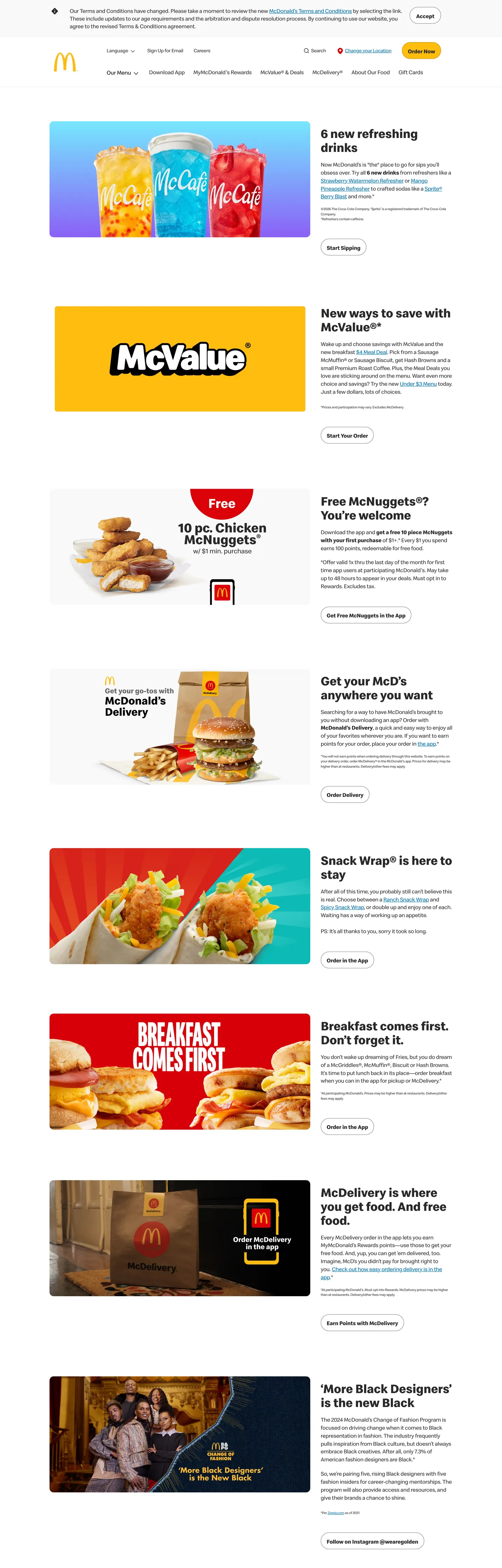
McDonald's marketing site does something the brand was famously incapable of for thirty years: it shuts up. The hero on mcdonalds.com is not a wall of red and yellow chrome — it is a six-row stack of campaign photographs (a trio of fountain drinks, a yellow McValue tile, a Chicken McNuggets shot, the McDelivery bag, a Snack Wrap, a Breakfast Comes First flat-lay) each paired with a Speedee headline at 36px / weight 700 in charcoal ink on a white canvas. The Arches yellow shows up exactly once above the fold, as a 48px-radius pill CTA reading "Order Now." A 1px gold-stroke border at #c08b00 fences the pill — a small typographic restraint that signals the brand has moved decisively toward an editorial register.
The DESIGN.md file packages the system into a machine-readable spec. Inside: 7 color tokens (charcoal ink at #292929 carrying 839 of the captured page's text + border occurrences, the singular Arches yellow #ffbc0d as the one chromatic voltage, a quiet civic-program blue #006bae that appears in 74 places never on commercial CTAs, and four neutral tones); 11 Speedee typography tokens spanning a 36px / 700 hero h2 down to 10px / 400 disclaimer captions; a binary 48px / 12px radius scale; an 18px-and-6px-dominated spacing rhythm; and 16 component definitions covering the golden pill CTA, the photo-card stack, the secondary outline button, the disclaimer caption strip, and the top-nav.
Feed this file to an AI coding tool and it reproduces the specific moves the rebrand was built on: photography as the only chromatic moment, charcoal-on-white marketing chrome, Speedee at modest tiers without a heavier display weight, and the golden pill held in such reserve that a single CTA above the fold carries the entire brand recognition. Treat it as a reference rather than a clone target — the system works because the campaign photography is doing the load-bearing work. Strip the photography and the chrome alone reads as a generic editorial page; what the system is really documenting is the brand's willingness to let the food speak.
What makes it distinct
- Photography as voltagethe marketing chrome has receded to charcoal #292929 on white; every chromatic moment lives inside the campaign photography stacked below the hero
- Single golden pillArches yellow #ffbc0d appears exactly once on the captured page as the CTA pill fill, fenced by a 1px #c08b00 gold-stroke border
- Speedee across every tierthe 36px / 700 h2 is the loudest typographic moment; no display ladder, no serif companion, no italic emphasis variant
- Binary radius48px pill for buttons and 12px for image tiles, nothing in between; no 4 / 8 / 16px middle tier
- Quiet civic bluecommunity-program text #006bae appears 74 times as the only secondary color in the chrome, never on commercial CTAs
Live at mcdonalds.com
A snapshot of the brand in production. Hover the frame to scroll the page; click to visit.
 mcdonalds.com
Explore McDonald's
Pick what you want to see — mockups, colors, typography, layout, or the full component list.
Brand & Accent
Sparing, CTA-only voltage.
Surface
Page and card backgrounds.
Text
Headlines, body, captions, muted.
Other
Specialty colors.
McDonald's design system FAQ
Common questions about McDonald's's tokens, components, and how to use this DESIGN.md in your project.
Related reading
Specs, directories, and component libraries that pair with this design system.
Browse all design systems
The full directory of DESIGN.md files on shadcn.io, with live mockups for each.
McDonald's — official site
McDonald's public marketing site — the source of truth for the live tokens captured in this file.
The DESIGN.md specification
Google Labs' open spec for machine-readable design system files — the format this page is built on.