Medium Design System
Medium's homepage design as a DESIGN.md file.
About Medium DESIGN.md
Curated by Dov AzencotUpdated Source medium.com
- News & Publishing
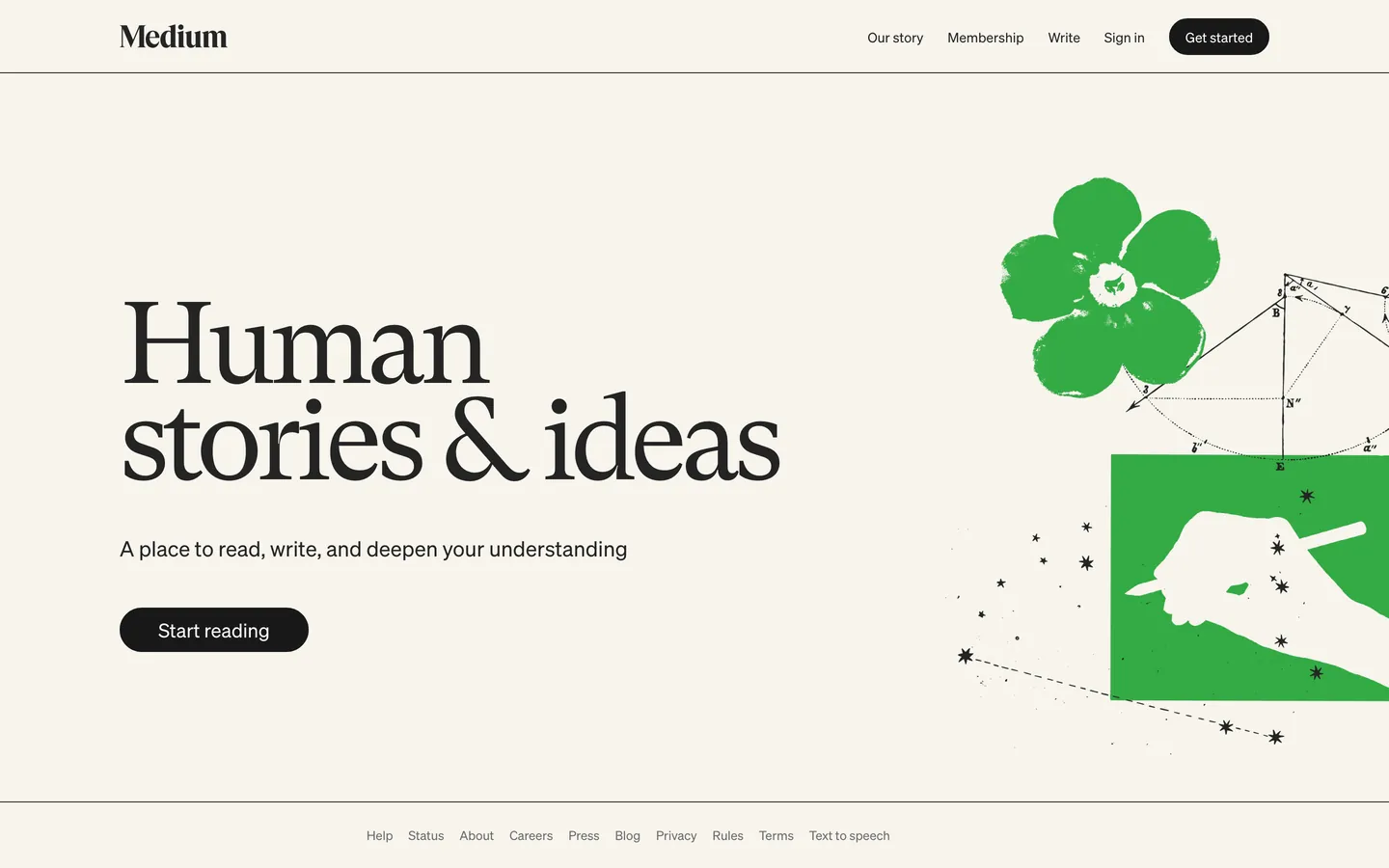
Medium's homepage is a reading room rendered as a webpage. The canvas is a warm cream ("#f7f4ed") rather than pure white — close enough to feel like cheap newsprint, far enough from beige to avoid the vintage-tea-stain trap. The hero is four words of GT Super serif set at 120px ("Human stories & ideas"), and that single typographic gesture is the entire identity. There is no gradient, no abstract product illustration, no SaaS-template feature grid below the fold — the page ends where it begins, with one headline, one dek, one pill button, and a hand-screened green illustration occupying the right half.
This DESIGN.md file packages the homepage system into a structured spec: 18 color tokens covering the cream-and-ink monochrome plus the editorial green, 9 typography tokens spanning GT Super display (28–120px) and Söhne UI (13–22px), a 2-step radius scale where the pill ("1386px") swallows every button and the rectangle ("0px") owns everything else, an 8-step spacing scale, and 16 component specifications covering the nav, hero, CTA pill, footer link rail, and the surface treatments for both reading body and metadata layers. The format follows the Google Labs DESIGN.md specification.
Feed the file to Claude, Cursor, or any agent that reads structured tokens and it produces Medium's exact reading-first voice — cream paper, oversize literary serif, monochrome ink, a single pill CTA. Unlike most publishing brands that stack a feature grid below a 64px headline, Medium commits the entire first viewport to one sentence — that restraint is the design. Reference the tokens directly in Tailwind config, paste the hex values into CSS variables, or use the spec as an audit checklist when reviewing whether a long-form reading surface feels like a magazine page or a SaaS landing.
What makes it distinct
- Cream canvas#f7f4ed warm off-white reads as printed paper rather than screen, set against #242424 ink for newspaper-grade contrast
- GT Super at 120px / weight 400a literary serif treated at billboard scale with -6.6px tracking, where most publishing brands cap display at 64px
- Single near-black pill CTA#191919 fill at 1386px radius, paired with a 38px height that reads more like a chip than a button
- Two-family stackGT Super serif for the hero word, Söhne sans for every nav link, byline, and button label, with zero blended weights
- Hand-screened editorial illustrationa stamped green flower and pencil hand occupy the right column, the only color voltage in an otherwise monochrome page
Live at medium.com
A snapshot of the brand in production. Hover the frame to scroll the page; click to visit.
 medium.com
Explore Medium
Pick what you want to see — mockups, colors, typography, layout, or the full component list.
Surface
Page and card backgrounds.
Text
Headlines, body, captions, muted.
Borders & Hairlines
Dividers, outlines, structural rules.
Other
Specialty colors.
Medium design system FAQ
Common questions about Medium's tokens, components, and how to use this DESIGN.md in your project.
Related reading
Specs, directories, and component libraries that pair with this design system.
Browse all design systems
The full directory of DESIGN.md files on shadcn.io, with live mockups for each.
Medium — official site
The publishing platform itself — read the homepage to see the GT Super hero and cream canvas in motion.
The DESIGN.md specification
Google Labs' open spec for machine-readable design system files — the format this page is built on.