Meta Design System
Meta's hardware commerce design system as a DESIGN.md file.
About Meta DESIGN.md
Curated by Dov AzencotUpdated Source about.meta.com
- Consumer Electronics
- E-commerce & Retail
Meta's design system reads like a hardware merchandiser that learned restraint. Across meta.com, the Quest 3S configurator, the Ray-Ban Meta product detail page, and the prescription-lens upsell, the same playbook holds: a stark white canvas, full-bleed product photography on 32px-rounded cards, and a confident Optimistic VF wordmark anchoring every heading. The brand voice is photography-first — large images take 50 to 70 percent of the viewport height above the fold, and the type tucks underneath at modest weights rather than fighting for attention.
This DESIGN.md captures the spec across 24 color tokens, 16 typography styles, 10 corner radii, 13 spacing values, and 33 components — every primary surface from `button-buy-cta` to `tech-specs-table`. The most distinctive token is the dual-primary system: a black pill (`#000000`) for marketing CTAs that flips to saturated cobalt (`#0064e0`) the moment the user enters the buy-now flow. The file follows the Google Labs DESIGN.md format, so every value is machine-readable and references the same token names Meta's own engineering teams would use.
Feed this file to Claude, Cursor, or GitHub Copilot and the agent produces React components that look like a Meta commerce surface rather than a generic e-commerce theme. The pill buttons stay at `rounded.full` (100px), the photographic feature cards skip the border-and-shadow chrome, and the 300-weight editorial subheads slot in between the 500-weight displays. The discipline worth studying here is the cobalt-versus-black split — Meta uses color scarcity as a navigational signal, telling the user exactly which surface they're standing on without saying a word.
What makes it distinct
- Two-tier primary button systemblack ink pills on marketing, cobalt #0064e0 pills exclusively inside buy-now flows
- Optimistic VF anchors the entire scale64px hero down to 12px caption, with ss01 and ss02 stylistic sets always paired
- Pill-shaped buttons at 100px radius and 32px card rounding form the dominant geometric signature across all surfaces
- Photographic feature cards run zero chromeno border, no shadow; the product imagery itself is the surface treatment
- Editorial subheads at 28px / 300 create a three-tier rhythm against 500-weight displays and 400-weight body copy
Live at about.meta.com
A snapshot of the brand in production. Hover the frame to scroll the page; click to visit.
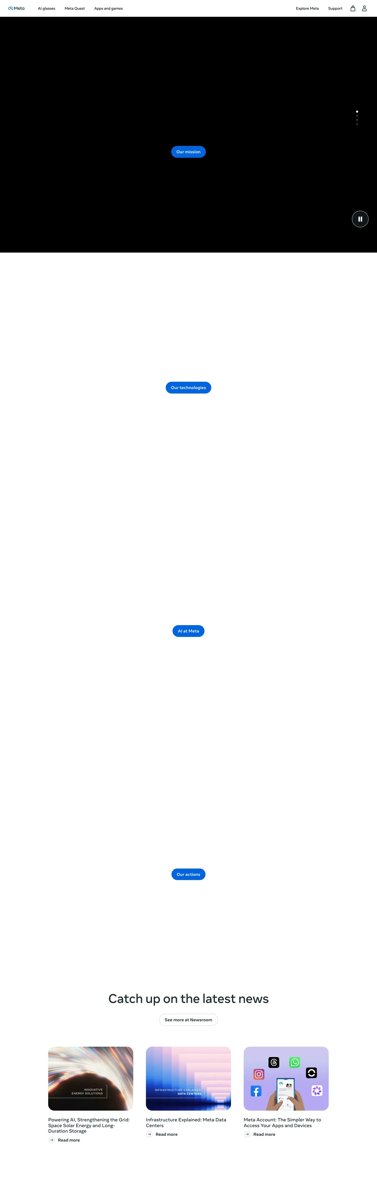 about.meta.com
Explore Meta
Pick what you want to see — mockups, colors, typography, layout, or the full component list.
Brand & Accent
Sparing, CTA-only voltage.
Surface
Page and card backgrounds.
Text
Headlines, body, captions, muted.
Borders & Hairlines
Dividers, outlines, structural rules.
Semantic
Status, errors, success, inline links.
Other
Specialty colors.
Meta design system FAQ
Common questions about Meta's tokens, components, and how to use this DESIGN.md in your project.
Related reading
Specs, directories, and component libraries that pair with this design system.
Browse all design systems
The full directory of DESIGN.md files on shadcn.io, with live mockups for each.
Meta Design
Meta's official design portal, covering brand, product, and the Optimistic typeface.
The DESIGN.md specification
Google Labs' open spec for machine-readable design system files — the format this page is built on.