Netflix Design System
Netflix's design system as a DESIGN.md file.
About Netflix DESIGN.md
Curated by Dov AzencotUpdated Source netflix.com
- Music, Video & Streaming
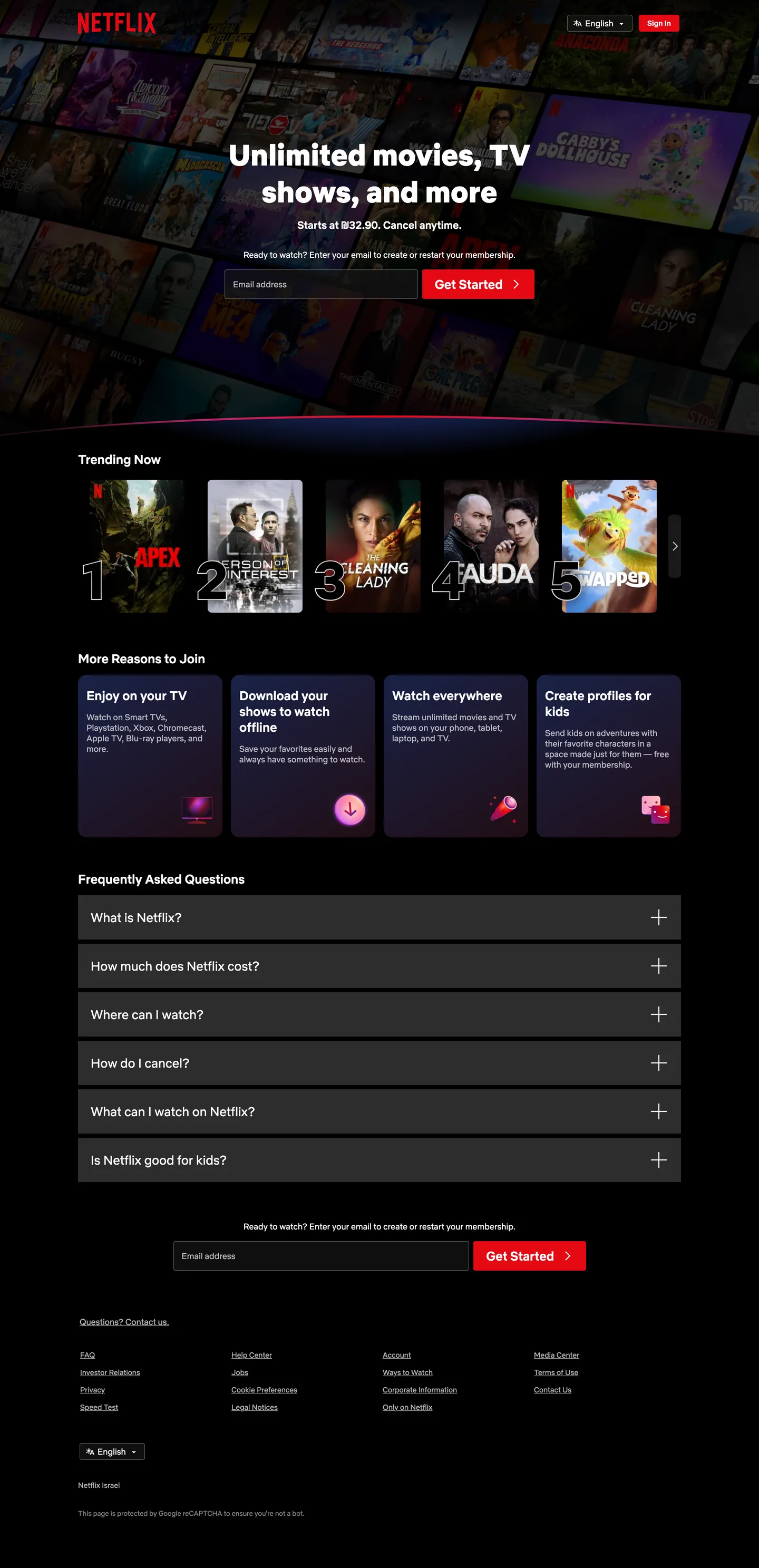
Netflix's sign-up page is a movie theater before the lights come up. The canvas is pure "#000000" with three charcoal surfaces — "#161616" for the trending rail backdrop, "#232323" for the FAQ accordion and feature cards, "#2d2d2d" for the inline email field — stacked so that movie-poster artwork is the only object on the page carrying chroma. Netflix Red ("#e50914") appears in exactly three places: the "Get Started" CTA pill, the top-right Sign In button, and the play-triangle glyph inside the rotating logo. Where streaming competitors crowd the homepage with feature shelves, marketing chrome, and hover affordances, Netflix runs a four-section funnel — hero, trending poster carousel, four reasons-to-join cards, FAQ accordion — that ends every screen in the same email-and-Get-Started field.
This page packages the Netflix homepage chrome into a single DESIGN.md file built on the Google Labs spec. Inside: 18 color tokens grouped into brand, surface, ink, hairline, and gradient roles; 8 typography levels in a tight 13px–56px range; 5 corner radii anchored on the dominant "8px"; a 9-step spacing scale; and 18 component recipes covering the red CTA pill, dark accordion rows, gradient poster rail, vertical-stacked feature cards, and the inline email-capture field. The extraction picked up zero CSS custom properties on ":root" — Netflix ships its homepage with hex literals on inline styles rather than a token API, so every value here is a render-time measurement.
Feed the file to Claude, Cursor, or GitHub Copilot and the agent writes signup-funnel components that match Netflix's vocabulary — weight 900 hero on cinema-black, single-pill red CTA, "8px" rounded charcoal cards with FAQ accordion — rather than a generic SaaS landing template. Or reference the tokens directly: every hex, font stack, radius, and spacing value is a quoted DESIGN.md value ready for Tailwind config, CSS variables, or your own component library. The system is worth studying as the strict end of single-voltage marketing — one red, one font family, one corner radius, four sections — designed to make every visitor end at the same email field.
What makes it distinct
- Cinema-black canvaspure black ('#000000') page with three charcoal cards ('#161616', '#232323', '#2d2d2d') so movie posters carry all chroma
- Single-shot red voltageNetflix Red ('#e50914') restricted to the Get Started pill, Sign In button, and play glyph; never on hairlines or text
- Weight 900 hero with weight 400 bodya heavyweight Netflix Sans display sits on top of a thin body, no intermediate display tier
- Gradient wash poster raildeep navy ('#192247') into burgundy ('#461518') sits behind the trending row, the only place gradients live
- Eight-pixel rounding everywherebuttons, accordion FAQ rows, feature cards, and email input share one '8px' radius (44 of 71 measurements)
Live at netflix.com
A snapshot of the brand in production. Hover the frame to scroll the page; click to visit.
 netflix.com
Explore Netflix
Pick what you want to see — mockups, colors, typography, layout, or the full component list.
Brand & Accent
Sparing, CTA-only voltage.
Surface
Page and card backgrounds.
Text
Headlines, body, captions, muted.
Borders & Hairlines
Dividers, outlines, structural rules.
Other
Specialty colors.
Netflix design system FAQ
Common questions about Netflix's tokens, components, and how to use this DESIGN.md in your project.
Related reading
Specs, directories, and component libraries that pair with this design system.
Browse all design systems
The full directory of DESIGN.md files on shadcn.io, with live mockups for each.
Netflix — official site
The streaming homepage this DESIGN.md was extracted from.
The DESIGN.md specification
Google Labs' open spec for machine-readable design system files — the format this page is built on.