Nike Design System
Nike's design system as a DESIGN.md file.
About Nike DESIGN.md
Curated by Dov AzencotUpdated Source nike.com
- E-commerce & Retail
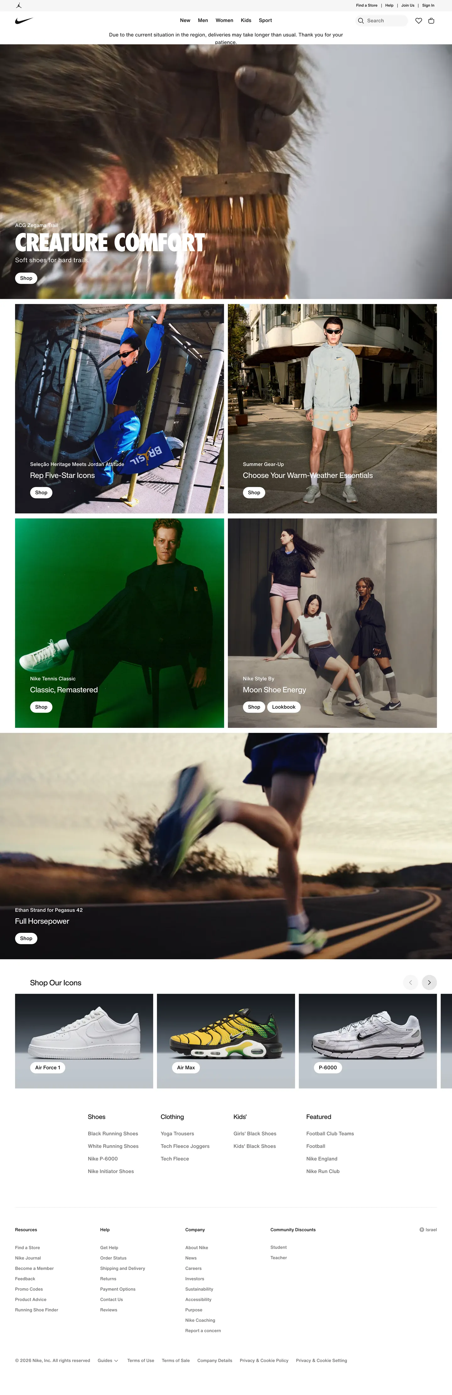
Nike's commerce system reads like a printed athletic catalog rendered for the browser. The chrome is almost violently restrained — pure ink `#111111`, pure canvas `#ffffff`, and a single soft cloud gray `#f5f5f5` carry roughly 95% of the surface area across `/men`, the PLP listings, the PDP, and `/membership`. Every chromatic moment in the page is reserved for the product photograph or a pricing signal. There is no decorative gradient, no soft shadow, no accent color used for tone. The brand's voice is loud, kinetic, and absolute, and the system earns that loudness by withholding color everywhere except where it has to scream.
This page packages Nike's commerce surface into a single DESIGN.md file built on the Google Labs spec. Inside: 22 color tokens (one ink, one canvas, one soft cloud, five text grays, four semantic, six category accents), 13 type styles topped by a 96px Nike Futura ND campaign tier at line-height 0.9, 5 corner radii, 8 spacing values from 2px to 48px, and 24 components — pill CTAs, search pills, filter chips, swatch dots, badge promos, the campaign tile, the PDP disclosure row, the four-column footer. Every value is quoted and machine-readable.
Feed the file to Claude, Cursor, or GitHub Copilot and the agent will produce React components that look like Nike: pill-shaped `#111111` buttons, square product cards on `#f5f5f5` swatches, sale prices in `#d30005`, an 8px grid that locks PLP and PDP to the same vertical rhythm. Or read it as a discipline study — the system's strength is that almost every component reuses the same pill plus flat card plus photography-on-cloud vocabulary, which is why Nike never has to introduce a new token to ship a new page.
What makes it distinct
- Photography-first chrome95% of the surface is `#111111`, `#ffffff`, and `#f5f5f5`; color lives only in the imagery
- Single typographic mountain96px uppercase Futura ND at line-height 0.9, then a hard cliff to 16px Helvetica Now
- Pill geometry everywhereevery CTA, chip, and badge uses `{rounded.lg}` 30px or `{rounded.full}`; sharp corners are reserved for cards
- Sale is the only color in chrome`#d30005` price text with strike-through original, no badge background, never elsewhere
- Zero drop shadowsdepth comes from photography and a single 1px inset hairline on sticky bars
Live at nike.com
A snapshot of the brand in production. Hover the frame to scroll the page; click to visit.
 nike.com
Explore Nike
Pick what you want to see — mockups, colors, typography, layout, or the full component list.
Brand & Accent
Sparing, CTA-only voltage.
Surface
Page and card backgrounds.
Text
Headlines, body, captions, muted.
Borders & Hairlines
Dividers, outlines, structural rules.
Semantic
Status, errors, success, inline links.
Other
Specialty colors.
Nike design system FAQ
Common questions about Nike's tokens, components, and how to use this DESIGN.md in your project.
Related reading
Specs, directories, and component libraries that pair with this design system.
Browse all design systems
The full directory of DESIGN.md files on shadcn.io, with live mockups for each.
Airbnb design system
Another photography-led consumer system — compare Airbnb's soft Rausch coral against Nike's pure-black discipline.
React blocks for shadcn/ui
Production-ready hero, pricing, CTA, and dashboard sections built with the same Tailwind + shadcn primitives.