Ollama Design System
Ollama's design system as a DESIGN.md file.
About Ollama DESIGN.md
Curated by Dov AzencotUpdated Source ollama.com
- AI & LLM Platforms
- Developer Tools & IDEs
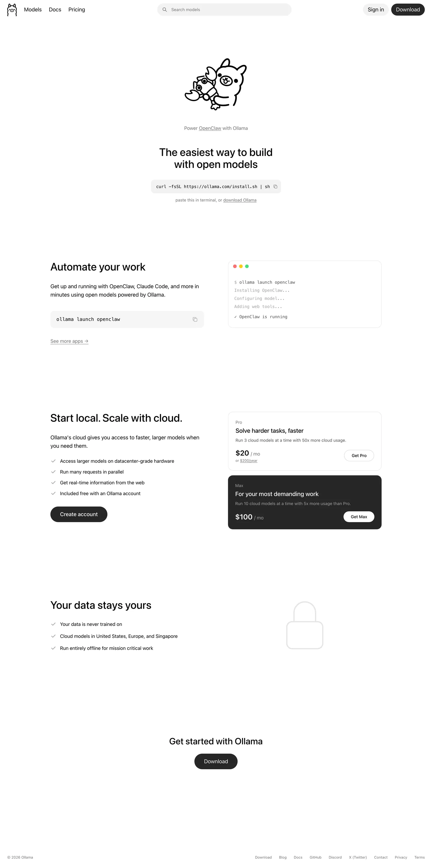
Ollama runs the most aggressively under-designed marketing surface in AI tooling, and the restraint is the brand. The home page reads like a Markdown README rendered with care: a 36px center-aligned headline above an inline curl install snippet in a soft-gray pill, a single black Download CTA, and a hand-drawn llama as the only ornament. There is no gradient, no hero photography, no marketing pyrotechnics. Pricing tiers, FAQs, and the "your data stays yours" strip all sit on the same paper-white canvas (#ffffff) with quiet #737373 body text carrying the prose. The single inverted moment in the entire system is the dark #171717 Max pricing card, which breaks the flat-white rhythm exactly once per page.
This DESIGN.md file captures the system in machine-readable form: 20 color tokens grouped into surface, text, hairline, and semantic terminal-light groups, 13 typography tokens (SF Pro Rounded display, ui-sans-serif body, ui-monospace code), five corner radii (with 9999px and 12px doing nearly all the work), eight spacing tokens, and 19 components — buttons, inputs, the signature install-snippet pill, terminal mockup card, pricing cards in both light and inverted dark variants, FAQ rows, nav, and footer. The format follows Google Labs' DESIGN.md spec so the same tokens resolve cleanly into Tailwind config, CSS variables, or component-library code.
Feed the file to Claude, Cursor, or GitHub Copilot and the agent will reproduce Ollama's restraint instead of inventing decoration. Reference {colors.primary} or {rounded.full} directly in React components, or use the spec as an audit lens against your own marketing site. The system is worth studying for one reason: it proves a heavily technical product can ship a public surface that looks like its own CLI output, and the restraint scales — every section is the same long-form Markdown column, and every new component falls out of the existing pill plus flat-card plus terminal-mockup vocabulary.
What makes it distinct
- Two-color chromepure black #000000 on pure white #ffffff with three neutral grays, no brand accent at all
- Pill geometry everywhereevery interactive element collapses to 9999px radius; cards use 12px and nothing else
- One inverted moment per pagethe dark #171717 Max pricing card is the only attention-grabbing surface in the entire system
- Install snippet as hero CTAan inline curl pill at 48px height replaces the standard hero illustration
- Stock Apple typographySF Pro Rounded display, ui-sans-serif body, ui-monospace code, treated as a non-decision
Live at ollama.com
A snapshot of the brand in production. Hover the frame to scroll the page; click to visit.
 ollama.com
Explore Ollama
Pick what you want to see — mockups, colors, typography, layout, or the full component list.
Brand & Accent
Sparing, CTA-only voltage.
Surface
Page and card backgrounds.
Text
Headlines, body, captions, muted.
Borders & Hairlines
Dividers, outlines, structural rules.
Other
Specialty colors.
Ollama design system FAQ
Common questions about Ollama's tokens, components, and how to use this DESIGN.md in your project.
Related reading
Specs, directories, and component libraries that pair with this design system.
The DESIGN.md specification
Google Labs' open spec for machine-readable design system files — the format this page is built on.
Browse all design systems
The full directory of DESIGN.md files on shadcn.io, with live mockups for each.
React blocks for shadcn/ui
Production-ready hero, pricing, CTA, and dashboard sections built with the same Tailwind + shadcn primitives.
Use Ollama in your project
One machine-readable file. Drop it into Claude, Cursor, or any AI tool that reads DESIGN.md.