Peloton Design System
Peloton's design system as a DESIGN.md file.
About Peloton DESIGN.md
Curated by Dov AzencotUpdated Source onepeloton.com
- Healthcare & Wellness
- Consumer Electronics
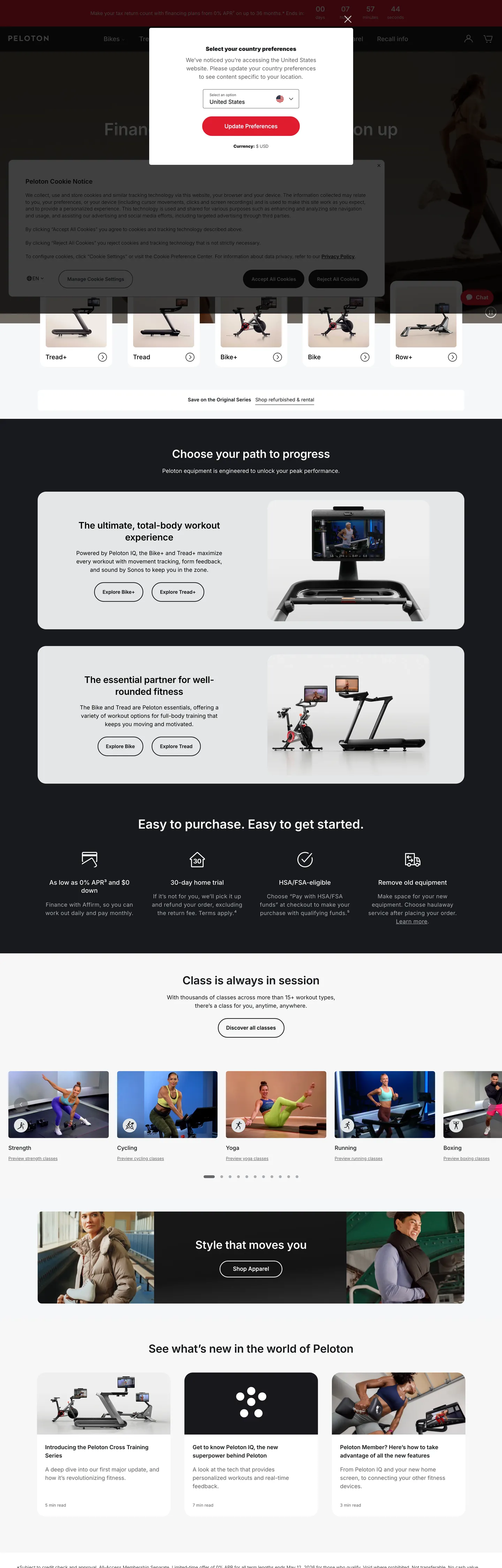
Peloton's storefront is a hardware-commerce surface dressed as an editorial fitness brand. The chrome is almost entirely near-black `#181a1d` typography on a pure white canvas — 780 elements use the ink as text, 778 as borders — interrupted in only one place by a single Peloton Red `#df1c2f` voltage that lights the primary purchase CTA. Everything else on the page is photography of the Bike+, Tread, Row, and Guide, captioned by Inter at modest 14–18px sizes. The page reads less like a typical fitness site (which leans on colorful gradient banners and motion) and more like an appliance store that happens to sell hardware you sweat on.
This file packages Peloton's home page chrome as a DESIGN.md — Google Labs' open spec for machine-readable design tokens. Inside: 18 color tokens with one brand voltage (`#df1c2f` Peloton Red), one near-black ink (`#181a1d`), and a six-step neutral ladder; 11 typography tiers all running Inter at sizes 12 through 48 and weights 300 through 600, with a `-0.2px` letter-spacing reserved for the 26–48px display row; six radii from 4px to a full pill plus an 8px / 12px spacing scale lifted directly from the 1440px viewport's most-used values; and 17 components ranging from `button-primary` and `button-secondary` through `nav-link`, `product-tile`, `footer-email-input`, and a financing banner.
Drop the file into Claude, Cursor, GitHub Copilot, or any agent that reads design tokens. The result is a React surface that looks like Peloton: ink-on-white body, a single red 28px pill anchoring purchase flow, Inter at five weights with display tightened by `-0.2px`, and product tiles framed by 6px corners rather than rounded cards. Use it as a reference for hardware storefronts where the photography sells and the chrome stays out of the way — or as a study in how a single accent token plus a single near-black can carry an entire commerce page without a second brand color.
What makes it distinct
- Single-voltage red`#df1c2f` shows up 4 times on the page yet carries every primary purchase CTA, never a chip, never a hairline
- Two-radius geometryprimary CTA sits at a 28px pill, every other interactive surface lands at a 6px corner (66 occurrences)
- Inter at five weights300/400/500/600 across 14 typography tiers, with a `-0.2px` letter-spacing reserved for the 32–48px display row
- Ink as canvas voltage`#181a1d` text fills 780 elements vs. `#df1c2f` red at 4, putting 99% of the chrome on near-black against pure white
- Hardware-first photographythe 1440px viewport stacks Bike, Tread, Row, Guide tiles edge-to-edge, with copy held under 18px so the product stays the loudest object
Live at onepeloton.com
A snapshot of the brand in production. Hover the frame to scroll the page; click to visit.
 onepeloton.com
Explore Peloton
Pick what you want to see — mockups, colors, typography, layout, or the full component list.
Brand & Accent
Sparing, CTA-only voltage.
Surface
Page and card backgrounds.
Text
Headlines, body, captions, muted.
Borders & Hairlines
Dividers, outlines, structural rules.
Semantic
Status, errors, success, inline links.
Other
Specialty colors.
Peloton design system FAQ
Common questions about Peloton's tokens, components, and how to use this DESIGN.md in your project.
Related reading
Specs, directories, and component libraries that pair with this design system.