PlayStation Design System
PlayStation's design system as a DESIGN.md file.
About PlayStation DESIGN.md
Curated by Dov AzencotUpdated Source playstation.com
- Gaming & Entertainment
- Consumer Electronics
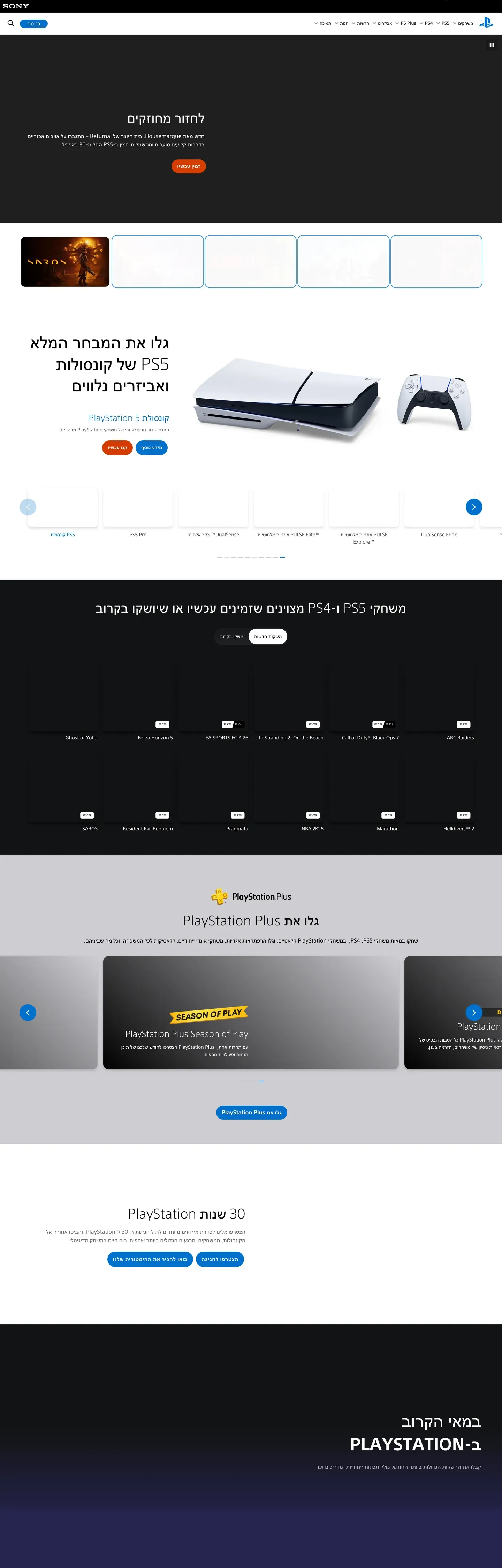
PlayStation's marketing system reads like a console launch trailer broken into chapters. Each section is a full-bleed band in one of three canvases — pure black "#000000", true white "#ffffff", or PlayStation Blue "#0070d1" — and the band's surface color is the only divider between chapters. No mesh, no gradient transition, no decorative rule. The signature move is typographic: PlayStation SST renders display headlines at weight 300 (light), an editorial choice for a brand that could easily reach for heavy geometric display faces. Headline sizes step in tight increments at 54px, 44px, 35px, 28px, and 22px, all on a 1.25 line-height ladder, while body settles at 18px with 1.5 line-height for long-form readability on support and game pages.
This file packages the entire system as a single Google Labs DESIGN.md spec. Inside: 32 color tokens covering brand, surface, ink, hairline, and semantic roles; 15 typography styles all set in PlayStation SST with substitution notes for Roboto Light and Inter; 8 spacing tokens stepping from 4px to a 96px section rhythm; a five-step radius scale where every CTA pill renders at 9999px and every product card at 8px; and 30 component recipes covering primary and commerce buttons, filter pills, game tiles, three hero band variants, the PS Plus gold banner, nav, footer, and the support search field.
Feed this file to Claude, Cursor, or GitHub Copilot and the AI will generate React components that match PlayStation's actual restraint — flat-on-canvas cards, pill CTAs at "#0070d1", commerce orange at "#d53b00" used only for store actions, and SST display copy at weight 300. Or reference the tokens directly when building marketing pages, console product pages, or game detail surfaces. The system's value as a study is that it proves a gaming brand can win without bold display weights, gradient chrome, or atmospheric backgrounds — imagery does the heavy lifting and the typography stays quiet.
What makes it distinct
- Three-canvas chapter rhythmpure black #000000, true white #ffffff, and PlayStation Blue #0070d1 alternate edge-to-edge with no decorative dividers
- Display headlines render at weight 300unusual for a gaming brand, giving the chrome an airy editorial voice over typographic muscle
- Two-color CTA grammarPlayStation Blue #0070d1 for marketing pills, Commerce Orange #d53b00 reserved exclusively for store actions
- Single permitted gradientthe PS Plus gold three-stop #ffce21 to #ee8e00, never reused on other chrome surfaces
- Imagery occupies 60-90% of every bandconsole renders, game key art, and tier illustrations carry the storytelling, copy is compressed
Live at playstation.com
A snapshot of the brand in production. Hover the frame to scroll the page; click to visit.
 playstation.com
Explore PlayStation
Pick what you want to see — mockups, colors, typography, layout, or the full component list.
Brand & Accent
Sparing, CTA-only voltage.
Surface
Page and card backgrounds.
Text
Headlines, body, captions, muted.
Borders & Hairlines
Dividers, outlines, structural rules.
Semantic
Status, errors, success, inline links.
Other
Specialty colors.
PlayStation design system FAQ
Common questions about PlayStation's tokens, components, and how to use this DESIGN.md in your project.
Related reading
Specs, directories, and component libraries that pair with this design system.
The DESIGN.md specification
Google Labs' open spec for machine-readable design system files — the format this page is built on.
Browse all design systems
The full directory of DESIGN.md files on shadcn.io, with live mockups for each.
React blocks for shadcn/ui
Production-ready hero, pricing, CTA, and dashboard sections built with Tailwind + shadcn primitives.